How to Master the Monochrome: 12 Black and White Bathroom Ideas (With Real Photos)
Let me be honest with you. Black and white bathrooms are everywhere, and yet somehow people still manage to make them look like a half-finished renovation project. The difference between a bathroom that looks intentional and one that looks accidental usually comes down to just a handful of decisions.
I pulled together 12 real examples, not CGI fantasy renders or staged showrooms that no human actually lives in. These are real bathrooms that real people designed, built, and use every single morning. Some go full glamour. Some keep it brutally simple. A couple of them took risks that genuinely surprised me.
Whether you’re planning a full gut renovation or just trying to figure out why your current bathroom feels weirdly off, there’s something useful in each of these.
1. Black Geometric Mosaic Shower Tile with Gold Hardware Accents
If you walk into this bathroom, your eyes go straight to the shower wall. Not the vanity, not the cabinets. That shower wall.
The mosaic tile features irregular cracked-earth shapes in deep charcoal black connected by bright gold grout lines that create a web-like effect across the entire enclosure. The frameless glass door with brushed brass hardware turns the shower into a display piece rather than just a box you stand in.
What makes this work is how restrained everything else is. The floor tile is large-format charcoal rectangle. The vanity cabinet is dark but plain. The walls outside the shower are simple white subway tile. Every other surface is quietly stepping aside so that statement shower wall can do its thing.
Here’s the practical lesson:
- Pick one surface to go bold
- Keep every other surface clean and calm
- Gold or brass hardware adds warmth that pure monochrome schemes often lack
- Recessed glass shelving eliminates visual clutter in compact spaces
One thing I genuinely love here: the toilet is tucked between the vanity and the shower almost as an afterthought. That dramatic tile grabs your attention so completely that the toilet basically disappears from the composition. Honestly, that’s a design trick worth stealing.
2. Classic White Square Tile with Black Floor and Arched Alcove
Some bathrooms earn their spot simply by doing something old extremely well. This one uses full-height white square tiles interrupted by a single horizontal band of solid black gloss tile near the top, and that one stripe does more work than most people’s entire renovation budgets. No joke.
The arched alcove above the toilet is the element that keeps pulling me back. It’s painted soft sage green inside, which creates a gentle contrast without breaking the black and white framework. A small vase of purple flowers sits inside it, and combined with the arch shape and the greenery visible through the window, this bathroom has a sense of life that purely monochrome spaces often lose.
The black penny tile floor is a classic pairing with white square wall tiles. The execution here is textbook correct: small enough to read as a dark field from normal viewing distance, but up close it has real texture and dimension.
If you’re working with older architecture or a home with genuine character, this approach is worth serious consideration. It feels period-appropriate while remaining completely livable. FYI, the single white towel bar and simple window treatment keep accessories minimal and let the architecture do the heavy lifting.
3. Checkerboard Floor, Wild Wallpaper, and a Marble Vessel Sink
Okay, I’ll admit it. When I first looked at this one, I thought it was going to be a disaster.
Deep teal jungle wallpaper covers the upper walls and ceiling. Charcoal grey paneling sits on the lower half. Bold black and white checkerboard floor tiles cover the ground. A rectangular marble vessel sink with grey veining sits on a floating vanity. A cast iron column radiator painted in dark chrome stands nearby. By every conventional rule, this should be overwhelming.
It isn’t. And here’s why: the checkerboard floor acts as a visual anchor. It’s the most graphically strong element in the room and everything else orbits around it.
The dark lower paneling gives the checkerboard tile a solid frame. The marble vessel sink brings white back into a space that’s otherwise quite dark. The brass faucet and mirror frame add warmth against all that cool charcoal and teal.
This is a powder room done with real personality, and that matters. Smaller rooms can handle more visual intensity because visitors spend only a few minutes inside. What would feel exhausting in a master bathroom reads as delightful in a compact guest toilet.
Quick tip if you’re attempting this: the checkerboard pattern works best with tiles at least 4 to 6 inches square. Smaller tiles start looking like optical noise rather than intentional pattern.
Also Read: How to Go Dark Without Feeling Doped: 12 Lessons in Black Bathroom Design
4. Bold Black Vertical Stripes Paired with Full Marble Surfaces
This bathroom commits fully to drama and somehow pulls it off without tipping into excess. Wide vertical black and white stripes run floor to ceiling on the accent wall above the double vanity. The kind of choice that makes most homeowners break out in a cold sweat.
Paired with that, the shower features floor-to-ceiling Carrara marble slab walls with heavy dark veining. The floor is a classic diamond-inset marble pattern with small black dot accents.
The large rectangular frameless mirror reflects the striped wall, which doubles its visual impact and makes the room feel wider. Two brushed gold sconces flanking the mirror and matching gold faucets pull warmth into what could otherwise feel like a very cold space.
The most instructive thing about this bathroom is how scale is used. The stripes are wide, probably 6 to 8 inches per band, which reads as confident rather than fussy. Narrow stripes in a bathroom can feel like an optical trick. Wide stripes make a statement.
Is it for everyone? Absolutely not. But if you’ve been debating a striped accent wall and wondering whether it can actually work, this is your proof.
5. Matte Black Vanity with Encaustic-Style Patterned Floor Tile
The contrast here is clean and effective. A deep matte black vanity cabinet with angular hardware and a crisp white quartz countertop sits against a floor covered in grey-toned encaustic-style patterned cement tiles. The floral medallion design on those floor tiles reads almost like wrought iron: intricate, slightly rustic, and completely at home against that flat black cabinet finish.
What this design gets right is texture variety:
- The black cabinet absorbs light rather than reflecting it
- The white countertop is smooth and clean
- The floor tile has an organic, hand-pressed quality that adds tactile warmth the smooth surfaces can’t provide
The matte black fixtures throughout including the faucet, mirror frame, cabinet hardware, towel bar, and shower accessories create a consistent hardware finish that unifies everything. This is a practical lesson worth writing down: committing to a single hardware finish across every fixture in a bathroom creates cohesion without requiring expensive renovation decisions.
For a mid-size bathroom that wants to feel intentional without being theatrical, this combination of matte black and textured patterned tile is one of the most livable approaches I’ve come across.
6. High-Gloss Black Lacquer Vanity with Checkerboard Marble Floor
If the previous entry was restrained, this one absolutely is not. And it earns every inch of its confidence.
The vanity is finished in a lacquered black gloss that catches light like a mirror, with curved drawer detailing and ornate gold ring pulls at every cabinet front. The countertop is smooth cream stone with a shaped, undulating front edge that gives it the look of antique furniture.
The floor is large-format black and white marble checkerboard, with the black squares showing visible white veining that prevents the contrast from feeling harsh. Above the vanity, a circular gilt-framed mirror and a pair of gold-detailed rectangular mirrors create an eclectic wall composition. Brass candlestick faucet hardware, crystal accessories, white orchids, and a wicker basket complete the styling.
This is Hollywood Regency design applied to a black and white bathroom. It works because every single element commits to the same register of glamour. Nothing here is understated, but the black and white color framework keeps it from becoming garish.
The practical takeaway: high-gloss cabinetry shows fingerprints. It requires regular attention to maintain. If you can live with that, the payoff in visual impact is very real. IMO, the ornate ring pulls are the kind of hardware detail most people overlook when budgeting, but they matter enormously in a maximalist design like this one.
Also Read: How to Style a White Tile Bathroom: 10 Real-Life Designs to Copy
7. Black Beadboard Wainscoting with Octagon Mosaic Floor Tile
This is the bathroom that genuinely changed how I think about beadboard. Because beadboard does not have to be white.
The lower half of every wall is painted black in the classic vertical-plank wainscoting style. The upper walls stay bright white. The ceiling is white. The vanity is white with a subtle marble-look countertop. The floor is a traditional black and white octagon mosaic tile with diamond insets.
Painting the lower portion of walls in a darker color does something counter-intuitive in small rooms: rather than making them feel smaller, it grounds the space and makes the bright white ceiling feel higher by contrast. That’s a technique worth remembering if you’re working with a bathroom that lacks natural height.
A black-framed round mirror and a three-bulb matte black vanity light create vertical punctuation marks against the white upper wall. The result feels immediately familiar, like a well-loved craftsman home, but reads as current because the black wainscoting inverts the expected color hierarchy.
The octagon mosaic floor is also one of the most historically durable choices you can make. Victorian bathrooms used it. 1920s craftsman homes used it. Contemporary renovations use it now. That longevity is worth factoring into your decision.
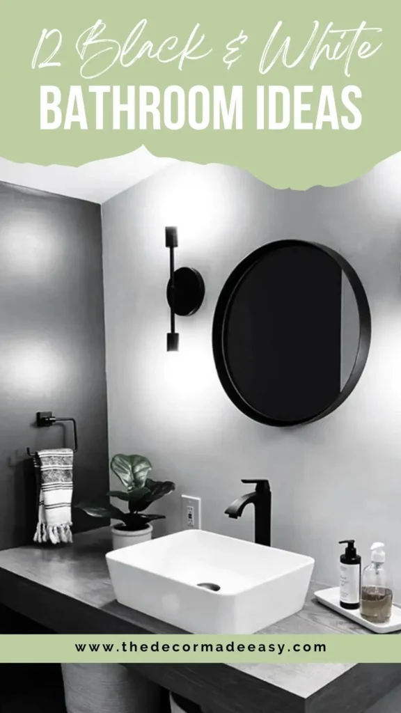
8. All-White Subway Tile with Black Vessel Sink and Round Mirror
Minimalism is harder than it looks. Anyone who tells you otherwise has probably never actually attempted it.
This bathroom strips away almost every decorative element and makes it work through precise material selection and intentional accessory placement. White subway tile covers the walls floor to ceiling. The floor is matte black hexagonal tile. A floating vanity with grey-brown oak drawer fronts holds a white rectangular vessel sink. A matte black faucet and a round black-framed mirror complete the primary composition.
Every accessory in this room serves a function. Nothing is present purely for decoration. Two matte black wall sconces provide warm directional light. A small fiddle-leaf plant adds life. A striped hand towel and a soap tray provide organization. That’s it.
What makes this succeed is the honest contrast between the black hexagonal floor and the white subway tile walls. The transition between surfaces is clean and deliberate. There’s no awkward threshold tile, just a direct material change at the floor plane that reads as sharp and decisive.
If pattern and ornament exhaust you, this is your answer. And honestly? You spend more cumulative time in your bathroom than almost any other room. Calm and clean at 6 a.m. is not boring. It’s a gift to yourself.
9. White Subway Tile Walls with Black Hexagonal Floor and Wood Vanity
This bathroom sits comfortably between Scandinavian simplicity and urban loft aesthetics, and the combination works better than either would alone.
Full white subway brick tile covers every wall surface including inside the walk-in shower. The floor throughout is large matte black hexagonal tile with thin white grout joints. A floating vanity in weathered grey-brown oak holds a matte black ceramic bowl vessel sink.
An exposed Edison-style pendant bulb hanging from the ceiling on a short cord adds warmth and a deliberate lo-fi quality to what would otherwise be a pristine white space. The round black-framed mirror is large enough to occupy the wall comfortably without competing with the subway tile pattern behind it.
Here’s something worth examining: the only real color in the room is a potted grass-like plant in an orange terracotta pot sitting on the counter. One warm accent in an otherwise completely committed black and white room reads as intentional rather than accidental. That’s the lesson. The more committed your palette, the more intentional even a single accent appears.
Floor tile is often an afterthought in bathroom renovations. This example shows exactly how much the floor can contribute to the overall character of a space.
Also Read: 12 Black Tile Bathroom Ideas That Will Change Your Mind
10. Black and Sage Green Combination with Geometric Diamond Tile Floor
This one uses one of the more unexpected approaches in the entire collection: pairing the black and white framework with a saturated sage green subway tile inside the shower enclosure. The green creates a moody, jewel-toned contrast against the surrounding black surfaces including the dark grey walls, black vanity cabinet with white countertop, and black shower surround.
The floor throughout is a small-scale black and white geometric pattern featuring diamond and triangle shapes arranged in a repeating three-dimensional cube illusion. It’s a bold floor choice that rewards close inspection. The kind of tile that makes people crouch down and stare, which is either endearing or slightly weird depending on who’s in your house.
The brass shower fixtures and accent hardware on the vanity prevent the dark, cool palette from reading as oppressive. Without those warm metal accents, this bathroom would feel like a cave. With them, it reads as deliberate and sophisticated.
The valuable lesson here is about complementary tones. You can introduce a third color into a black and white bathroom without breaking the scheme, as long as you contain it to a specific zone like an interior shower wall. The eye reads the overall room as black and white while registering the green as a special reveal behind the glass.
11. Victorian Octagon and Dot Floor Tile with Freestanding Soaking Tub
The floor in this bathroom is genuinely one of the most impressive tile installations I’ve come across. Large white octagonal field tiles with small decorative medallion inserts in black and grey alternate across the entire floor plane, bordered by a dark running trim tile along the edges. The pattern is intricate without being chaotic.
The rest of the bathroom intentionally steps back to let the floor breathe. White subway tile covers the walls with no decorative banding. A freestanding pedestal tub in white sits centered against the back wall with antique brass cross-handle faucet hardware. The toilet and vanity cabinet are classically styled in white.
This is a case study in knowing when to stop. Most designers would be tempted to add decorative wall tile, a dramatic mirror, or accent lighting to a bathroom with this floor. The restraint here is correct. The floor is the feature, and everything else is a supporting player.
If you’re drawn to traditional or heritage-style homes, this approach translates beautifully. The floor tile references Victorian and Edwardian bathroom traditions while the streamlined white subway tile walls read as contemporary. The freestanding tub is the essential third element: a built-in tub would have conflicted with the grandeur of that floor.
12. Matte Black Freestanding Tub Against Full-Height Marble Slab Walls
The most elemental contrast you can create in a bathroom is exactly what’s happening here. A matte black oval freestanding soaking tub sits in front of floor-to-ceiling marble tile walls in white with sweeping dark grey and gold veining. The tub absorbs light. The marble practically glows.
A narrow horizontal black-framed window is set into the marble wall at a height that allows privacy while framing a view of mountains and open sky. Two recessed niches with black metal trim hold matte black soap and shampoo dispensers. A matte black floor-mounted faucet rises beside the tub with an arced spout form that echoes the tub’s curves.
The combination of matte black fixtures and white marble is one of the most compelling material pairings available in contemporary bathroom design. The marble provides pattern and variation that white tile alone cannot. The matte black provides gravity and contrast that chrome or polished fixtures would dilute.
What I’d point out about this space is that the accessories are perfectly edited. The black towels, the concrete side table, the plant, the window. Nothing is present by accident. That level of intentionality in accessory selection is what separates a designed bathroom from a simply renovated one. There’s a real difference between those two things.
Quick Comparison: All 12 Black and White Bathroom Styles
| Style | Best For | Budget Level | Difficulty |
|---|---|---|---|
| Black mosaic tile shower feature wall | Statement renovation, compact bathrooms | High | Advanced |
| Classic white square tile + black floor | Traditional or heritage homes | Medium | Easy |
| Checkerboard floor + bold wallpaper | Powder rooms, guest bathrooms | Medium | Medium |
| Vertical stripe wall + marble shower | Large master bathrooms | High | Advanced |
| Matte black vanity + patterned floor tile | Mid-size family bathrooms | Medium | Medium |
| Glossy black lacquer vanity + checkerboard marble | Glamorous powder rooms | High | Medium |
| Black beadboard wainscoting + octagon tile | Craftsman, colonial, farmhouse homes | Low to Medium | Easy |
| All-white subway + black hexagon floor | Minimalist modern spaces | Medium | Easy |
| White subway + black hex floor + wood vanity | Scandinavian or urban loft style | Medium | Easy |
| Black-green-white combination with geometric floor | Contemporary, moody aesthetics | High | Advanced |
| Victorian octagon tile + freestanding tub | Period-accurate or estate-style bathrooms | High | Advanced |
| Matte black tub + marble slab walls | Spa-style master bathrooms | Very High | Advanced |
The Principles Behind Every Successful Black and White Bathroom
After looking across all twelve examples, a few patterns become impossible to ignore.
Hardware finish consistency matters more than almost any other single decision. Every successful bathroom here commits to one metal finish, whether that’s matte black, brushed brass, antique gold, or chrome, and applies it everywhere without exception. Mixing metal finishes is one of the most common ways a bathroom loses its sense of cohesion.
Pattern density needs to be distributed deliberately. When a bathroom has a bold floor, the walls tend to be calm. When the walls carry the drama, the floor steps back. Rooms that try to pattern every surface simultaneously collapse into visual noise. Pick your hero surface and let everything else support it.
The black and white palette handles almost any accent color gracefully when that color is introduced in small, contained doses. The orange terracotta pot in example nine, the sage green shower tile in example ten, the purple flowers in example two. None of these feel out of place because the black and white framework is so clearly established around them.
And what every single one of these bathrooms shares, regardless of style or budget, is a clear point of view. Each one made real choices and committed to them. That commitment, more than any tile selection or fixture brand, is what makes a bathroom worth designing in the first place.
Final Thoughts
Here’s the honest truth. You don’t need an unlimited budget or a professional designer to get a black and white bathroom right. You need to make actual decisions and follow through on them. Pick your bold surface. Commit to one hardware finish. Let the busy elements breathe. Edit your accessories ruthlessly.
The twelve bathrooms above prove that this combination works across every style, budget, and scale imaginable. From a tiny powder room with jungle wallpaper and a checkerboard floor to a spa-caliber master suite with a matte black soaking tub against marble slabs, the formula is the same underneath: intentionality wins every time.
Now go look at your bathroom with fresh eyes. What’s the one decision you’ve been avoiding? That’s probably exactly where to start.