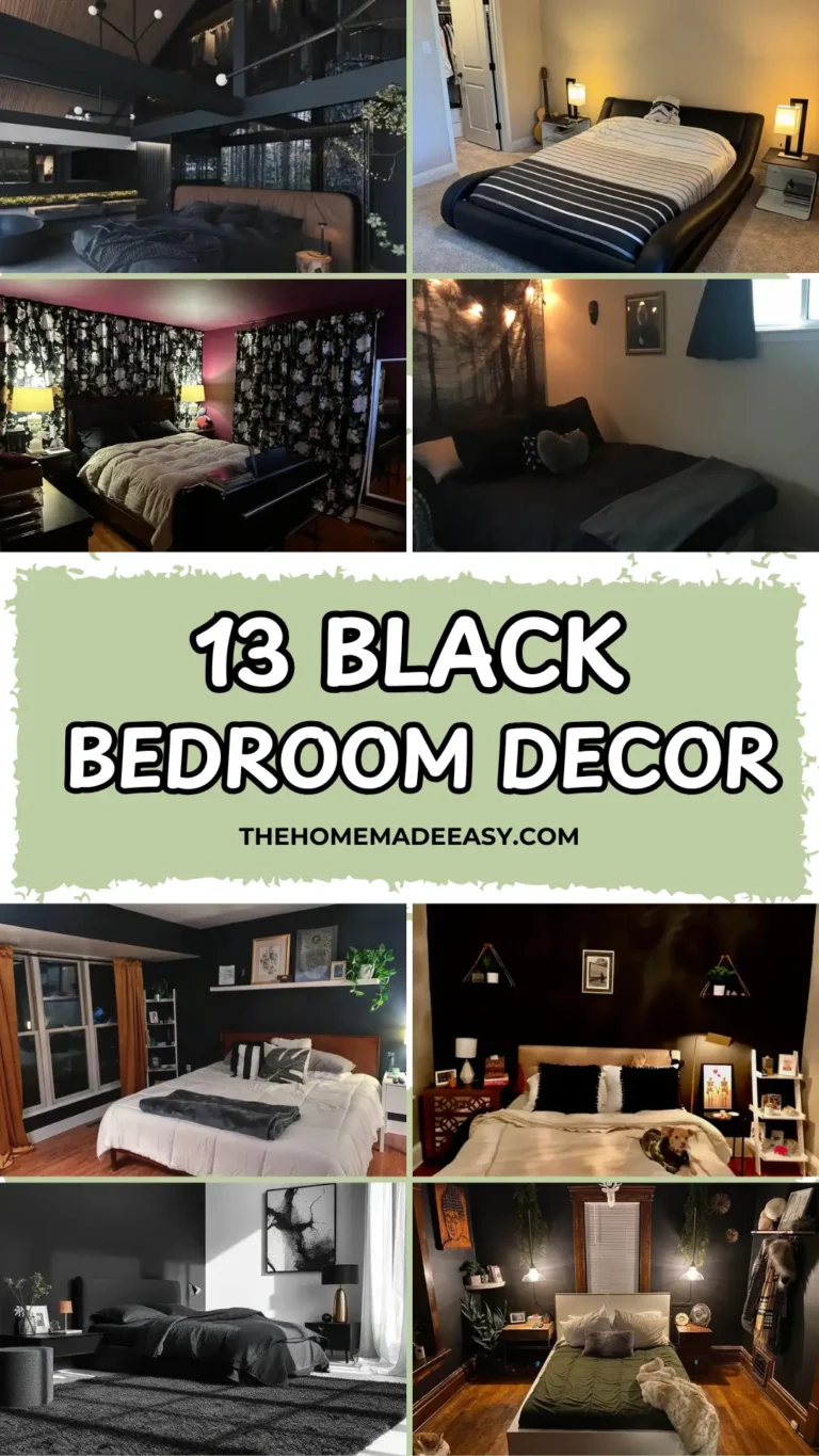
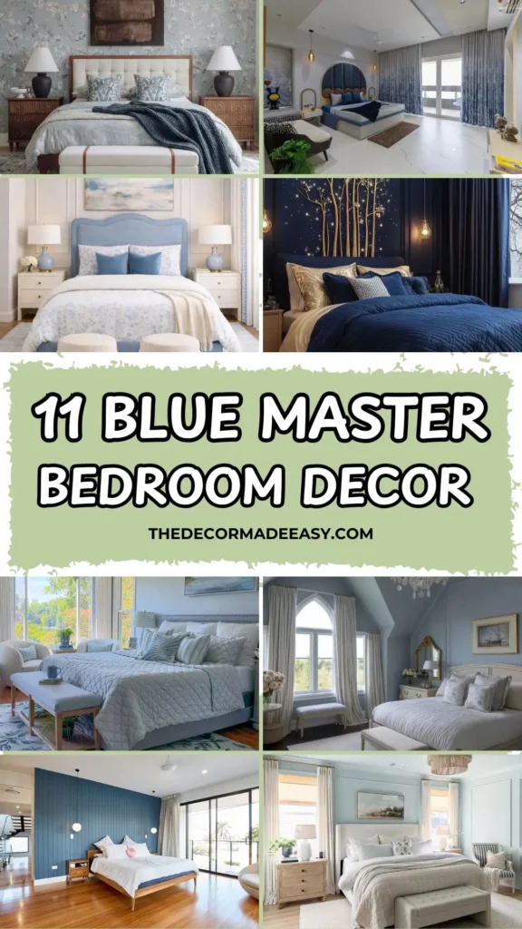
11 Blue Master Bedroom Decor Ideas That Actually Work (And Why They Work)
Let me be honest with you. I’ve spent an embarrassing amount of time scrolling through blue bedroom inspiration, and most of it looks stunning online but makes zero sense in a real room. Too cold, too dark, too “I accidentally painted my room the color of a gas station bathroom.”
But here’s the thing: blue is genuinely one of the best colors you can put in a bedroom. It calms you down, it makes the space feel bigger or cozier depending on how you use it, and it pairs well with almost everything. The trick is knowing which version of blue to use and how to build around it.
So I rounded up 11 real rooms that each take a different approach to blue bedroom decor. I’ll break down exactly why each one works so you can steal the best bits for your own space.
1. Arched Headboard with Gold Accents and Printed Curtains
Okay, this one stopped me mid-scroll the first time I saw it. In a good way.
The star of the room is a deep navy upholstered headboard built inside a large arch shape, trimmed with warm gold edging. It sits against a white wall, and the arch gives it this almost sculptural quality that a regular rectangular headboard just can’t match. A row of small round brown cushions lines the base of the arch, adding a bit of organic texture to what could’ve been a very cold, sleek setup.
Here’s what makes the whole thing click:
- White marble floors give the bold headboard room to breathe without competing
- Gradient curtains shift from grey at the top to deep navy at the bottom, echoing the headboard without being a matchy-matchy snooze fest
- Amber glass pendant lights hung at different heights bring warmth into an otherwise cool palette
- A black-and-white armchair in the corner keeps the room from feeling too perfectly coordinated
That last detail is important. A room this polished needs at least one deliberately unexpected piece to feel like a real human lives there and not a furniture showroom.
How to steal this look: Start with the arch headboard as your anchor. Add a mid-toned wood nightstand for warmth, and resist the urge to match every single element.
2. Soft Powder Blue Velvet Headboard with Toile Bedding
This room is what people actually mean when they say “effortlessly put together.” Everything earns its place, and nothing is screaming for your attention.
The focal point is a powder blue velvet headboard with a curved top edge. The shape reads as romantic without crossing into “grandma’s guest room” territory. The matte, slightly chalky velvet keeps the blue feeling calm rather than saturated.
What I love most about this room is how the layers work together:
- A blue and white toile floral duvet pairs beautifully with solid blue velvet accent pillows
- A pale blue and cream plaid rug grounds the space without adding visual chaos
- Cream nightstands with brushed gold hardware quietly elevate the whole setup
- Pale blue ceramic lamps with white shades continue the blue thread without overdoing it
- Two cream fringe-skirted ottomans at the foot of the bed add charm and soften the room’s formal symmetry
The chandelier overhead is a clustered glass bubble design in gold. Sculptural enough to feel special, restrained enough to not steal focus from the bed arrangement below.
Pro tip: If this palette calls to you, look for a duvet with small-scale botanical prints in blue and white. They’re widely available and work across a ton of different furniture styles.
3. Navy Blue Starry Night Wall with Golden Branch Art Installation
Some rooms are just bold. This is one of them, and it absolutely works.
The feature wall behind the bed is a deep, saturated navy, almost the shade of a clear night sky. What transforms it from “dramatic” to genuinely atmospheric is the art installation: tall gold-finished branches that rise from behind the bed and spread across the wall, each one hung with small warm-white fairy lights. The effect is like sleeping at the edge of a glowing forest at dusk.
This sounds like it could go very wrong. It goes very right.
The branches don’t overwhelm the space because the dark wall absorbs their drama. The fairy lights handle the room’s ambient glow, and it’s warm, flattering light rather than the harsh overhead lighting most bedrooms suffer through.
The rest of the room supports the vibe without competing:
- A deep navy quilted duvet with gold and silver-toned euro pillows reinforces the richness
- A warm wood nightstand provides essential contrast so the room doesn’t feel cold
- Edison-style hanging pendants flank the bed for task lighting that fits the moody aesthetic
No budget for a branch installation? Start with deep navy paint and drape fairy lights from ceiling hooks. A single large dried or faux branch secured to the wall gets you most of the way there. The paint color and warm light temperature do the heavy lifting.
Also Read: 12 Smart Ways to Decorate a Large Master Bedroom (No Awkward Empty Corners)
4. Blue Shiplap Accent Wall with Mid-Century Timber Bed Frame
This room is confident in the most relaxed way possible. No fuss, no over-styling. Just great instincts.
The entire back wall is vertical shiplap boards painted in a strong, slightly muted blue that sits somewhere between teal and royal blue. Against white ceilings and warm honey hardwood floors, it commands the room without shrinking it.
The bed frame is the perfect companion: solid timber in a mid-century silhouette, low to the ground with tapered legs and a walnut-like finish. Warm wood against cool blue is one of the most reliable pairings in bedroom design, and this room executes it without overthinking.
A few more things worth noting:
- White and cream bedding keeps the focus on the wall and frame
- Globe pendant lights on black ceiling fixtures add modern contrast to the timber warmth
- The shiplap wall actually does the job of a headboard here, so there isn’t one
- A grey linen curtain next to the floor-to-ceiling glass door adds softness to the clean lines
DIY note: Shiplap paneling kits and tongue-and-groove boards are both manageable weekend projects. For the paint, look for a blue with a slight grey or green undertone rather than a true primary blue. It reads more sophisticated and plays much better with warm wood tones.
5. Pale Ice Blue Walls with Natural Linen and Woven Textures
This room makes a quiet argument, and the argument is: calm is a design choice, not a compromise.
The walls are a pale, almost silvery ice blue so light it can read as grey depending on the light. It doesn’t impose itself. It just creates a backdrop that makes everything in front of it look more intentional.
The layering here is worth studying:
- An ivory linen panel headboard that’s clean and textural without trying too hard
- Bedding in grey, ivory, and pale ticking stripe cotton that all belongs together without perfectly matching
- Bamboo roman shades layered under sheer white curtains for flexible light control
- Raw blonde wood nightstands with turned legs bringing organic texture into the room
- A striped accent chair in the corner with a faint navy stripe that reminds you there’s a blue color story happening without announcing it
The drum pendant overhead has a natural fiber shade that keeps the ceiling connected to the rest of the room rather than floating in a different design universe.
IMO, this palette is perfect for anyone who finds bold color a bit exhausting but doesn’t want to live in a room that’s just “beige and fine.”
6. All-Blue Immersive Palette with French Rattan Bed Frame
Most decorating advice tells you not to paint your walls, furniture, and accessories the same color. This room ignores that advice entirely and wins.
The walls are a strong, saturated cobalt-adjacent blue with a matte finish. The bed frame is a French provincial rattan design painted the same blue. The nightstands? Also rattan, also blue. And somehow it doesn’t feel like too much.
Here’s why it works: tonal variation. The wall blue is slightly deeper and more intense than the slightly dustier blue on the furniture. That subtle difference creates depth instead of flatness. A few other things prevent the room from feeling cave-like:
- Grey polished concrete floors reflect light back into the space
- A large window floods the room with natural daylight
- A pale grey-blue Roman blind is just one shade away from the walls, keeping things cohesive
- A large abstract painting in pale aqua, cream, and grey above the bed adds movement without breaking the color story
- White and blue-grey bedding with a single paisley accent pillow provides necessary lightness
The lesson from this room is that monochromatic blue decor works when you vary texture and tone rather than fighting the palette with contrasting colors. Committing fully to blue creates a cohesion that feels intentional and genuinely restful.
Also Read: I Looked at Hundreds of Real Rooms: Here are 10 Master Bedroom Decor Ideas Worth Copying
7. Lakeside Blue Bedroom with Bobbin Bed and Botanical Rug
This room has that quality that’s hard to define but immediately felt. It looks lived in, in the best possible way.
The walls are a pale, slightly steely blue. The bed is painted in a deeper slate-blue with bobbin post details and a nailhead-trimmed headboard, which adds just enough formality to prevent the room from feeling too casual.
The real skill here is in the textile layering. Pay attention:
- Grey-blue botanical print quilt as the base
- White fringed throw on top of that
- Pillows in sage green velvet, blue and white stripe, blue floral, and white texture all coexisting beautifully
- A large botanical rug in cream, green, and navy that ties the blue walls to the sage green accents
The reason all those different patterns work together is that they share a consistent color family. They’re not identical, but they’re related. That’s the secret most people miss when mixing prints.
The wooden bench at the foot of the bed holds a book, a pair of glasses, and a small stack of titles. That detail is almost theatrical in its warmth, but it earns it because the rest of the room does the work first.
No lake view? No problem. A botanical rug in blue and green tells its own nature-connected story regardless of what’s outside your window.
8. Navy Blue Slat Wall Panel with Modular Velvet Headboard
This room answers a question a lot of people have: how do you make a bedroom look expensive without actually spending on architectural details you don’t have?
The answer here is a split feature wall. The left side features a navy blue vertical slat panel that reads as custom millwork from across the room. The right side is clean white wainscoting. Together, they create a headboard zone with depth and dimension that no paint color alone could achieve.
The headboard itself is a large, wide modular navy velvet panel sectioned into a grid of individual cushioned squares. It extends nearly to the ceiling, making the room feel taller and more dramatic than it probably is. Smart move.
The styling around it is deliberate:
- Multi-globe pendant lights on black ceiling fixtures that function as art as much as lighting
- Warm greige linen bedding with a casually draped charcoal throw, which contrasts perfectly with all that bold navy
- Grey curtains that soften the transition between the headboard zone and the window light
- A small potted fern on the nightstand that adds life and prevents the room from feeling too slick
If everything were navy, the room would feel relentless. The contrast between the bold navy architecture and the soft, neutral bedding is what keeps it from going overboard.
9. Pale Blue Lake View Bedroom with Florals and Layered Textiles
This room is basically summer in bedroom form. FYI, it’s not trying to be bold, and that’s exactly what makes it work.
The walls are a warm, slightly greenish pale blue that reads almost silvery-grey in photos but in person probably feels like a calm afternoon sky. Large windows frame a view of trees in full autumn color, creating a natural artwork that no wall hanging could compete with.
The bed is upholstered in pale grey-blue fabric with nailhead trim, which adds definition without formality. The pillow arrangement layers white quilted euros with pale blue and ivory striped and patterned accents. Nothing particularly bold. The whole room operates in a register of calm.
A few standout details worth borrowing:
- A botanical floral rug in blue, green, and cream running under the bed and across the floor
- A matching wooden bench at the foot of the bed with a coffee mug, books, and a trailing plant on it
- Two bouclé accent chairs and a small footstool near the windows forming an actual usable reading nook
That last point is worth emphasizing. A master bedroom with a seating area designed for actual use changes how you experience the whole room. Most people skip it entirely and just add a decorative bench that nobody ever sits on.
The big takeaway here: Blue master bedroom decor doesn’t always require a dramatic paint choice. The right pale blue flooded with natural light is its own kind of bold.
Also Read: 10 Pro Secrets for Shelf Decor Bedroom Styling That Feels Like a Hotel
10. Periwinkle Blue Walls with Vaulted Ceiling and Crystal Chandelier
Vaulted ceilings are an architectural gift, and this room actually uses one properly instead of just painting it white and hoping for the best.
The walls are periwinkle-grey blue, cooler and more sophisticated than a standard sky blue. The pitched ceiling is painted white, creating a bright, airy canopy above the deeper-toned walls. The combination makes the room feel grand without feeling cold.
The crystal chandelier is a traditional candelabra-style fixture with brass arms and cascading crystals. It sounds fussy written out like that, but it’s completely at home here because the blue walls have a quiet formality that matches the chandelier’s romance.
The rest of the room builds on that foundation:
- A Gothic-arched window framed by floor-length cream and ivory striped curtains adds architectural character
- A cream-painted French provincial bed with a carved headboard and footboard dressed in crisp white linen
- Blue-toned floral accent pillows that reference the wall color without matching it
- A gilded mirror above the nightstand placed horizontally to keep the wall color as the focal point
- Dark hardwood floors anchoring all that pale color above with depth and warmth
This room is a solid case study in how blue master bedroom decor can achieve genuine luxury without expensive furniture. The wall color, the ceiling height, and the light fixture do most of the heavy lifting.
11. Blue Floral Wallpaper Accent Wall with Chunky Knit Throw and Dark Art
Wallpaper is back, and this room is exactly why.
The feature wall behind the bed is soft blue floral wallpaper: climbing botanical branches with blooms in ivory, cream, and pale pink against a dusty blue-grey ground. It reads as antique and fresh at the same time, and it adds dimension and visual warmth that paint simply cannot replicate.
The rest of the room is built around it thoughtfully:
- An ivory linen tufted headboard with a walnut wood frame coordinates beautifully with the warm-toned walnut nightstands
- Black ceramic table lamps on both nightstands ground the room without competing with the wallpaper
- A large abstract painting in deep brown and rust tones hung over the headboard provides earthy contrast that tone-matches the exposed ceiling beams
- Those raw wooden ceiling beams are the room’s secret weapon, pulling the organic quality of the floral wallpaper upward and connecting all the elements vertically
- Pale blue and white linen bedding with blue ikat-print accent pillows provides lightness against all that pattern
- A deep indigo chunky-knit throw draped across the lower third of the bed adds color, texture, and coziness in a single move
- A faded blue, ivory, and brown Persian-inspired rug beneath the bed ties the wallpaper’s antique sensibility to the dark art above
If you want to try wallpaper but aren’t sure how to make it feel current: pair a soft vintage floral with natural textures like raw wood, linen, and rattan. Add one contrasting dark element, whether that’s a bold painting or dark lamp bases. Then let the pattern do the rest.
Finding Your Version of Blue Master Bedroom Decor
Here’s a quick cheat sheet based on everything we just covered:
| Style Direction | Best Blue Shade | Pair It With |
|---|---|---|
| Modern and Dramatic | Deep navy or cobalt | White walls, gold fixtures |
| Romantic and French | Powder blue or periwinkle | Cream furniture, crystal lighting |
| Relaxed and Coastal | Pale ice blue or sky blue | Natural linen, wood tones |
| Moody and Atmospheric | Near-black navy | Gold metallics, warm ambient lighting |
| Eclectic and Layered | Mid-tone blue-grey | Botanical prints, mixed textiles |
| Immersive and Monochromatic | Saturated cobalt | Tonal variations, concrete or stone floors |
The Real Key to Blue Bedroom Decor
Here’s what these 11 rooms actually have in common: they commit.
The rooms that hedge their bets, a blue pillow here, a blue rug there, tend to feel uncertain and unresolved. The rooms that choose their blue, own it fully, and build everything else around it feel pulled together and genuinely restful. That’s it. That’s the secret.
Blue also behaves differently depending on your room’s light situation. A pale blue in a north-facing room can feel completely different from the same paint color in a south-facing room flooded with sunshine. Always test your chosen shade in your actual space before committing.
Whether you’re drawn to the moody drama of midnight navy with golden fairy lights, the soft romance of powder blue velvet against white paneling, or the confident simplicity of shiplap in steel blue, you now have real rooms to reference. Not just Pinterest boards. Actual spaces where people sleep, read, and exist.
Pick the room from this list that you keep coming back to. Start with its palette. Then work outward from there. You’ve got this.