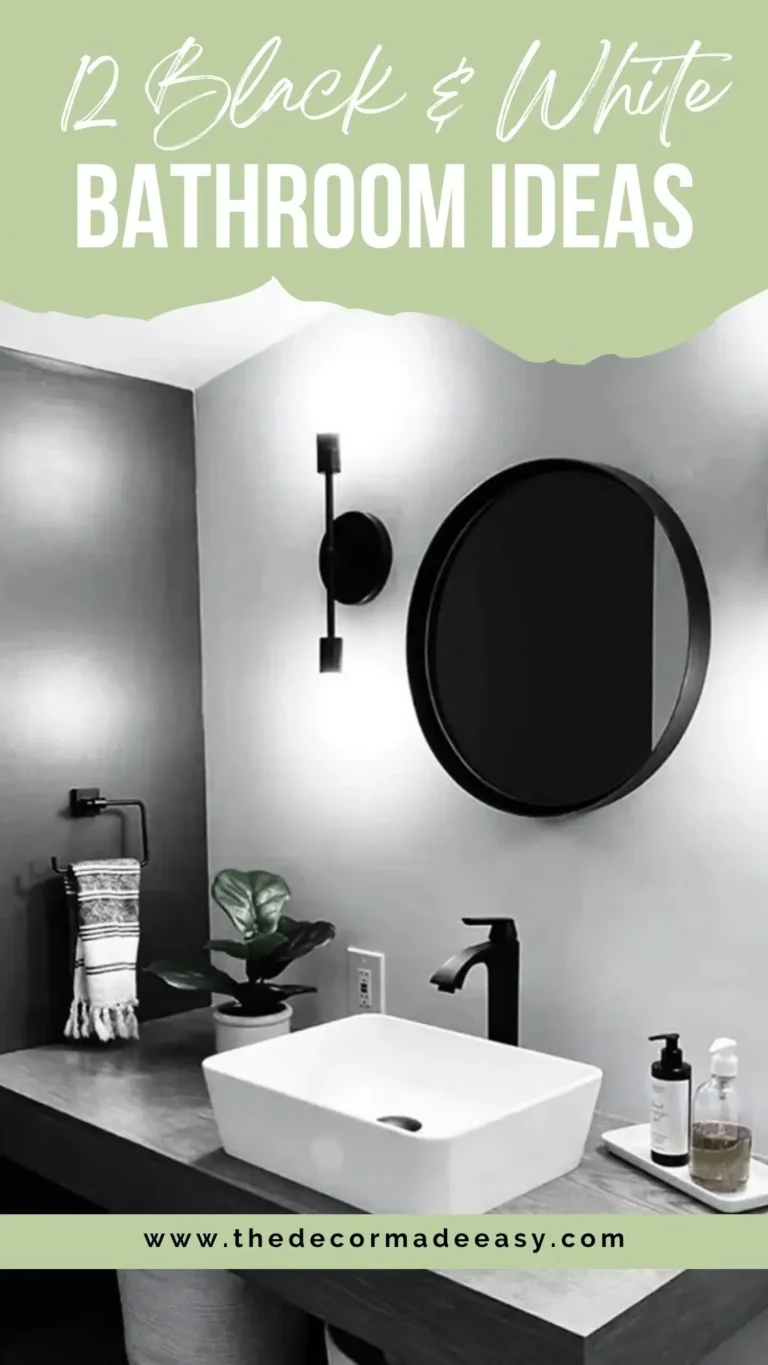
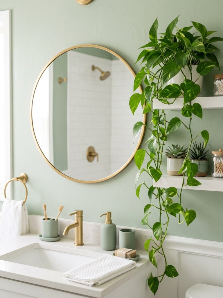
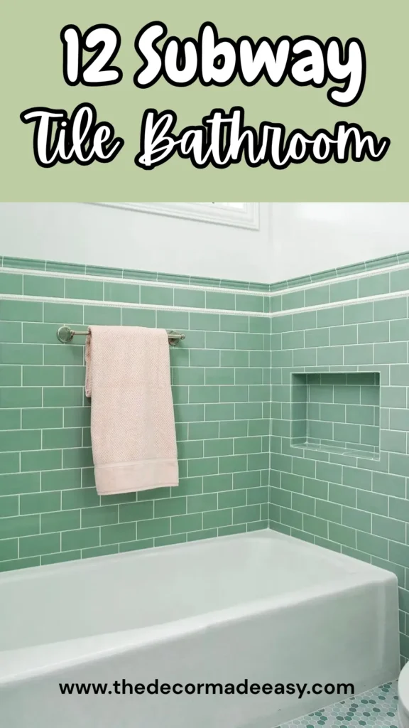
12 Subway Tile Bathroom Ideas That’ll Make You Rethink Everything
Subway tile has been holding it down in bathrooms since the early 1900s. That’s over a century of staying power. And somehow, designers keep finding fresh ways to make these rectangular beauties sing.
If you’ve been doom-scrolling Pinterest wondering why your bathroom still gives “apartment you’ll never get your deposit back from” energy, here’s the truth. It’s probably not the tile itself. It’s how you’re using it.
I’ve rounded up 12 real bathroom photos that show just how far subway tile has come from that plain white grid your grandma had. These aren’t staged showrooms with fake towels nobody’s allowed to touch. They’re actual homes where real humans made real decisions. And honestly? Most of these ideas are worth stealing.
You’ll find color choices that seem scary (but actually work), layout tricks that completely transform a space, and hardware combos that pull everything together. By the end, you’ll know exactly what’s possible and where your money should actually go.
Glossy White Subway Tiles with Wavy Texture and Matte Black Hardware
Some bathroom renovations play it safe and still manage to look incredible. This one nails that balance perfectly.
Floor to ceiling glossy white subway tiles cover every wall, including the shower area. But here’s the thing. These aren’t your standard flat tiles straight from the factory floor. They’ve got this subtle handmade ripple that catches light differently across the whole wall. From across the room? Clean and bright. Up close? Actual visual texture that makes you want to run your hand across it.
The matte black hardware is the secret sauce here. Shower fixtures, tub filler, handheld wand, glass panel brackets. All in the same flat black finish. When every metal element matches, your bathroom stops looking like a random collection of stuff you grabbed at different stores. It starts looking intentional.
That warm toned slatted wood vanity cabinet anchors the bottom half and keeps the white from feeling like a hospital room.
How to get this look: Hunt for tiles labeled “zellige adjacent” or “handmade style.” They cost more per square foot than basic subway tile, but way less than true custom work. Look for crackle glaze or undulating surface options. Then snag a complete matte black fixture package from one brand so everything actually matches.
Dusty Blue Subway Tile Inside an Arched Shower Niche with Brass Fixtures
Most people design their shower like a practical box. Get in, get clean, get out. Whoever designed this bathroom said “what if the shower was an experience?” and honestly, they were right.
The shower alcove is framed by a pointed ogee arch, tiled continuously in this dreamy dusty slate blue from floor to peak. Inside, standard horizontal brick pattern. Nothing fancy. Because when you’ve got an arch and that color working together, the layout doesn’t need to compete.
A rainfall showerhead and exposed pipe style brass fixtures add warmth against the cool blue. The shower curtain? A block printed botanical pattern in cream and brown that just screams cottage core in the best way.
Outside the shower, cream shiplap walls, light oak vanity with brass hardware, and a small hexagonal mosaic floor with cream and dark dot accents. The contrast between the bold tiled alcove and the quieter surrounding space is genuinely smart design. One clear focal point. No visual overwhelm.
Real talk on the arch: More achievable than you’d think. Curved tile cuts happen with a standard tile saw. The arch framing gets built into the wall before tiling even starts. Your bigger decision is grout color. This example uses white or cream grout against blue tile, keeping those joints visible and creating a clear grid. Matching grout to tile creates a more continuous color wash. Both valid. Just different vibes.
Vertical White Subway Tiles with Black Hexagon Floor and Gold Accents
Rotating your tile 90 degrees is one of the easiest moves in bathroom design. Also one of the most ignored. This bathroom proves exactly why you should try it.
White subway tiles are installed vertically in a stacked joint pattern throughout the walk in shower. Floor to ceiling coverage. That vertical orientation pulls your eye up and makes the ceiling feel taller than it actually is. Super helpful if you’re working with standard eight foot ceilings.
The back shower wall features two recessed niches lined with black and white penny tile mosaic. Storage plus deliberate pattern break in one move.
Black large format hexagon tiles on the floor connect visually to the penny tile inside the shower. Same color family, different scales. This kind of material echo makes a bathroom feel designed rather than assembled over time. Brushed gold fixtures on the vanity, including a curved faucet and globe pendants, add warmth to the black and white palette.
Installation notes: When ordering, specify stacked vertical installation. Same tile, different pattern. It’s purely a setting decision. Keep grout lines narrow and white for that clean reading. Budget heads up though. Large format hexagon floor tiles need more precise substrate prep than smaller mosaics. Plan for higher labor costs on the floor work.
Also Read: Bathroom Wall Tile Design: 10 Real-World Ideas That Actually Work
Forest Green Subway Tiles Installed Vertically with Matte Black Fixtures
Some subway tile ideas make you think “that’s clever.” This one made me think “wait, you can DO that?”
Deep forest green subway tiles cover the entire tub surround and two side walls in a tight vertical stacked pattern. And these aren’t flat painted ceramics. They’ve got that handcrafted vibe with minor color shifts from tile to tile. The white grout lines create a crisp grid that offsets all that rich green. Matte black fixtures press cleanly against the tile without fighting for attention.
The painting on the adjacent white wall caught me off guard. Most bathrooms get towel bars. Maybe a mirror if you’re fancy. Actual art next to this shower suggests someone who was confident about their design choices. And they should be. The muted peach and ochre tones in the painting provide the only warmth in an otherwise cool saturated space.
Why vertical stacked works here: It amplifies the height stretching effect while giving the space this graphic, almost grid like quality that feels contemporary rather than classic. If you’re considering green, this sits on the deep emerald end of the spectrum, not sage or mint. It looks bold in photos but functions almost as a neutral IRL. Green has been a bathroom color forever because it plays nice with white fixtures and natural light.
Classic White Subway Tile Shower with Black Frame Glass Enclosure and Penny Tile Floor
This is what “getting subway tile right” looks like on a realistic budget in a tight space.
Standard white 3×6 subway tiles laid in horizontal brick offset throughout the walk in shower. Flat and glossy. Not handmade. Not textured. Just well executed classic subway tile. Nothing special about the tile itself.
What elevates this bathroom? The decisions around the tile. A black framed glass shower enclosure. Matte black fixtures throughout. Charcoal penny tile mosaic floor inside the shower.
Light gray concrete look vanity cabinet with black hardware. Mirror with black frame. Every black element repeated. Shower frame. Faucet. Mirror. Cabinet hardware. Light fixture above. That consistency separates a polished bathroom from a random collection of matching ish things.
The budget lesson here: The tile is completely ordinary. The kind you find at any tile supply store. The money went into the fixture package and the frameless glass installation. Smart allocation. Black framed glass enclosures run from about $800 for prefab to $2,500 plus for custom. But the visual impact compared to a shower curtain is significant, especially in a small bathroom.
Full Saturation Turquoise Subway Tile in Herringbone and Straight Patterns
Full saturation color in a small shower could easily become a disaster. This one completely sticks the landing.
The narrow walk in shower is tiled floor to ceiling in a vivid turquoise glaze. Somewhere between teal and aquamarine with a high gloss finish that catches light intensely. The layout alternates between patterns. Two side walls use horizontal brick offset. The back wall and ceiling use herringbone. This pattern variation prevents the uniform color from becoming visually monotonous. Chrome fixtures blend quietly without competing with the tile.
The shower floor is a white and teal penny tile mosaic with a dark border strip at the base of the walls. A grounding element that separates the vertical tile field from the floor without introducing another color.
The psychology angle: A single dominant color at full saturation in an enclosed space creates an immersive effect. More like a designed experience than a utility room. Deliberate choice, not accident. If you’re considering something this bold, the small shower footprint actually helps. Less tile needed means expensive artisan tiles become more financially feasible. Look for zellige or handmade glaze tiles in saturated colors. The light variation in handmade glazes makes a monochromatic scheme way more interesting than machine made uniformity.
Also Read: 12 Bathroom Floor Tile Ideas That Prove the Floor is the Foundation, Not an Afterthought
Deep Emerald Green Square Tiles with Brass Hardware and a Live Plant
The distinction between subway tile and square tile matters less than you’d think when the color is this gorgeous.
Floor to ceiling deep emerald green square tiles, probably 4×4 format, cover every wall of this walk in shower. The glaze has variation within each tile, shifting between jewel toned green and near black at the edges. Gives the surface depth rather than flatness. Antiqued brass fixtures including a vintage style showerhead and cross handle controls warm the cool green considerably. A small built in niche handles storage.
The detail that makes this photo memorable? A live potted plant on a small wooden trivet in the corner. Either a dracaena or similar shower tolerant plant. It extends the nature forward quality of the green tile into something literal. Whether a plant is practical in your shower depends entirely on your commitment to watering schedules. But it confirms the designer’s intent. This shower should feel like being surrounded by something alive.
Grout tip: Specify dark gray grout with green tile. White grout would sharpen the grid lines and create a busier reading. Gray recedes and lets the tile color dominate.
Navy Blue Vertical Subway Tiles with Brass Fixtures and a Built In Bench
Vertical installation plus saturated color in a narrow shower. This combo solves a common spatial challenge better than almost anything else.
Slim elongated subway tiles in deep navy blue are installed vertically in a stacked pattern across all three shower walls. The tiles have a glazed surface with slight variation. Not uniform blue but a shifting, slightly marbled depth somewhere between ink and midnight. Unlacquered brass fixtures age naturally in the humidity, adding warm golden tones against the cool blue. A built in corner bench is tiled to match the walls, making it feel integrated rather than stuck on later.
Outside the shower? Deliberately quiet. White walls, wood fronted vanity with brass hardware, simple white countertop, neutral pendant light. The contrast between the dark saturated shower and the light airy vanity area creates genuine visual interest in a small footprint.
Why the bench matters: A tiled corner bench requires planning during framing, before any tile goes up. But it adds function and reinforces the idea that this shower is a space to spend time in, not just move through quickly. Frameless glass is the right enclosure choice here. A heavy chrome or black frame would interrupt the visual continuity of the tile field.
Electric Blue Vertical Subway Tiles with Brass Hardware and a Recessed Window
Bold shower color works best with natural light present. This bathroom gets that completely.
Bright cobalt blue subway tiles, clear and saturated without gray or green undertones, cover the shower walls in vertical stacked pattern. A small double hung window sits centered on the back wall, surrounded by tile on all sides, framing it as an architectural feature rather than just a practical necessity. Natural light through the window interacts with the glossy glaze to create shifting brightness across the tile surface throughout the day.
Below the window, a recessed niche with brass frame holds two bottles of Monday haircare products. The styling detail that makes a shower feel curated. Warm copper toned brass fixtures connect to the yellow orange end of the color spectrum, which sits directly opposite blue on the color wheel. That complementary relationship is why brass and cobalt look intentional together rather than random.
Grout specification: Narrow joints in white grout, as used here, keep the tile lines crisp and graphic. Wide joints would soften the look, fine for a different aesthetic but wrong for this design. Ask for 1/16 inch grout joints if your tile contractor offers it. 1/8 inch is standard and also acceptable.
Also Read: 10 Real-Life Green Tile Bathrooms That Prove This Color Works in Every Space
Sage Green Subway Tile with Half Wall Wainscoting and Retro Pink Accents
Subway tile as wainscoting rather than running to the ceiling is one of the most underused applications in residential bathrooms. This example does it with more personality than most.
Sage green 3×6 subway tiles cover the lower half of the walls in standard horizontal offset, capped with a small decorative border tile at the top edge. Above, white plaster walls rise to the ceiling. The upper portion accommodates a horizontal transom window flooding the space with diffused light without privacy issues. Green painted medicine cabinet doors match the tile color, unifying the palette vertically.
The pink accents. A blush bath towel. Penny tile floor in mint with white. Feel exactly right for a green bathroom. Pink and green went out of fashion for decades then came back harder than expected. Partly because it reflects mid century bathroom color sensibilities that aged surprisingly well. Satin nickel hardware stays neutral.
Height note: The tile runs about two thirds of the wall height rather than traditional chair rail height at 36 inches. Running it higher creates a more substantial visual base and makes the white upper wall feel intentional rather than unfinished. If your tile budget is limited, this approach covers less square footage than full height installation while delivering more character than a standard tub surround.
Blue Gray Speckled Subway Tile Half Wall with Wallpaper and Vintage Styling
This bathroom proves subway tile pairs well with almost everything. Including ornate wallpaper, a round mirror, and a framed landscape painting that looks like it’s from the 1890s.
Blue gray subway tiles with a speckled, slightly matte finish run as a wainscot band around the lower half of the walls. These tiles have flecks of white and darker gray throughout the body, giving them a terrazzo adjacent quality that works somewhere between industrial and antique. Above the tile, botanical pattern wallpaper in pale lavender and white takes over. Reeded gray vanity with brass hardware. Large round brass framed mirror. Three globe brass vanity light. The period mixing aesthetic comes together cohesively.
Classic marble basketweave mosaic floor in white with black dots anchors the vintage styling. A small Persian style rug adds texture and a warm color note.
Why this works despite all the elements: Restraint in the color palette. Tile, vanity, wallpaper, and rug all work within a muted, slightly dusty spectrum of blues, grays, and pinks. Nothing shouts. Every element was chosen deliberately but none compete for dominance. For a similar effect, start with your tile color and build every subsequent decision outward from it.
White Subway Tile in Herringbone Pattern as a Full Feature Wall
The last example doesn’t use color at all. And it’s arguably the most design forward bathroom in this entire collection.
White subway tiles laid in classic herringbone pattern across the entire back wall of a powder room. Floor to ceiling, including the panel that wraps under the floating concrete vanity. The herringbone creates diagonal movement across what would otherwise be a flat white surface. Two clear glass globe pendant lights hang on either side of a round mirror with thin black frame. Wall mounted black faucet at sink level.
Wide plank oak floor introduces the only warmth in an otherwise white and black palette. The contrast between organic wood grain and precise herringbone tile geometry creates genuine visual tension. The kind that makes a room feel considered rather than safe.
Technical heads up: Herringbone requires significantly more tile than straight lay installation. Typically 10 to 15 percent more due to edge cuts. Labor costs also increase because herringbone demands precise layout and consistent joint spacing. Budget accordingly. The visual return on investment is high, but this is one of the more technically demanding subway tile applications on this list.
Choosing the Right Subway Tile Approach for Your Bathroom
Before committing to a direction, map your priorities against these variables:
Classic White Horizontal
- Best for: Any bathroom, especially small spaces
- Grout recommendation: Gray or white
- Complexity: Low
Vertical Stacked Layout
- Best for: Low ceiling bathrooms
- Grout recommendation: Match tile or white
- Complexity: Low
Bold Color (Green, Blue, Teal)
- Best for: Accent showers, statement bathrooms
- Grout recommendation: White or light gray
- Complexity: Medium
Herringbone Pattern
- Best for: Powder rooms, feature walls
- Grout recommendation: Dark gray or charcoal
- Complexity: High
Wainscoting Half Wall
- Best for: Full bathrooms, vintage styles
- Grout recommendation: Match tile color
- Complexity: Medium
Arched Niche Treatment
- Best for: Primary bathrooms with remodel budget
- Grout recommendation: White or cream
- Complexity: High
Hardware finish matters as much as tile choice. Matte black grounds bright or white tile with graphic contrast. Unlacquered brass warms cool toned blues and greens. Satin nickel disappears into the background and lets tile carry the design.
Grout color is the variable most people underestimate. White grout shows the tile grid clearly and brightens the overall surface. Matching grout creates a more continuous, almost wallpaper like effect. Dark grout emphasizes the geometric pattern and reads more graphic. None of these is wrong. But each produces a meaningfully different result from identical tile.
What These Bathrooms Actually Prove
Subway tile bathroom ideas have evolved way beyond the white brick rectangle. Every example above shows the format is essentially a canvas. What you put on it, around it, and in front of it determines whether your bathroom feels like a renovation or a genuine design decision.
The common thread across all twelve? Specificity. Every bathroom that works here made deliberate choices. A particular grout color. A fixture finish repeated consistently. A layout direction chosen for spatial effect. None of them look like someone who walked into a tile showroom and pointed at the first thing they saw.
The simplest upgrade available to almost any subway tile bathroom: Choose a grout color that was NOT the default recommendation. And specify every metal finish in the room before purchasing anything. Those two decisions, made intentionally, do more for a finished bathroom than almost anything else in your budget.
Now go make your bathroom look like it was actually designed. FYI, you’ve got this.