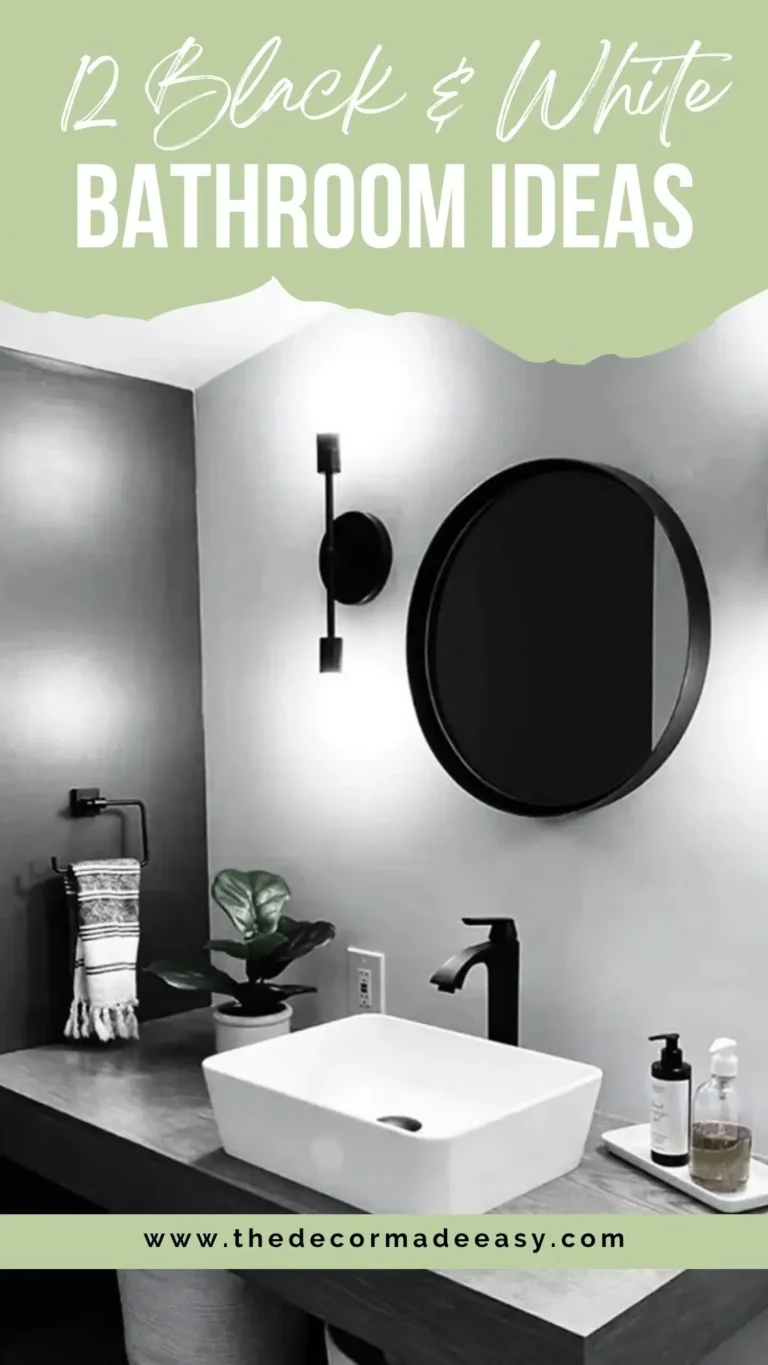
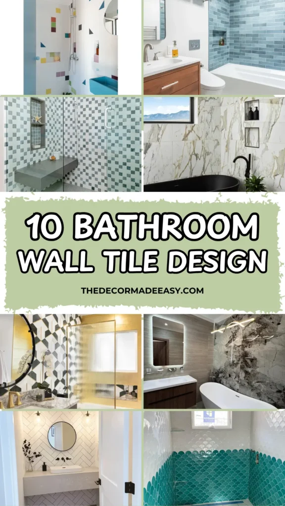
Bathroom Wall Tile Design: 10 Real-World Ideas That Actually Work
Here’s a wild stat for you: your bathroom walls make up about 70% of what you see when you walk into the space. Yet most renovation guides obsess over faucets and toilets like they’re the main characters. Spoiler alert: they’re not.
The tile you slap on those walls? That’s what sets the entire vibe. The pattern, the finish, how it catches morning light while you’re half asleep and brushing your teeth. That’s the real star of the show.
I’ve rounded up ten actual bathrooms (not Pinterest fantasies that only exist in someone’s imagination) that nail different approaches to wall tile design. Some are bold enough to make your mother-in-law clutch her pearls. Others are so restrained they whisper elegance. And honestly? At least one made me completely rethink what I thought I liked.
Whether you’re gutting the whole room or just want one killer feature wall to save a boring space, these examples cover everything from dramatic stone slabs to playful geometric patterns to fish-scale tiles that have absolutely no business looking this gorgeous.
Dramatic Natural Stone Accent Wall Behind a Freestanding Tub
Okay, there are accent walls. And then there’s THIS.
The feature wall in this bathroom uses large-format natural stone slabs with the kind of movement that makes you stop and stare. We’re talking swirling charcoal clouds, deep brown mineral deposits spreading across an off-white base. It basically looks like someone hung a 30-square-foot abstract painting behind the tub.
The tiles appear to be roughly 24×48 inches, and that’s intentional. Large-format tiles minimize grout lines and let the natural veining read as continuous. You get the look of genuine stone cladding rather than obvious individual tiles pieced together.
The surrounding walls use a complementary taupe-toned tile in a subtle horizontal linear pattern, laid in a staggered brick format. This contrast works because the quieter walls basically say, “Go ahead, main character. We’ll just be over here being supportive.”
What Ties It All Together
The material harmony here is chef’s kiss territory. The walnut floating vanity cabinet picks up those warm brown tones in the stone. A backlit LED mirror provides a clean, modern anchor on the quieter wall without trying to compete with the drama happening behind the tub. A sculptural wave-form pendant light in brushed brass hangs directly over the freestanding soaking tub, turning the bathing area into a genuine focal point.
How to Recreate This Look
The key discipline is restraint everywhere except the feature wall. Keep your vanity, flooring, and secondary walls calm and low-contrast. Let the stone do the talking.
One heads-up though: natural stone slabs with this kind of dramatic veining are expensive. Like, really expensive. If your budget is tighter, look for large-format porcelain tiles that replicate dramatic stone patterns. The technology has gotten genuinely good, and you can achieve about 80% of this effect at a fraction of the cost.
Teal-to-White Ombré Fish Scale Tiles for a Coastal Shower
I’ll be honest. I was skeptical about fish scale tiles for the longest time. They felt like a trend that would age about as well as avocado-colored appliances from the 70s.
This shower completely changed my mind.
The fish scale tiles here (also called fan tiles or scallop tiles) transition from a deep teal at the bottom to a soft pearl white at the top. It creates a natural ombré gradient that mimics the way ocean water lightens toward the surface. It’s genuinely clever visual storytelling for a space that’s, you know, entirely about water.
The tiles are glazed ceramic, giving them a reflective sheen that shifts with the lighting throughout the day. Morning light hits different than evening light, and that’s part of the magic.
Why This Works Beyond the Obvious Coastal Reference
The quality of the installation makes or breaks this look. The alignment is precise, with each scallop overlapping the row below by exactly half. It’s the same interlocking logic as actual fish scales in nature. The white grout lines are consistent and clean, defining each tile individually.
At the transition zone between teal and white, there’s a gradient band of aqua-tinted tiles that soften the color shift. No harsh lines here. Just smooth, oceanic vibes.
Practical Considerations
FYI, fish scale tiles are more complicated to install than rectangular subway tiles. Those curved edges require careful cutting at borders and corners. Plan to spend more on labor if you’re hiring out, or allocate significantly more time if this is a DIY project.
The ceramic material is easy to clean and highly durable in wet environments. Pair these with white or light grey grout. Dark grout would create a fussy, dated look that completely undermines the clean coastal feeling.
Scattered Multicolor Geometric Accents on White Subway Tile
Most people treat tile as a background decision. This bathroom treats tile as the entire design statement, and it pulls it off by understanding something most designers miss.
White can hold a lot of personality if you give it the right conversation partners.
The base layer here is standard white subway tile in a classic stacked vertical format. But scattered throughout the field are individual accent tiles in different colors and shapes. Yellow squares. Red squares. Deep teal triangles. Lavender rectangles. Dark charcoal squares. Sage green tiles. They appear like confetti frozen mid-air.
The shapes vary: some are squares, some are right-angle triangles cut from the same tile module. The randomness looks random but is clearly considered. No two identical tiles appear adjacent to each other, and the density stays light enough that the white base remains dominant.
The Design Elements That Make It Pop
A turquoise vessel sink and matching wall trim panels anchor the playful palette, giving the multicolor accents a clear color family to reference. A round mirror and chrome rain shower head add restrained fixtures that don’t compete with the tile’s exuberance.
Why This Is Perfect for Budget Renovations
This approach is genuinely achievable on a budget because you’re buying primarily standard white subway tile, which is one of the least expensive tile products available. You only need a relatively small quantity of colored accent tiles.
The accent pieces can even be hand-painted ceramic tiles cut to size. The design depends more on the placement strategy than the cost of materials.
Pro tip: plan the accent tile positions on graph paper before you begin installation, and stick to the plan with discipline. Improvising mid-installation tends to create unintentional clustering, and that’s when things start looking messy instead of intentional.
Also Read: 12 Bathroom Floor Tile Ideas That Prove the Floor is the Foundation, Not an Afterthought
Steel Blue Handmade-Style Subway Tile with a Built-In Niche
The appeal here is textural as much as it is chromatic.
These subway tiles are not the flat, perfectly uniform variety you find in most builder-grade bathrooms. Each tile has subtle surface variation. Slightly rippled edges. Gentle undulations in the glaze. Natural color shifts between individual pieces that range from steel blue to slate teal to dusty denim.
The effect reads as handcrafted, even if the tiles are produced at scale.
The Layout and Why It Works
The tiles are installed in a classic running bond pattern, with each row offset by half a tile. It’s the most traditional subway tile layout, and it’s appropriate here because the tile itself is the focal point, not the pattern. A more complex layout would compete with the natural variation in the glaze.
What I appreciate most about this bathroom is how much the tile color does for the surrounding materials. The walnut wood vanity cabinet, which would read as straightforward and warm in a white-tile bathroom, becomes almost rich and saturated against the cool blue. The white countertop and white hex floor tiles keep the room from feeling heavy. Brushed nickel fixtures bridge the warm walnut and cool tile without disrupting either.
The Niche Detail You Need to Know
The recessed niche in the shower surround is tiled to match. This sounds simple but requires planning before installation. If you’re remodeling and know you want a niche, frame it during rough construction. Retrofitting a niche into an already-tiled wall is expensive and difficult.
One practical upside of this tile type: the natural surface variation hides minor grout inconsistencies and water spots better than perfectly flat, glossy tiles. Less maintenance stress for the win.
Grey-and-White Checkerboard Mosaic Tiles with Penny Round Floor Accents
Checkerboard patterns have been having a long moment in residential design, and this shower shows exactly why.
The walls use small square mosaic tiles (roughly 2×2 inches) in alternating soft grey and matte white. This creates a tight checkerboard pattern that covers all four walls of the walk-in shower from floor to ceiling. The result is graphic and energetic without feeling overwhelming, partly because the muted, stone-toned grey prevents the pattern from becoming harsh.
The floor transitions to grey penny round mosaic tiles, which maintains the tone-on-tone grey palette while introducing a textural shift at the level where your eyes naturally drop. A floating concrete-look bench in charcoal provides a break in the pattern without disrupting the palette. The recessed niche is lined with smaller square tile in a solid grey, offering a subtle pause within the checkerboard field.
Why This Could Have Gone Wrong (But Didn’t)
This is one of those designs that seems like it could easily fail. A checkerboard with higher contrast, like black and white, would be exhausting in a fully enclosed shower space. You’d feel like you’re showering inside a chess board.
The success here comes down to choosing tones that are close enough in value that the pattern reads as texture from a distance. It only reveals itself as a true checkerboard when you’re standing close to the wall.
Grout Color Matters (A Lot)
If you pursue this look, pay close attention to grout color. White grout would emphasize every joint and make the pattern frenetic. A mid-grey grout that splits the difference between the two tile colors allows the squares to hold their distinction without the grid becoming the loudest visual element.
IMO, this is where a lot of people mess up checkerboard installations. Don’t be that person.
White Herringbone Tile with Matte Black Fixtures for a Minimalist Statement
A single tile color. A single fixture finish. One bold layout decision.
That’s the entire design brief for this bathroom, and the result is more satisfying than rooms with three times the material variety. Sometimes less really is more.
The white rectangular tiles are laid in a herringbone pattern, with each tile set at 45 degrees to the previous. This creates the characteristic V-shaped zigzag that runs across the full back wall and even continues across the lower portion of the vanity front panel. The grout lines are thin and grey, defining the pattern without loudness.
The herringbone format gives a flat white tile far more visual interest than a standard horizontal or vertical layout would. The pattern continues down to the baseboard, which removes that awkward visual stop you often see when tile ends before the floor.
The Matte Black Magic
All fixtures are matte black: the wall-mount faucet, the mirror frame, the door hardware, the drawer pulls. Matte black against white tile is a combination that photographs beautifully and holds up well in real life too.
Fair warning though: it does show water spots more readily than brushed nickel. Worth factoring in if you dislike frequent wiping.
Smart Lighting Choices
The two globe pendant lights hung flanking the round mirror are a smart move. Standard vanity lighting mounted above a mirror creates unflattering downward shadows. Pendants positioned at eye level on either side of the mirror provide even, diffused light that works far better for actual grooming tasks.
Budget Considerations
Want this look without the full renovation price? Here’s the reality check: the herringbone pattern itself costs more in labor than a straight-lay tile installation because every tile must be cut at angles for the borders. Budget roughly 15 to 20% more for installation labor compared to a standard brick layout.
Also Read: 10 Real-Life Green Tile Bathrooms That Prove This Color Works in Every Space
Floor-to-Ceiling Calacatta Gold Porcelain Tile Paired with a Matte Black Tub
This one stopped me in my tracks.
A matte black freestanding tub positioned in front of floor-to-ceiling marble-look porcelain tile. It works almost violently well.
The tiles are large-format, likely 24×48 inches or larger, and replicate the appearance of Calacatta Gold marble. We’re talking a bright white base with bold grey veining and dramatic sweeps of warm gold running diagonally across the surface. The vein movement is intense and theatrical.
Installed from floor to ceiling without any interrupting border tiles or contrasting wainscoting, the pattern creates an immersive wall effect. It feels closer to a natural stone grotto than a residential bathroom.
Why the Black Tub Is Essential
The matte black freestanding soaking tub is the critical counterbalance. In a room this ornate, a white tub would disappear against the bright tile. The black form provides a strong graphic anchor that grounds the room without competing with the marble pattern.
A matching matte black floor-mount faucet and two recessed black-trimmed wall niches carry the dark accent throughout the composition with discipline. Everything feels intentional.
A small green plant on a concrete side table, with neatly folded black towels, is the only soft element in an otherwise hard-surfaced room. It does more work than it looks like it should.
The Case for Porcelain Over Real Marble
The practical case for porcelain over genuine marble here is compelling:
- Cost: Large-format marble slabs of this quality would be extraordinarily expensive
- Maintenance: Porcelain resists staining without any sealing
- Durability: Handles humidity without the risk of mineral deposits damaging the surface over time
You get the visual effect at a fraction of the cost and none of the headaches.
Deep Navy 3D-Relief Geometric Tiles for a High-Drama Shower
Not every bathroom needs to be calm. Sometimes you want drama, and you want it dialed up to eleven.
This shower was designed to be the main event, and it achieves that with total commitment to a single bold choice. Deep navy blue tiles with a dimensional geometric relief pattern create a faceted, almost origami-like surface across every wall.
Each tile has a raised diamond or pyramid form pressed into its face. This creates a surface that catches light from different angles and produces shifting shadows throughout the day. The glaze is a rich ink blue, somewhere between navy and slate, with subtle tonal variation that keeps the surface from feeling flat.
The effect is closest to a geometric crystal formation or a deeply textured fabric made architectural. It’s bold. It’s confident. And it absolutely owns the space.
Smart Contrast Choices
The floor uses a contrasting navy penny round mosaic, which maintains the dark palette while introducing a purely circular form against all the angular geometry above. It’s a smart contrast that keeps the eye from fatiguing on a single shape vocabulary.
Because the tile itself is so dominant, everything else steps back. The frameless glass enclosure allows a full view of the tile without interruption. A small recessed niche in a complementary grey adds function without distraction. The adjacent room’s white walls and a framed abstract artwork with blue tones create a visual transition that keeps the drama contained.
Cleaning and Grout Considerations
Tiles with relief surfaces like these require more attention during cleaning. The recessed areas around the raised geometric forms can collect soap residue. Plan accordingly.
A grout that closely matches the tile color (dark grey or charcoal) is advisable. Stark white grout against these tiles would fight the surface pattern and look messy within weeks. Don’t do it.
Metallic Chevron Mosaic Tile with Gold Hardware for a Glamorous Vanity Wall
There are bathroom tile designs that are beautiful from across the room. This is one that rewards close examination.
The wall tile here is a large-format chevron mosaic, with individual pieces that appear to be a mix of white ceramic and metallic silver or chrome elements arranged in a continuous arrowhead pattern. Each chevron unit catches light differently depending on the viewing angle, so the wall has a subtle shimmer that shifts as you move through the space.
The metallic elements are not garish or mirrorlike. They’re more of a brushed platinum, giving the surface a sophisticated, low-key luminosity rather than a disco ball situation. Thank goodness.
The Warm vs. Cool Balance
The gold hardware throughout creates a warm counterpoint to the cool metallic tile. Gold-framed rectangular mirrors, gold wall sconce fixtures, gold faucets, gold drawer pulls on the natural oak vanity. This is a room where warm gold and cool silver are in deliberate conversation.
The balance tips just enough toward warm that the overall feeling is welcoming rather than cold.
Two matching gold-framed mirrors sit above a double-sink vanity with a crisp white countertop that runs the full length of the cabinetry. Fresh orange flowers in small vases add the only organic color, preventing the room from feeling sterile. A crystal-and-white chandelier visible in the mirror’s reflection adds a layer of ceiling interest.
Budget-Friendly Alternatives
This design is genuinely high-end in its execution, but the fundamental strategy translates to more modest budgets. You don’t need custom chevron mosaics to achieve the warm-metallic balance.
A simpler geometric tile with a pearlescent glaze and consistent gold hardware selections gets you most of the way there. Focus on the concept, not the exact materials.
Also Read: Stop Picking Random Tiles: 15 Real-Life Bathroom Designs That Actually Work
Graphic Black, White, and Gold Geometric Tile Paired with a Gold Shower Enclosure
Sometimes a bathroom tells you it took a lot of decisions and everything landed exactly right. This is one of those rooms.
The feature wall uses a bold geometric tile pattern that mixes deep forest green, bright white, and gold accent lines in a complex tessellating arrangement. Diamonds, triangles, and hexagonal forms create an optical illusion of depth. The pattern has a strong Art Deco reference while remaining contemporary in its color palette.
It’s the kind of tile that would be easy to botch by pairing it with too much visual competition. But this bathroom surrounds it with precisely chosen foils.
Supporting Elements Done Right
The adjacent shower wall is clad entirely in large-format gold metallic tile. A solid warm gold that provides contrast in texture and color against the graphic pattern without competing with it. The ribbed glass shower door in a brushed gold frame adds another layer of textural interest while allowing light to move through the enclosure.
A dark espresso-stained vanity cabinet with marble-look granite countertop, gold faucets, and gold cabinet hardware completes the warm palette.
What pulls the room together is the round black-framed mirror with a gold interior ring. It’s a transitional piece that references both the dark vanity cabinet and the gold fixtures simultaneously. A cluster of white orchids provides the only soft, organic element in a room otherwise composed of hard surfaces and strong geometry.
The Lesson Here
Once you decide that gold metallic and graphic tile are the anchors, every subsequent decision becomes clearer. The color palette, the fixture finish, the mirror style, all flow from that initial commitment.
Indecision in rooms like this produces a muddled result. Commitment produces rooms worth photographing. Pick your direction and go all in.
Choosing the Right Bathroom Wall Tile for Your Space
Before you finalize any of these approaches, a few practical considerations can save significant expense and frustration.
| Design Style | Best Room Size | Difficulty Level | Relative Material Cost |
|---|---|---|---|
| Large-format natural stone accent | Medium to Large | Advanced | High |
| Fish scale ombré | Any size | Advanced | Medium |
| Scattered geometric accents | Small to Medium | Medium | Low |
| Handmade-style subway tile | Any size | Easy | Low to Medium |
| Checkerboard mosaic | Small to Medium | Medium | Medium |
| Herringbone white tile | Any size | Medium | Low to Medium |
| Floor-to-ceiling marble-look porcelain | Medium to Large | Advanced | Medium to High |
| 3D relief geometric tile | Small to Medium | Medium | High |
| Metallic chevron mosaic | Medium to Large | Advanced | High |
| Graphic gold and geometric | Medium to Large | Advanced | High |
Quick Guidelines to Keep in Mind
- Grout color has an outsized impact on the final result. Test it on a sample board before committing to the full installation
- Large-format tiles visually enlarge a small space. Small mosaic tiles can make a large wall feel busy
- Relief or textured tiles require dark or matching-tone grout to prevent grime buildup in recessed areas
- Feature walls work best when surrounding walls and flooring stay neutral and quiet
What stands out across every example here is that the most effective bathroom wall tile design ideas are driven by a single clear decision. One material. One color story. One pattern. Executed with consistency.
The rooms that feel scattered almost always tried to do too much at once.
Final Thoughts
Here’s the thing about bathroom tile: it’s not just a surface. It’s the mood-setter, the personality definer, the thing that makes you either love your bathroom or tolerate it.
Pick one idea that genuinely connects with how you want the space to feel. Commit to it. Let everything else serve that direction.
The results, as these examples show, tend to be rooms you won’t want to leave. And honestly? That’s a pretty great outcome for a space where you spend the first and last moments of every day.
So which style grabbed you? The dramatic natural stone? The playful geometric confetti? The moody navy relief tiles? Whatever it is, trust your gut and go for it. Your bathroom is about to become the most photographed room in your house.