Sometimes a room feels almost finished, but one wall still looks empty. That is where the right artwork can change everything. A few well-chosen pink posters can bring color, personality, and a clear visual theme without requiring a complete room makeover. Pink also gives you plenty of room to experiment. Soft blush can create a calm feeling, while hot pink can add energy. Adobe notes that pink can communicate playfulness, warmth, love, and youth, while dusty pink tends to feel more calm and neutral. Whether your style leans toward K-pop, vintage art, celebrity-inspired decor, cute illustrations, or a clean room aesthetic, the key is choosing prints that work together instead of making the wall feel random.

1. Soft Blush Gallery Wall

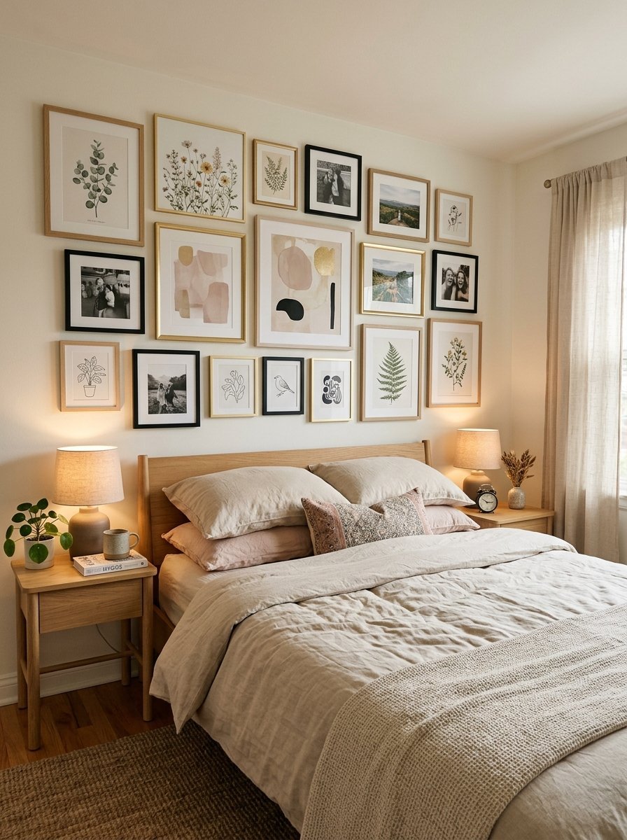
Start with a gentle palette of blush, cream, white, and very light pink. Mix floral artwork, abstract shapes, simple typography, and small photographs. This style works beautifully when you want a calm aesthetic without making the entire room pink. Use different frame sizes but keep the colors connected. Adobe’s color guidance notes that lighter pinks can create a softer visual effect, while white gives other elements breathing room.
2. Cute Pink Posters for a Cozy Bedroom

For a younger or playful room, combine hearts, bows, flowers, stars, ribbons, cherries, and tiny illustrations. Keep the background mostly white or pale pink so the wall does not become too busy. A few cute prints can create personality while still keeping the room polished. Add a small pink lamp, fluffy pillow, or matching blanket to connect the wall art with the rest of the room.
3. Black and Pink Poster Wall

Pink does not have to look soft. Pair it with black for a stronger, more graphic style. Try black frames with pink artwork, black typography, dark photography, and a few hot-pink accents. The contrast makes individual prints stand out. Adobe explains that black often communicates strength, mystery, elegance, and sophistication, making it a useful counterpoint to playful pink.
4. Hot Pink Statement Art

If your room already has neutral walls, one large hot-pink artwork can become the focal point. You do not need ten small prints. Choose an oversized abstract design, bold graphic artwork, or colorful floral print. Adobe describes hot pink as a vivid color that can create strong visual impact, so using it as an accent can make the wall feel energetic without covering the whole room.
5. Olivia Rodrigo-Inspired Music Wall

Create a music-inspired wall around the mood of Olivia Rodrigo without simply filling the room with unrelated images. Combine purple-pink artwork, lyric-inspired typography, butterflies, hearts, stars, and vintage-style photography. Keep one main color family so the collection feels intentional. You can also mix a few small prints with one larger statement piece.
6. K-Pop Pink Wall

A K-pop-inspired gallery wall can combine music photography, abstract graphics, fashion images, stars, and colorful typography. You can build the collection around groups such as BTS, ENHYPEN, or KATSEYE, depending on your taste. Use matching pink, black, silver, and white tones to make different images feel like one collection. For a cleaner result, leave small gaps between prints rather than placing every piece edge to edge.
7. Pink and Green Botanical Prints

Pink and green create a fresh contrast. Adobe specifically highlights pink-and-green combinations as a lively pairing that can work well for spring-inspired designs. Try botanical drawings with pink flowers, green leaves, soft cream backgrounds, and natural wooden frames. Add a real plant below the gallery wall to make the design feel connected to the room.
8. Blue and Pink Poster Combination

For a cooler look, bring blue and pink together. Baby blue, dusty pink, cream, and white can create a gentle balance. Try cloud prints, abstract artwork, small stars, ocean-inspired illustrations, and soft geometric designs. This combination works especially well when the bedroom already contains blue bedding or curtains.
9. Ariana Grande-Inspired Pink Vanity Wall

Create a glamorous corner inspired by the soft, feminine visual mood associated with Ariana Grande. Use pink photography, bows, perfume-inspired illustrations, soft florals, and elegant black-and-white portraits without using copyrighted promotional images. Place the posters near a vanity with a round mirror. A few metallic details can add polish without making the space feel overly decorative.
10. Taylor Swift-Inspired Color Story

Instead of using official album artwork, build a Taylor Swift-inspired wall around colors and themes. Think vintage photography, handwritten-style design elements, stars, florals, old books, soft pink, cream, and muted red. This creates a music-fan atmosphere while allowing you to make the collection your own. A few antique-looking frames can strengthen the vintage feeling.
11. Vintage Pink Prints

If modern graphics feel too sharp, try vintage artwork. Botanical illustrations, old advertisements, romantic florals, postcards, and faded photography can create a collected look. Use different frame styles but keep the overall color palette controlled. Architectural Digest has featured interiors using blush, coral, magenta, and raspberry across bedrooms and other spaces, showing how different pink shades can create very different moods.
12. Pink and White Minimalist Wall

Sometimes the best wall has only three or four pieces. Choose white backgrounds with soft pink shapes, clean lines, small floral drawings, or simple typography. This works especially well if your room already contains patterned bedding or decorative furniture. The wall stays quiet while still adding color. Adobe notes that white can provide visual breathing room and help other design elements receive more attention.
13. Pretty Pink Flower Wall

For a romantic bedroom, build the collection around flowers. Mix roses, peonies, wildflowers, pressed-flower illustrations, and soft botanical sketches. A pretty in pink palette can include blush, dusty rose, cream, muted green, and a small amount of gold. The result feels warm without becoming overly sweet.
14. Lana Del Rey-Inspired Vintage Wall

For a darker romantic mood, create a Lana Del Rey-inspired wall using original vintage-style photography, roses, old cars, film textures, black-and-white images, and dusty pink tones. Add one or two darker pieces to keep the collection from looking flat. Black frames can create contrast against pale pink walls.
15. Sabrina Carpenter-Inspired Pink Room

For a playful pop-inspired room, combine soft pink with bows, stars, mirrors, flowers, and glossy accents inspired by the visual mood associated with Sabrina Carpenter. Keep the posters varied in size. A large central print can anchor the wall, while smaller pieces create movement around it. This prevents the arrangement from looking like a flat grid.
16. Create a Mixed Pink Poster Gallery

If you cannot choose one theme, combine several. Mix abstract prints, flowers, music-inspired artwork, vintage photography, small quotes, and cute illustrations. The trick is to give the collection one visual connection. It might be the same frame color, the same background tone, or a repeated shade of pink. Better Homes & Gardens recently highlighted the value of intentional arrangement and consistent spacing when creating gallery walls, noting that mixing artwork can work when the overall composition remains structured. For a simple layout, place the largest print in the center and build outward with smaller pieces. Leave roughly 3–6 inches between pieces when your wall size allows it.
Final Thoughts

The best pink posters are not always the brightest ones. Sometimes a tiny blush floral print can make a room feel more finished than a huge neon artwork. Other times, one bold hot-pink piece is exactly what a plain wall needs. Start with the mood you want. Then choose the colors, artwork, frames, and layout around that mood. Whether you love K-pop, vintage photography, celebrity-inspired aesthetics, cute illustrations, or minimalist design, pink gives you plenty of ways to build a wall that feels personal. The most important thing is cohesion. Repeat a few colors, keep your spacing intentional, and leave enough empty space for each piece to stand out. Your wall should tell a visual story rather than simply hold a collection of pictures.


1 Pingback