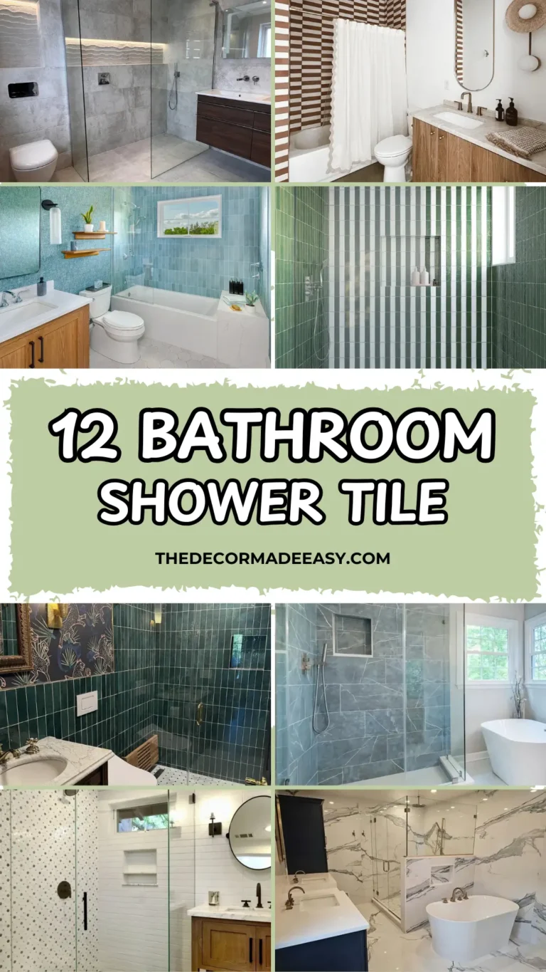
Steal the Look: 10 Blue Tile Designs That Put Basic Bathrooms to Shame
Let’s be honest. Most bathroom tile decisions are made out of fear. People pick beige because it’s “safe.” They go with grey because it “matches everything.” And then they spend the next decade wondering why their bathroom feels like a dentist’s waiting room.
Blue tile? That’s a choice made with actual conviction. And when you get it right, it transforms a bathroom from functional box to genuine sanctuary.
I’ve rounded up ten real bathrooms that prove blue tile isn’t just a trend. It’s a timeless decision that rewards commitment. Some of these will make you want to grab your credit card immediately. Others might make you question everything you thought you knew about color. That’s exactly the point.
Vertical Zellige-Style Blue Tiles with Brushed Brass Fixtures
There’s something almost magical about handmade tiles. They catch light differently every hour of the day. This shower absolutely nails that quality.
The walls are covered floor to ceiling in narrow rectangular tiles. They’re likely a zellige-style ceramic, stacked vertically in a straight stack bond pattern. The color shifts between pale aqua and deeper slate depending on where you’re standing. It’s steel blue with serious depth.
Here’s what makes this shower exceptional: the brass. Every single fixture matches. Rain head, handheld wand, diverter knob, grab bar, glass hardware. All brushed brass. All the same warm gold tone.
That consistency matters more than most people realize. When metal finishes are mismatched in a bathroom, the whole room feels like it couldn’t make up its mind. Here, the repetition reads as deliberate confidence.
The floor adds a third texture with dark pebble or penny-round mosaic in charcoal brown. It grounds those airy blue walls perfectly. A small built-in shelf with white marble provides function without stealing the spotlight.
Want to recreate this look? The vertical stacking orientation is non-negotiable. Horizontal would create an entirely different vibe. Choose tiles with natural surface variation rather than flat factory finishes. That handmade quality is what gives the wall its depth. And please, resist the temptation to mix in chrome hardware as an afterthought.
Deep Navy Herringbone Tiles Paired with Marble and Botanical Wallpaper
Bold decisions stacked on top of each other can go spectacularly wrong. Or they can produce something like this.
The shower is wrapped entirely in deep navy blue tiles laid in herringbone. The color sits somewhere between midnight blue and indigo with a subtle sheen that catches light across each diagonal line. It’s dark enough that your eyes need a moment to adjust.
What stops this from feeling like a cave? Everything outside the shower. A lush botanical wallpaper in cream, sage, and rust covers the walls. The floating vanity is grey-veined marble on a brushed brass frame. The overall effect is closer to a boutique hotel than a residential bathroom. And honestly? I’m here for it.
Inside the shower, a built-in niche framed in brass holds two white soap dispensers. That’s the only relief from the dark tile. That restraint is smart. Adding decorative elements there would have made the space feel cluttered rather than curated.
I find this combination genuinely persuasive, even though deep navy carries some risk of feeling too dark. The herringbone pattern is a major reason it works. Those diagonal lines create movement that prevents the wall from looking flat or heavy.
If you want to go this direction, choose a tile with some surface texture or natural glaze variation. A perfectly flat, machine-smooth tile would lose the depth that makes this special.
Cobalt Blue Vertical Tiles as a Full Vanity Backsplash Feature
This bathroom takes a completely different approach. Instead of tiling the shower, the designer used tall, narrow cobalt blue ceramic tiles as a full-height backsplash behind a double vanity. The tiles run floor to ceiling in straight vertical orientation with white grout creating a crisp grid pattern.
Let’s talk about this color. It’s not soft. It’s not muted. It’s full-strength cobalt, highly glossy, with the kind of reflective surface that bounces light around the entire room. Because the tiles have slight imperfections in their glaze (paler streaks, darker patches), the wall has a handcrafted quality that prevents it from feeling clinical.
Against this wall sits a walnut wood vanity with integrated brushed brass hardware, a light grey quartz countertop, and a black-framed mirror. A brass globe light bar with three spherical white shades runs across the top.
The warmth of wood and brass is essential here. Without it, the cobalt blue would dominate in a way that might feel relentless. Fresh flowers in a ridged white vase add an organic touch that makes the space feel genuinely lived-in.
This approach works beautifully when your shower is modest or out of sight. It creates a strong visual anchor without overwhelming everything.
Key detail: The white grout is doing heavy lifting. Grey or dark grout would make the grid pattern more subtle. White grout emphasizes the geometry and keeps everything crisp.
Also Read: 12 Subway Tile Bathroom Ideas That’ll Make You Rethink Everything
Retro Aqua Tile Wainscoting with Coordinated Cabinetry
Not every blue tile bathroom needs to be a dramatic renovation. This one is a genuine vintage holdover, and I’m including it because it illustrates something important.
The tile is that distinctive 1950s aqua. It’s a slightly greyed turquoise that reads differently from modern teals. It covers the lower third of every wall as wainscoting and continues across the floor in small mosaic squares. The vanity cabinet is painted and laminated in the same aqua shade. Even the countertop follows suit.
Above the tile line, a small-scale floral wallpaper in muted blues, greens, and golds could have been applied in the same decade the tile was laid.
There’s something admirably un-self-conscious about this bathroom. It’s not trying to be stylish in a contemporary sense. The fluorescent vanity bar, the sliding frosted-glass shower door, the vent fan. All period-appropriate details that most renovators would replace immediately.
Here’s why this matters as a blue tile bathroom idea: it demonstrates the power of color commitment. When everything in a room shares the same hue family, the result is a coherent world unto itself. Modern designers are now deliberately recreating this monochromatic approach with contemporary materials and calling it intentional. Whoever designed this bathroom decades ago simply knew what they liked.
If you have a vintage aqua bathroom like this one, I’d encourage you to think carefully before replacing it. Aqua tile in original condition is becoming genuinely collectible.
Bold Blue Floral Encaustic Tiles Contrasted with Soft Vertical Backsplash
Some tile choices read as art. This shower wall falls firmly into that category.
The encaustic-style patterned tile features large medallion motifs in dusty blue and charcoal on a cream background. The pattern is bold enough that from a distance, the shower wall reads as a single graphic field. Up close, you see the individual flowers and geometric outlines that make up each tile.
Here’s the clever part: the contrast between inside and outside the shower. The shower wall uses the loud, patterned tile. The vanity backsplash beside it switches to a simple, solid pale blue vertical tile in a much quieter register. The two blues are related but not identical. The backsplash tile is softer and more muted, which lets the shower pattern take the lead without competition.
Brass fixtures carry through consistently. A brushed gold faucet on the white vanity, brass shower hardware, and a gold-framed round mirror above. The vanity itself is white with gold feet. A contemporary piece that doesn’t overwhelm the decorative tile.
One word of caution: encaustic-style tiles are a significant commitment because the pattern is inescapable once installed. Look at the full pattern repeat at the scale you’ll actually use before ordering. This tile works partly because the medallion motifs are large enough to read clearly across the full shower wall. At a smaller scale with a more intricate pattern, the wall would look busy without being beautiful.
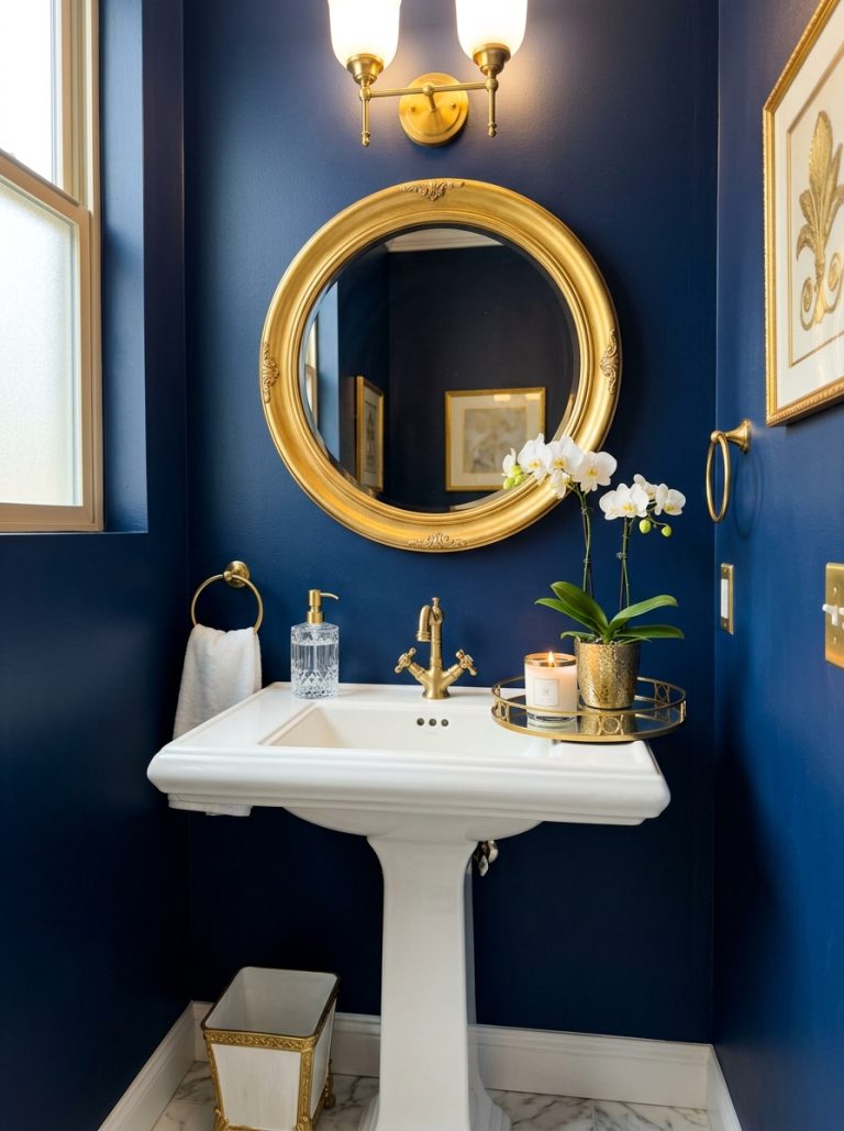
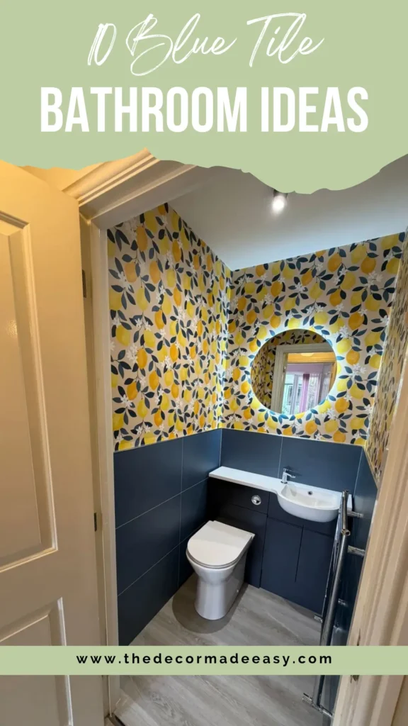
Navy Blue Tile Wainscoting with Lemon-Print Wallpaper in a Powder Room
The word “daring” is overused in interior design. But this powder room has earned it.
Navy blue large-format tiles cover the lower half of every wall, topped with cheerful wallpaper printed with oversized yellow lemons on a white ground. The combination sounds like it shouldn’t work. And then you look at the image and wonder why everyone isn’t doing this.
The grout on the navy tile is minimal and close in tone to the tile itself. So the lower walls read as a single deep blue plane rather than a grid. The vanity and toilet unit are integrated in the same navy blue. Practical and visually seamless. A round backlit mirror hangs above, creating a soft halo of warm light.
What makes the lemon wallpaper work? Look closely at the leaves. They’re the same dark navy as the tiles below. That repetition ties the two halves of the room together and prevents the transition from feeling accidental. Someone thought this through carefully.
The grey laminate floor is the right call. A dark floor would have made the small space feel cramped. A very light floor would have competed with the bright wallpaper. Grey sits comfortably in between. The chrome towel rail adds a cooler note that stops everything from going too warm.
For anyone designing a powder room, this is a useful template:
- Choose a bold pattern above
- Use a solid anchor color below
- Find the one element that bridges them
Also Read: Bathroom Wall Tile Design: 10 Real-World Ideas That Actually Work
Pale Blue Wainscoting with Pink Fixtures and a Faux-Finish Ceiling in a Vintage Bathroom
I was genuinely surprised by this one.
The pale periwinkle-blue tile is entirely in the background. Quiet, slightly grey-toned, covering the lower walls as traditional wainscoting. What you actually notice first is the pink. The pedestal sink is solid soft pink ceramic. In any other context, this might seem like a renovation mistake. Here, it reads as a curatorial choice.
The wall above the tile features a painted faux technique. A mottled, cloud-like application in grey-blue tones gives the upper wall a soft, atmospheric quality. A strip of small decorative border tiles in pink and cream separates the blue wainscoting from the painted upper wall. A period detail that locks the whole room into a specific mid-century register.
The lighting is a standout. A vintage Hollywood-style bar with round globe bulbs runs along the top of the large mirror, casting warm, even light across the vanity. Glass shelving built into a mirrored cabinet provides storage without visual weight. Pink-mauve towels complete the color story.
What’s instructive here is how the blue tile functions as a supporting player rather than the main event. The blue tile bathroom idea doesn’t always mean the blue is the hero. Sometimes the tile establishes a foundation (cool, solid, consistent) and everything layered on top gets to be more interesting.
That supporting role is just as valid a design strategy as centering the tile itself.
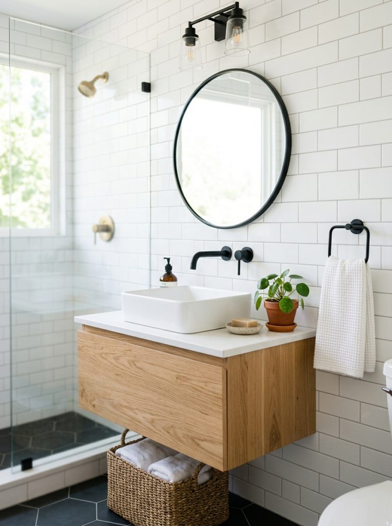
Soft Blue Glass Subway Tiles in a Classic Walk-In Shower
If the other entries in this list have been about personality and drama, this one is about polish.
The shower walls are clad in large-format glass subway tiles in a soft, even blue-grey. The kind of color that could also be described as pale denim or weathered sky. The tiles are laid in a traditional horizontal brick pattern, and the finish is noticeably glossy. Bright specular reflections appear wherever light hits.
The simplicity of this shower is its strength. No competing patterns. No decorative borders. No dramatic contrast. A built-in niche lined with small cream penny-round mosaic tiles introduces subtle texture without disrupting the calm. The shower floor uses the same penny-round tile across a wider area, picking up cream tones from the exterior wall and creating a natural transition.
Chrome hardware keeps the color palette cool and consistent. Brushed brass would have introduced warmth that this particular blue doesn’t need. The sliding glass door on a chrome track is a practical choice for a space that reads as quietly refined rather than dramatically styled.
This is the kind of blue tile bathroom idea that ages well. The color isn’t trend-dependent. The pattern is traditional. The execution is clean.
If you’re renovating a bathroom that you want to feel elevated without feeling fashionable (a distinction worth making), this is a useful reference point. You won’t be repainting or retiling it in five years because the moment passed.
Blue Subway Tiles Inside an Arched Shower Alcove with Warm Farmhouse Details
The arch is the idea here.
The shower is set into a pointed arch (almost Moorish in its profile) tiled entirely in matte blue subway tiles. A matching blue border traces the arch’s curved outline. The effect is architectural in a way that a standard rectangular shower enclosure simply cannot be.
Inside the arch, the tiles are dusty, muted blue. More blue-grey than blue-blue. The surface texture is slightly rougher than standard ceramic, giving the walls a soft, chalky appearance. Brass fixtures inside the arch (a ceiling-mounted rain head, an exposed shower bar in antique brass finish) add warmth without competing with the tile color.
Outside the arch, the bathroom takes a completely different direction. Shiplap-style painted panelling covers the walls in warm white. A light oak vanity, classic hex-tile floor in cream with a small repeating dot motif, framed art, and a patterned block-print curtain on the shower. These elements create a farmhouse-inflected vocabulary that the arch somehow sits within perfectly.
That tension is what makes this bathroom memorable. The slightly exotic arch against familiar farmhouse details. The patterned curtain works because it introduces a botanical repeat in brown and cream that connects warm wooden elements to the cool tiled arch without trying to match either.
If you have a bathtub-shower combo and want to elevate it significantly without a full structural renovation, an arched surround is worth exploring with your contractor. The arch itself is a plastered structural element. The tile comes after. The investment is real, but so is the result.
Also Read: 12 Bathroom Floor Tile Ideas That Prove the Floor is the Foundation, Not an Afterthought
Teal Blue Herringbone Feature Wall in a Contemporary White Bathroom
The final example takes herringbone and applies it in a way that feels completely different from the dark navy version earlier.
The tiles are medium teal-blue. Brighter and more saturated than duck-egg, lighter than cobalt. They cover the shower wall and bathtub surround in a continuous herringbone pattern. White grout makes every diagonal line sharp and readable.
Everything else in the bathroom is white or very light grey:
- Floating vanity with a ribbed texture in white
- White countertop
- White vessel sink
- Full-width mirrored cabinet above the mirror (doubles the sense of space)
- Large-format light grey floor tiles laid plain
The overall effect is clean, bright, and visually uncluttered.
The teal herringbone wall does all the work in this room. Because the surrounding surfaces are so neutral, it doesn’t have to compete with anything. It simply sits there being the point of the room. Matte brushed steel hardware keeps the metal tone cool, which complements the slightly green-leaning teal better than warm brass would.
What I find useful about this example is how accessible it is for small bathrooms:
- White surroundings make the space feel larger
- Herringbone pattern gives the eye something to follow without adding physical clutter
- Warm under-vanity lighting adds a soft, grounding glow at floor level
That lighting detail makes the floating vanity feel less stark and the room feel more welcoming.
Quick Reference: Choosing the Right Blue Tile Style for Your Bathroom
| Tile Style | Best Suited For | Grout Recommendation | Difficulty Level |
|---|---|---|---|
| Zellige / handmade vertical stack | Master ensuite, statement shower | Matching tone or slightly darker | Medium |
| Navy herringbone | Feature shower, powder room | Matching or dark grey | Medium to Advanced |
| Cobalt vertical backsplash | Vanity feature wall, full bathroom | White for contrast | Easy to Medium |
| Retro aqua wainscoting | Period renovation, full-room commitment | Matching aqua | Easy |
| Encaustic floral patterned | Walk-in shower feature wall | Cream or sand | Advanced |
| Navy wainscoting with wallpaper | Powder room, cloakroom | Dark matching | Easy |
| Soft blue glass subway | Classic walk-in shower | Cream or light grey | Easy |
| Matte blue arch subway | Bathtub-shower alcove | White or warm grey | Advanced |
| Teal herringbone feature wall | Small bathroom, bath surround | White | Medium |
Final Thoughts
Blue tile bathroom ideas span a wider range than most people initially realize. What connects all ten of these bathrooms isn’t a shared hue or pattern. It’s the confidence with which each choice was made and the care with which everything around that tile was chosen in response.
Here’s the most useful lesson from reviewing these spaces: the tile is rarely the problem. The problem is usually everything that surrounds it. Mismatched fixtures, unrelated accent colors, or neutral choices made out of caution rather than intention. These are what undermine a strong tile selection.
When fixtures, countertops, hardware, and secondary materials are all chosen in genuine dialogue with the tile, the result looks purposeful rather than assembled.
Blue tile bathrooms have been around for nearly a century. The vintage aqua example here proves it. What changes is how we frame them and what we put beside them.
Whether you’re drawn to the quiet restraint of a pale blue glass subway shower or the full-throated drama of deep navy herringbone, the work is the same. Choose your blue. Then build the rest of the room around it with equal care.
That’s what separates a bathroom worth photographing from one that simply functions. So pick your blue, commit to it, and watch everything else fall into place. Your future self (the one who actually enjoys getting ready in the morning) will thank you.