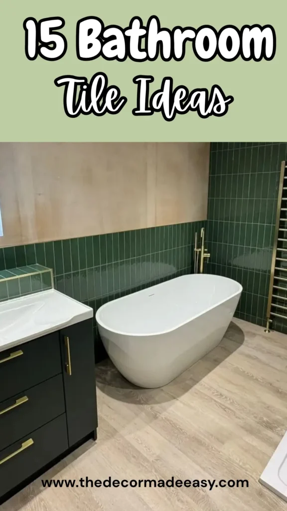
Stop Picking Random Tiles: 15 Real-Life Bathroom Designs That Actually Work
Here’s the thing about bathroom renovations: most people mess them up before they even pick up a trowel. They fall in love with tiles in a showroom, buy them on impulse, and then wonder why their bathroom looks like a confused hotel lobby.
I’ve pulled together 15 bathroom tile ideas from actual renovations. Real homes. Real people living with their choices. Not magazine renders. Not staged hotel rooms that cost more than your entire house.
Whether you’re gutting everything or just rethinking your shower situation, at least a few of these will completely change how you see your options.
Marble Herringbone Floors with Vertical Subway Walls
Some bathrooms feel clean. Others feel considered. This one nails the second category.
The floor features narrow-strip herringbone in white and soft grey marble. It flows seamlessly from the main bathroom right into the walk-in shower, which makes the whole space read as one continuous zone instead of two awkward areas fighting for attention.
The individual tiles are slim, almost ribbon-like. This gives the herringbone a delicate, woven quality rather than that chunky look you get with wider cuts. Grey veining adds movement without making things feel chaotic.
On the walls? Simple white rectangular tiles running vertically in a straight stack pattern, floor to ceiling. Vertical stacking draws your eye upward, making the ceiling feel taller than it probably is. The contrast between the intricate floor and the calm walls hits just right.
How to steal this look: Focus your energy on one high-detail surface (the floor) and let your walls breathe. The herringbone does all the heavy lifting. Your walls don’t need to compete.
Natural Pebble Shower Floor with Linen-Look Wall Tiles
I’ll be honest. When I first heard “pebble floor with grasscloth-style walls,” I thought it could go either way. In practice? It works beautifully.
The shower floor features a classic pebble mosaic in warm grey and beige tones. Standing on it feels vaguely like being on a riverbed. It’s genuinely one of the better tactile experiences you can have in a bathroom.
The wall tiles mimic fine horizontal linen texture in a neutral greige tone. Both surfaces stay quiet color-wise and let texture do all the talking.
What makes this space pop is everything around the tile. A dramatic wrought-iron chandelier with dark crystal drops hangs from a vaulted ceiling. A warm oak vanity with black hardware grounds everything. These elements give personality to what could’ve been a forgettable neutral box.
The lesson: Restrained bathroom tile ideas can absolutely anchor a dramatic space. If your tiles are subtle, invest somewhere else. A remarkable light fixture costs way less than a full tile redo and transforms how a neutral bathroom reads entirely.
Full-Coverage Striped Grey Porcelain (Floor to Ceiling)
Some people see a bathroom wrapped in a single tile from baseboard to ceiling and call it overwhelming. I’d call it committed. And commitment in design usually reads as confidence.
This bathroom uses large-format grey porcelain tiles with soft horizontal striations running through them. Think natural stone vibes without actual stone maintenance headaches. These tiles cover the vanity backsplash, wrap around shower walls, and appear on the shower floor. The result is a cohesive grey envelope that feels modern and slightly industrial.
The floor shifts to wood-look plank tile in warm grey-brown. Smart move. That variation in direction and finish breaks the monotony just enough.
A backlit LED mirror adds crisp white glow against the grey backdrop. Vintage-style cross-handle fixtures on the sink add character without clashing.
Pro tip: Choose a tile with natural variation baked in. Random striations, veining, or tonal shifts. Flat single-color tiles on every surface create a cold, clinical atmosphere. A tile with built-in movement gives the room that finished, professional quality.
Also Read: 12 Pink Bedroom Decor Ideas for When You Want “Serene Sanctuary,” Not “Dollhouse”
Large-Format White Marble with Hexagonal Shower Accent
The contrast in this bathroom is the whole point. Whoever designed it understood that perfectly.
The main floor and lower wall sections feature large-format polished white tiles with subtle grey-cream veining. Classic marble-look porcelain that photographs beautifully and handles moisture like a champ. A freestanding soaker tub sits in front of five casement windows, completely surrounded by that pale, reflective tile. The effect is serene. Almost meditative.
Then you catch the shower floor: bold grey and white hexagonal tiles in a geometric honeycomb pattern, framed by a marble border. The shift from quiet main floor to active hexagonal pattern works because both surfaces share the same grey and white palette. The pattern changes, but the color story stays consistent.
This is one of the most reliable bathroom tile ideas for large master baths. Anchor your main floor in clean, minimal tile, then introduce a distinct pattern in the shower zone. It defines two different functional spaces without walls or barriers. A silver multi-globe chandelier overhead reinforces the glamorous, spa-adjacent mood.
Blush Pink Hexagonal Floor with Zellige Wall Tiles
Some bathroom tile ideas feel safe and forgettable. This one has a point of view. And honestly? I’m here for it.
The floor features large blush pink hexagonal tiles. Not that dusty millennial pink that’s been done to death, but a soft peachy-rose tone with white grout lines that make each tile pop without feeling too graphic. The hexagons are generous (roughly six inches), which keeps the pattern from feeling fussy even in a narrow bathroom.
The walls behind the freestanding tub and shower feature square zellige-style ceramic tiles in pale, cloudy white with slight glaze variations from tile to tile. That variation is what makes these tiles special. They catch light differently depending on the angle, creating a surface that feels alive rather than flat.
Brass fixtures and a ceiling-mounted rainfall shower head add warmth without competing. A wood-toned vanity keeps everything grounded.
What’s genuinely clever here: The pink floor is bold enough to be memorable, but the quiet wall tile prevents things from tipping into overly precious territory. Balance is everything with statement floor tile.
Moroccan Patchwork Tiles as a Shower Feature Column
Not everyone has the nerve to use this kind of tile. That’s exactly what makes it so effective when someone does.
The shower features a full floor-to-ceiling column of hand-painted Talavera or Moroccan-style patchwork tiles. Every single tile carries a different intricate geometric or floral pattern in rich blues, oranges, reds, yellows, and cobalt. The tiles sit on the diagonal, which reinforces the patchwork quality and keeps your eye moving.
The rest of the bathroom keeps its composure: large-format cream terrazzo-look floor tiles, soft sandstone-colored wall panels in the shower, and a freestanding oval tub. None of those elements compete with the feature column. They let it perform.
This approach works: Using bold decorative tiles as a single contained feature rather than spreading them everywhere. The shower column is the artwork. Everything else is the white wall it hangs on.
If you want Moroccan or encaustic tiles but fear committing to them everywhere, a single feature wall or column is your honest answer.
Also Read: I Tried These 5 DIY Projects for a “High-End” Bedroom, and They’re Actually Easy
Forest Green Vertical Subway with Brushed Gold Hardware
I was skeptical about forest green bathroom tiles a few years ago. That skepticism is now entirely gone.
This bathroom uses deep emerald green rectangular tiles in a vertical stack pattern across shower walls and as a wainscot band running behind the vanity. The tiles feature glazed variation. Some patches appear darker, almost hunter green, while others show brighter emerald quality. That tonal inconsistency separates these from cheaper alternatives and gives the wall genuine depth.
The floor is warm light oak wood-look plank tile, creating beautiful contrast against the dark green. Brushed gold hardware appears everywhere: faucet, towel rail, shower fixtures, cabinet handles. The combination of forest green and gold has a collected, slightly vintage quality that reads luxurious without being fussy.
The plaster-effect wall section above the tile line is warm nude-beige, softening what could’ve been an intense color scheme.
Key insight: If you’re going bold on tile color, keep untiled portions in warm neutrals. Cool whites next to saturated green can feel harsh. Warm plaster tones feel intentional and considered.
Black and White Marble Checkerboard with Subway Wainscot
This is the bathroom equivalent of a well-cut navy suit. It never ages. It always works. And somehow, people still mess it up when they try to replicate it.
The floor features large diagonal checkerboard tiles in polished black marquina marble and white Carrara marble. Both have visible natural veining that keeps the pattern from looking too graphic or manufactured. The squares are generous (maybe 18 inches), so the room doesn’t feel visually shredded by too-small checks. Laid diagonally, they give the rectangular room a sense of movement and expansion.
The walls carry classic white subway tiles in brick offset pattern, with a single course of black pencil tiles at chair-rail height providing a clean horizontal break. A freestanding roll-top bath with chrome claw feet completes the Victorian reference.
What I appreciate most: The restraint above the chair rail. Upper walls continue as plain white subway tile to the ceiling. No additional pattern, no competing element. When your floor is this declarative, the walls need to step back. That discipline separates a successful classic black and white scheme from one that feels chaotic.
Diagonal Herringbone Tile Behind the Vanity
A single accent wall can do more work than three decorated ones. This bathroom proves that point convincingly.
The entire wall behind the vanity (floor to crown molding) features marble-look porcelain tiles laid in large-scale herringbone at roughly 45 degrees. The tiles have soft white and silvery-grey color with natural-looking veining. Grout lines are tight and closely matched to the tile color. Because the grout nearly disappears, the wall reads almost like a continuous woven surface rather than individual tiles.
The same tile continues onto the bathroom floor in horizontal format, tying the two surfaces together without making them identical.
Two brass wall sconces flank the LED backlit mirror, casting warm gold light that plays off the reflective tile surface.
The vanity is dark ebony wood with polished nickel hardware. That deliberate contrast grounds the silvery tile wall and stops things from feeling too ethereal.
Important: Pay close attention to grout color selection for herringbone feature walls. Contrasting grout emphasizes geometry aggressively. Matched grout creates that almost textile-like effect you see here. It’s harder to achieve but far more sophisticated.
Also Read: The “Un-Pinterest” Guide: 15 Real-Life Boys Bedroom Decor Ideas That Actually Work
Maximalist Powder Room with Checkerboard and Jungle Wallpaper
This room is entirely sure of itself. And that confidence is infectious.
The floor features classic black and cream checkerboard in small square tiles. Straightforward, traditional, and exactly right for what comes next. Walls below chair-rail-height paneling are painted deep charcoal grey with white moulding panels. Above that? Jungle-motif wallpaper in deep teal and forest tones depicting large cats, leopards, and tigers among dense tropical foliage.
A marble vessel sink on a floating dark vanity with tall brass faucet adds genuine luxury. A cast-iron column radiator in dark metallic finish completes the moody, slightly theatrical atmosphere.
What this bathroom does well: It uses checkerboard tile as a grounding element in a room that could easily tip into chaos. The pattern is familiar and structured, giving the eye somewhere to rest amid all the visual wall information.
When building a maximalist bathroom, your tile choices should be the most controlled surface in the room. Let wallpaper, art, or fixtures be the drama. The tile is the floor of a stage. It needs to be stable.
Floor-to-Ceiling Onyx-Effect Porcelain with Green and Gold Veining
There’s a version of this design that looks gaudy. This is not that version.
The walls and shower area wrap completely in large-format porcelain tiles mimicking green onyx or serpentine marble. A creamy off-white background features dramatic swooping veins in sage green, olive, and warm amber gold. The tiles polish to high gloss, making the room feel much larger and allowing veining patterns to catch light from every angle.
Chrome fixtures throughout keep metallic elements clean and modern against the busy stone pattern. A round backlit mirror provides focused illumination. The vanity features warm teak wood tone, echoing the amber veining.
This bold move pays off because the tile is high-quality with genuinely dramatic pattern variation. The critical factor with full-coverage stone-look tiles is resolution. The scale of veining pattern relative to tile size matters enormously.
Veins that are too small on large tiles look busy. Veins with good scale and sweep (like here) look painterly. Choose large-format tiles with large-scale veining for the best impact in small rooms.
Victorian Mosaic Border Floor with Penny Hex Field Tiles
This floor stopped me. It’s meticulous in a way most modern bathrooms simply aren’t.
The floor features tiny cream penny hexagonal mosaic tiles as the main field, punctuated by individual black flower-shaped motifs scattered at regular intervals. That alone would be lovely.
What elevates it is the border: a precise, multi-layered geometric border running around the room’s perimeter, featuring alternating black and white triangles and diamond shapes in an interlocking pattern. The border changes direction at corners in a way that only happens through careful planning and highly skilled installation.
A white pedestal sink stands at the composition’s center. The floor pattern was almost certainly designed around that specific placement. That detail reveals the intentionality behind this project.
FYI: Victorian and Edwardian mosaic floor tile designs like this come from specialty companies such as Tessellated Tile Factory, who create patterns as pre-assembled mesh-backed sheets. This isn’t a DIY project for most homeowners.
But the investment returns itself in permanence. This floor will outlast every trend that comes after it and only increase in appeal with age.
Sage Green and White Checkerboard Covering Shower and Ceiling
Checkerboard tiles have dominated design conversations for a couple of years, and most implementations use black and white. This version (soft sage green and white) is the one that actually makes me want to redo a bathroom.
The shower walls, floor, and upper wall sections above the shower feature checker pattern using matte square tiles in weathered sage green and off-white. The tiles have a slightly uneven, handmade quality that softens what would otherwise be aggressive graphic pattern. The ceiling matches the sage green, pulling color upward and creating total immersion.
A walnut vanity with silver hardware and black rounded-rectangle mirror anchor the room in more traditional materials. The floor outside the shower uses small white penny hexagonal tiles with black dot accents, complementing the checker without competing.
The key to making checkerboard tiles work on shower walls: Choose the right scale. Too small becomes optical-illusion territory. Too large loses energy. These tiles appear roughly four-by-four inches, which is the sweet spot. Large enough to read clearly at distance, small enough to wrap around corners without awkward cuts.
Warm Beige Large-Format Tiles with Fluted Shower Accent
Minimal doesn’t have to mean cold. This bathroom demonstrates that convincingly.
Main walls throughout feature large-format tiles with warm limestone-like texture. Creamy beige with slightly irregular surface mimics natural stone without maintenance demands. The tiles are large (approximately 24 by 48 inches), so grout lines nearly disappear. Near-seamless surface effect throughout. The floor uses similarly toned large tiles, maintaining that serene, unbroken quality.
Inside the shower, the back wall introduces slim vertical fluted tiles in paler, almost white version of the same warm tone. The fluting creates shadow and dimension without introducing new color. Refined approach.
Frameless glass shower panel and brushed copper fixtures add warmth tying everything together.
Under-cabinet lighting beneath the floating oak vanity creates warm amber wash on floor tile. This detail photographs beautifully and genuinely transforms atmosphere at night. If you’re planning a neutral-toned bathroom, don’t underestimate architectural lighting’s impact on tile surfaces. That under-cabinet glow costs little to install and completely changes how minimal tile schemes read after dark.
Vertical Ribbed Wood-Look Porcelain as Full Accent Wall
This last bathroom tile idea challenges the definition of “tile,” and I think it’s better for it.
One full wall (including area behind toilet and extending behind shower) features large-format porcelain tiles with deeply ribbed, vertically-grained wood texture. Warm medium oak tone with natural grain variation. Each tile runs probably 24 by 48 inches or larger. Ribs run in tight vertical channels creating strong directionality and texture from across the room. The surface reads unmistakably as a design feature, not background.
The rest stays controlled: large neutral grey tiles on floor and shower walls, white fixtures, floating wood-grain vanity echoing the accent wall. Matte black hardware on shower door, faucet, and vanity handles provides sharp contrast against warm wood tones. A round LED backlit mirror hangs from a leather strap. Small detail that signals this bathroom was considered holistically, not assembled piece by piece.
Textured wood-look porcelain tiles are among the strongest bathroom tile ideas available for people wanting natural warmth without moisture-related risks of actual wood. One caveat: grooves in ribbed surfaces accumulate soap residue in wet areas. Reserve this tile for accent walls rather than inside shower enclosures.
Quick Reference: Matching Tile Style to Your Priorities
Before finalizing any bathroom tile decision, this comparison helps match tile style to what actually matters to you:
| Tile Style | Best For | Maintenance | Visual Impact |
|---|---|---|---|
| Marble herringbone mosaic | Floors in medium-to-large bathrooms | Medium | High |
| Large-format neutral porcelain | Walls in minimal/spa bathrooms | Low | Subtle |
| Pebble mosaic | Shower floors only | Medium-High | Textural |
| Checkerboard (black/white) | Classic and maximalist styles | Low | Bold |
| Zellige/handmade square | Feature walls and shower surrounds | Medium | Rich |
| Victorian penny hex mosaic | Heritage and period-style bathrooms | Medium | Detailed |
| Wood-look ribbed porcelain | Accent walls; dry areas | Low | Warm/Dramatic |
| Moroccan patchwork | Single feature columns or walls | Medium | Maximum |
| Stone-look large format | Full coverage in modern bathrooms | Low | Refined |
What Actually Makes Bathroom Tiles Work
Fifteen different bathrooms. Fifteen different tile approaches. But common threads run through all the ones that genuinely work.
Choose one surface to carry the design weight. Whether that’s a dramatic mosaic floor, single feature wall, or fully wrapped checker pattern, the decision gets made deliberately. Rooms that feel chaotic are usually the ones where multiple surfaces compete for attention simultaneously.
Grout color matters way more than most people realize at planning stage. Matched grout creates continuity and near-seamless finish. Contrasting grout emphasizes pattern and grid lines. Neither is wrong, but the choice shapes the final result as much as the tile itself.
The bathroom tile ideas that age best root themselves in genuine style preferences rather than current trends. Victorian mosaic floors. Marble herringbone. Checkerboard in marble. These feel current because they were confident choices, not because they were safe ones.
Whatever direction you take your bathroom, the tile deserves the same level of commitment as everything else in the room. Maybe more.
So what’s catching your eye? Time to stop pinning inspiration and start making some actual decisions. Your bathroom isn’t going to renovate itself.