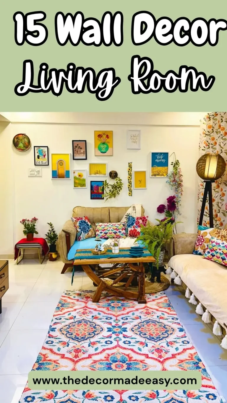
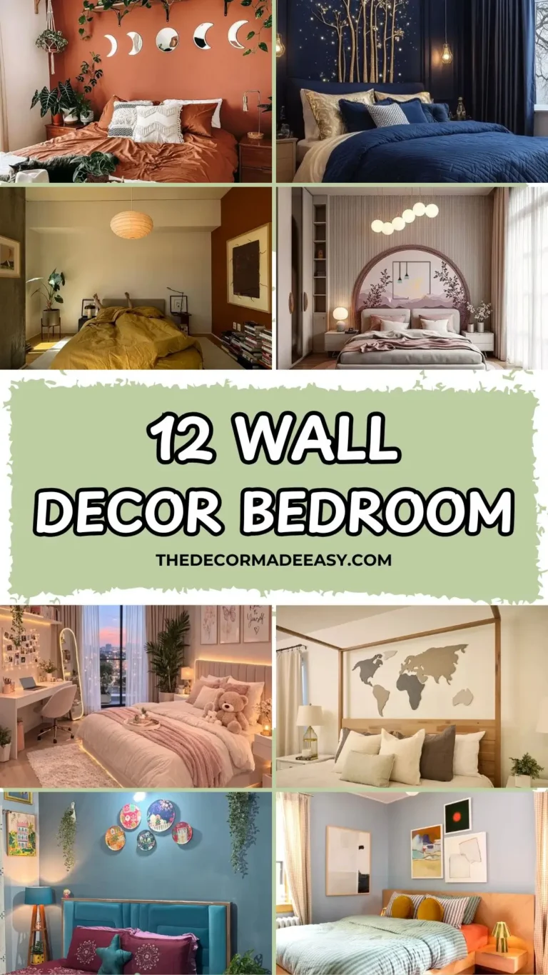
Stop Staring at Your Blank Kitchen Walls: 10 Decor Ideas That Actually Work
Let’s be honest. Your kitchen wall has been staring at you blankly for months, and you’ve been staring right back, doing absolutely nothing about it. No judgment, we’ve all been there. But that sad, empty wall? It’s basically free real estate just waiting for a glow-up.
Whether you’re working with a tiny apartment kitchen or a sprawling farmhouse setup, there’s something on this list for you. I’ve broken down 10 genuinely good kitchen wall decor ideas, covering different budgets, styles, and effort levels. Some of these will take an afternoon. Others are more of a “this is a lifestyle decision” kind of commitment.
1. A Gallery Wall of Food-Themed Oil Paintings
This one is for people who want their kitchen to feel like a cozy Italian trattoria crossed with a private art collection. Imagine a white shiplap wall covered in original oil paintings of fruits, cantaloupes, pears, tangerines, little ceramic dish compositions, all rendered in warm golden tones that somehow feel cohesive even though nothing technically “matches.”
What makes it work:
- Mix of frame sizes and styles (raw oak, black-edged canvas, unframed edges)
- One large anchor painting surrounded by smaller pieces
- A shared color palette rather than a matching subject matter
The key here is scale variety. Your eye keeps moving, discovering new details every time you look up from your coffee. It never gets boring.
How to pull it off: Start with one large statement piece and build outward. Stick to yellows, ochres, and warm greens for that sun-soaked produce market vibe. You don’t need to buy everything from the same artist. Honestly, mixing sources makes it look more authentic and less like you panic-ordered a bundle set at 2am.
This look works best in kitchens with high ceilings and longer walls. If your kitchen is more “cozy closet” than “open concept,” maybe try idea number 2 instead.
2. One Big, Bold Abstract Print That Does All the Heavy Lifting
Sometimes less really is more, and this idea is proof. Picture a single oversized painting of a chili pepper, brushstrokes loose and expressive, colors shifting from orange at the top to deep red at the bottom, with paint splatters in teal, pink, yellow, and green flying around it like confetti. On a soft cream background. It slaps.
Why one big print works:
- No clutter, no visual noise
- The cream background keeps it from feeling chaotic
- It works above a shelf, behind a dining table, next to an island
The trick is going big. Like, actually big. At least 24 by 30 inches, bigger if your wall can handle it. A small version of this painting would lose everything that makes it interesting. It would just look like a vegetable sticker.
FYI, you can find abstract food art prints like this on Etsy and Society6 without spending a fortune. The subject doesn’t have to be a pepper either. A lemon, artichoke, or cluster of tomatoes in the same painterly style carries the same energy.
3. Vertical Sage-Green Tile with Sconce Lights
Okay, this one surprised me. There’s no art, no signs, no cute quote about coffee. Just floor-to-ceiling vertically stacked ceramic tiles in a muted sage-green with a slightly iridescent glaze, and two white dome barn-style sconce lights mounted directly into the tile on long articulating arms.
And honestly? It’s stunning.
Why vertical tile hits different:
- Draws the eye upward, making ceilings feel taller
- The hand-glazed finish gives each tile slightly different light reflection so the wall looks alive
- The sconces double as lighting AND architectural detail
This works especially well for backsplash walls, wet bars, or the wall behind a range. If you want the look on a tighter budget, zellige-style ceramic tiles give a similar effect at a lower price point.
Swap the white sconces for brass if you want a warmer, Mediterranean feel. Go matte black if you’re leaning more industrial. Either way, this approach makes the wall itself the decor, which means zero art-hanging stress.
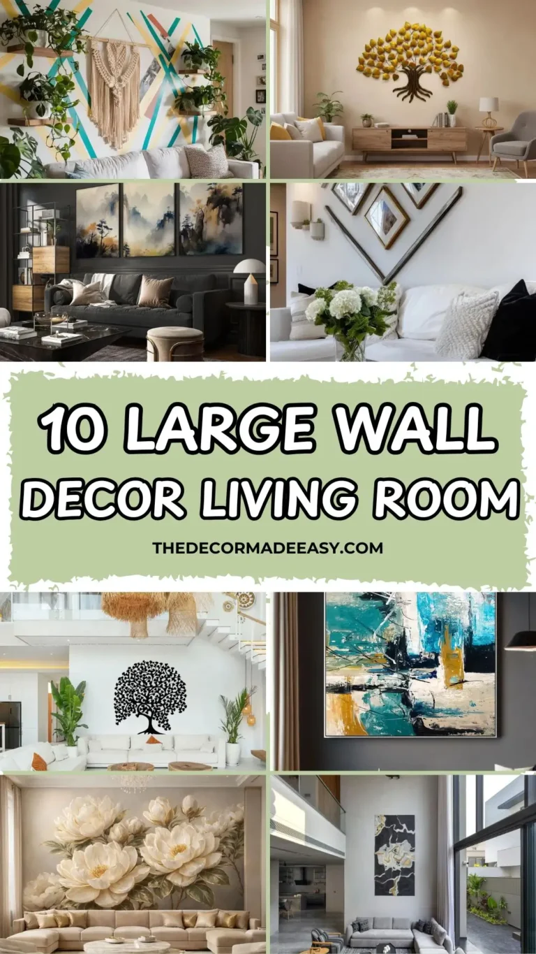
Also Read: How to Make Your Living Room Wall Decor Look Intentional (Without the Designer Price Tag)
4. A Grid of Live-Edge Wood Slices
Cutting boards on walls? Classic. But six raw live-edge wood slices hung in a clean 3×2 grid? That’s a different conversation entirely.
Each slice is roughly oval, hung individually on a short loop of rust-colored leather cord. Some are lighter and golden, some darker with heavy grain patterns. Together they create a subtle visual rhythm that feels organic but intentional.
The grid format is everything here. The same six pieces hung randomly would look like a tornado passed through your kitchen. Even spacing and aligned rows are what turn this from “stuff on a wall” into actual design.
How to do it yourself:
- Source wood slices from craft stores or raw wood sellers online
- Predrill a small hole at the top of each slice
- Thread leather cord or jute twine through
- Hang from small nails or picture hooks, measured and spaced evenly
This works beautifully in modern and farmhouse kitchens where warm organic textures balance out sleek finishes. The honey tones against gray shaker cabinets? Chef’s kiss.
5. Felt Tile Panels as a Pinboard AND Sound Absorber
This is the idea I genuinely had never seen before, and it’s solving three problems at once, which I respect immensely.
A section of kitchen wall covered in interlocking felt panels with a retro geometric pattern, sage green, olive, and cream, that creates a flowing overlapping circle design across the full surface. You can pin notes and postcards directly into the felt. And here’s the part nobody talks about: it absorbs sound.
Kitchens are loud. Hard tile, hard counters, stainless steel appliances. A large felt panel actually softens that acoustic harshness in a way that paint and art simply cannot.
Why this idea is underrated:
- Functions as a pinboard for recipes, notes, kids’ drawings
- Reduces echo and kitchen noise
- Looks like mid-century modern art, not an office corkboard
The sage, olive, and cream color combo feels fresh and current without being a trend that’ll look dated in two years. These panels are available from brands like Offecct or through Etsy sellers who cut custom acoustic tiles. For a DIY version, compressed wool felt sheets work great with adhesive strips or small nails.
6. Mason Jar Quote Signs in Bold Primary Colors
These signs are not subtle. They are not trying to be. And that’s exactly the point.
Three mason jar-shaped wooden signs, each painted in a saturated primary color: orange, teal, and red. Each one has bold hand-lettered text with classic kitchen sentiments. Hung with red-and-white twisted cord against white subway tile. They pop. Hard.
This look is perfect if:
- You have a family kitchen where warmth beats minimalism
- You want personality on the wall, not just aesthetics
- You love a design choice that makes guests smile
What keeps these from feeling generic is the typography variety. Each sign uses different lettering styles, bold block letters mixed with flowing cursive. Uniform lettering across all three would make them look mass-produced. The mix is what makes them feel handcrafted.
These particular signs appear to be from an Indian brand called GKD, which reflects a growing handcrafted signage market that’s worth exploring if you want something unique and personal.
Also Read: 12 Bedroom Wall Decor Ideas That Actually Work (With Real Examples)
7. A Personalized Sign Set with Decorative Wooden Utensils
This one takes the quote sign idea and turns it into a full three-piece wall vignette. Center stage: a mason jar-shaped sign reading “Calories Don’t Count When [Name] Cooks the Food.” Flanking it on either side: oversized decorative wooden utensils, a fork and a spoon, painted black with hand-painted white daisy motifs and little bows of jute twine and lace at the base.
The personalization is the whole game here. The moment someone reads their name on that sign, the wall stops being decoration and starts being theirs.
What makes it work as a complete composition:
- The utensils frame the central sign like a proper art installation
- Small faux greenery softens the overall look
- The humor in the message gives the wall genuine personality
You can find customizable sets through sellers like Frames Orchid on Etsy, or DIY it with unfinished wooden utensil hangings, any paint color, and whatever motif suits your style. Florals, geometric patterns, or even solid block colors all work beautifully.
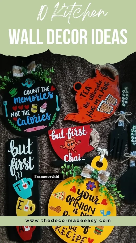
8. A Collection of Witty Food-Themed Shaped Signs
IMO, this is the most fun idea on the list for people who want their kitchen to feel like it has a sense of humor.
Multiple wooden signs in different shapes: circular, teapot-shaped, rectangular, rounded cup-shaped, and oval. Each one in a different format with messages like “Your Opinion is Not Part of the Recipe,” “But First Chai,” and “Count the Memories, Not the Calories.” Black, red, and yellow color scheme throughout. Consistent little details like jute twine, lace bows, and faux greenery tie them all together.
The secret to making a collection like this work:
- Stick to a two or three color palette across all pieces
- Choose one or two consistent embellishment materials (here it’s jute and lace)
- Let the shape and text variety do the visual work
Mixing too many colors or materials makes a collection feel like a garage sale display. But commit to a tight palette and the variety in shape and text carries everything. Hang them at varied heights across a horizontal wall for a gallery-style effect with loads of personality.
9. A Farmhouse Cutting Board Wall Display with Seasonal Accents
This is genuinely one of the most creative uses of functional kitchen items I’ve seen turned into wall decor. A black iron pipe rod mounts to the wall at two heights, with S-hooks supporting an overlapping collection of cutting boards in various shapes and sizes. Paddle boards, oval boards, rectangular boards, small round boards. Ranging from deep aged walnut to fresh light pine.
But here’s what takes it from “storage” to “installation”: the seasonal layering.
Autumn dried leaf branches and trailing dried hop vines weave through the S-hooks. A small white enamel bucket holds a mini pumpkin and herb sprigs. A botanical print leans at the base. A leafy plant anchors the floor. It looks like a styled vignette from a home magazine.
The best part? You update it with the seasons. Swap dried autumn leaves for spring greenery. Replace the pumpkin with summer herbs. The boards themselves rotate too since you display them when they’re clean and swap them out when they’re in use.
The iron pipe rod system is available at hardware stores or through IKEA’s FINTORP range. This look suits farmhouse, rustic, and industrial kitchens without missing a beat.
Also Read: Stop Buying Mass-Produced Art: Try These 3 DIY Wall Hacks Instead
10. A Multi-Panel “Kitchen Rules” Hanging Sign
Yes, kitchen rules signs are everywhere. But this version is executed so cleanly that it earns its spot on the wall and on this list.
Six wooden slats hang vertically from a single cord, alternating between dark walnut stain and white-painted finish. The top panel reads “Kitchen Rules” with a rolling pin graphic. Each panel below delivers one rule in a cause-and-effect format:
- IF YOU EMPTY IT — fill it
- IF YOU OPEN IT — close it
- IF YOU DIRTY IT — clean it
- IF YOU SPILL IT — wipe it
- IF YOU COOK IT — share it
The alternating dark and light panels create rhythm and make each rule easy to read at a glance. The typographic contrast between bold caps and lowercase cursive reinforces the call-and-response structure. Small icons of forks, spoons, and pots add visual variety without cluttering the message.
What makes this actually worth hanging: It’s decorative AND communicative. It says something useful with enough wit that reading it feels like a small reward rather than a chore chart. These are widely available at home goods stores and online markets, or you can commission a custom version with rules that actually fit your household’s chaos.
Quick Comparison: All 10 Ideas at a Glance
| Decor Style | Best Kitchen Type | Effort Level |
|---|---|---|
| Food-themed gallery wall | Large, open kitchens | High |
| Single large-scale art print | Any size kitchen | Low |
| Decorative tile with sconces | Backsplash / bar area | High |
| Wood slice grid display | Modern, farmhouse | Medium |
| Felt acoustic tile panels | Any active kitchen | Medium |
| Mason jar quote signs | Family kitchens | Low |
| Personalized sign with utensils | Any personal kitchen | Low |
| Multi-shaped themed sign set | Eclectic kitchens | Low |
| Cutting board farmhouse wall | Farmhouse, rustic | Medium |
| Kitchen rules hanging sign | Any kitchen | Low |
So, Which One Should You Actually Go For?
Here’s the honest truth: the best kitchen wall decor is the one you’ll actually commit to. All ten of these ideas work. Some require more time and money, some you can pull off this weekend for under thirty bucks.
If you’re starting from zero, go with a single large art print in your kitchen’s existing color palette. That one decision tends to clarify everything else, what else belongs on the wall and what doesn’t. From there, you build outward with pieces that share either a color story or a material.
Your kitchen is probably where you spend a huge chunk of your waking hours. It deserves the same design attention you’d give your living room. And none of these ideas require a contractor, a massive budget, or even a particularly artistic eye.
Pick one. Give it a shot. Your blank wall has been waiting long enough.