10 Creative Album Cover Wall Decor Ideas for Music Lovers
Your walls are basically talking behind your back. And right now, if they’re saying “I grabbed this canvas from a clearance bin,” it’s time for a glow-up. Let your music taste do the heavy lifting instead.
Album cover wall decor has blown up recently, and honestly? It makes total sense. It’s personal, it’s visual, and it’s one of the few decor choices that actually means something. I’ve rounded up ten real ideas, pulled from real rooms, built by real people who figured out how to make this work. Whether you’ve got a bare bedroom wall, a living room that needs a focal point, or a music space that deserves better than a single dusty poster, there’s something here for you.
1. The Full-Discography Grid: All Your Faves, One Wall
There’s something beautifully obsessive about covering an entire wall with every album from one artist. And I mean that as a compliment.
Take this R.E.M. setup as the gold standard. Roughly 20 album covers, each in a matching black frame, arranged in a near-perfect grid. Four rows, five frames each. Every frame is the same size, the wall is clean off-white, and the result looks like a proper gallery installation, not just “stuff on a wall.”
You can spot iconic covers like Automatic for the People, Monster, and Out of Time across the display. The visual evolution of one band across decades becomes the whole story. Nothing competes with it.
Why it works:
- Identical frames create a unified rhythm
- Consistent sizing makes the grid feel intentional
- The variety of cover art actually pops because everything else is controlled
If you want to copy this: Decide upfront whether you’re including studio albums only, live records, or compilations too. Then lock in your frame size and stick to it. Standard 12-inch LP display frames from most home goods stores hold covers without the actual vinyl, which keeps things lighter and easier to hang.
Pro tip: Black frames on a white wall is basically cheat code territory for this style. It’s almost impossible to mess up.
2. The Gaming Gallery Wall: Because Game Cover Art Deserves Respect
Okay, hear me out. This one technically features video game covers, but it’s one of the most useful references for album cover wall decor you’ll find anywhere.
White frames in varying sizes hold covers across multiple platforms and eras. Star Wars, Sonic All-Stars Racing, SimCity, Call of Duty: Ghosts, SpongeBob (yes, really), and a large Afro Samurai poster anchoring the right side. The arrangement is deliberately asymmetrical, different heights, different frame sizes, which gives it a collected-over-time feel rather than a retail display vibe.
The key move here is the anchor piece. That large Afro Samurai poster on the right gives the whole wall a visual center of gravity. Without it, the smaller frames would just float around feeling lost.
This concept translates directly to album covers:
- Use one large frame as your anchor, then build outward from it
- Mix frame sizes to avoid the “inventory shelf” look
- White frames on a neutral wall let the cover art provide all the color and personality
If your music collection spans genres and decades, the mixed sizes actually work in your favor. They signal genuine enthusiasm rather than a calculated decorating decision.
3. The Dark Wall Treatment: When Your Background Does the Work
Paint choice is wildly underrated in gallery wall setups, and this example proves it.
Framed prints mounted against a deep charcoal-blue wall, each one in a black frame with a white mat. The white mat creates a triple-layer border effect (black frame, white mat, image) that gives every piece a formal, exhibit-quality look. The arrangement fans out in a loose triangle that widens toward the bottom, which is exactly how museum installations achieve visual stability.
Here’s what a dark wall does for album cover decor specifically: it makes the art glow. Covers with bright reds, yellows, or vivid blues look almost luminous against charcoal or navy. Moody, darker covers gain a dramatic atmosphere they’d never achieve on white.
Best wall colors for this approach:
- Deep teal
- Charcoal grey
- Navy blue
And don’t skip the white mat inside the frame. Without it, darker album covers visually merge with the wall and you lose all the edge definition. Pre-matted frames from any framing retailer solve this without breaking the bank.
Also Read: Stop Ignoring Your Hallway: 12 Real-World Decor Ideas to Transform Your Entry
4. The Maximalist Collage: Full Send, No Apologies
Some people whisper with their decor. This wall yells. And it absolutely earns it.
Against vivid red walls, hundreds of posters, prints, and artworks are mounted edge-to-edge across an entire room. Anime, horror art, gaming prints, painted portraits, African masks, pop culture illustrations. Barely an inch of red visible underneath all of it. Two carved wooden masks add actual three-dimensional texture among the flat prints.
The effect is overwhelming in the best possible way.
What makes this style work:
- No single item is treated as precious or special
- The wall becomes an environment, not a curated selection
- The bold red background ties the chaos into something coherent
For album cover wall decor in this style, don’t frame everything uniformly. Some covers taped flat, some in frames, some overlapping slightly, that variation makes the collage feel organic. If you commit to this approach, commit fully. A half-covered wall in this style looks incomplete. The impact only arrives at true density.
IMO, this is the style for people who’ve been collecting prints and posters for years and are finally done being apologetic about it.
5. Three Clean Rows Above the Sofa: The Living Room Classic
This might be the most copy-paste-able idea on this entire list.
Three horizontal rows of identically framed album covers mounted above a sofa. Warm walnut-toned frames, standard 12-inch square LP covers, on a sophisticated blue-grey wall. The selection spans Stone Temple Pilots, Led Zeppelin, Nine Inch Nails, Nirvana, Madonna, Pearl Jam, and more. A golden retriever has claimed the sofa below, which honestly makes the whole photo better.
The sofa acts as your natural width guide. Your display shouldn’t extend significantly wider than the furniture beneath it or the proportions go off and it starts looking unbalanced.
Why warm wood frames over black here:
- The room already has warm neutrals and wood furniture
- Walnut frames feel lived-in rather than gallery-stark
- The blue-grey wall bridges the cool and warm tones together
To replicate this: Measure your sofa width first. Plan your display to span that width plus roughly 6 to 8 inches on each side. At standard LP size, six frames per row covers about 8 to 9 feet, which works perfectly above most three-cushion sofas.
6. Portrait-Format Classics: Six Albums, Maximum Impact
Here’s a move most people never think to try: portrait-format frames for album covers.
Six iconic rock covers, Iron Maiden, AC/DC, Nirvana, Pink Floyd, Ramones, mounted in tall portrait-format black frames with white mats on a dark textured wall. Most people default to square frames to match vinyl dimensions. Portrait orientation gives each cover extra visual breathing room and a proper fine-print elegance.
The curation sends a crystal-clear message too. Nevermind, The Dark Side of the Moon, Highway to Hell. You don’t need 30 covers to make an impact. Six strong covers, thoughtfully framed, do more than a wall of 50 mediocre ones.
The white mat is doing critical work here. On a dark wall, without a mat, darker album covers lose their edge definition and blur into the background. That clean white border keeps everything sharp and intentional.
If you’re printing album art to frame (rather than using original covers), print slightly smaller than your frame dimensions. This lets you add a custom mat at any framing shop, and a mat-plus-frame combination always looks more deliberate than a cover just stretched to fill the frame.
Also Read: 15 Budget-Friendly Bathroom Wall Decor Ideas That Look Expensive
7. The Bedroom Mix: Vinyl Records, CDs, and Prints Together
This one’s my personal favorite for sheer creativity.
Two full-size black vinyl records are mounted directly on a white wall alongside CDs hung flat, surrounded by album cover prints. Starboy by The Weeknd in red, Graduation by Kanye, Kids See Ghosts, Nevermind, an Arctic Monkeys AM print, Porsche imagery mixed in. The physical records break up the rectangularity of everything else with their circular form, and the reflective surface catches light differently as the day changes.
Using actual vinyl as wall objects is genuinely clever:
- The circular shape contrasts beautifully against rectangular prints
- The reflective black surface adds texture no framed print can match
- It confirms you actually own and love the music, not just the aesthetic
To mount vinyl safely: Adhesive disc mounts designed for clocks work great. Small command strips applied to the record label area also hold well. Avoid anything that requires drilling through the vinyl itself. CDs can hang from small adhesive hooks through the center hole.
The loose, layered look here suits a personal space like a bedroom perfectly. Some prints taped directly, some with borders, some overlapping slightly. It reads as accumulated over time rather than installed in an afternoon, which is always the goal.
8. Bold Colored Background: The Statement Wall Approach
This example technically features fashion and lifestyle photography, but it teaches one of the most important lessons in any wall display: the background is part of the design, not just a backdrop.
A 5×3 grid of prints mounted on an electric cobalt-blue wall above a bed. No frames, just clean-edged prints mounted flush to the wall. The cobalt acts like a stage set. Everything placed against it immediately gains heightened color contrast and visual intentionality.
The frameless grid approach is increasingly popular for album cover decor because removing the frames eliminates visual noise and lets the artwork function almost like tiles rather than individual pieces.
To pull off a frameless grid:
- Print all covers at one consistent size (8×8 inches works well)
- Use a long level and pencil marks for each corner before mounting
- Good-quality artist tape or small adhesive strips handle the mounting cleanly
For album covers with strong color palettes, a saturated wall color like cobalt, forest green, or burnt orange could create something genuinely striking. This approach also suits anyone who wants maximum visual impact with minimal investment in frames or hardware. FYI, this is the budget-friendly move on this list.
9. The Polaroid-Style Tracklist Display: A Wall That Actually Says Something
This wall commits to something unusual and it absolutely pays off.
Every album cover print includes not just the image, but the album title, artist name, release year, and full tracklist printed below it in small text. Like an expanded Polaroid format. The wall covers an entire large space with 80 to 100 individual prints spanning Radiohead, Nirvana, Kanye, Frank Ocean, MF Doom, Gorillaz, Deftones, System of a Down, and dozens more.
What this format adds that conventional displays don’t: actual information. A visitor can read about the music, discover release years, see the tracklist. The wall becomes an interactive archive, not just decoration.
The Polaroid-with-tracklist format is available through several online print services where you simply enter album names and they generate everything automatically. Printing at home on cardstock with a consistent template also works well.
For mounting: washi tape in a neutral color is the go-to choice. It holds well, doesn’t damage the wall, and creates a thin visible border that actually enhances the Polaroid aesthetic.
What prevents this wall from turning into overwhelming color noise, despite having nearly 100 prints, is the white text area below each image. That white space gives your eye somewhere to rest between covers.
Also Read: Stop Staring at Your Blank Kitchen Walls: 10 Decor Ideas That Actually Work
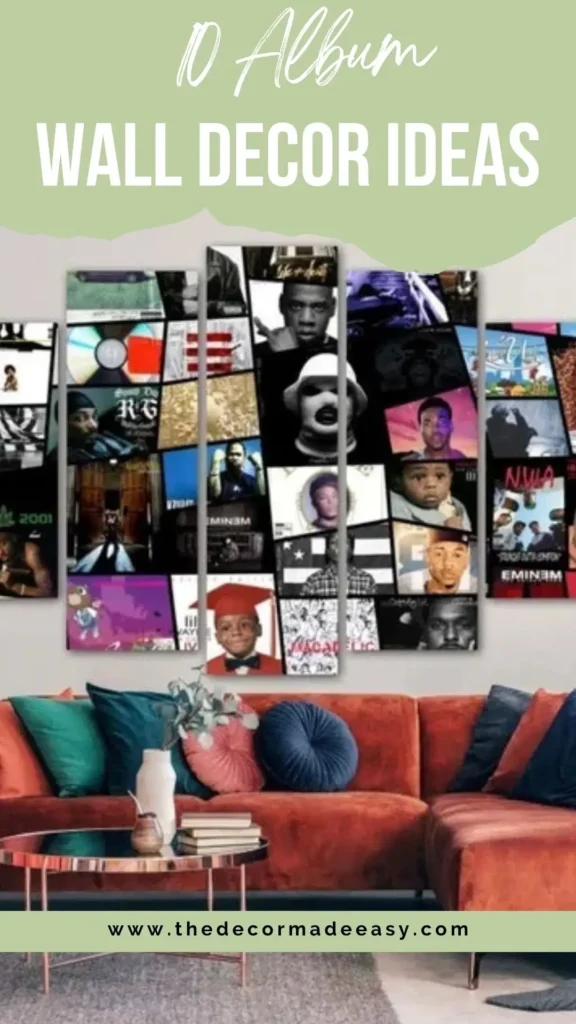
10. The Multi-Panel Canvas: One Big Statement Instead of Many Small Ones
Sometimes you don’t want a gallery wall. You want one powerful piece of art that references many covers at once. That’s exactly what this is.
A five-panel canvas split artwork depicting a dense collage of hip-hop album covers and artist portraits. Jay-Z, Eminem, 2Pac, Nas, Biggie, recognizable artwork woven together with portraits in black, white, and color. Mounted above a large sectional in terracotta orange, paired with a copper coffee table and teal accent pillows. The scale makes it the undisputed focal point of the entire room.
The multi-panel format solves a problem that traditional gallery walls create: visual complexity from many individual frames. Here, everything unifies into one statement piece that reads clearly from across the room and reads as art in a way scattered individual covers sometimes struggle to achieve.
Multi-panel canvas prints like this are available from numerous custom print services. You choose or provide the artwork concept, and the panels arrive ready to hang.
Scale matters here: a general guideline is that the total width of your multi-panel display should be 60 to 75% of your sofa width. Wide enough to anchor the space, not so wide it overwhelms it.
Practical Tips Before You Start Putting Holes in the Wall
A few things worth thinking through before you commit:
Frame consistency matters more than you expect. Matching frames, even cheap ones, elevate a collection from “random stuff on a wall” to a considered display. The exception is a full maximalist collage, where inconsistency becomes part of the aesthetic on purpose.
Think about your wall color before buying frames:
- Black frames work on almost any background
- Warm wood tones pair best with neutral or warm-toned walls
- White frames look clean and modern but show misalignment more than any other option
For print sourcing, you’ve got options:
- Print at home on cardstock
- Order through an online print service (many offer same-day pickup)
- Use actual physical album covers from your collection
Original covers have an authenticity that prints can’t fully replicate. The slight aging, the cardboard texture, the occasional notch-cut or sticker, these details matter to the people who notice them.
| Display Style | Best Wall Space | Frame Type | Difficulty |
|---|---|---|---|
| Single-artist grid | Large feature wall | Matching square frames | Medium |
| Three-row sofa display | Above sofa | Warm wood LP frames | Easy |
| Portrait format classics | Small-medium wall | Black with white mat | Easy |
| Maximalist collage | Entire room wall | Mixed or none | Hard |
| Polaroid tracklist grid | Large flat wall | None (tape mount) | Medium |
| Multi-panel canvas | Feature wall | N/A (canvas) | Easy |
| Vinyl and prints mixed | Bedroom wall | Mixed | Medium |
| Bold background grid | Accent wall | None | Easy |
Your Music Deserves Wall Space
Here’s the thing about album cover wall decor that makes it genuinely different from most decorating decisions: it gets better the more personal it becomes. Generic prints are interchangeable. The cover of the album you played on repeat at 17, or the record you and someone you loved passed back and forth, carries weight that no stock photograph ever could.
The ten ideas here span decades, genres, budgets, and personalities. Some needed careful planning and matching hardware. Others needed tape and enthusiasm. What they all share is specificity. Each one reflects real taste rather than a designer’s safe, neutral choices.
Start with what you actually love. Figure out your wall space and how formal or casual the room needs to feel. Then pick the approach that fits both the space and your personality.
The rest is just measuring twice, driving one nail, and letting your music finally say something out loud.