Stop Ignoring Your Hallway: 12 Real-World Decor Ideas to Transform Your Entry
Let’s be honest. Your hallway is probably the most neglected space in your entire home. You walk through it 20 times a day, toss your keys somewhere near the console table, and never once think, “this space deserves better.”
Well, it does. And I’m here to fix that.
Your hallway is literally the first thing guests see when they walk in. It sets the tone for your entire home. Leaving it bare and boring is like wearing a stunning outfit with no shoes. Something’s just… missing.
Here are 12 real-world hallway wall decor ideas that actually work, from bold statement wallpaper to gallery walls to sleek timber slats. No staged showroom setups. No Pinterest-perfect spaces you could never recreate. Just genuinely good ideas you can actually use.
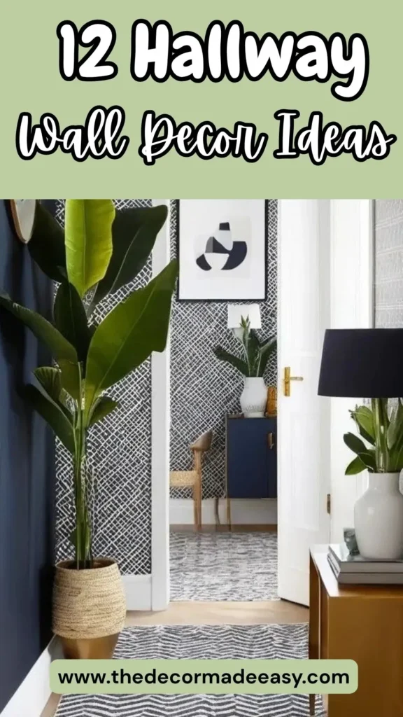
1. Bold Patterned Wallpaper With Layered Mirrors and Greenery
The most confident hallways don’t whisper. They walk in, drop their bag, and own the room.
This space does exactly that. Floor-to-ceiling black-and-white crosshatch wallpaper runs the full length of the hallway and continues into the connecting room, instantly pulling your eye forward. It’s dramatic in the best possible way.
Here’s the fun part: two round brass-framed mirrors sit flush against that busy patterned wall, which sounds like design chaos on paper. But somehow it works. The pattern almost swallows the mirrors, making them read as texture rather than decor. A tall bird-of-paradise plant in a woven basket anchors the left side, while a walnut console table on the right holds a ceramic lamp, a small plant, and a couple of stacked books.
The whole room operates within a tight navy, white, black, and warm brass palette. Nothing goes rogue. Every single piece earns its spot.
The takeaway here: Pick one strong wallpaper and let it do the heavy lifting. Resist the urge to pile on contrasting pieces. Repeat the materials already present, think brass, ceramic, woven textures, rather than introducing new ones. The wallpaper works hard so you don’t have to.
2. Oversized Abstract Canvas With a Minimal Console Setup
There’s a common myth that hallways are too narrow for large art. This setup laughs in the face of that myth.
A large abstract canvas in a slim gold frame hangs above a matte black console table on a warm white wall. The painting itself features broad strokes of gold leaf, deep blue, and textured charcoal. It’s the kind of piece that literally looks different depending on where you’re standing and how the light hits it.
The console holds exactly three items: a sculptural blue-gray ceramic lamp, a small white dish, and a ceramic pot with a fern frond. That’s it. No clutter. No unnecessary additions. One great painting plus three perfectly chosen objects equals a hallway that looks expensive without actually being expensive.
A brass multi-arm chandelier overhead casts warm light that catches the gold tones in the canvas. The black console grounds everything. Without that dark anchor at the base, the painting would visually float away.
Here’s your action plan: Invest in one genuinely bold large-format canvas. Scale it so the bottom edge sits roughly 6 to 8 inches above your console surface. Keep whatever sits on that console to three items max. Done. No overthinking required.
3. Dramatic Blue-Gray Paint With Original Victorian Architectural Details
Some hallways don’t need art on the walls because the walls themselves are the art. This Victorian-era space is proof.
The walls are painted a deep slate blue-gray, moody, rich, and completely different under natural light versus artificial light. What makes it extraordinary is the plaster ceiling molding: an elaborate carved cornice running the full perimeter, painted white to pop sharply against the deep blue. A ceiling rose at the center holds a vintage-style pendant light with a frosted ribbed globe shade.
The warm mahogany staircase banister with white painted risers adds a third material to the mix. And the only warm element in an otherwise cool palette? A single tan trench coat hanging from a dark wooden coat rack on the left wall. That coat does more styling work than most people’s entire hallway setups combined.
Here’s the genius move: White molding on white walls is basically invisible. White molding on deep blue-gray? That’s sculpture. If your home has original period features like picture rails, dado rails, corbels, or cornicing, paint the walls a rich, saturated color that makes those architectural details the star. No framed art needed. Not a single piece.
Also Read: 15 Budget-Friendly Bathroom Wall Decor Ideas That Look Expensive
4. Soft Botanical Canvas With a Warm Wood Console in a Light-Filled Hallway
Not every hallway needs drama. Some hallways just need to feel really good to walk through. This one absolutely nails that.
A medium-format painting in a warm oak frame hangs centered on a cream wall. The subject is a coastal path at golden hour, flanked by wildflowers in soft pinks, yellows, and whites. Below it, a simple four-legged light wood console holds a warm-toned ceramic lamp, two stacked hardcover books, and a fern in a white ribbed pot. A vintage-style faded rug in blush and cream runs beneath the table. Floor-to-ceiling windows flood everything with natural light.
Every element operates within the same warm cream-to-blush palette. The only green note is the fern, which reads as fresh rather than out of place. Every texture is soft, matte ceramic, worn fabric, natural wood grain, and the overall effect is deeply, genuinely calming.
This approach works especially well for hallways connecting busier rooms. It creates a breath between spaces rather than demanding attention. If your living room or kitchen leans maximalist, a hallway like this is the visual exhale your home actually needs.
5. Harlequin Diamond Wallpaper With Candlelit Sconces and a Vintage Runner
This hallway rewards a second look. On first glance it reads as atmospheric and slightly dramatic. On second glance, you realize just how precisely it’s all balanced.
Large-scale harlequin diamond wallpaper in muted taupe and cream covers every wall surface, including the ceiling panel. A crystal pendant lantern hangs at center, casting warm light that shifts the diamond shapes between flat and dimensional depending on the angle. On the right wall, two dark walnut bracket shelves hold large glass hurricane vases with pillar candles. The warm amber glow of those candles softens what could otherwise feel like a cold, graphic pattern.
A vintage floral runner rug in deep burgundy and brown runs the full length of the hallway over wide-plank hardwood floors. Small framed prints at varying heights break up the continuous wallpaper rhythm without fighting it.
Here’s what I love most about this design: it uses pattern as a neutral. Taupe-and-cream diamonds sound incredibly busy, but because the tones are muted, the effect reads as refined rather than chaotic. And extending the wallpaper to the ceiling? That removes the visual “cut” at the crown molding line, making the hallway feel like an actual intentional room rather than just a corridor you pass through.
6. Dark Textured Abstract Art Flanked by Sculptural Brass Sconces
This is the kind of hallway you’d find in a five-star boutique hotel. Except someone actually lives here. Lucky them.
A large vertical canvas in deep bronzed charcoal hangs centered on a matte taupe paneled wall. The painting has visible impasto texture, thick layered strokes that catch and scatter light depending on the angle. Two sculptural brass wall sconces sit on either side of the canvas, not simple candlestick fixtures but elongated cast-glass forms in smoky amber with brass hardware.
Below the canvas, a bench with a white ribbed cushion and dark espresso base runs the full width. Travertine tile floors and dark espresso wood door frames complete a palette of warm taupe, deep brown, brass, and off-white.
The symmetry here is absolute and intentional. Canvas, bench, sconces all sit on an invisible center axis, perfectly mirrored. That formal symmetry creates a sense of ceremony that makes simply walking through the hallway feel like an event. FYI, that’s a design flex most people never think to pull off.
If you’re drawn to this look but don’t have a full renovation budget, start with a pair of matching sconces and one large dark canvas. The symmetry does most of the heavy lifting. Two matching sconces instantly elevate any hallway wall, no joke.
Also Read: Stop Staring at Your Blank Kitchen Walls: 10 Decor Ideas That Actually Work
7. Stacked Timber Ledge Shelves With Landscape Photography and Plants
Gallery walls don’t always mean driving nails directly into plaster and hoping for the best. This setup offers a smarter, more flexible alternative. Renters, this one’s especially for you.
Two wide light oak timber ledge shelves run the length of a wall, stacked at roughly 36 inches and 60 inches from the floor. The upper shelf holds a mix of landscape photography prints in black and natural oak frames, leaned casually rather than hung. Small white ceramic vessels and a trailing pothos fill the gaps between frames.
The lower shelf takes a warmer approach: chunky cream and green textured throw cushions, a large fiddle-leaf fig in a white ceramic bowl, and a sculptural white conch shell with a stack of coffee table books. Woven rattan floor poufs sit below, adding another layer of texture at ground level.
The ledge shelf system wins because nothing is permanently committed to the wall except the brackets. Frames can be swapped seasonally, rearranged on a whim, or completely replaced without a single extra nail hole. It’s genuinely the most adaptable hallway wall decor approach on this entire list.
8. Children’s Art Gallery Wall With Matching White Frames
This might be the most emotionally effective wall in this entire collection. And honestly? It’s also really well designed.
Thirty-plus pieces of children’s artwork fill an entire wall, from near the floor to well above eye level. Crayon drawings, watercolors, painted hearts, abstract color splashes. The secret to why this works instead of looking chaotic? Every single piece is framed in either a white or light gray frame with consistent white matting.
That one decision transforms a refrigerator door situation into a proper gallery. The consistent framing provides structure. The artwork itself provides all the color and visual energy, bright reds, cerulean blues, acid yellow, purple. A clipboard with a drawing clipped in among the frames adds a charming practical touch for a space that presumably rotates new work in regularly.
Here’s the real lesson from this image: hallway wall decor doesn’t always need to be curated taste. Sometimes it just needs curated execution. The content is entirely child-led and gloriously unrefined. The presentation makes it art.
This exact same principle works for postcards, concert tickets, travel photos, or anything else that feels “too casual” for a wall display. Consistent framing with consistent matting is the single most effective trick for making a diverse collection look cohesive and intentional.
9. Botanical Prints in Bobbin Frames With a Statement Gold Leaning Mirror
The contrast between old and new is handled with real sophistication here, and I’m genuinely impressed by how well it all holds together.
On the left wall, five botanical prints hang in distinctive black bobbin-bead frames, the kind with a raised spherical border running around the entire edge. The prints show magnolias, insects, and botanical subjects on dark backgrounds, giving them a collector’s-cabinet quality. On the right, a full-length mirror with an ornately carved gold baroque frame leans casually against the wall rather than hanging from it.
Encaustic floor tiles in black, white, teal, and terracotta run from the hallway toward the staircase. Crown molding with carved detail at the stair arch adds another layer of period authenticity. Everything is playing at full volume, the bold tiles, the baroque mirror, the bobbin frames, yet because every element is period-influenced rather than contemporary, they all speak the same design language. Nothing clashes.
The leaning mirror is worth a specific mention as a hallway strategy. It avoids the commitment of wall hanging, adds height from floor level up, and introduces a slight informality that stops the space from feeling like a museum. It’s a low-effort move with a high-impact result.
Also Read: How to Make Your Living Room Wall Decor Look Intentional (Without the Designer Price Tag)
10. Staircase Gallery Wall With Paneling and Eclectic Framed Prints
If you have a staircase, you’re sitting on one of the best gallery wall opportunities in your entire home. This image shows exactly how to use it.
Black-painted banisters, spindles, and newel posts contrast against white wainscoting paneling on the staircase wall. The gallery extends from the landing level up the rake of the stair, mixing sizes and orientations freely. A large portrait of a cat in a striped jacket, pop art prints in pink and green, black-and-white photographs, abstract works. All frames are black. That single consistent choice creates the cohesion that allows content this varied to coexist without looking like a yard sale.
At the base of the stair, a large monstera in a striped planter adds a lush organic counterpoint to the graphic geometry of the black-and-white checkerboard tile floor.
Following the staircase rake with art is a commitment. You can’t simply measure and hang like you would on a flat wall. But the diagonal line created by the stair angle energizes the gallery in a way a flat wall simply can’t replicate. It’s worth the extra effort, I promise.
11. Black-and-White Family Photo Gallery With Organic Mirror and Console
Personal photographs in a hallway can easily tip into “this is just documentation” territory. This setup avoids that completely.
One full wall is dedicated to black-and-white family photography in matching black frames of varied sizes, ranging from roughly 5×7 up to 16×20, arranged in a loose grid that tightens toward the center. The consistency of the monochromatic treatment is the masterstroke. Because every photo is black and white, the gallery reads as a unified composition rather than a chronological jumble of random memories.
At the far end of the hallway, a dark burl-wood console table holds a bowl of oranges, a tall dark matte vase with dried branches, and two woven black baskets underneath. Above the console, an organic-form mirror with a thin black frame reflects the hallway back, adding depth and drawing the eye forward.
That wavy, amorphic mirror shape deserves a specific mention. In a hallway full of rectangular frames, that organic outline creates a visual punctuation mark. It signals: this is the destination.
Converting your favorite family images to black and white and printing them at varied coordinated sizes is honestly an afternoon project that results in something you’ll walk past every single day and never get tired of. Zero regrets.
12. Vertical Timber Slat Feature Wall With Japandi Console Styling
This is the most contemporary idea on this list, and honestly? It might have the broadest appeal of all twelve.
Full-height vertical timber slats in warm medium-oak tones cover one entire wall of a wide entryway, running floor to ceiling with clean shadow gaps between each slat. Against this textured backdrop, a slim black metal console table holds three items: a tall white textured ceramic vase with dried pampas grass, a matte black spherical lamp with a cream drum shade, and a smaller dark decorative sphere. A woven seagrass storage basket sits on the lower shelf.
Looking down the hallway, two black-framed minimal prints hang with a wall-mounted light fixture between them, and a circular mirror reflects the space at the far end. Herringbone hardwood floors and a gray linen runner ground the whole composition.
The timber slat wall works for three solid reasons:
- It adds dimension without requiring art or objects to create visual interest. The slats themselves create rhythm, light, and shadow naturally.
- It introduces warmth through material rather than color, so it works with almost any decor style.
- It’s relatively DIY-friendly. Pre-made acoustic slat panels are widely available and install directly over existing walls.
The Japandi console styling, pampas grass, organic ceramics, dark metal, natural fiber, complements the slats without duplicating their material. You get warmth from both elements but through different textures, which adds depth without making the space feel one-dimensional.
How to Pick the Right Hallway Wall Decor for Your Space
Before you sprint to the hardware store or start bookmarking wallpaper samples, take a beat. What does your hallway actually need?
A narrow Victorian terrace hallway calls for different solutions than a wide modern entryway. A rental with strict no-nail rules needs a completely different approach than a home you own. Here’s a quick breakdown to help you figure out your starting point:
| Approach | Best For | Difficulty |
|---|---|---|
| Bold patterned wallpaper | Any size hallway | Medium |
| Large single canvas | Wide hallways, tall walls | Easy |
| Architectural paint color | Period homes with molding | Easy |
| Ledge shelves with leaned art | Renters, flexible decorators | Medium |
| Timber slat feature wall | Modern or transitional homes | Medium-Advanced |
| Gallery wall with framed photos | Any size hallway | Medium |
| Leaning mirror | Narrow hallways, renters | Easy |
| Harlequin wallpaper | Narrow corridors, period homes | Advanced |
The one consistent lesson across all 12 examples: Commit to a palette and repeat it. Whether that’s brass and navy, black and white, or warm taupe and oak, the spaces that genuinely work best all operate within tight material constraints. Restraint within a defined palette creates cohesion. No defined palette creates noise.
Your Hallway Deserves a Point of View
Here’s the truth: your hallway is not a waiting area. It’s not a corridor. It’s not “just the bit between the door and the living room.”
It’s the first space every single guest experiences when they walk into your home. And it’s the last thing you see before you walk out every morning. That space shapes how you feel about every room you arrive in.
Every single one of these 12 examples makes the same argument in a different way: the space you move through matters just as much as the spaces you stay in.
That might mean bold harlequin wallpaper and candlelit sconces. It might mean one large canvas and three perfectly chosen objects on a console table. It might mean converting your favorite family photos to black and white and finally giving them a proper home.
What it definitely doesn’t mean is leaving a perfectly good wall blank while you wait for inspiration to magically arrive.
Pick one idea from this list. Just one. Start there. Your hallway is worth the effort and honestly? So are you.