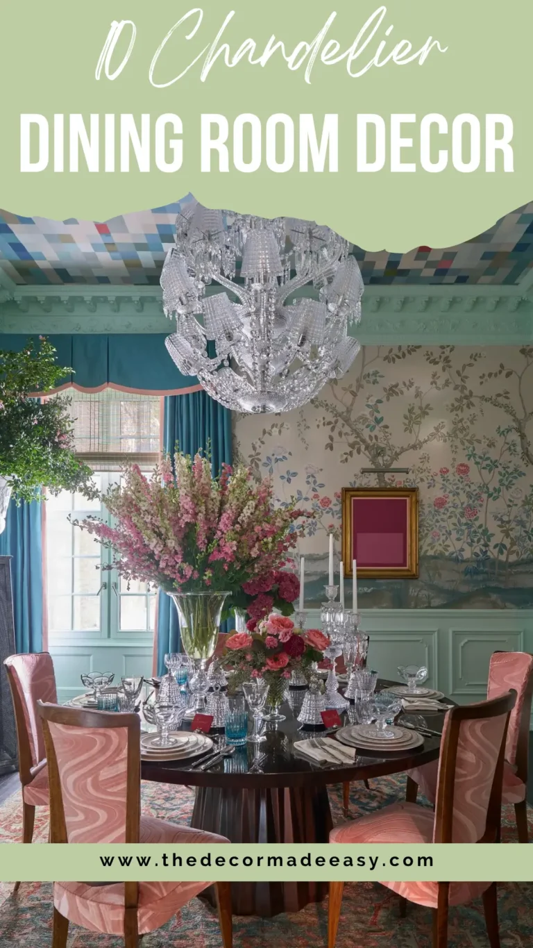
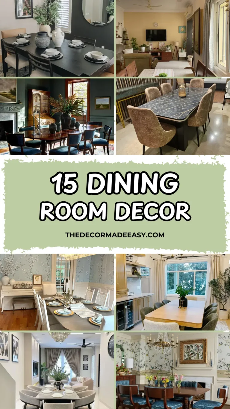
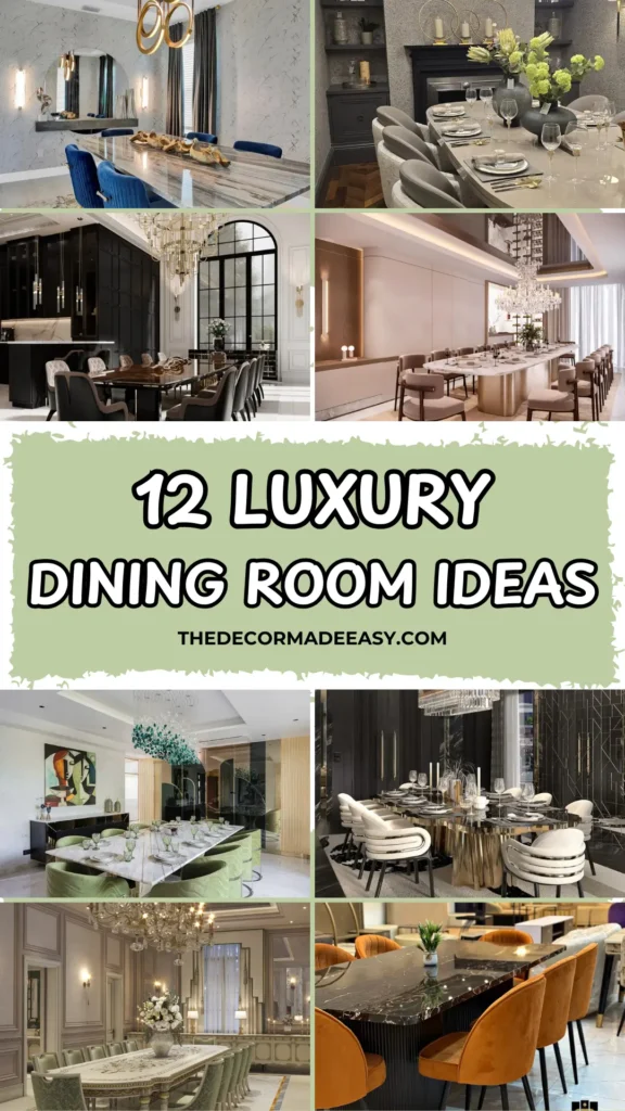
The New Standard: 12 Real-World Luxury Dining Rooms That Refuse to Settle
Let’s be honest. Most dining rooms are just… there. A table, some chairs, a light fixture that nobody really chose with intention, and a vibe that screams “we gave up after the couch.” If your dining room currently exists just to hold takeout containers and unopened mail, this one’s for you.
I went deep on 12 real luxury dining rooms from designers around the world, figured out exactly what makes each one work, and broke down how you can actually use those ideas in your own space.
No fantasy renders that exist only on Pinterest. These are rooms where real people sit down, eat, and genuinely don’t want to leave. Let’s get into it.
1. The Gold-Accented Contemporary Room That Layers Texture Without Looking Extra
There’s a thin line between “layered and rich” and “I bought everything at once.” This room from Design Touch Studio walks that line perfectly.
The foundation is warm beige travertine flooring. A fluted grey accent wall adds architectural interest. Two abstract artworks in mustard yellow and charcoal bring just enough color. Every single element earns its spot.
Here’s what I love most about it: the gold doesn’t slap you in the face. It shows up quietly in the candleholders, the pendant light canopy, and tiny chair medallions, creating a throughline that ties everything together without screaming “I love gold” at every guest.
A crystal pendant light with a gold canopy hangs overhead, catching warm recessed downlights for that one perfect moment of glamour. Eight slim slate-grey upholstered chairs keep the eye moving rather than anchoring it in one place. On the opposite wall, a gallery of decorative plates in varying sizes adds personality without demanding attention. Basically, the room knows when to talk and when to shut up.
How to steal this look:
- Start with neutral flooring and walls in warm beige or greige
- Add texture through one architectural element like fluting or paneling
- Pick one accent color and repeat it in small, intentional doses
- Practice restraint. Seriously. The restraint is the whole point.
2. The Classic Elegance Room With a Crystal Chandelier That Proved Me Wrong
I’ll admit it. My first instinct was skepticism. A glass-top table in a space this formal? That sounds like a recipe for cold, clinical, and kind of sad. But this rendering by Mehraaz Group completely flipped my thinking.
The large rectangular glass table sits on carved walnut legs, surrounded by high-backed ivory linen chairs with brass nail-head trim. Traditional silhouette, yes. But the glass tabletop keeps it from feeling like a furniture museum. You can see the rug underneath, which visually opens up the whole room.
The ceiling is doing the real work here. A rectangular crystal chandelier hangs inside a dark coffered recess, and that contrast makes it glitter like crazy. Most people treat ceilings like they don’t exist. This room treats the ceiling like prime real estate, and it pays off.
Large black-framed glass panels reflect the interior and basically double the perceived size. Two botanical canvases in sage green add the only real color, and it’s perfectly dialed in.
Key takeaway: reflective surfaces plus a considered ceiling treatment equals a room that feels twice as big and three times as elegant. Write that one down.
3. The Grand Tropical Dining Room That Uses the Outdoors as a Design Element
Most luxury dining room ideas completely ignore what’s outside the window. This one makes the outdoors the whole point.
Floor-to-ceiling sliding glass doors open directly onto a palm-lined pool terrace. Natural light floods in. The view becomes part of the room. It’s genuinely one of the smartest design moves I’ve seen in this entire collection.
The marble table is square, substantial, and built to anchor the space. Cream leather chairs on walnut frames keep the palette light enough to let the view breathe. A multi-tiered crystal and brass chandelier handles the drama overhead while natural light does the heavy lifting during the day.
On the far wall, a warm walnut sideboard holds ceramic vases, brass lanterns, and table lamps arranged with that “effortless” look that actually takes a really long time to perfect. A soft grey and cream abstract painting grounds it all.
The real lesson: your view is a design element. If you have access to greenery, natural light, or any outdoor space at all, orient your dining room around it. Frame the window. Use sheer curtains that filter light instead of killing it. The outside can make your inside feel more expensive without costing you anything extra.
| Feature | Design Approach | Effect |
|---|---|---|
| Indoor-outdoor connection | Floor-to-ceiling sliding doors | Expands space, adds natural light |
| Ceiling treatment | Coffered with LED cove lighting | Adds warmth and depth |
| Table material | Thick marble slab | Anchors the room |
| Chair upholstery | Cream leather | Keeps palette light |
| Wall art | Abstract in neutral tones | Decorates without competing with the view |
| Chandelier | Crystal and brass, multi-tiered | Provides overhead drama |
Also Read: From Pinterest Rabbit Holes to Reality: 13 Round Table Dining Room Ideas for Real Homes
4. The Baroque Maximalist Room That Absolutely Goes for It
Some rooms whisper. This one sends a formal invitation, arrives early, and takes the best seat.
The ornate white plasterwork ceiling, covered in sculpted foliage, scrolls, and medallions, is the single most striking architectural feature in this entire collection. It earns every square centimeter of attention it gets.
Two towering gold candelabra chandeliers descend in stacked formations of brass arms and candle-style bulbs. Theatrical? Absolutely. Dark ebony wall panels and cabinetry create the contrast that stops the whole room from dissolving into a cream fog. A dramatic arched steel-and-glass window fills the space with light and garden greenery from outside.
The dining table is long, dark-lacquered with gold edge detailing. The mix of tufted cream chairs and charcoal velvet chairs with gold legs adds interest without chaos. Pale veined marble flooring keeps the base quiet while everything above competes magnificently for attention.
What I genuinely respect here: the designer committed fully. Dark against white. Baroque against modern. Ornate plasterwork against sleek lacquered cabinetry. This room shouldn’t work as well as it does, but full commitment is what saves it. Half-measures in maximalist design always, always fail. Go all in or go home.
5. The Long Banquet Hall With a Ceiling That Steals the Show
Designing a dining room for 14+ people without it feeling like a corporate boardroom is genuinely hard. This concept cracks it with one brilliant ceiling move.
A curved floating panel in dark bronze with a high-gloss lacquered underside creates a dramatic mirrored soffit above the dining area. The reflective ceiling visually doubles the height and throws the already-substantial crystal chandelier back into the room as a reflection, creating the effect of two chandeliers at once. Warm LED strips rim the edge and cast soft amber glow down the walls.
Below, a long oval-ended table with a white marble top and brushed gold drum base anchors the space. Blush-pink velvet barrel chairs surround it, because apparently someone made a great chair color decision and I respect it. Floor-length white curtains on one wall diffuse daylight into a soft, even wash.
The design principle here is clean: pick one bold idea and let everything else support it. If you have a long dining room with decent ceiling height, a dropped panel with a lacquered or mirrored underside is one of the highest-impact moves available. It adds vertical interest, improves acoustics slightly, and gives the chandelier something beautiful to bounce off.
6. The European Royal Dining Room With a Hand-Painted Table That Belongs in a Museum
This room makes no apologies for being extremely, unapologetically formal. And honestly? I respect that.
Every detail references 18th-century French and Italian palace interiors. Paneled dove-grey walls with gilded molding. Parquet-style marble flooring with a decorative gold border inlay. Boiserie detailing at the cornices. It could easily tip into costume, but it’s executed with such consistency that it reads as conviction instead.
The centerpiece is the hand-painted dining table. An elongated oval form finished in cream with gilded floral inlays across the surface. It’s the kind of piece you’d find in a museum, yet here it’s casually set for dinner with fresh white roses. The twelve surrounding chairs in sage green damask with carved gilded frames manage to feel both historical and surprisingly fresh. That color choice alone is doing a lot of work.
Twin antique brass-and-crystal chandeliers drip with crystal drops above. Wall sconces provide secondary lighting. Sheer curtains filter daylight from the tall rear window.
My big takeaway from this room: material authenticity matters more than quantity. Every surface here is what it claims to be. Carved wood. Woven damask. Hand-painted lacquer. Real marble. That authenticity creates depth that no laminate or printed vinyl can fake. If your budget forces compromises, put your money into one or two genuinely crafted pieces and keep everything else simple.
Also Read: 12 Steal-Worthy Ideas for Your Modern Farmhouse Dining Room
7. The Bold Black Marble and Amber Velvet Room That Surprised Me
This one came from a furniture showroom photograph. You can see other pieces in the background. But the dining set itself is so striking it works as a complete design study on its own.
The polished black marble tabletop with dramatic white veining sits on a fluted cylindrical black lacquered base. Two different high-contrast textures on a single piece, and the result is a table that’s visually interesting before a single chair enters the picture.
Then someone chose amber velvet chairs and everything clicked.
Eight amber velvet dining chairs with barrel backs and slim black metal legs surround the table. Against black marble, that amber creates warmth that white, grey, or navy simply wouldn’t. It’s the kind of color decision that feels sophisticated specifically because it’s unexpected. Most people default to neutrals around a dark table, and that restraint tips into timidity.
If you’re investing in a statement dining table, be equally bold with the chairs. These two pieces will be seen together every single day. A neutral chair next to a dramatic table is a missed opportunity, full stop.
8. The Soft Transitional Room With an Arched Niche That Pulls You In
This room by Studio Shya sits comfortably between traditional and contemporary, and the arched niche detail is the one I keep mentally returning to.
A large arched architectural niche dominates one wall, housing a framed painting of a classical stone archway. An arch within an arch. The layering draws the eye inward in a way that feels almost cinematic. Table lamps flank it. A small sculptural horse figurine sits on the ledge. An illuminated built-in shelf nearby displays ceramic vessels in white and cream.
The marble-topped dining table is set with black-edged plates and crystal wine glasses. Oval-backed chairs in off-white upholstery on dark bronze frames surround it. That silhouette, sometimes called a Thonet-inspired oval back, is one of the most reliably elegant dining chair shapes you can choose.
Overhead, a sculptural chandelier with large petal-shaped Murano-style glass drops adds organic drama to an otherwise restrained space.
What this room proves: luxury doesn’t require dark palettes or heavy materials. Warmth and elegance can absolutely coexist in a room that’s almost entirely cream and white. Sometimes the lightest rooms feel the most refined.
9. The High-Gloss Dark Interior With a Gold Sculptural Table Base
Confidence. That’s the operating word for this one.
The entire room commits to dark and high-contrast. Charcoal fluted wall panels. Near-black marble cladding. Dark hardwood flooring. Then three elements cut through the darkness with precision: white chairs, a gold table base, and a crystal pendant overhead.
The table base alone is worth talking about. An oval black marble top sits on a sculpted liquid-gold base with organic folds that mimic draped fabric or poured metal. It functions as furniture and sculpture at the same time. The surrounding chairs are low-slung with curved barrel backs, layered ribbed white upholstery, and a thin gold trim strip at the base that ties them visually to the table.
An engraved mirror panel with geometric gold line work on one wall reflects the room without simply duplicating it. The etching adds texture while still expanding the space. A black-and-cream patterned rug grounds the seating area.
Fair warning: this room is not for the timid. Every surface is doing active work. Nothing is neutral by accident. If you’re drawn to this aesthetic, commit to the darkness completely. One pale wall would undo the entire thing.
Also Read: 15 Dining Room Lighting Ideas That’ll Make You Never Eat Under Boring Lights Again
10. The Navy Velvet and Gold Coffered Ceiling Room That Proves Ceilings Are Underrated
The ceiling in this room is the detail most people would never think to attempt and then immediately want the second they see it.
A deep charcoal grey ceiling panel is divided by bold brushed gold lattice trim in a geometric diamond grid. It sits somewhere between an Art Deco coffered ceiling and a contemporary architectural feature. It’s the first thing you notice when you enter, and it absolutely earns that attention.
Suspended from it is a pendant made of stacked gold rings of descending diameter, each lined with LED strip lighting. The rings echo the geometry of the ceiling grid above. It’s cohesive without being obvious.
Below, a large pale grey marble table with dramatic brown and charcoal veining anchors the space. Navy blue velvet dining chairs with gold hairpin legs surround it. Channel-tufted backs add texture. The jewel tone provides the room’s most saturated hue.
The material echo here is smart. Marble-effect wallcovering on every wall references the table surface and creates a deliberate design connection across the room. An arched mirror on the side wall reflects the overhead ring pendants, doubling their visual impact. The theme is gold and navy, and it’s executed with precision at every scale from ceiling grid down to chair leg finish.
11. The Emerald Chandelier Room Where One Color Axis Changes Everything
The chandelier stopped me in my tracks. A cascading form of clear glass orbs and tumbled emerald-green glass fragments, it looks less like a light fixture and more like something spectacular that froze mid-fall. It is unmistakably the room’s focal point, and everything else smartly arranges itself in support.
The white marble dining table below has natural grey veining and a brass-edged frame. Sage green velvet barrel chairs with chrome bases surround it. The green of the chairs and the green of the chandelier create a vertical color axis through the room that feels completely intentional and genuinely satisfying. Matching green drinking glasses on the table reinforce the theme without overdoing it. FYI, that level of detail is what separates a curated room from an assembled one.
On the far wall, a large Cubist-style painting in amber, rust, green, and black provides the art anchor. A sleek black sideboard with brass detailing sits beneath it. A full-height mirrored glass partition on one side reflects the entire space while adding the warm bronze cast of tinted glass.
The most instructive thing about this room: the color commitment. Sage green appears in the chairs, the chandelier, the glassware, and the painting. That repetition is what makes the space feel curated. Pick a non-obvious color, not grey, not beige, and repeat it deliberately across multiple elements.
12. The Fireside Dining Room That Proves Compact Spaces Can Still Feel Luxurious
The fireplace in this room does something that’s often completely overlooked: it gives the room a focal wall that has nothing to do with the dining table. That separation of gravity centers is what creates the room’s particular sense of balance.
A traditional black-framed fireplace sits centered on one wall, flanked by built-in alcove shelving in dark charcoal grey. Considered decorative objects fill the shelves: a tall ribbed jar, a small plant, a leather-bound book, a hammered brass vessel. Three gold hoop candle holders sit on the mantel. A lush arrangement of chartreuse hydrangeas and protea fills a dark ceramic vase at the table’s center.
The oval dining table in warm greige with a high-gloss ceramic surface is surrounded by barrel-back chairs upholstered in two fabrics. A textured ivory geometric fabric covers the exterior. Smooth warm grey covers the seat and inner back. That double-fabric treatment elevates what would otherwise be a simple chair into something noticeably more refined.
Herringbone walnut flooring adds warmth and pattern at ground level. A crystal droplet chandelier with gold internal framing casts warm light and glints off the gold flatware at each place setting. Textured silver-grey wallcovering ties the palette together.
This room is proof that you don’t need a ballroom. The space is relatively compact, yet it feels completely resolved, because every element from the fireplace to the flatware was chosen with intention.
What All 12 of These Rooms Actually Have in Common
After going through every single one of these spaces, a few truths kept showing up regardless of style, budget, or geography.
The chandelier is never an afterthought. In every room above, the overhead light fixture is a deliberate design statement, sized to the room and chosen to reinforce the overall vibe. If yours isn’t, that’s probably the first thing worth revisiting.
Material authenticity beats quantity every time. The rooms that feel most genuinely luxurious use fewer materials but use them with real confidence. One authentic marble surface outperforms ten convincing imitations, full stop.
Color takes courage. Amber velvet. Sage green. Navy blue. Emerald glass. The rooms that stick in the memory are the ones where someone made a color decision that most people would have talked themselves out of. Neutrals are safe. Safe is forgettable. IMO, the chair color is almost always where people play it too safe.
The ceiling is a surface. Coffered panels, reflective lacquer, geometric grids, cove lighting. Every room that achieved something memorable did something deliberate above the table. Look up. That’s often where the real opportunity is hiding.
These 12 rooms span continents, aesthetics, and design philosophies, but they all share one underlying quality: intention. Every choice made with a clear idea behind it. That’s the actual definition of luxury in interior design. Not expense. The absence of indifference.
So which of these rooms spoke to you? Pick one idea, just one, and actually try it. Your dining room deserves better than a table and adequate lighting. Go give it something to talk about.