10 Luxury Living Room Ideas That Actually Work in Real Homes
Let’s be honest. Most “luxury living room” articles are basically fiction. You know the ones. Staged magazine spreads where everything looks suspiciously perfect, zero evidence of human habitation, and a budget that could fund a small wedding.
I went hunting for something different. Real rooms. Real people. Real solutions that don’t require selling a kidney.
What I found? Ten living rooms where actual humans figured out how to make their space feel elevated without losing the “someone actually lives here” vibe. Some have cats. One has a Christmas tree chilling in the corner. And honestly? That’s exactly why they’re worth studying.
Mid-Century Meets Mountain View: Let Your Rug Do the Heavy Lifting
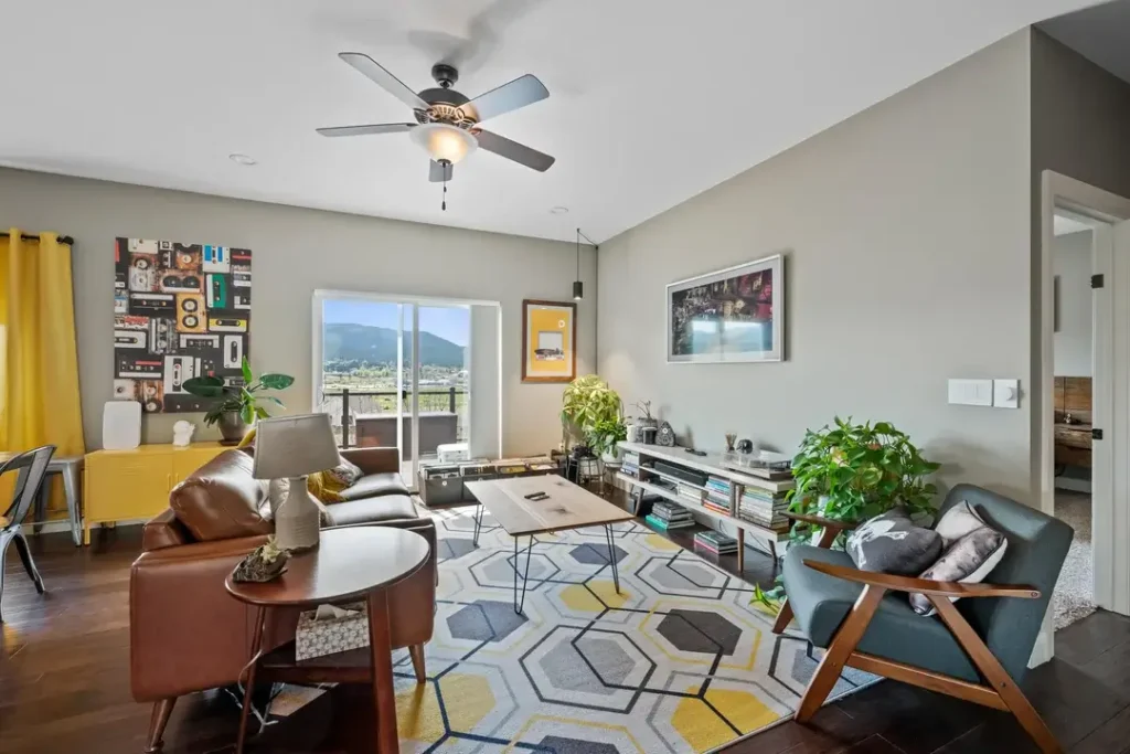
There’s a lot happening in this living room, and somehow none of it feels like chaos. Which is basically interior design magic.
Picture this: warm cognac leather sofas hanging out with a teal accent chair (tapered walnut legs, classic mid-century vibes). A large hexagonal-patterned area rug in grey, yellow, and white ties the whole crew together. The walls are grey, but that rug? It’s doing what paint or wallpaper would do in another room. Color and pattern from the floor up.
Here’s the trick that makes it work: Yellow shows up in exactly three places. The rug. A mustard cabinet against the far wall. The curtains near the window.
That repetition of a single accent color is interior design 101, and it works every single time. FYI, the mountain view through those sliding glass doors doesn’t hurt either. Natural light plus landscape equals a fourth wall no decorator could buy.
Want to recreate this?
- Start with the rug (geometric pattern, one dominant accent color)
- Echo that color in two other spots
- Keep walls neutral
- Let the rug become your palette
Everything else just responds to it.
Gallery Wall Meets Greenery: Your Personality Deserves Wall Space
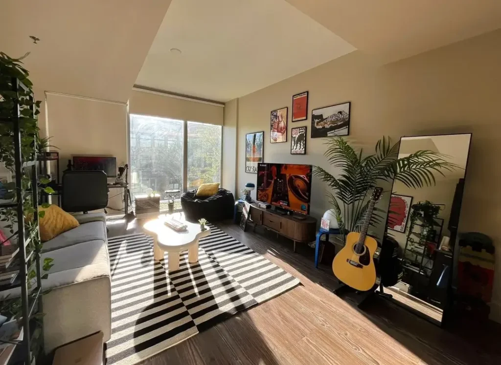
This is basically someone’s cultural biography on display. Concert posters, photography, graphic art. A cluster of framed pieces above a mid-century walnut media console. An acoustic guitar leaning casually against the wall. A tropical palm doing its thing in the corner.
A tall full-length mirror leans beside the TV, bouncing afternoon light across dark hardwood floors. The black-and-white striped rug is bold but grounds the seating area perfectly.
Why it works: Most people hang artwork too high and too sparsely. This gallery wall drops lower toward the console, connecting the vertical and horizontal planes. The plants (a large palm plus several smaller specimens on the shelving unit) bring organic softness that balances all those framed right angles.
Pro tip for your own gallery wall: Fill it more than feels comfortable. Tighter spacing between frames reads as intentional. Too much breathing room looks like you ran out of steam halfway through.
Pair it with at least one oversized plant for texture. Trust me on this one.
The Plant-Lover’s Sanctuary: When Greenery Becomes the Décor
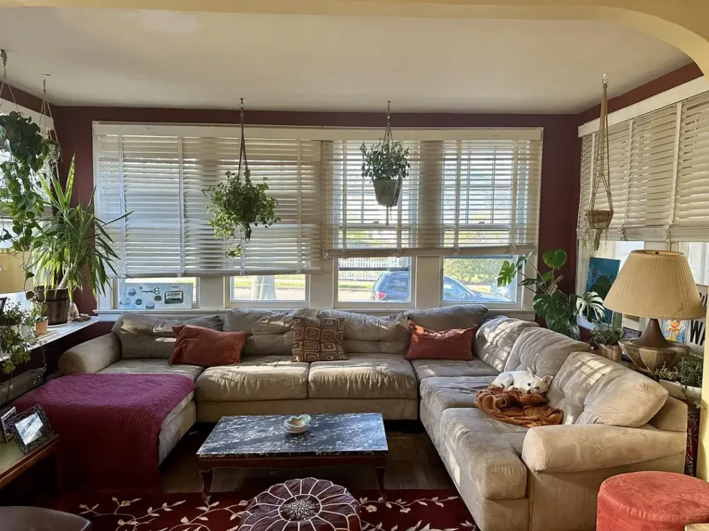
Someone looked at their bare walls and decided plants were the answer.
They were absolutely right.
Hanging planters dangle from the ceiling in front of wide windows with white wooden blinds. A large L-shaped sectional in soft beige fills most of the floor plan, dressed with rust-toned throw pillows and a burgundy throw blanket.
Now here’s where it gets bold. Deep cranberry-red walls. Not a color most people would attempt. But it creates this cocooning warmth that makes you want to spend every rainy afternoon right there.
The genius move? Those hanging plants serve as a living curtain layer between the blinds and the room. They soften the transition from inside to outside, filter light, and introduce vertical movement that pulls your eye up. Most living rooms completely ignore the ceiling. These planters claim it.
About that wall color: Burgundy reads sophisticated when balanced with natural textures like linen, plants, and woven rugs. It overwhelms a space when paired with too many hard surfaces.
If you’re tempted to try a deep wall color, commit to all four walls. Half-measures rarely work. Go big or go beige.
The Built-In Entertainment Wall That Changes Everything
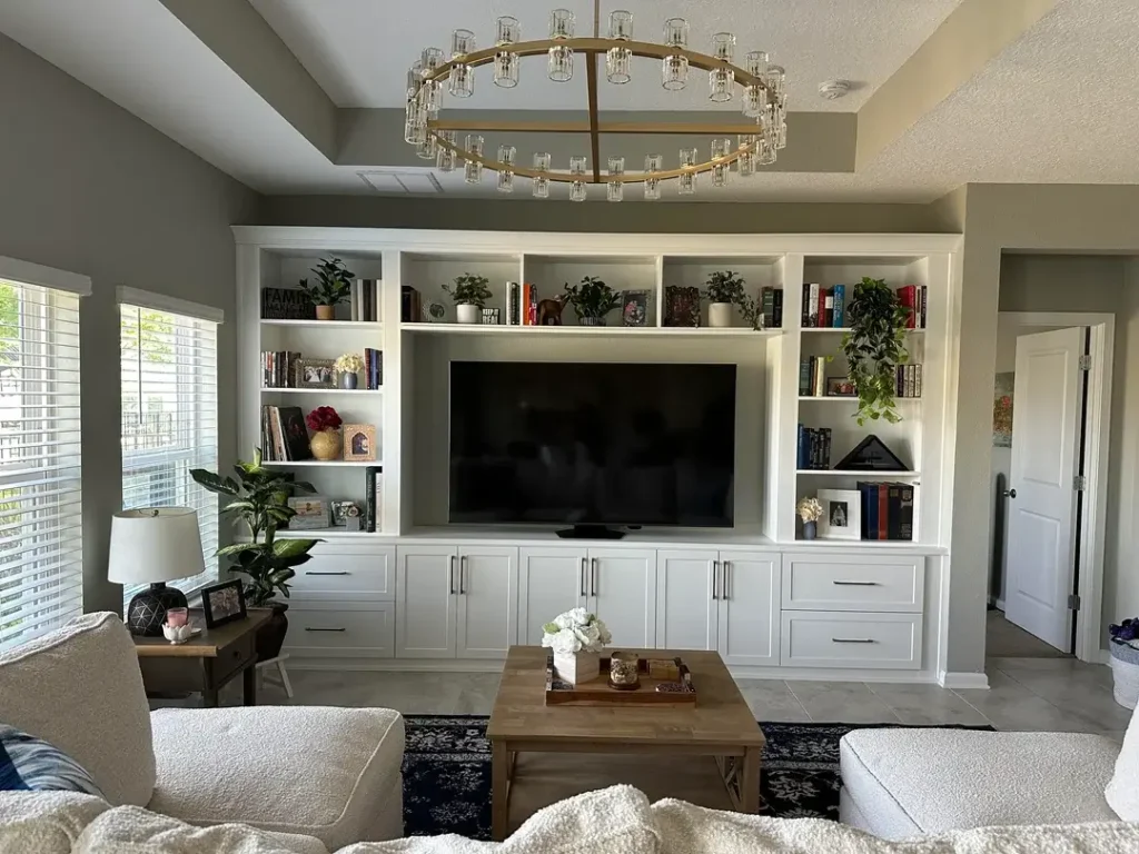
Some upgrades are cosmetic. A floor-to-ceiling custom built-in entertainment unit? That’s a structural shift in how a room functions and feels.
This white built-in spans the entire back wall, framing a large flatscreen TV within a recessed niche. Flanking shelves carry a curated mix of books, framed family photos, small plants, and decorative objects. Not crammed randomly. Organized by height and weight. Intentional.
Upper cabinets continue to the ceiling (hello, vertical storage). Below, a row of cabinetry with matte black bar-pull hardware hides everything that would otherwise clutter the room.
But here’s what elevates it from “nice renovation” to genuinely luxurious: A brass-and-crystal ring chandelier hanging above the seating area. That chandelier introduces glamour into what’s otherwise a clean, transitional aesthetic. The contrast between sparkle and crisp white millwork gives the room its personality.
Real talk about built-ins: They’re not cheap. But they solve more problems than any single piece of furniture can. Clutter, storage, visual anchoring, style. All at once.
Budget-friendly alternative? IKEA’s Billy bookcase system with added trim and paint creates a surprisingly convincing approximation.
Soft Bohemian Bliss: Making a High-Rise Feel Like Home
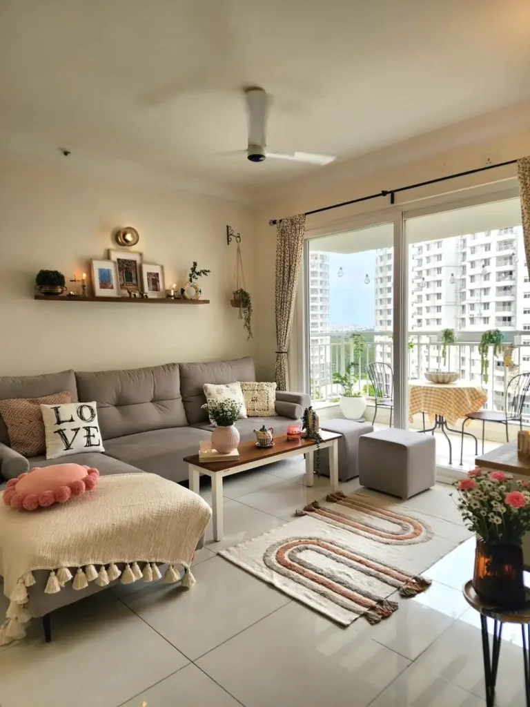
A condo living room that feels both airy and deeply cozy at the same time. Which is harder than it looks.
The foundation is a grey L-shaped sofa with a tufted back. Casual and comfortable without being shapeless. A long wooden floating shelf runs along one wall, dressed with framed prints, candles, brass decorative pieces, a small trailing plant, and a macramé hanger. The kind of eclectic shelf arrangement that looks effortless but takes several iterations to nail.
The rug features an abstract swirling design in blush, terracotta, and cream. It introduces the warmest tones in the room. Sliding glass doors open to a balcony with city skyline views, and floral-print curtains in soft beige and green frame the opening without blocking light.
What makes this work: That shelf. It sits at a height that connects upper and lower zones without the visual weight of a gallery wall.
The key insight: Vary the object heights on the shelf rather than lining things up at the same level. That variation creates visual rhythm. One tall item, two medium pieces, something small. Repeat.
The Crystal Chandelier Statement: When Lighting IS the Luxury
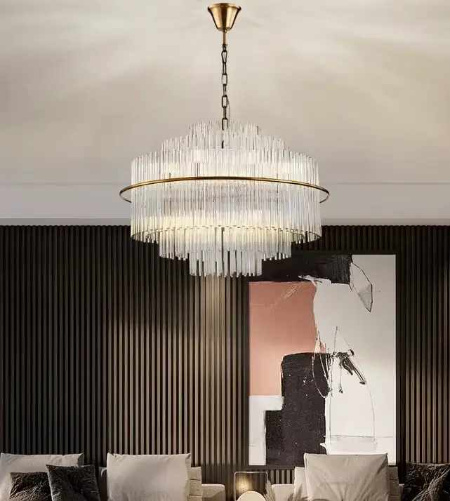
If there’s one upgrade that screams “luxury living room” louder than almost anything else, it’s the right light fixture.
This tiered crystal chandelier features two stacked rings of rectangular glass rods suspended from a brushed brass chain and canopy. The glass catches and scatters light in multiple directions, casting reflections across a dark slatted-wood accent wall behind it.
Below sits a low-profile seating arrangement with deep velvet cushions in charcoal and silver. To the right, a large abstract canvas in pink, black, and white. Exactly the kind of contemporary art that pairs well with a traditional fixture form.
Here’s a design principle worth internalizing: Contrast activates luxury materials. Gold looks richer against dark surfaces. Crystal looks more spectacular against moody backdrops. That slatted dark wall makes the brass and crystal read dramatically.
The most common chandelier mistake? Choosing fixtures that are too small. For a standard living room, aim for 24 to 36 inches in diameter. Go bigger than feels comfortable. You’ll almost always land closer to right.
Quick Chandelier Guide:
| Chandelier Style | Best Room Size | Ideal Ceiling Height |
|---|---|---|
| Tiered crystal | Large living rooms | 10 ft+ |
| Ring/hoop with glass | Medium to large | 9-12 ft |
| Drum shade | Small to medium | 8-10 ft |
| Globe pendant cluster | Any size | 8 ft+ |
| Linear suspension | Open-plan spaces | 9 ft+ |
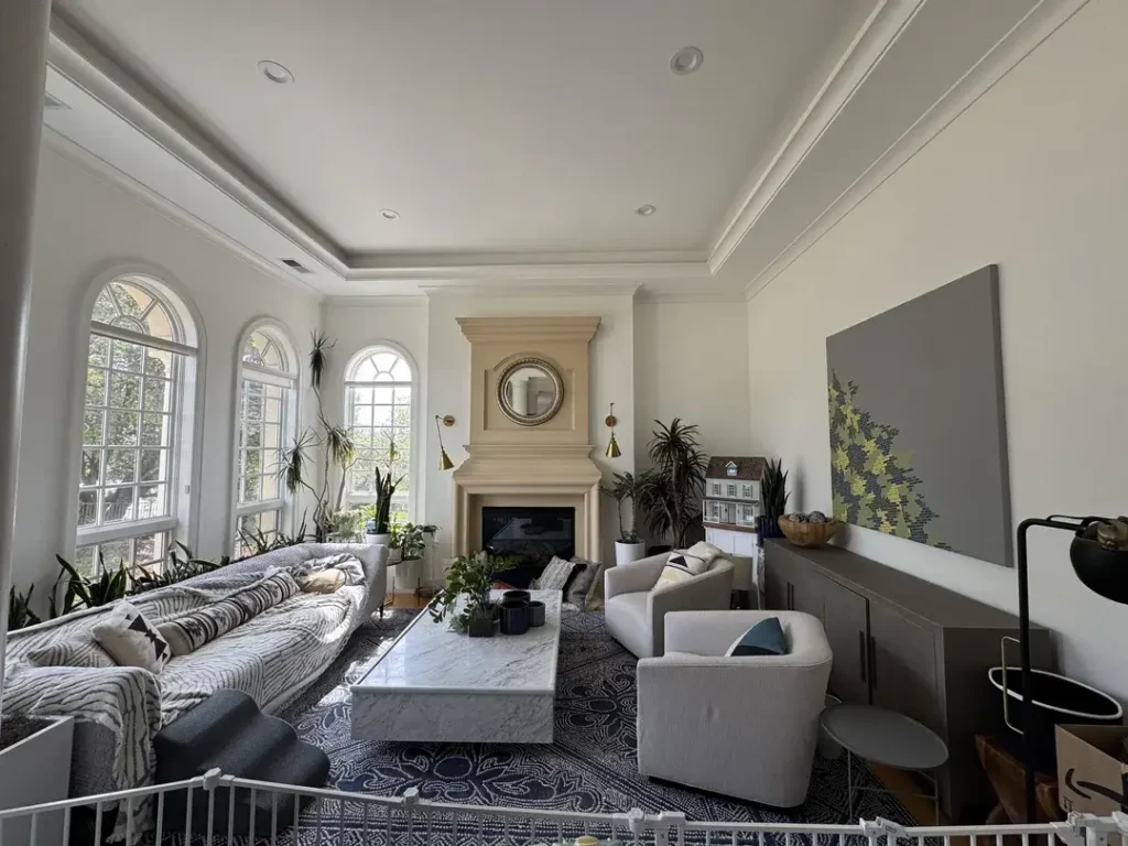
Classical Architecture Meets Contemporary Comfort: The Arched Window Living Room
Some rooms don’t need decoration. They need good furniture that gets out of the way.
This living room sits inside what appears to be a period home. The architecture alone does most of the work. Arched multi-pane windows flood one wall with structured natural light. The kind architects no longer build into standard construction. A limestone fireplace with a convex gold-framed mirror above it anchors the opposite end. Crown molding runs the full perimeter.
Within this framework, the furnishings stay deliberately restrained. A large patterned sectional in grey and ivory anchors the center. Two curved swivel chairs in light linen face the fireplace. A rectangular matte white marble coffee table with subtle grey veining provides a grounding horizontal plane.
What I appreciate most? The restraint. The temptation with an architecturally rich room is to over-furnish it. Instead, pieces complement the space without competing.
If your home has original architectural features (crown molding, arched openings, built-in alcoves) let them lead. Furniture and décor should support the architecture, not overwhelm it.
Warm Ambient Lighting at Night: The Cozy Evening Living Room
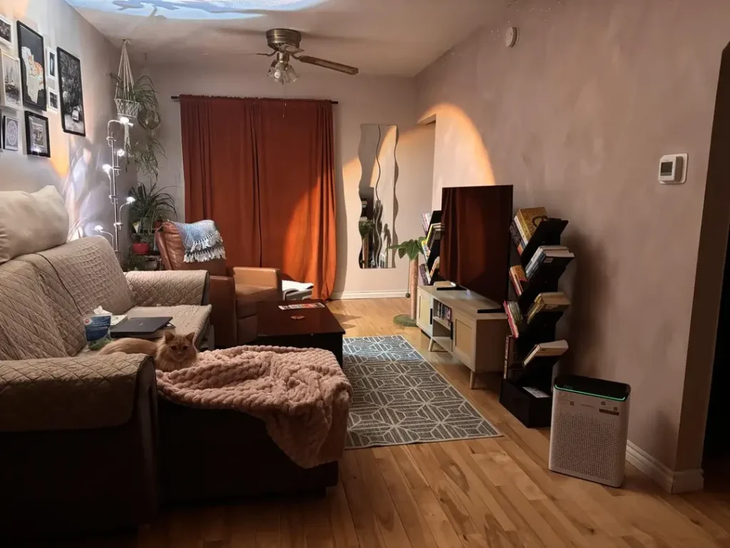
Here’s something most people miss: Daytime living rooms and evening living rooms are different rooms. Most people optimize for one and completely neglect the other.
This space, photographed at night, shows what a living room feels like when lighting is designed for atmosphere rather than just function.
A terracotta-colored floor-length curtain creates a rich warm backdrop. A galaxy projector casts soft, scattered light across the ceiling and upper walls. Not a traditional design choice, but wildly effective for creating an immersive evening atmosphere. A multi-arm arc floor lamp provides warm task lighting near the seating. A wavy sculptural mirror reflects warm light back into the room.
On the left wall, a gallery arrangement of framed prints in black frames reads as organized even in low light. A macramé wall hanging adds texture near a hanging potted plant.
The lesson here is layered lighting. Overhead lights create flat, institutional brightness. Layer in a floor lamp, a couple of table lamps, and one ambient or accent source, and the room transforms after dark.
Ask yourself: What does your living room feel like at 9 p.m.? If the answer is “like an office,” you’ve got work to do.
Floor-to-Ceiling Glass and the White Cloud Sofa: High-Rise Minimalism Done Right
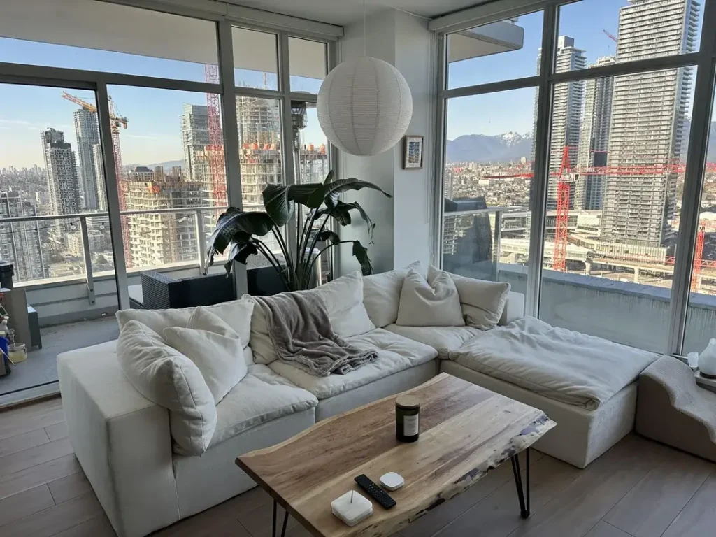
This is the room people picture when they say “luxury living.” Floor-to-ceiling glass on two walls. Panoramic city and mountain views. A sofa so deep and white it looks like a cloud you could disappear into for an entire afternoon.
The sofa is a modular cloud-style sectional in ivory linen. Low to the ground. Generously proportioned. Loose cushions with a soft grey throw casually draped across one corner.
The single most grounding element? A live-edge coffee table. Raw-edged walnut slab on black hairpin legs. It provides warmth and organic imperfection against all the white and glass. A large-leafed tropical plant stands in the corner. A simple white paper globe pendant hangs from the ceiling.
The restraint is the point. When your view is the décor, you add nothing that competes.
You don’t need a penthouse view to apply this principle. In any room with a strong architectural feature or large windows, simplifying everything else allows that feature to shine. Strip back. Let the room breathe. The empty space is part of the design.
Warm Heritage Pieces in a Simple Cottage Room: When Old Things Are the Luxury
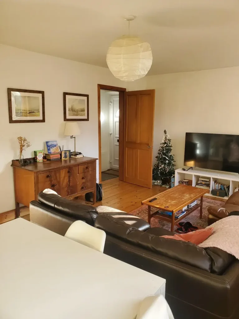
Not every luxury living room idea requires a renovation budget. Sometimes the luxury is in the edit. Recognizing that a well-chosen antique piece, properly placed, does more than any new furniture could.
This cottage living room is honest and unpretentious. Pine floors with a warm honey tone. A dark leather sofa and large white sectional face each other across a worn wooden coffee table. A vintage walnut chest of drawers against one wall serves as both storage and display surface. Stacked books, a dried flower arrangement, a small lamp with a neutral shade. Above it hang two simple landscape watercolors in matching dark-stained frames.
A small Christmas tree in the corner near the TV suggests this room is actually lived in. Which it clearly is.
Fun fact: The paper globe pendant (the same IKEA Regolit from the high-rise condo) works just as well here. Proving that a single well-considered light fixture transcends budget and setting.
What makes this room compelling? The confidence in its simplicity. No attempt to look like something it isn’t. The antique chest grounds the space with genuine history. The paired watercolors hang at the right height and distance apart.
Sometimes getting the basics right (proper picture hanging height, a genuinely good antique, clean floors) is more impactful than any expensive renovation.
What the Best Luxury Living Rooms Have in Common
After studying all ten spaces, a few patterns jump out.
Intentionality wins. The rooms that feel most elevated share one thing: every object is there for a reason. Functional, emotional, or aesthetic. No random accumulation of stuff.
Full commitment beats hedging. These rooms commit to their palettes rather than playing it safe with neutrals throughout. The burgundy room commits to drama. The high-rise commits to restraint. The mid-century room commits to yellow. Half-commitments produce forgettable rooms.
Lighting is the secret weapon. The chandelier room shows how one fixture changes everything. The evening room demonstrates how layered light transforms atmosphere after dark. Ceiling lights alone cannot create richness.
Personality matters most. And this one surprised me. The rooms with the most personality are where you can actually tell something about who lives there. The concert poster gallery. The guitar against the wall. The inherited antique chest. The ceiling projector.
Luxury isn’t just expensive materials. It’s the confidence to put the things you actually love in your space without apology.
Start there, and the rest tends to follow.
Now go look at your living room with fresh eyes. What’s one thing you could add, remove, or rearrange today? Even small moves in the right direction count.