Stop Wishing for More Square Footage: 15 Small Living Rooms That Prove Bigger Isn’t Better
You know that thing where you walk into your small living room, sigh dramatically, and wish you had a bigger place? Yeah, stop doing that.
Here’s the truth nobody tells you: small living rooms often end up looking better than huge ones. Big rooms can feel empty and soulless. Small rooms? They force you to make intentional choices. And intentional choices are what make a space feel like yours.
I pulled together 15 real examples, mostly from actual homes, not Pinterest-perfect showrooms where nobody has ever eaten cereal on the couch. Real homes with real compromises and real personalities.
Whether you’re dealing with a narrow layout, a studio apartment, or a room that just feels… meh, you’ll find something here you can actually use.
A Floor-to-Ceiling Room Divider That Doubles as Storage
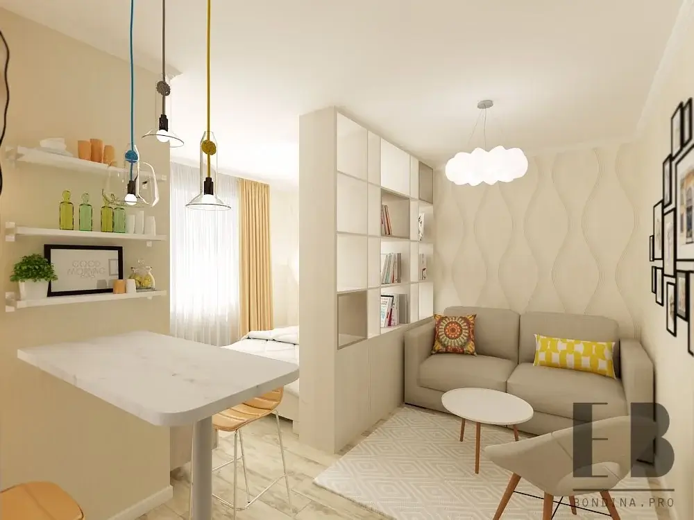
The Studio Apartment Problem, Solved
Splitting a studio into zones without making it feel like a prison cell? That’s one of the hardest design challenges out there. This room absolutely nails it.
A tall white shelving unit runs from floor to ceiling, separating the sleeping area from a compact living room. On the living side, you’ve got a low grey sofa with yellow and multicolored cushions, a small white oval coffee table, and a cream patterned rug. The walls sport a subtle wave-patterned wallpaper, and a cloud-shaped pendant light hangs overhead.
On the kitchen side, the designer added a bar-height white countertop with wooden stools, floating shelves lined with green glass bottles and small plants, and a trio of pendant lights in yellow, teal, and clear glass.
Why It Works
The divider separates zones visually while letting light pass through the open shelving cubes. Nothing feels boxed in. Warm cream tones tie both sides together even though each side serves a completely different function.
If you live in a studio, take this approach seriously. Here’s how to pull it off:
- Use a freestanding bookcase or modular shelving unit instead of built-ins
- Keep the tones light so the divider doesn’t feel like a wall
- Leave some sections open so your eye can travel through the space
- Keep it consistent with the rest of your color palette
A White Sectional and Elevated Plant Shelf Keep a Narrow Room Open
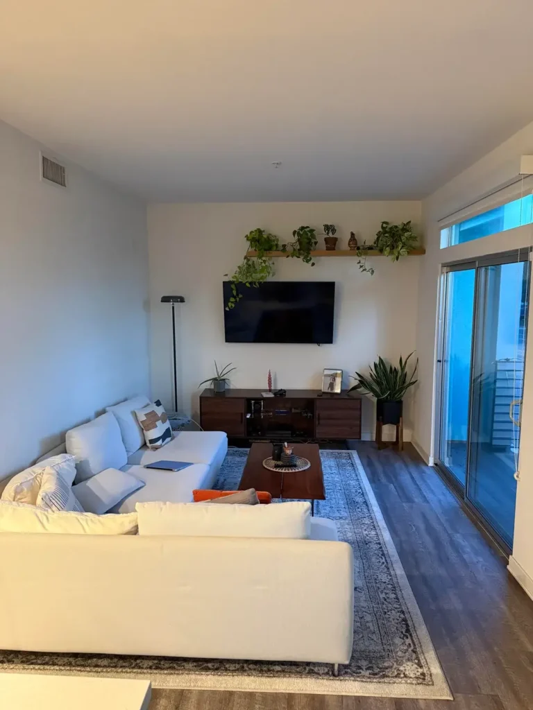
Stop Making Your Narrow Room Feel Like a Hallway
Narrow living rooms turn into glorified corridors real fast if you don’t plan carefully. This setup avoids that trap beautifully.
A large white cloud sectional anchors the left side. Opposite it sits a walnut media console with a wall-mounted TV. Dark hardwood floors run the length of the space. A blue-toned Persian-style rug grounds the seating area, and a dark walnut coffee table with a round tray sits at the center.
But here’s the star of the show: a single oak floating shelf positioned high above the TV, loaded with trailing pothos plants, a small sculptural vase, and a ceramic pot. A floor lamp with a dome shade stands in the far corner, and a large sliding glass door floods everything with natural light.
The Plant Shelf Is Doing More Than You Think
That shelf draws your eye upward, which makes the ceiling feel higher and the room feel longer instead of narrower. The trailing plants cascade down the wall and soften the hard geometry of the TV setup below. It’s a small move with a huge payoff.
A few takeaways for narrow rooms:
- Don’t push all furniture against the walls. Give the sectional some breathing room so the layout feels intentional.
- A white sofa keeps things bright even with dark flooring.
- One rug clearly defines your living area within the longer rectangle of the room.
A Plant-Filled Bohemian Living Room That Still Breathes
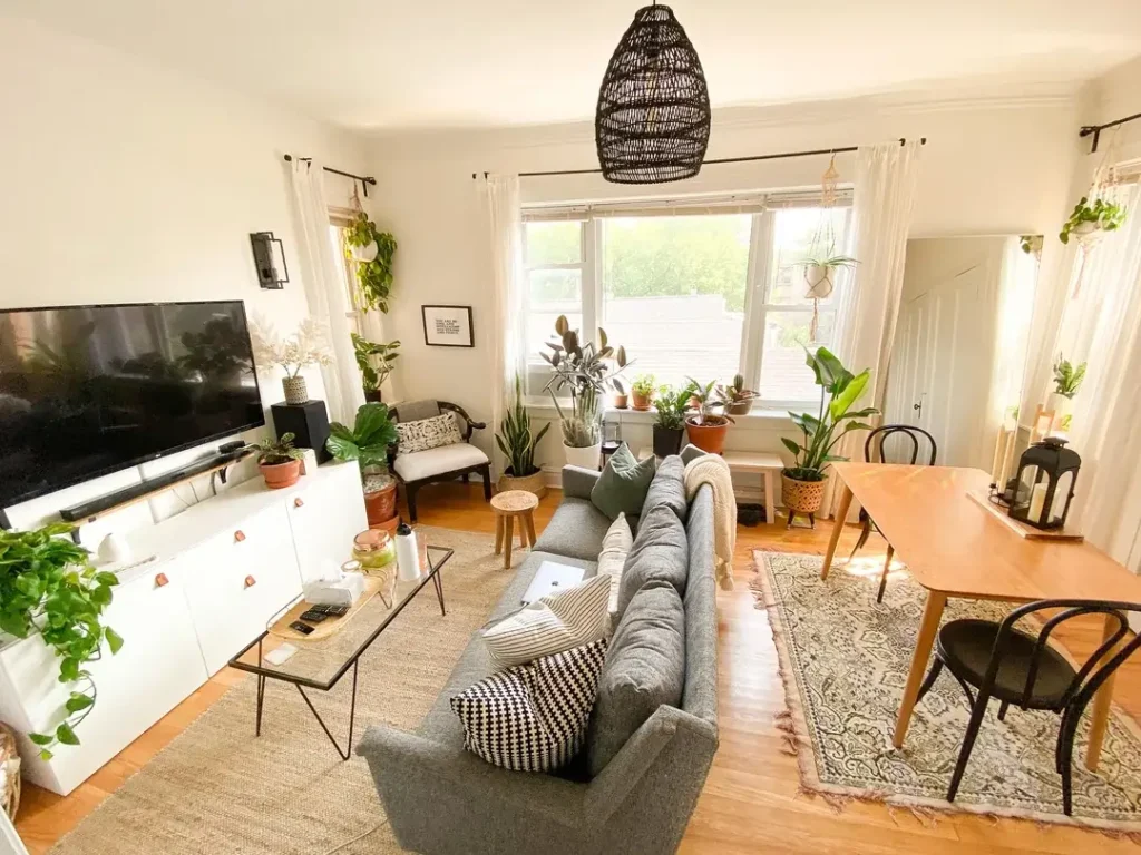
Yes, You Can Have 40 Plants Without It Looking Like a Mess
Some rooms look like they should feel cluttered but somehow feel alive instead. This is one of those rooms.
Dozens of plants in terracotta and ceramic pots cover every surface and windowsill. A grey upholstered sofa sits at the center on a natural jute rug, piled with striped, checked, and solid cushions. A glass and black metal coffee table holds a laptop and water bottle. Opposite the sofa, a white IKEA-style media cabinet with leather pull tabs houses a flat-screen TV.
A small warm oak dining table with two black bentwood chairs tucks in to the right. A dark brown wicker pendant lamp hangs overhead, and tall windows with floor-length white curtains let light pour in from multiple directions.
The Secret: Container Consistency
Nearly every plant pot is either terracotta or a muted ceramic tone. That creates a visual thread through what could otherwise feel chaotic. The furniture stays quiet (neutral grey sofa, natural wood, white storage), and all the personality comes from the plants and textile patterns.
Here’s what I genuinely love about this approach: you can build it in stages. You don’t need to buy forty plants on a Saturday. Start with three or four in similar pots near a window, then expand over time. The jute rug is also a smart pick because it reads as part of the natural palette instead of fighting it.
A Loft-Style Space That Uses Layered Lighting Like a Pro
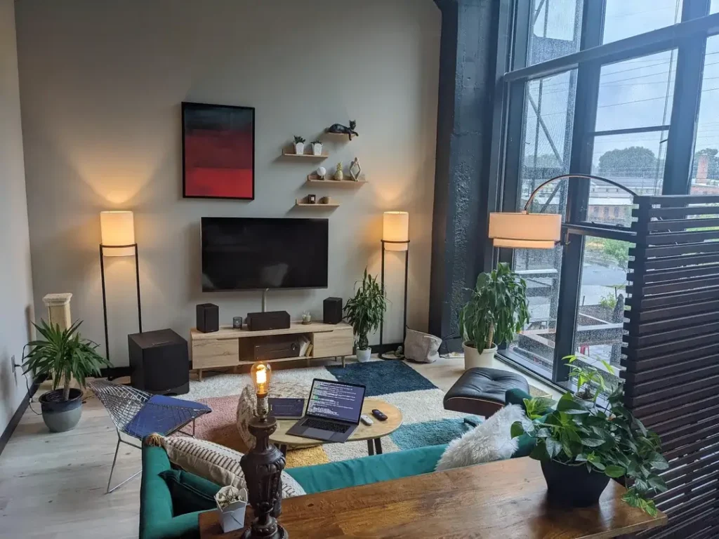
Ditch the Single Overhead Light, Seriously
This room stopped me in my tracks because the lighting strategy is something you rarely see executed this well in a small space.
High industrial ceilings sit next to a full-height steel-frame window overlooking a cityscape. A light oak TV console holds a mid-size screen flanked by two tall drum-shade floor lamps in matte black and white. Three asymmetric floating shelves above hold small plants, a sculptural cat figure, and a framed piece of red and black abstract art.
The seating includes a low teal sofa, a wire-frame accent chair, and a dark leather lounge chair with a matching ottoman. A colorful patchwork rug in blue, teal, yellow, red, and white covers light oak flooring. A live-edge wooden coffee table, a vintage ornate table lamp, and several potted plants (including a large fiddle-leaf fig) complete the scene.
The Lighting Is the Real Hero
Instead of relying on one ceiling fixture, this room uses multiple lamp sources at different heights. Here’s the breakdown:
- Two matching floor lamps frame the TV symmetrically
- A vintage table lamp adds warmth at a lower level
- The city window provides ambient glow
The result? A room that feels deeply atmospheric rather than harshly lit.
If your small living room has terrible ceiling lighting, study this approach. Two matching floor lamps flanking a focal point create instant structure. A table lamp on a coffee table adds personality without eating floor space.
A Dual-Purpose Living Room and Home Office That Actually Works
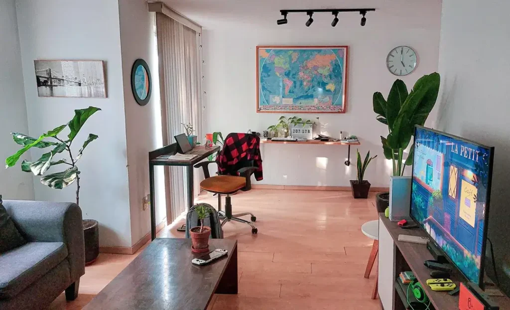
Not Just an Office That Reluctantly Shares Space With a Couch
Most work-from-home living rooms look like an office that grudgingly allowed a sofa to exist in the corner. This one gets the balance right.
On the left, a narrow black desk sits near a window, holding a laptop, a small plant, and a desk lamp. A brown leather-seated office chair rolls behind it. The back wall features a large framed world map as the central piece of art, flanked by a round blue mirror and a wall clock. A small grey armchair and dark coffee table sit to the right, with a TV console and large TV completing the living zone.
Three potted plants (fiddle-leaf fig, desktop greens, terracotta pot on the coffee table) distribute life throughout. Track lighting runs along the ceiling, and warm honey-toned laminate covers the floor.
One Big Piece of Art Beats Three Small Ones
The world map is both art and personality statement. It anchors the back wall by itself, no additional pieces needed. This is a super useful principle: in a multipurpose room where visual noise needs to stay low, one large meaningful piece of wall art beats three smaller mismatched ones every time.
The desk placement near the window gives you natural light during work hours, but it also means the work area doesn’t interrupt your sightlines when you’re chilling on the sofa. If you’re merging work and living spaces, separate by zone, not by furniture type. That’s the golden rule here.
An Eclectic, Color-Heavy Living Room That Goes All In
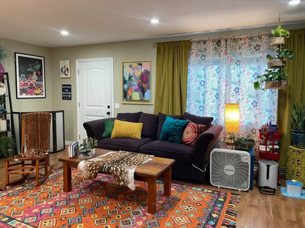
Halfway Measures Don’t Work in Maximalist Rooms
If you’re going bold, you’ve gotta commit. This room understands that and leans in completely.
A deep aubergine sofa dominates the center, piled with velvet cushions in mustard yellow, teal, and deep red with floral motifs. A large orange and red Moroccan-style rug with geometric shapes in pinks, blues, and greens covers the floor. A solid wooden coffee table has a deer-print hide draped over it. Sage green walls provide the backdrop, and a large abstract artwork in muted pink, yellow, and blue hangs above the sofa. A cluster of framed prints (including a colorful cat artwork and vintage graphic sign) hangs to the left.
Moss-green velvet drapes frame a window dressed in a blue floral botanical print curtain. Hanging planters in woven baskets cascade from a ceiling rod, and a wooden rocking chair with a woven throw adds a folk-craft vibe.
The Color Logic Is Sneakier Than It Looks
The walls are neutral sage, which keeps the room from feeling like a carnival. The rug provides the main color hit. The dark purple sofa grounds everything. The cushions, artwork, and curtains layer on top of that base without competing.
The rocking chair in a modern living room? Total surprise, and it works because the rest of the room has enough warmth and eclecticism to absorb it.
Want this kind of layered maximalist look in a small space? Here’s your game plan:
- Start with one dominant pattern (usually the rug)
- Choose a neutral or dark wall color
- Build your cushion and textile choices around the rug’s palette
A Family-Friendly Living Room With Bold Color and Zero Sacrifice
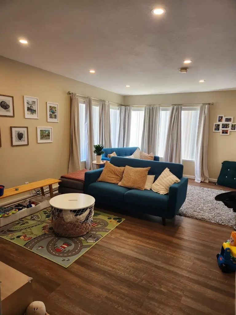
You Don’t Have to Give Up Style Just Because You Have Kids
Designing around young children usually means surrendering all aesthetic ambition. This room proves the compromise doesn’t have to go nearly as far as most parents assume.
Two teal blue sofas face each other across a large grey plush rug, with a kids’ road-map play rug on the left. A round white storage drum with a lid provides toy storage without looking like toy storage (genius). A wooden bench sits along the left wall. Warm sand-toned walls, four tall windows with floor-length grey-beige linen curtains, dark hardwood flooring, and recessed ceiling lights complete the setup.
Smart Choices for Real Life
The matching teal sofas are the boldest and smartest decision here. They’re vibrant enough to give the room character, but because both sofas match, everything reads as intentional instead of chaotic. Gallery walls of family photos add warmth without requiring expensive art.
But honestly? The round storage drum is the MVP. It provides a surface, acts as a coffee table alternative, and hides all the clutter inside. For rooms that double as play spaces, replacing a traditional coffee table with a lidded storage ottoman is one of the most practical upgrades you can make. It reduces injury risk AND eliminates the toy pile in one move. Win-win.
An All-Grey Monochrome Room That Feels Warm, Not Corporate
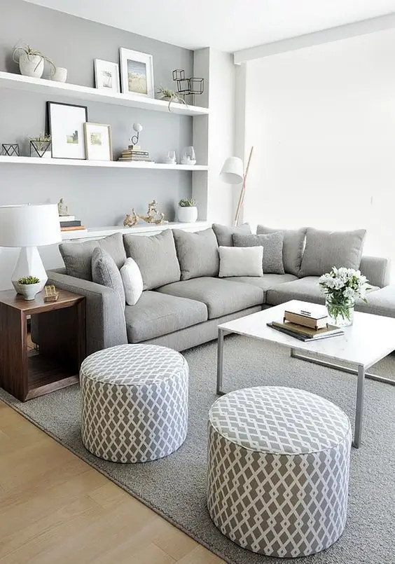
Grey Doesn’t Have to Mean Cold
Grey living rooms get a bad rap for feeling sterile and office-like. This one never does, and the reason is texture.
A large light grey L-shaped sectional fills the seating zone, stacked with grey and white cushions in varying shapes. Two round poufs with a geometric diamond lattice print in grey and white sit in front of a square white marble-top coffee table. A grey area rug underlies everything. Three wide floating shelves on the back wall hold framed art, ceramic sculptures, potted succulents, small geometric terrariums, art books, and glass vessels.
A table lamp with a white shade sits on a dark walnut side table, and a white arc floor lamp curves over the sectional from behind. The accent wall behind the shelves is painted medium grey, contrasting gently with the white wall on the left.
Why the Accent Wall and Poufs Matter
The single grey accent wall creates depth behind the shelves without making the room feel smaller. It gives the shelf objects a backdrop that makes them pop. Smart and subtle.
The poufs? They’re doing triple duty:
- Flexible seating when friends come over
- Footrests for daily lounging
- Easy to move when you need floor space
The key to making a monochrome palette work in small spaces: vary your materials. Velvet, woven fabric, ceramic, marble, lacquered wood. They all read differently even in the same color family. That’s exactly what this room demonstrates.
A Navy Sectional Against a Textured Brick Wall for Instant Depth
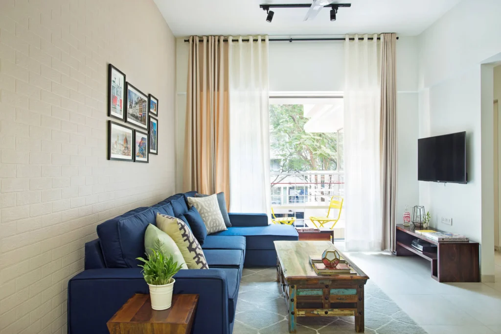
Adding Texture to Neutral Walls (Without Paint)
Neutral walls are the default for small rooms, and fair enough. But this room makes a strong case for adding texture to that neutrality instead of relying purely on flat paint.
A deep navy blue L-shaped sectional sits against a white brick-effect panel, giving texture without adding dark color. Patterned and plain cushions in sage green, grey, and off-white pile on the sofa. A rustic reclaimed wood coffee table with painted multicolored lower panels in blue, green, and teal sits in front. A cluster of four framed city photography prints in black frames hangs on the brick wall.
Floor-length cream and warm beige linen curtains hang beside a large balcony door that opens to a small outdoor space with yellow folding chairs. Track lighting runs along the ceiling, and a TV mounts on the plain white wall to the right.
Why This Is Perfect for Renters
The textured brick panel adds visual interest and warmth without introducing color. It’s an excellent option for renters who can’t paint or for anyone who wants to warm up a bright white room without committing to bold color.
The reclaimed wood coffee table deserves a shout-out too. The multicolored panels reference the navy sofa and the yellow balcony chairs, threading the color story through the room without overwhelming it. When you’re working with a strong main color like navy, finding pieces that echo it in smaller doses elsewhere works way better than adding competing colors.
Warm Lighting and a Gallery Wall Create a Rich, Intimate Space
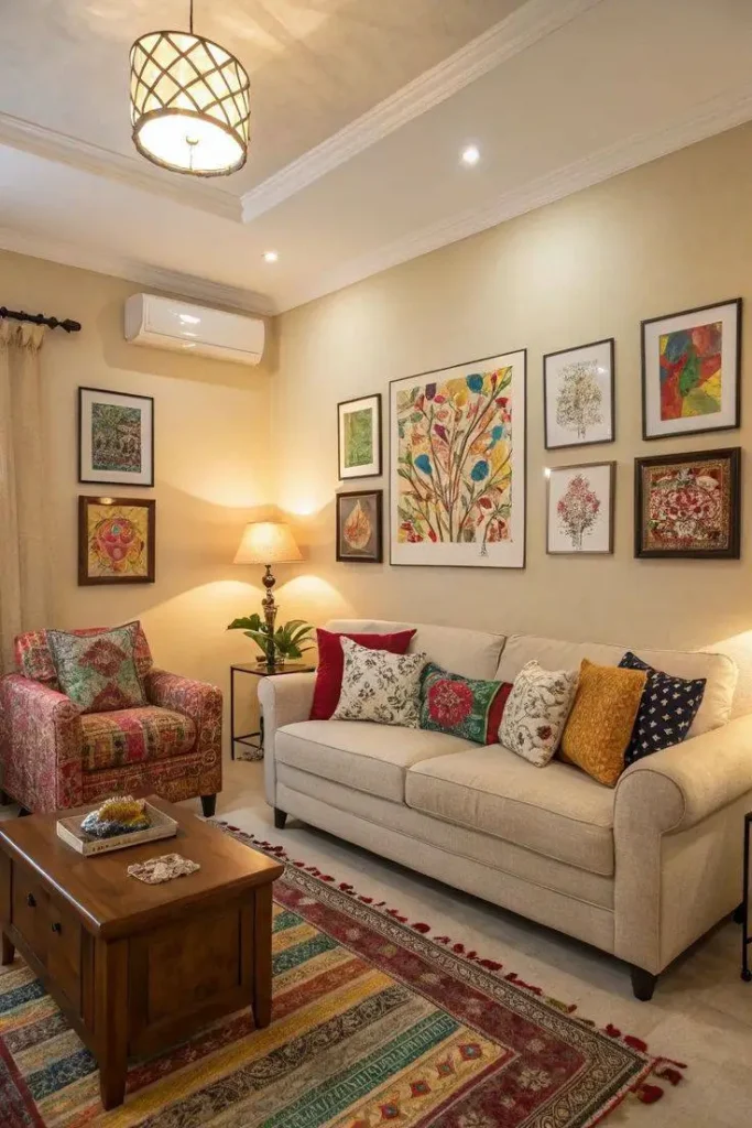
Three Warm Light Sources Change Everything
This room proves that a small living room doesn’t have to feel small when you handle the lighting correctly.
Warm cream walls pair with ornate white crown molding and a recessed lighting detail above the sofa area. A woven drum pendant light in warm amber tones drops from the center. A cream upholstered sofa with rolled arms gets layered with cushions in red, floral white, block-print patterns, mustard yellow, and deep navy. A deep red patterned armchair sits to the left. Between them, a standard lamp with a cream shade adds a third warm light source. A wooden coffee table sits at center.
The multi-frame gallery wall spans from the armchair to above the sofa, displaying botanical watercolors, floral illustrations, tree prints, and traditional art in dark wood and black frames. A striped traditional rug in red, mustard, blue, and cream tones with tassel edges covers the floor.
The Lighting and the Gallery Wall Are Both Doing Heavy Lifting
Three warm light sources working together make this room feel enveloping. The pendant, the recessed accent lights, and the standard lamp all emit the same amber warmth. No cool overhead fluorescent to flatten everything. IMO, this is one of the most high-impact, low-cost changes you can make to any living room.
The gallery wall is also worth studying. It extends well beyond the sofa width, covering most of the wall from floor to near-ceiling. Most people chicken out on this because it requires confidence and planning, but a gallery wall at this scale makes the ceiling feel taller and gives the room a sense of abundance.
Quick tips for pulling it off:
- Plan the arrangement on the floor first before touching a hammer
- Use consistent frame styles with mixed sizes
- Don’t stop short of the full wall width available to you
A Built-In Niche and Balcony Garden Create Calm in a Small Room
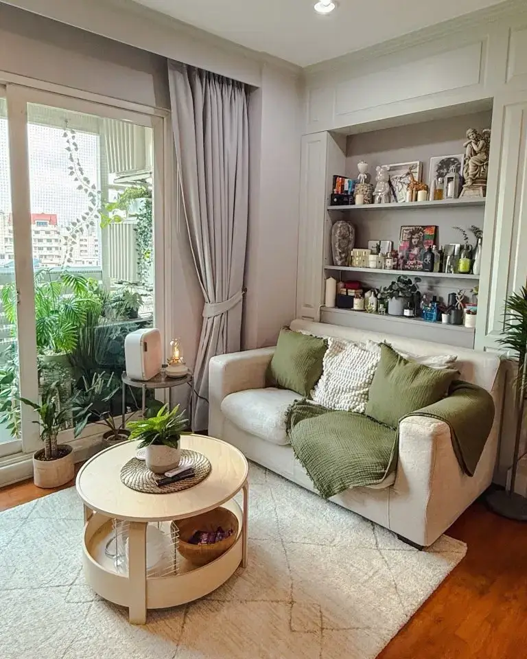
Your Balcony Is Part of Your Living Room (Treat It That Way)
Compact city apartments have to work extra hard to feel restful. This one earns that quality through two specific choices.
A cream upholstered loveseat sits against a wall with a built-in recessed shelving niche above and around it, framed in greige painted paneling. The shelves hold perfume bottles, candles, small sculptures, books, and ceramic figures. Sage green knit cushions, a cream textured cushion, and a draping sage green throw create a calming palette on the sofa. A round light wood coffee table with a lower shelf sits in front, topped with a woven tray and small plant.
A large sliding balcony door dressed with grey linen drapes reveals a lush, densely planted balcony filled with palms, ferns, and climbing vines. Warm honey oak floors and a single downlight over the sofa complete the scene.
Two Features That Make This Room Special
The balcony garden literally extends the living room. When the door is open (or even just visible through glass), those dense green plants become part of the interior view. The room feels larger and more alive than its square footage suggests. If you have any outdoor space, even a tiny balcony, investing in plants for it is one of the highest-value moves for your living room.
The built-in niche provides display and storage space without consuming any floor area. If your apartment has a niche or alcove, style it with personal objects at varying heights. The key is density of objects paired with consistency of color. These shelves hold a lot, but everything is muted and monochromatic enough to read as curated rather than cluttered.
A Stone Fireplace Wall Gives a Small Room Architectural Weight
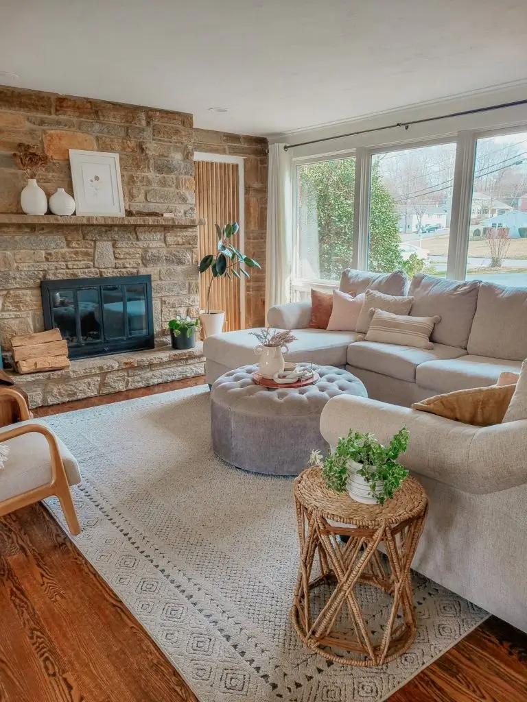
When the Architecture Does the Heavy Lifting
Some small living rooms feel flimsy no matter what you put in them. This one never will, because the architecture itself carries the room.
A full-height natural stone fireplace occupies the entire left wall, built from irregular fieldstone in warm tans, greys, and rust tones. White ceramic vases and a framed botanical print sit on the mantle. Firewood stacks in the hearth. A vertical wood slat panel in light birch runs floor-to-ceiling next to the fireplace. The main seating is a large greige sectional with dusty pink and cream cushions.
A large round tufted ottoman in mid-grey velvet serves as the coffee table, topped with a white ceramic pitcher holding dried botanicals on a terracotta tray. A rattan side table, a geometric cream and white rug, and large bay windows with white curtains complete the space. Warm russet hardwood runs underfoot.
The Smart Choice: Don’t Compete With Your Best Feature
Everything except the stone wall stays quiet in cream and grey tones. The sofa, the rug, the curtains, the ottoman. This allows the stone to read as the feature it is without the room turning into a mountain lodge showroom.
The round tufted ottoman as a coffee table substitute is worth copying. Here’s why:
- It softens the geometry of a rectangular room
- It works as extra seating when needed
- It gives the room an organic quality that a rigid coffee table can’t
- It doesn’t block movement through the space the way a rectangular table does
For small living rooms with a sectional, a large round ottoman at the center almost always beats a rectangular table.
Bold Mustard Window Trim and Built-In Bookshelves Transform a Narrow Room
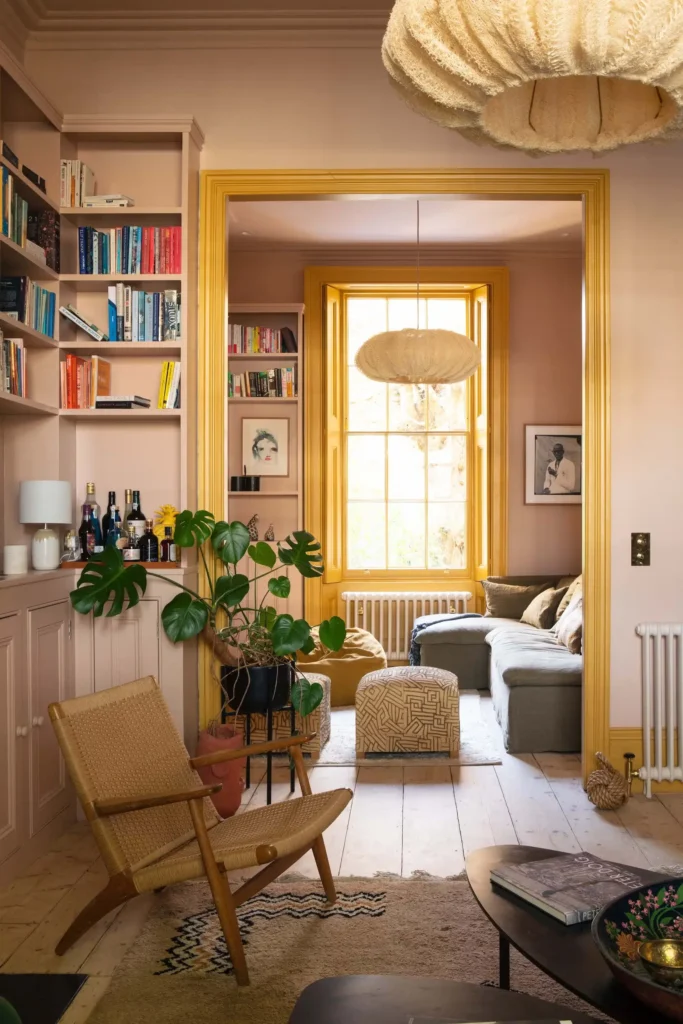
One Paint Color Decision That Changes Everything
Whoever decided to paint those window frames mustard yellow made an excellent call. It’s hard to overstate how much that single decision transforms this space.
Dusty pink walls continue onto built-in bookshelves along the left wall, packed with a dense, colorful library. The window and door trim throughout gets painted a warm mustard yellow that catches and amplifies incoming natural light. A rattan armchair in natural blonde tones sits in the foreground.
A grey low-profile sofa is visible through the doorway in the next room with a patterned cream and black ottoman. A large monstera in a terracotta pot grounds the transition zone. A sculptural cloud-like pendant lamp in cream raffia hangs from the ceiling. Wide-plank aged pine boards in a pale, slightly bleached tone cover the floor.
Two Tricks Worth Stealing
Trick #1: Paint built-in bookshelves the same color as the walls. When shelves disappear into the wall color, your eye sees books and objects floating rather than a hulking piece of furniture consuming the wall. The pink here is quiet enough to let the mustard trim do the showboating.
Trick #2: Paint trim instead of accent walls. Woodwork and trim cover a fraction of wall surface, but when you paint them a saturated color, they create as much visual impact as an accent wall. Often more. This approach works particularly well in older homes or apartments where the original trim has genuine character worth highlighting.
A Mid-Century Color Mix With a Live-Edge Coffee Table and Vinyl Collection
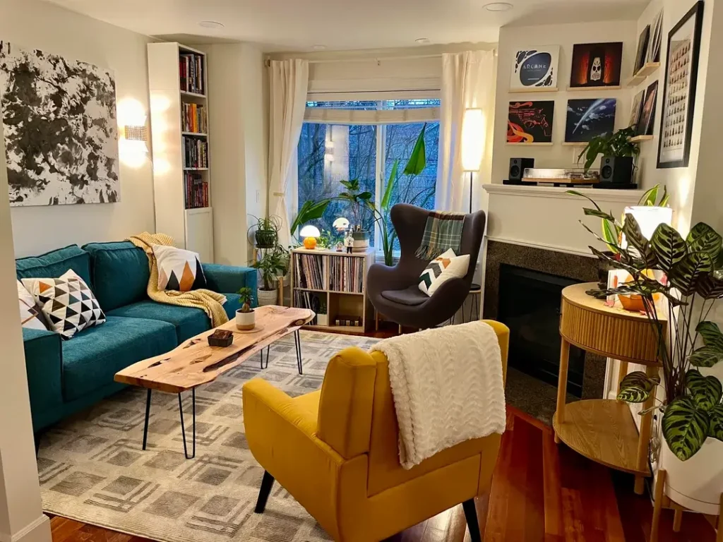
A Room That’s Unapologetically Personal
This room is unambiguously personal, and that’s precisely why it works.
A teal blue sofa anchors the left wall, dressed with geometric cushions in orange, white, and black triangles plus a mustard yellow blanket. A mustard yellow egg-style armchair and a grey wingback chair with a plaid cushion sit opposite near the window. The centerpiece: a live-edge wooden coffee table with hairpin legs, displaying a small potted plant and a dark stone coaster.
A vinyl record collection sits in a white cube storage unit beneath the window with records propped decoratively. Framed sci-fi and animated series posters arrange in salon-style above the mantle alongside small speakers and a turntable. A large abstract black and white painting dominates the left wall above the sofa. Rich mahogany hardwood covers the floor.
Collections as Decor (Seriously, Stop Hiding Your Stuff)
The live-edge coffee table earns its prominence. The irregular edge of the slab introduces an organic form that balances the deliberate upholstery colors, and the hairpin legs keep it visually lightweight.
But the bigger lesson? The vinyl display is both storage and art. If you have a collection of physical media, instruments, books, or objects you genuinely love, displaying them openly gives a room authentic character that no amount of carefully chosen decor objects can replicate. The poster wall follows the same logic. These aren’t generic art prints, and the room feels richer because of it.
A Music Lover’s Wall Display Turns Guitars Into Art
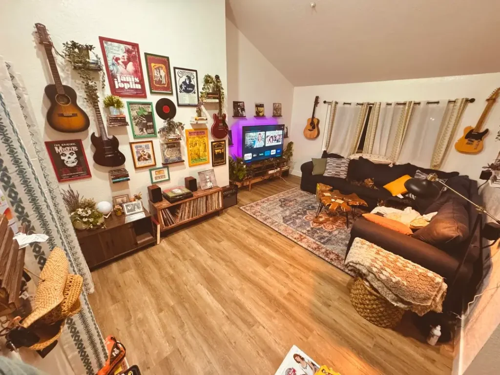
When Your Passion IS the Decor
When your passion fills your living room, guests never need to ask who lives there. And honestly? That’s the whole point.
The left and back walls of this room are covered in a dense gallery of concert posters, band artwork, framed prints, and vinyl records mixed with wall-mounted guitars at varying heights. Four guitars are visible: two acoustic and two electric, each hung like art. Concert posters for Janis Joplin, The Carpenters, and The Misfits sit framed alongside smaller prints and memorabilia. Small floating shelves hold additional records, collectibles, and plants.
A vinyl record storage unit sits below the main display. A dark sofa with orange and grey cushions faces a TV above a wooden media console. A Persian-style rug in navy and rust grounds the seating area. The ceiling slopes, warm wood flooring runs throughout, and an orange pouf sits near the sofa.
Commit to the Theme or Don’t Bother
Don’t attempt this kind of wall display halfheartedly. What makes it succeed is that every item belongs to the same world: music. No random landscape prints. No decorative objects that don’t fit. When you commit to a themed display at this scale, the coherence of the subject matter does the organizational work that would normally require strict visual symmetry.
The guitars on the wall are the most distinctive element, and practically speaking, they’re also great guitar storage. A guitar on a wall hook is accessible, protected, and visible in a way that a guitar in a case in a closet never is. FYI, the same principle applies to any object that’s both functional and beautiful.
Quick Comparison: Which Approach Fits Your Space?
Here’s a handy breakdown to help you figure out where to start:
| Decor Approach | Best Room Type | Difficulty | Key Investment |
|---|---|---|---|
| Room divider shelving | Studio or open-plan | Medium | Modular shelving unit |
| Elevated plant shelf | Narrow or corridor-shaped | Easy | Floating shelf + plants |
| Bohemian plant layering | Any small or medium room | Easy | Plants in terracotta pots |
| Layered lamp lighting | Loft or industrial space | Easy | Two matching floor lamps |
| Dual work/living layout | Multipurpose apartment | Medium | Compact desk + focal wall art |
| Maximalist color palette | Room with neutral walls | Advanced | Large patterned area rug |
| Bold sofa + family gallery | Family living room | Easy | Matching colored sofas |
| All-neutral with texture | Compact modern apartment | Medium | Layered fabric poufs |
| Textured brick accent wall | Rented or light-walled room | Medium | Brick-effect wall panel |
| Warm lighting + gallery wall | Traditional or heritage home | Medium | Three warm light sources |
| Built-in niche display | Condo or apartment with alcove | Easy | Balcony plants |
| Stone fireplace focal wall | Older home with fireplace | Easy | Round tufted ottoman |
| Painted trim + built-in shelves | Narrow Victorian or period room | Medium | Contrasting trim paint |
| Live-edge table + collections | Mid-century or eclectic room | Medium | Live-edge coffee table |
| Musical instrument gallery | Any room with a passion collection | Medium | Wall-mounted guitar hooks |
The Common Thread Across All 15 Rooms
After spending real time with every single one of these examples, a few patterns become impossible to ignore.
Every room that works well in a small footprint has made at least one confident choice. Not a cautious, hedge-everything choice, but a genuine commitment to a color, a collection, a material, or a layout decision that takes a clear position. Rooms that hedge every decision end up feeling unfinished no matter how much furniture fills them.
The best small living rooms treat vertical space as seriously as floor space. Whether it’s a tall room divider, a high plant shelf, a floor-to-ceiling bookcase, or a dense gallery wall, every room that feels larger than its dimensions has done something interesting above eye level. Floor space is finite. Wall and ceiling space? Vastly underused in most apartments.
And here’s the part that might surprise you: none of these rooms required a renovation or a huge budget. The bohemian room is built almost entirely around houseplants and IKEA furniture. The music room runs on a passion collection. The grey monochrome room uses floating shelves from a hardware store. The money matters far less than the intention behind it.
So here’s my challenge to you: pick one idea from this list that genuinely excites you, not the one that feels safest, and start there. Small living room decor ideas work best when they reflect the actual human living in the space, not some generic interpretation of what a living room is “supposed” to look like.
These 15 rooms are proof. Now go make yours one too.