Real-Life Living Room Decor 10 Spaces That Don’t Look Like a Showroom
Look, we’ve all been there. You walk into your living room, stare at the same beige sofa you’ve had since 2019, and think “I’ll deal with this eventually.” Eventually never comes. Meanwhile, your living room the room guests see first and you stare at every single day just sits there, looking… fine.
Fine isn’t good enough. And honestly? Making it better isn’t as hard or expensive as you think.
I pulled together ten real living rooms from real people (not staged catalog shoots, not million-dollar renovations) to prove that great decor comes down to three things: intention, a little personality, and the guts to actually commit to a direction. Some of these rooms run on tight budgets. Some went all out. All of them work.

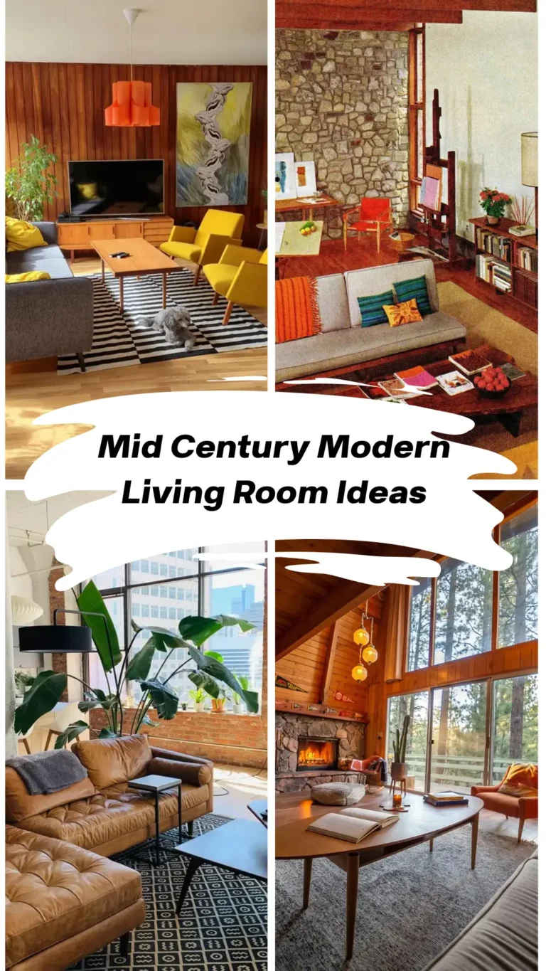
1. Mid-Century Modern With Actual Personality
When Clean Lines Meet “This Is Who I Am”
There’s a version of mid-century modern that feels like a furniture museum. Nobody sits down. Everything’s pristine. You’re afraid to breathe.
This room is not that.
It takes the classic mid-century bones hairpin-leg coffee table, walnut side table, low-profile seating with tapered legs and throws genuine personality on top. The star? A giant cassette tape wall art piece that basically screams “I have taste AND I’m fun at parties.”
Mustard yellow curtains and a matching yellow sideboard thread warm tones through the whole space, while a geometric rug in grey, white, and yellow ties the furniture together. The balance between warm materials (brown leather sofa, dark wood floors) and cool greys (accent chair, walls) keeps the energy up without making the room feel heavy.
Even the TV works here mounted in a gallery-style frame so it blends into the wall instead of being a giant black rectangle screaming for attention.
The move to steal: Pick one piece of art you genuinely love. Something that says something about you. Then build your color palette outward from that piece. In this room, yellow drives every single decision, and it shows. Don’t let your decor happen to you. Start with that anchor piece and make it intentional.
2. Warm Neutrals and Textural Layering (The Scandinavian-Boho Sweet Spot)
All Beige, Zero Boring
This style has been quietly taking over everyone’s feed, and honestly, I get it. When you do warm neutrals right, the result is a room that feels like a hug.
This particular space nails it. A warm mushroom-brown feature wall pairs with honey-toned wood floors and slat wood paneling on the lower half. The whole palette stays in a tight range of beige, cream, and brown. Nothing fights for attention. Everything just… exhales.
The oversized rattan pendant light is the hero. It’s sculptural and warm, and it anchors the seating area without the harshness of typical overhead lighting. A large black metal-framed clock on the feature wall adds geometric structure so all those soft textures don’t melt into each other.
That chunky bouclé-textured rug under the grey sectional? Doing serious heavy lifting. It grounds the whole arrangement and makes you want to take your shoes off immediately. And notice the cushion game polka dot mixed with plain, all in similar tones. Pattern variation without palette variation. That’s the cheat code for layering that looks sophisticated instead of chaotic.
Three things worth stealing from this room:
- Slat wood paneling as a textured alternative to wallpaper
- One oversized light fixture instead of three small forgettable ones
- A clock as wall art functional AND decorative
IMO, the smartest thing this room does is resist the urge to throw in a random teal cushion or coral vase “for a pop of color.” It commits to neutrals fully, and it’s stronger for it.
3. High-Glamour Formal Living Room (Going All In, No Apologies)
When You Want “Wow” and You Mean It
Some rooms whisper. This room walks in wearing a floor-length gown and a tiara.
The coffered tray ceiling with crown molding sets the tone before you even look at the furniture. Then your eyes hit the tiered crystal-and-brass chandelier, and you understand this room did not come here to play.
The walls are champagne gold. The coffee table is faceted geometric bronze. Mercury glass table lamps flank the seating. Everything operates within a gold-silver metallic range that somehow feels cohesive rather than gaudy. The cream velvet seating tufted, curved, on tapered silver legs looks like it belongs to the same family without being a matching set. That’s the mark of someone who actually thought about their furniture choices.
A mosaic wall installation in dark gold and bronze tiles anchors the main wall the way great art should.
So why doesn’t this room feel overwhelming? Restraint within the maximalism. The color palette is tight. Shapes repeat (arched doorways echo the arched sculpture details). Textures are luxurious but consistent.
Should every living room look like this? Absolutely not. But here’s the lesson: committing fully to a direction always beats hedging. A crystal chandelier hanging over IKEA furniture reads as confused. Done fully, it reads as intentional. If you’re going glam, go glam.
4. Eclectic Gallery Wall: Built Around What You Actually Love
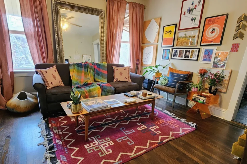
The “Beautiful Mess” That Isn’t Actually Messy
This room takes a second to process, and that’s the whole point.
The right wall is packed: vintage film posters (Vertigo, a James Stewart piece), abstract line drawings, photography, bold graphic prints all in a mix of black frames, natural wood, and minimal white borders. On paper, it shouldn’t work. In reality, it works beautifully.
Why? Because the collection is genuinely personal. This isn’t a “gallery wall starter kit” from Target. These are pieces the resident clearly cares about, and that authentic energy carries into the whole room.
An oversized ornate gold mirror leans against the window wall, bouncing light around and adding depth the small space desperately needs. The deep crimson Moroccan-style rug with ivory geometric patterns grounds the dark leather sofa. A plaid throw in yellow, green, and red drapes casually across the cushions. An orange side table stacked with books makes the room feel lived in, not staged.
If you’re building a gallery wall, here’s the practical cheat sheet:
- Start with your largest piece as the anchor
- Work outward from there
- Lean things against the wall before you commit to nails live with the arrangement for a few days
- Limit yourself to two or three frame styles max, even across wildly different art that consistency holds everything together
The difference between a gallery wall that feels curated and one that feels like a yard sale? Usually the frames. That’s it.
5. Green Velvet Statement Sofa: One Piece Changes Everything
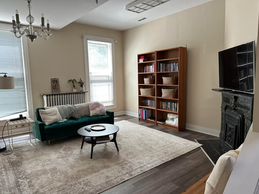
Proof That Restraint + One Bold Move = Magic
Here’s a take I’ll stand behind: one strong piece in an otherwise calm room does more than a room full of interesting pieces fighting each other.
This room proves it without a shred of subtlety.
The emerald green velvet tufted sofa is the room’s entire personality. Rich, jewel-toned, absolutely gorgeous against warm beige walls. Everything else steps back a simple round black coffee table, a faded vintage rug in grey and cream, white linen curtains, and an ornate cast iron fireplace in dark charcoal.
What gives this room its magic is the deliberate mix of eras. The fireplace reads Victorian. The sofa is clearly contemporary. The bookcase is warm honey oak with wicker baskets. The crystal chandelier has an antique vibe. Mixing eras works when you have a through-line connecting them. Here, that through-line is warmth and a slightly moody atmosphere.
Quick shout-out to that bookcase: filling shelves with a mix of organized books and wicker storage baskets is both practical and visually interesting. The book spines add the color the rest of the room deliberately avoids. The baskets bring texture. And a few empty spaces? Those read as more considered than a shelf crammed to capacity.
The move: If you can only invest in one new piece, make it a statement sofa. Let the rest of the room play supporting actor.
6. Minimalist College Apartment That Actually Looks Good
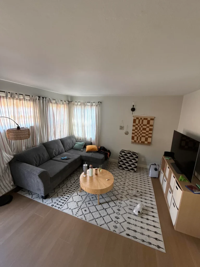
Working With What You’ve Got (And Making It Work Hard)
College apartments get roasted in the decor world and fair enough, most of them look like they were furnished during a panic attack at a thrift store. This one, though? This one gets it.
A large grey L-shaped sectional dominates the space, which is the right call for a social living room. It maximizes seating, defines the conversation area, and eliminates the need for extra chairs. A round natural wood coffee table with splayed legs sits at the center and warms up all that cool grey nicely. A Moroccan-style rug in white with black geometric motifs ties the whole thing together.
The wall decor is minimal but smart: a checkerboard wall hanging in terracotta and natural cotton adds texture and earthy warmth. Striped curtains in orange and cream add movement along the window wall. Nothing screams for attention, but nothing feels forgotten either.
What’s working:
- The rug is properly sized (finally someone got the rug size right)
- The furniture creates a clear focal point
- The wall hanging makes it feel personal without overdoing it
What could be pushed further:
- The TV console area feels bare
- A plant, small side table, or even a throw blanket folded over the sofa arm would add the warmth the room’s currently missing
Honest takeaway: You don’t need much to make a rental feel like yours. A rug, one piece of wall art that means something to you, and furniture that actually fits the room will get you 80% of the way there. The remaining 20% is just time and living in the space.
7. Warm Olive and Earth Tones: A Family Room That Gets Real
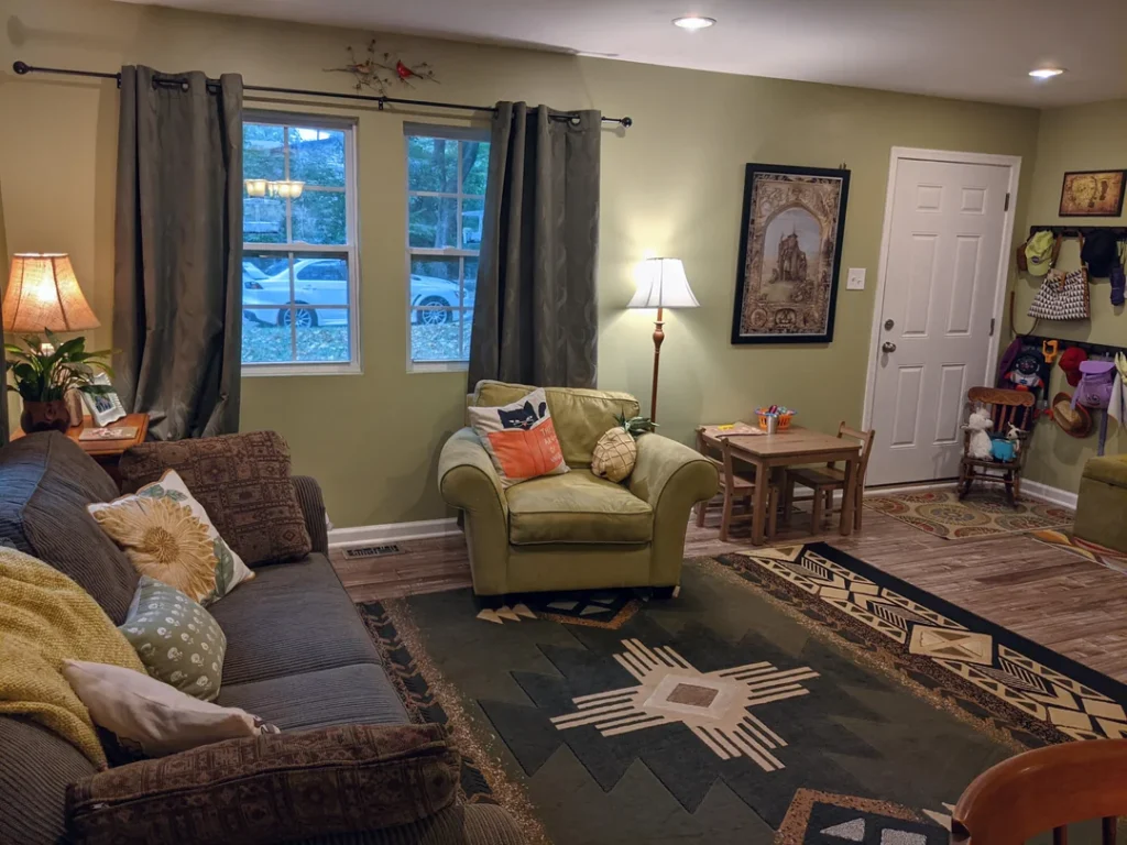
Designed for Actual Life, Not Just Photos
This room isn’t trying to win design awards and I mean that as a compliment. There’s a small child’s table in the corner with art supplies visible. Olive green walls, soft worn-in furniture, and layered rugs everywhere. This room was designed for living, and it handles that job with genuine charm.
The olive green armchair matching the wall color is a subtle flex. This tonal dressing technique where furniture and walls share the same color family creates a cohesive look that’s surprisingly easy to pull off. The layered rugs (an Aztec-inspired geometric on top, a second rug beneath) add pattern and define the sitting area. FYI, this rug-on-rug trick works especially well on hardwood or laminate floors that lack visual warmth on their own.
The lighting deserves a special mention. A floor lamp with a warm amber shade plus a table lamp on the other side creates layered lighting at multiple heights. This one detail separates rooms that feel cozy from rooms that feel flat under a single overhead bulb.
A nature-themed tapestry near the door and a small decorative bird above the curtain rod? Not expensive, not labored. Just small touches that reflect genuine interest and that’s what makes a room feel inhabited rather than staged.
If your room feels too impersonal, skip the generic “Live Laugh Love” stuff and look for small details that reflect something you actually care about.
8. The TV Wall, Done Simply and Done Right
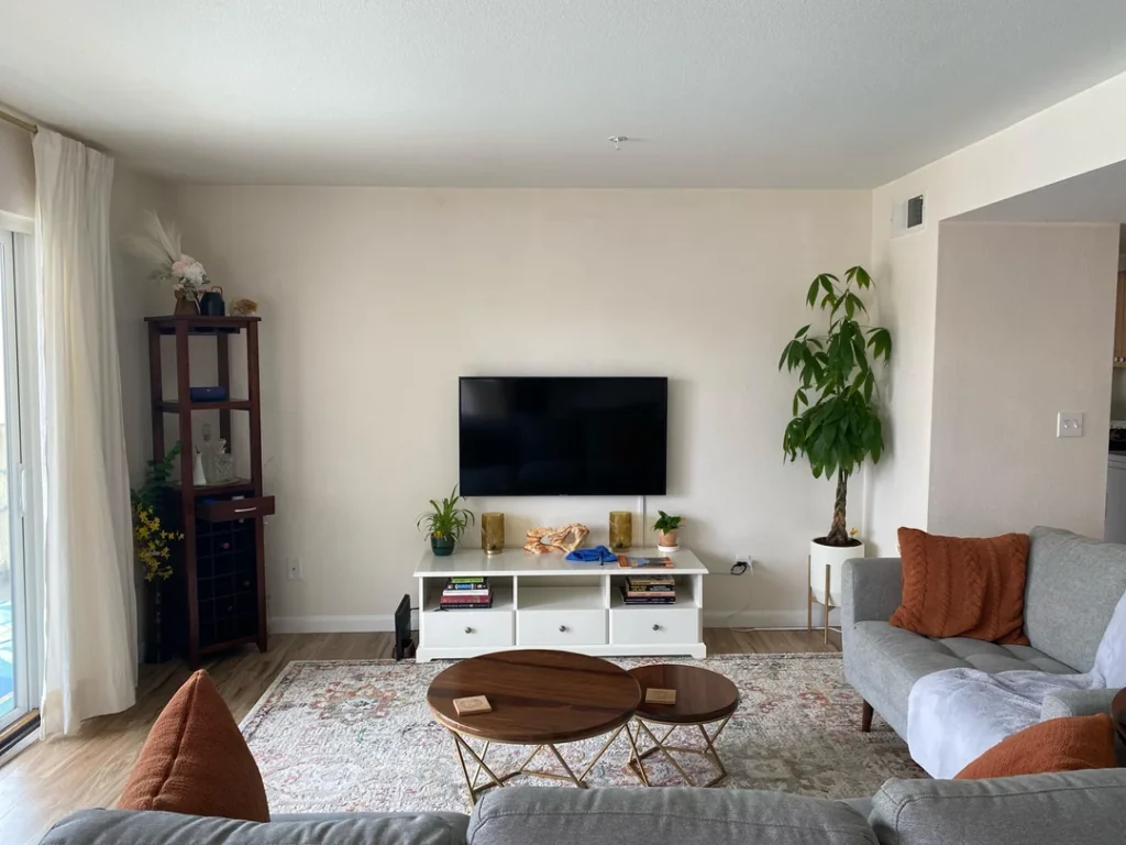
Sometimes Less Really Is More
Some of the best living room decor ideas are about what you don’t add. This room gets that.
The setup is clean: a white media console with drawers and open shelving, a wall-mounted TV at a comfortable height, and a tall dark walnut shelving unit on the left holding books, plants, and a few objects. On the right side of the TV, a tall potted money tree in a white planter provides structural visual weight basically, it balances the shelf without needing another piece of furniture.
Terracotta orange throw pillows on grey sofas give the room its primary color hit, and they’re saturated enough to feel deliberate without needing backup from other accent pieces. The round walnut nesting coffee tables (two circles that can stack or separate) are smart for a room that probably serves multiple purposes.
What I love about this room is the absence of anything unnecessary. No competing art on the TV wall. No clutter on the media console surface. Everything earns its spot. A faded floral rug in cream and terracotta ties the warm accents into the floor and softens the crisp white walls.
Pro tip: If your living room feels too sparse but you can’t figure out what’s missing, start with a large plant. Something tall a fiddle leaf fig, a money tree, a bird of paradise adds life, color, and organic form in a way no decorative object can replicate. Seriously, a big plant fixes a surprising number of room problems.
9. High Ceilings, Vinyl Records, and Greenery: The Collector’s Living Room
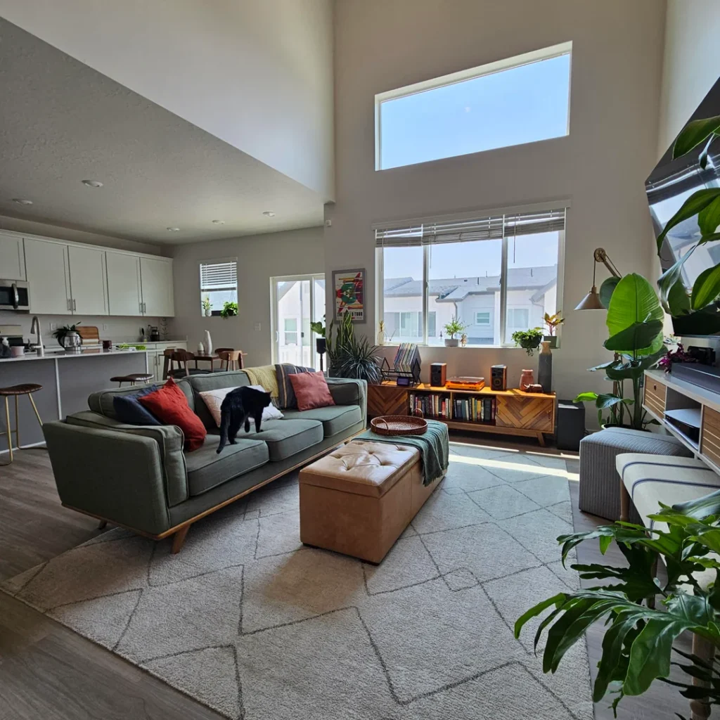
When Your Hobbies Become the Decor
Double-height ceilings are a gift and a curse. The vertical scale dwarfs normal furniture, and filling those massive walls without spending a fortune feels impossible.
This room solves the problem brilliantly: it doesn’t even try to fill the upper walls. Instead, it packs all the visual interest into the lower half and lets the height serve as breathing room. Smart.
An olive-green three-seater sofa with mid-century tapered legs sits at the center, loaded with cushions in terracotta, blush, and navy. A leather storage ottoman doubles as the coffee table practical, warm, sturdy. But the real magic is behind the sofa: a credenza in chevron-patterned walnut veneer topped with a vinyl record player, vinyl storage, speakers, and books.
This room is built around a love of music, and it shows. The turntable sits out in the open because it gets used daily, not displayed. Design that incorporates the things you actually do reading, listening to records, tending plants always produces more interesting results than design that ignores how you live.
The plants here are doing serious work. Monstera, rubber plant, fiddle leaf fig, and smaller potted specimens create a layered green presence that softens the modern architecture and fills visual space on a tight budget.
If you have tall ceilings that feel cold or empty, place plants at varying heights floor level, shelf level, and hanging. That natural vertical column does what furniture alone simply can’t.
10. Sage Accent Wall With a Classic Art Print: Maximum Impact, Minimum Budget
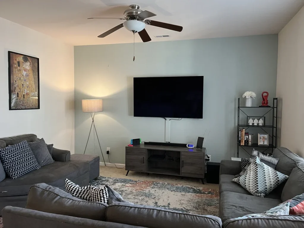
One Paint Decision. Entire Room Transformed.
This last room proves something the decor world doesn’t talk about enough: a single paint choice can transform a room without changing any of the furniture.
The sage green accent wall behind the TV has a quieting, sophisticated quality that the standard off-white on the other three walls can’t achieve alone. It’s soft enough to avoid dominating, cool enough to feel modern, and distinct enough to make the whole space feel intentional rather than default.
Quick observation: a wall-mounted TV against a colored accent wall consistently looks more intentional than the same TV against plain white. It’s one of the easiest upgrades out there.
The rest of the room keeps it honest two grey sofas, geometric patterned cushions, a simple credenza, and a black open shelving unit. A framed print of Gustav Klimt’s The Kiss on the adjacent white wall adds art-history cred and warm gold tones that complement the sage beautifully.
The tripod floor lamp near the seating area is the unsung hero. It’s sculptural at a low cost, positions warm light exactly where you need it for evening viewing, and doesn’t require a table or wall mount.
If your living room lacks atmosphere at night, a tripod or arc floor lamp beside the seating is often the single most effective change you can make. No rewiring, no renovation. Just plug it in and enjoy.
The Real Takeaway: Find Your Through-Line and Commit
Here’s what every room on this list has in common the ones that work best all have one clear through-line. A color that repeats. A material that shows up consistently. A genuine interest the room is built around.
That doesn’t mean your living room needs to look like a magazine cover. The lived-in family room with olive walls and layered rugs works just as well in its own way as the champagne-and-crystal formal sitting room. Both rooms made a choice and followed through. That’s the whole secret.
The practical starting point is simpler than most people expect:
- Pick one element you love a rug, a piece of art, a paint color you’ve been eyeing
- Build outward from that single decision
- Let the rest follow naturally over time
The rooms in this collection that feel incomplete? They’re the ones still waiting for that anchor piece to arrive. Once you find yours, the rest tends to fall into place.
So here’s my challenge: stop pinning, stop scrolling, and pick your one thing this week. A bold rug. A piece of art that actually means something. A paint swatch. Whatever it is commit to it and build from there. Your living room’s been waiting long enough.