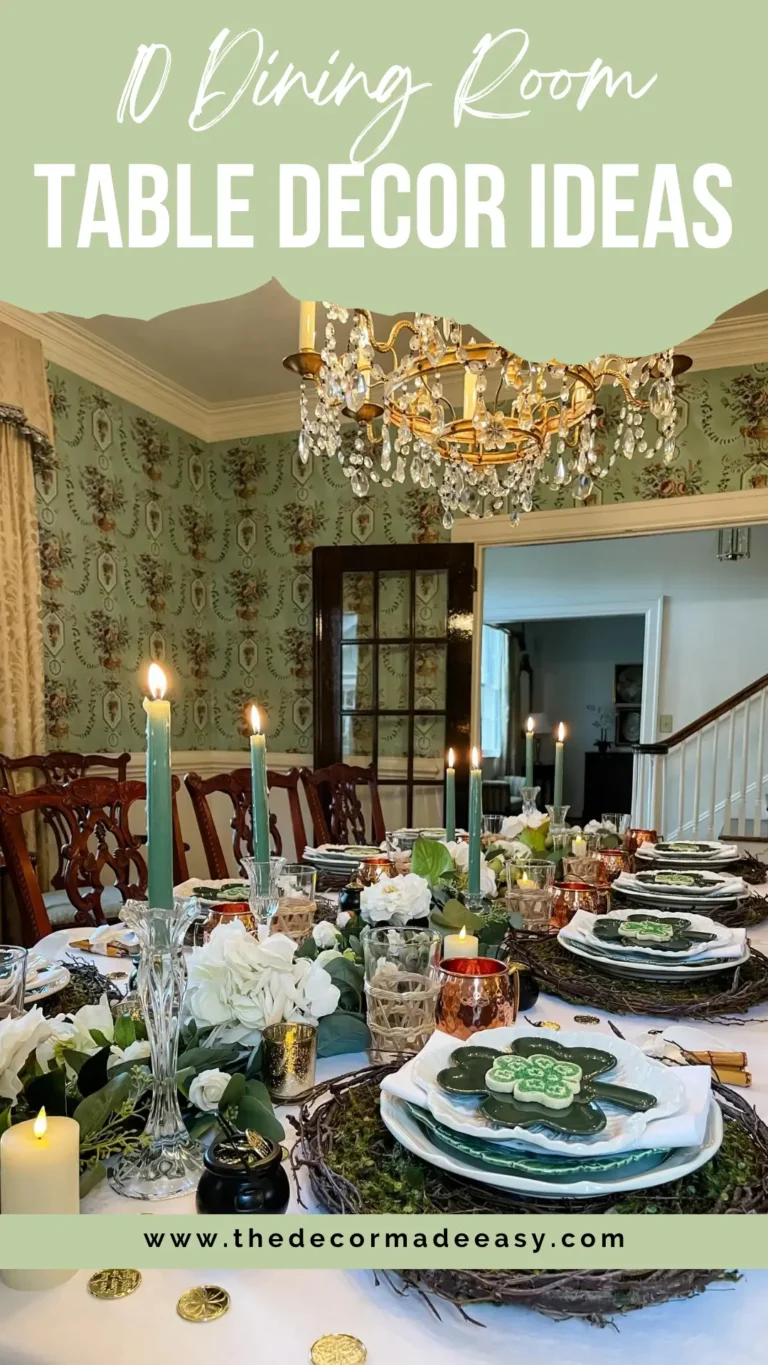
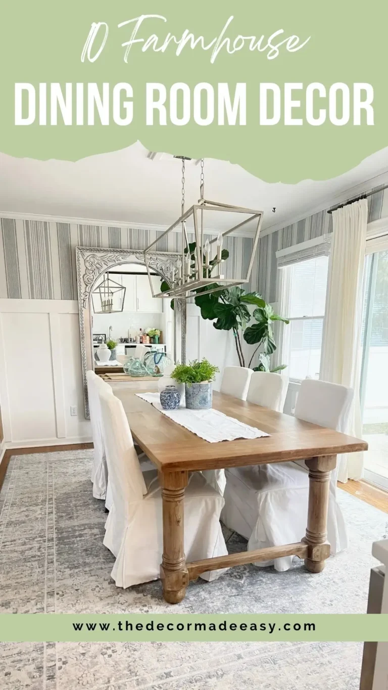
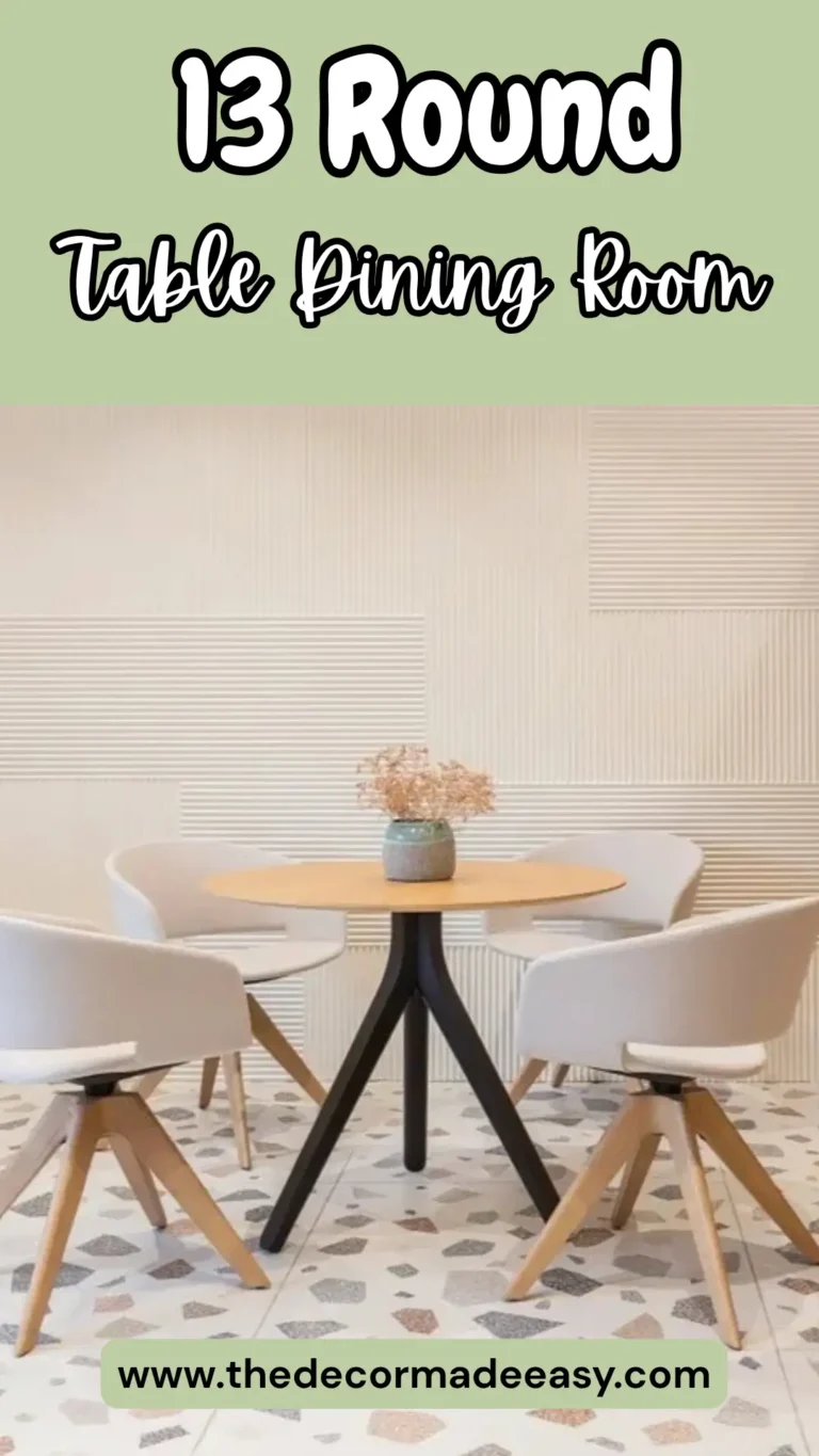
The “No-Fake-Fruit” Guide to 12 Kitchen & Dining Looks You’ll Actually Love
You know the drill. You open Pinterest, save 47 images, feel incredibly motivated, and then… nothing happens. Two weeks later you’re still eating cereal on a countertop you hate. Yeah, same.
The gap between “I love this kitchen” and “I actually changed something in my kitchen” is massive. So I pulled together 12 real kitchen and dining room ideas that genuinely work in actual homes, not just in perfectly staged photoshoots with fake fruit in the bowl.
These aren’t aspirational spaces that require a lottery win and a personal architect. These are real examples with real lessons you can steal, adapt, and use today.
1. Two-Tone Cabinetry with Mixed Material Accents
Two-tone kitchens have a reputation for going wrong, and honestly? That reputation is fair. Done badly, it looks like someone ran out of one paint color halfway through and just… kept going.
But this example absolutely nails it.
What makes it work:
- Slate-grey lower cabinets transition into matte charcoal tall units
- A clean white quartz island surface gives your eyes somewhere to rest
- Wood-frame wishbone bar stools (think Hans Wegner Y-chair vibes) add warmth without chaos
- Circular birch pendant lights keep the organic softness going
The secret ingredient here is restraint. The white countertops run consistently across the whole space, which acts like a visual referee between the darker cabinets and the walls.
Your takeaway: If you’re doing two-tone, start with your island countertop color and build outward from there. A white or light grey surface will mediate between dark lower cabinets and lighter walls better than almost any other single decision you make. Add natural wood accents in your seating or hardware rather than going full industrial, and you’re most of the way there.
2. Modern Indian Dining Room with Arched Alcove Feature Wall
Not everything has to come from a Scandinavian mood board. There. I said it.
This dining space layers contemporary Indian design with modern European functionality, and the result is genuinely stunning. The eight-seat table has a grey marble top with a sculptural crossed walnut base. Around it sit mid-century-influenced chairs with powder blue linen upholstery and warm walnut frames. Sophisticated but still approachable.
The showstopper is the arched alcove on the right wall, finished in warm wood with hand-painted botanical motifs inside. Next to it sits a decorative jaali screen panel, which references traditional Indian lattice craftsmanship in a totally modern context. It’s the kind of detail that makes guests stop mid-conversation to ask “wait, what IS that?”
The kitchen in the background stays calm on purpose. Flat cream cabinetry, fluted glass panels, and a grey marble backsplash let the kitchen look great without competing with the dining area’s personality.
Your takeaway: Pick ONE statement architectural element, whether that’s an arch, a niche, or a decorative screen, and let everything else support it. High contrast between the feature and a neutral backdrop is what makes it land.
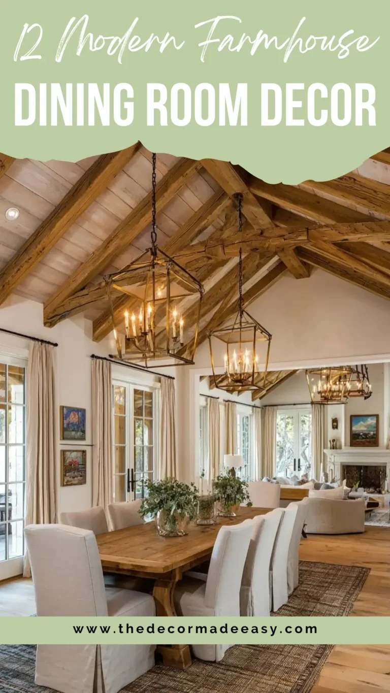
3. Open-Plan Farmhouse Layout with Vaulted Ceilings and Mixed Lighting
This space is built for people who actually love having people over. Big energy. Zero apologies.
We’re talking a single long dark-stained farmhouse table that seats around fourteen people. White Windsor-style chairs line both sides. Above the dining end hangs an ivory candelabra-style chandelier, while a geometric brass lantern fixture anchors the kitchen side. The ceiling is vaulted white with exposed knotty pine timber beams running at an angle, and it gives the whole room a relaxed, lodge-house quality that feels genuinely cozy rather than theme-parky.
The kitchen stays restrained by design. White Shaker cabinetry with glass-fronted upper panels, a patterned cement tile backsplash, and a navy blue island ground the all-white palette beautifully. A dark-bladed ceiling fan handles airflow without ruining the aesthetic.
Here’s the interesting bit: mixing two very different pendant styles (one romantic and traditional, one geometric and industrial) could easily look chaotic. It doesn’t here because both fixtures share the same warm metallic tone family. Form is different; finish is the same.
Your takeaway: If you want to mix light fixtures in an open-plan kitchen and dining room, match the finish or color temperature rather than the shape. That’s the move.
Also Read: Stop Pinning, Start Living: 12 Real-Life Boho Dining Rooms That Actually Work
4. Garden-Facing Kitchen with Herringbone Floor and Window Seat Nook
Natural light is a design material. This kitchen actually treats it like one.
Garden-facing glazing on two sides pulls the outside in constantly. Sage green Shaker cabinetry with a Belfast sink and brass hardware anchors the kitchen in classic English-cottage territory. A marble island countertop and round oak stools push it into contemporary territory.
A bold red-and-white floral Roman blind above the main windows sounds risky on paper and looks completely right in practice. FYI, that’s usually how the best design decisions work.
The built-in window seat nook to the right, cushioned and framed in natural oak beneath a large picture window, is the detail that turns this from a functional kitchen into somewhere you’d actually want to spend a Sunday morning. Wishbone chairs at the dining table beyond continue the light-wood theme and link both zones without any heavy visual transition.
Then there’s the floor. A herringbone oak parquet pattern runs throughout the whole space. This is worth highlighting specifically because herringbone floors carry both warmth and formality without leaning too hard into either. In kitchen-to-dining transitions, they define the space as unified without needing a rug to do the heavy lifting.
Your takeaway: If you’re reworking a kitchen-diner, a herringbone floor is one of the highest-impact decisions you can make. It does the zone-defining work so your furniture doesn’t have to.
5. White Quartz Island with Trailing Plants and Eclectic Accessories
This one might be my personal favorite, purely because it proves you don’t need a huge budget to create something that feels genuinely considered.
This is likely a rental or modest owner-occupied kitchen transformed almost entirely through styling decisions. The white quartz-look island is large and practical, lined with three dark charcoal bucket-seat stools on black metal frames. But the real move here is the greenery.
Trailing pothos cascade from the top of the refrigerator and upper cabinets, softening every hard surface in the room and adding a loose, lived-in quality that no fixture or fitting can replicate. On the island itself: a pastel blue KitchenAid stand mixer, a wicker tiered basket with citrus, small plants, and kitchen tools styled with genuine confidence. Not minimalist strictness. Just real life, but curated.
Bamboo lower cabinetry in the secondary cooking area adds warmth against the stainless steel appliances. The contrast works.
Your takeaway: If your kitchen lacks personality, plants are almost always the fastest and cheapest upgrade available. Trailing varieties like pothos work especially well on top of fridges and high cabinets because they cascade naturally and need minimal care. Add one statement appliance in a pop color and the room reads as styled rather than just functional.
6. All-White Traditional Kitchen with Gold Hardware Accents
The all-white kitchen is never going anywhere, and this is exactly why.
Every surface, cabinet, and appliance works within the same creamy white family here. But it’s anything but flat. Raised panel cabinetry with crown molding gives the room architectural substance that flat-front cabinetry simply cannot offer. Brushed gold hardware on the drawers and doors lifts the whole palette.
A custom arched range hood acts as the room’s focal centerpiece. Two oversized clear glass pendant lights with brass fittings drop over the island without blocking sightlines.
The quartz island countertop has a subtle wave veining pattern in soft grey that adds visual movement without bringing in a new color. Two boucle-upholstered round stools in cream with gold-toned bases reinforce the warm metallic accent running throughout.
The key lesson here is consistency of finish. Gold hardware reads elegant because it appears in the cabinet pulls, the faucet, the pendant ceiling caps, AND the bar stool frames. When a metallic accent repeats in four or five places minimum, it becomes a deliberate design choice rather than something that looks accidental.
Your takeaway: Commit to your accent finish and repeat it at least four times throughout the space. That’s when it starts looking intentional.
Also Read: Stop Falling for Pinterest Lies: 10 Farmhouse Dining Rooms You Can Actually Recreate
7. European Organic Modern Kitchen with Fluted Range Hood and Marble Backsplash
This is the kitchen that dominates design accounts for a reason. Not hype. Just genuinely excellent execution.
White oak cabinetry in a warm honey tone fills the space. The floor-to-ceiling backsplash in book-matched Calacatta marble is the kind of investment that earns its cost every single day you walk into the room. Three slender brass pendant lights on long stems drop over the island, echoing the brass pot-filler faucet and cabinet hardware. Exposed rustic timber ceiling beams run above, providing just enough raw contrast to keep the space from tipping into over-polished, magazine-only territory.
The island has fluted detailing on the face, which has become one of the most copied kitchen features in contemporary design. This example shows exactly why it works: the fluting adds texture and shadow without disrupting the clean horizontal lines of the cabinetry. Grey upholstered bar stools with wood frames complete the seating without introducing any new materials.
Your takeaway: Organic materials mixed with precision craft create spaces that photograph well AND age well. Marble, white oak, and brass aren’t trend-driven. That’s precisely why they don’t go out of style.
8. Open-Plan Dining Room with Vaulted Wood Ceiling and Feature Wall
This dining space doesn’t need the kitchen to do the heavy lifting. It carries its own visual drama entirely.
The design statement comes from the architecture itself. A vaulted ceiling clad in light blonde shiplap rises over the dining area and then transitions against a dramatic floor-to-ceiling charcoal board-and-batten feature wall. The tension between those two surfaces, one warm and organic, the other dark and graphic, makes the room genuinely compelling.
The dining table is a generous light oak rectangle with cognac leather-wrapped chairs. Warm but unfussy. What draws the eye upward is the lighting cluster: eight or nine exposed Edison-style teardrop bulbs hanging at varied heights from a single ceiling plate. It functions as sculpture as much as lighting.
A built-in cabinetry unit along the left wall with black steel grid frames and open shelving bridges the kitchen and living areas gracefully.
Your takeaway: In open-plan spaces, a well-designed ceiling treatment can do more for the room’s character than any furniture choice. Look up more when you’re planning a redesign.
9. Painted Dining Table Statement in a Contemporary Kitchen Extension
Painted furniture makes people nervous. Which is exactly why most people never try it. And exactly why the ones who do commit to it always look cooler than the rest of us.
The centerpiece here is a substantial grey-painted dining table with a classically turned pedestal base. Traditional form. Modern personality through its muted blue-grey paint finish. Around it sit sculpted mid-century dining chairs in blonde oak with grey cushioned seats that harmonize without matching too precisely. That’s an important distinction.
Two oversized woven sphere pendant lights in dark grey rattan hang above, warming the white extension ceiling and softening the contemporary kitchen behind it. The kitchen runs along both walls in a warm putty/greige flat-front finish with a slate worktop. Calm. Unfussy. Lets the dining zone do the talking.
A skylight floods the rear of the space with overhead natural light, which prevents the open-plan arrangement from feeling dark despite the deeper interior position.
Your takeaway: Painted furniture works in kitchen and dining room settings when you choose a paint color that already exists somewhere else in the room. Here the grey table echoes the kitchen worktop and the pendant shade. It feels deliberate because it IS deliberate.
Also Read: Small Dining Room Decor: 12 Real-Life Ways to Make Your Space Feel Huge
10. Raw Industrial Kitchen with Reclaimed Wood Range Hood
Okay, I’ll be honest. I was skeptical of this one. Then I looked more carefully. Now I want it.
This kitchen commits fully to an earthy, raw industrial aesthetic without sacrificing livability. The island is clad in dark stacked tile with a concrete or raw stone worktop.
Above it hangs an oversized reclaimed timber range hood, horizontal planks in varied weathered tones from grey to warm brown, paired with a simple stainless cylindrical flue pipe. It blends industrial function with artisan craft in a way that feels genuinely original.
The backsplash uses dark forest green handmade tiles in a running bond pattern, which creates texture and depth behind the cooking zone. On the dining side, two dome-shaped raw concrete pendant lights hang above a long timber table with aged dark Windsor chairs. Fresh tropical flowers and foliage on the table provide vivid color contrast against all that rawness. IMO, that floral pop is what stops it from feeling too heavy.
Your takeaway: The reclaimed timber range hood is the single element worth investing in here. It turns a standard functional item into a conversation piece. Work with a local fabricator using salvaged timber from demolished buildings or old barns for authenticity that no manufactured alternative can replicate.
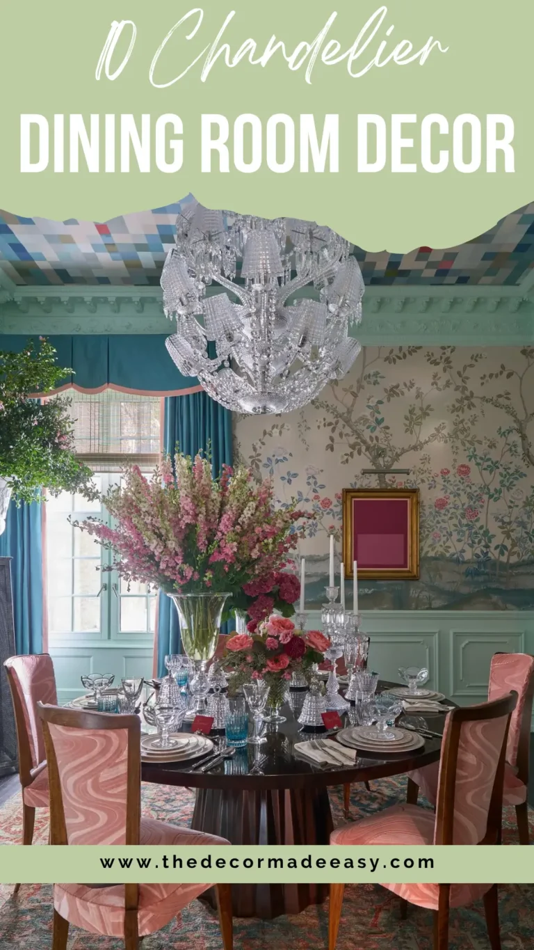
11. Luxury Dining Room with Capiz Shell Chandelier and Coffered Ceiling
Some kitchen and dining room ideas aren’t really about the kitchen at all. They’re about making dinner feel like an actual occasion rather than just… eating.
This dining space uses architecture and lighting to create something genuinely theatrical. A deep coffered ceiling with dark espresso-stained wood beams provides a dramatic overhead framework. Hanging from the center is an enormous capiz shell globe chandelier, hundreds of translucent shell discs layered around a circular form that diffuses light into a warm golden glow. It’s arresting in the best possible way.
The dining table is a long slate-grey lacquered surface with a dark border detail. Clean and graphic. Fully upholstered chairs in warm pewter linen with brushed brass frames connect to the chandelier’s gold fittings and the kitchen hardware visible beyond. A glass wall at the far end frames a palm tree and exterior view, blurring the line between inside and out.
To the right, an illuminated wine wall behind full-height glass doors functions as both practical storage and a glowing amber feature wall. This room demonstrates clearly that kitchen and dining room ideas can aspire to genuine atmosphere rather than just convenience.
Your takeaway: If you want a dining room that creates a mood rather than just hosts a meal, focus on your overhead lighting first. Everything else follows from that decision.
12. Contemporary Open Dining Space with Decorative Wood Screen Panel
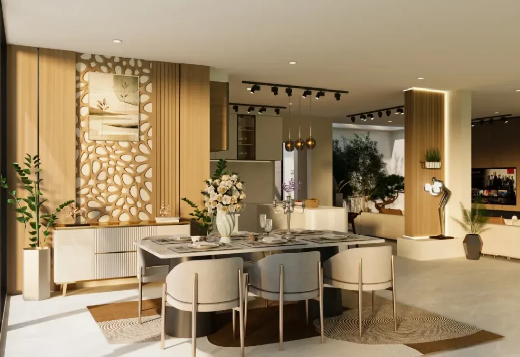
This last one pulls together nearly everything worth knowing about handling an open-plan kitchen-dining-living space. It’s a great note to end on.
A decorative carved wood panel with an organic cutout pattern acts as the room’s visual anchor. Irregular pebble-like shapes punched through a wooden frame create both a privacy screen and a textural art piece simultaneously. Behind it sits a sleek sideboard in fluted ivory with gold-leg detailing.
In front, a rectangular marble-look dining table in soft grey with a brushed gold metal base, surrounded by rounded velvet-upholstered chairs in cream and grey. A circular patterned area rug beneath the table grounds the seating zone within the larger open-plan flow.
Track lighting runs along the ceiling with warm globe pendants dropping over the table specifically for intimate meal-time lighting.
What this space does intelligently is separate zones in an open plan without using walls. The decorative screen creates a defined dining “room” within the larger layout. The rug anchors the table. The lighting distinguishes the dining zone from the kitchen area beyond.
Your takeaway: These three tactics (screen, rug, lighting) are things any open-plan space can borrow regardless of budget. You don’t need a wall to define a room.
Quick Comparison: All 12 Styles at a Glance
| Style | Best For | Key Feature | Difficulty |
|---|---|---|---|
| Two-tone contemporary | Modern homes | Contrast cabinetry + wishbone stools | Medium |
| Modern Indian eclectic | Character apartments | Arched alcove + jaali screen | Advanced |
| Farmhouse vaulted | Large family homes | Mixed lighting + long dining table | Medium |
| Garden-facing English | Period properties | Herringbone floor + window seat | Advanced |
| Plant-styled casual | Rentals and modest spaces | Trailing greenery + island styling | Easy |
| All-white traditional | Classic homes | Gold hardware + fluted range hood | Medium |
| Organic European modern | Luxury renovations | Marble backsplash + fluted island | Advanced |
| Barn vaulted open plan | New builds | Feature wall + Edison cluster light | Advanced |
| Painted furniture extension | Kitchen extensions | Statement painted table + rattan pendants | Medium |
| Raw industrial | Rural and loft properties | Reclaimed range hood + handmade tiles | Advanced |
| Luxury occasion dining | High-end builds | Capiz chandelier + coffered ceiling | Advanced |
| Contemporary open plan | Urban apartments | Decorative screen + track lighting | Medium |
What Every Single One of These Kitchens Gets Right
After looking across all 12 examples, a few patterns show up consistently regardless of style or budget. These aren’t coincidences.
Lighting is always intentional. Every space uses pendant lighting as a design element, not just a practical necessity. The fixture choice shapes the room’s personality more than almost anything else you’ll buy.
Material contrast creates depth. In every single example, at least two materials are in intentional tension with each other. Warm wood against cool marble. Matte cabinetry against gloss countertops. Organic texture against clean lines. Rooms that feel flat almost always lack this dynamic.
Plants and fresh flowers show up everywhere. This isn’t a coincidence. Live organic elements bring something to kitchens and dining rooms that furniture and fixtures genuinely cannot replicate. The cost is minimal. The visual return is disproportionate.
The best kitchen and dining room ideas don’t come from finding the most beautiful space on the internet and copy-pasting it into your home. They come from identifying WHICH specific decisions made a space work, whether that’s the ceiling treatment, the lighting choice, the flooring pattern, or the seating material, and then applying those principles with materials and proportions that actually suit YOUR home.
Start with one strong decision. Let the rest follow from it. That’s genuinely all it takes to go from “inspired but paralyzed” to “this room actually makes me happy.”
So, which of these 12 kitchen and dining room styles spoke to you? Drop it in the comments or, better yet, go rearrange something today. You’ve got more than enough inspiration now. No more excuses.