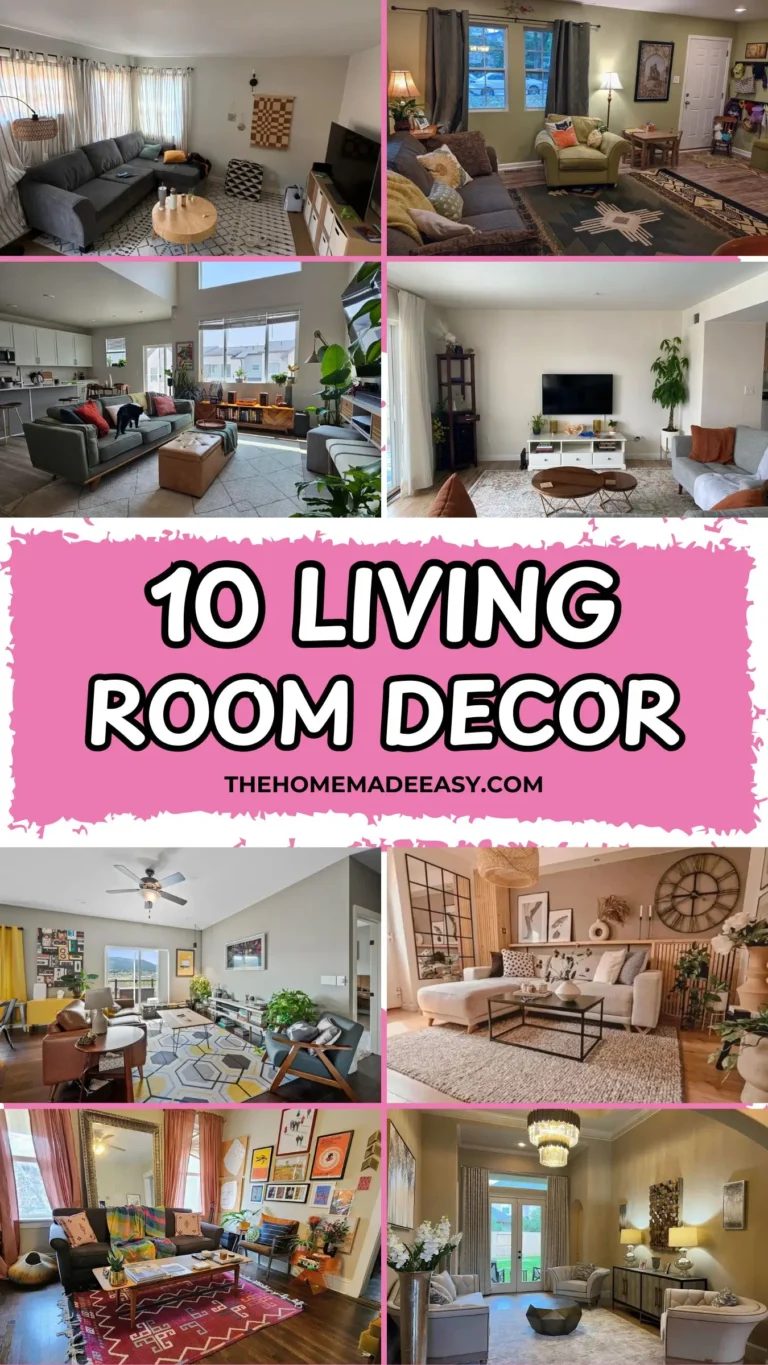
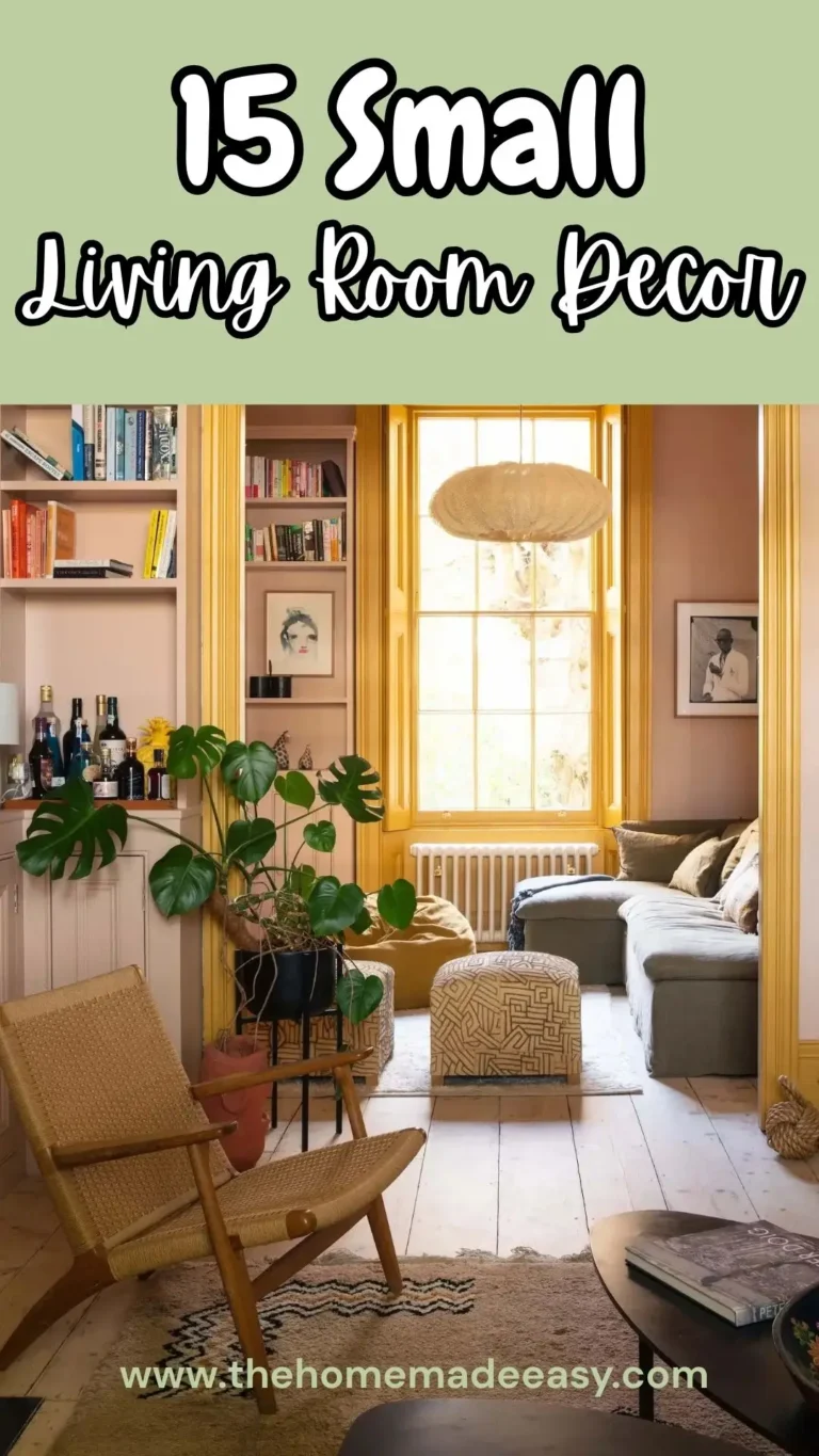
How To Style Your Living Room Wall Decor Like A Pro On A Target Budget
Let’s be honest. Your living room walls probably fall into one of two categories: completely bare (hello, sad beige box) or a chaotic mess of stuff that doesn’t really go together. Finding that sweet spot where your walls look intentional without screaming “I hired a professional” feels impossible.
Pinterest lies to you. Those perfectly styled rooms with unlimited budgets and professional lighting? Not helpful when you’re standing in your actual living room with a hammer and three random frames from Target.
So I went hunting for real inspiration from real homes. No staged magazine shoots. No $50,000 budgets. Just regular people who figured out how to make their walls look genuinely good. Some of these rooms are maximalist chaos (in the best way), some are minimal and clean, and some are clearly still works in progress. All of them taught me something worth sharing.
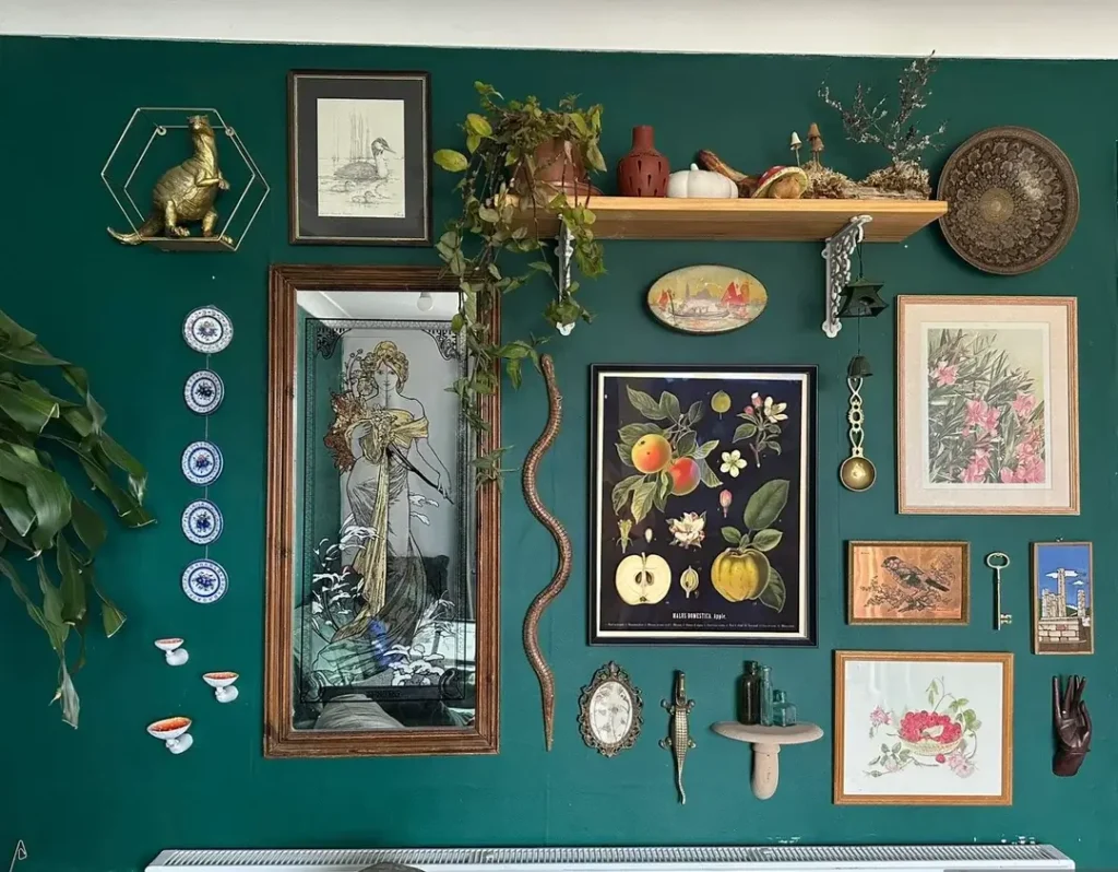
The Maximalist Curiosity Cabinet: A Deep Green Gallery Wall That Earns Every Inch
There’s a version of gallery walls that looks like a visual sneeze. This ain’t it.
Picture this: a rich hunter green wall covered with what I can only describe as extremely confident collecting. A warm oak floating shelf runs across the top third, holding terracotta vessels, dried botanicals, a small white pumpkin, and a brass decorative plate. Below it, the arrangement fans out beautifully.
What’s on this wall:
- A large framed Art Nouveau mirror print with a flowing female figure
- A dark botanical illustration of Malus Domestica (fancy talk for apple)
- A vertical string of blue and white decorative plates
- A vintage floral print in warm tones
- Small painted tiles
- A gold figurine inside a geometric brass frame
- A cast iron snake sculpture
- What appears to be a small wall mounted crocodile (yes, really)
- A living trailing plant spilling over the shelf edge
Why this works despite being absolutely packed: The color discipline is everything. That deep green wall acts as a unifying background. Nearly everything sits against it without competing because the green is bold enough to hold its ground. The gold, brass, and warm brown tones repeat through multiple pieces, creating cohesion without matching.
The lesson here: This approach suits anyone with a genuine collection rather than purchased as a set decor. The key is scale variety. The large mirror anchors the left center, medium prints fill surrounding zones, and small objects cluster at the edges. If you want to try this at home, paint the wall first. A bold color gives you permission to be denser with objects because the wall itself is already doing heavy lifting.
Mixed Media Living Room Gallery with Bold Portrait Art
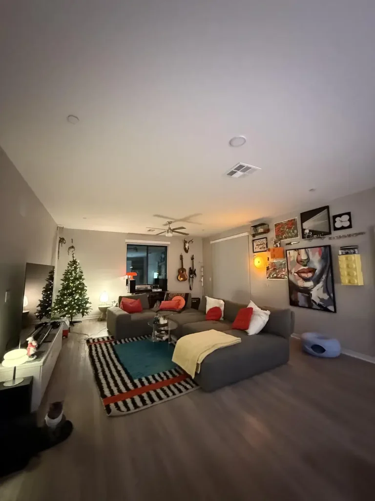
Some walls tell you exactly who lives in a space within about three seconds. This one does that immediately.
In a generously sized living room with warm ambient lighting, a gallery cluster centers around a large scale portrait painting. We’re talking a woman’s face rendered in loose, expressive brushwork with bold lips and striking eyes in pinks, reds, and skin tones. Around it, smaller framed pieces fill in: a mirror with a dark frame at the top, colorful abstract works, and a black and white piece with a floral cutout pattern.
Here’s the clever part: an orange ambient light fixture glows among the frames, acting as both decor and illumination. On the opposite side of the room, two acoustic guitars hang on the wall near an antler mount. Completely different wall surface, completely different vibe, but it works together.
My honest recommendation: If you’re building a wall arrangement from scratch, use a large scale figurative painting as your anchor. It gives the eye an immediate landing point and establishes an emotional tone for everything around it. Abstract or smaller works feel more intentional when they orbit a dominant centerpiece.
What also works: Each wall has its own identity, but they share a color energy. Both warm, both expressive, neither minimal. The room communicates personality without being obnoxious about it.
The Retro Cassette Tape Artwork: When One Statement Piece Does All the Work
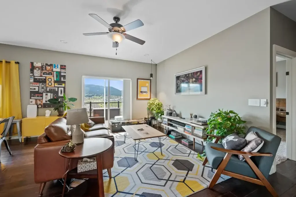
Hot take: not every wall needs a gallery. Sometimes one piece, placed correctly, carries the entire visual weight of a room.
This mid century influenced living room features a single large artwork showing a collage of colorful vintage cassette tapes arranged in a grid pattern. Each tape rendered in different colors: teal, red, orange, yellow, and green. The piece hangs against a medium gray wall, and the room’s other colors pick up threads from that palette without directly matching it.
The color connections:
- Mustard yellow curtains
- A yellow media cabinet
- Cognac leather chairs
- A geometric yellow, gray, and white rug
Two smaller pieces occupy the opposite wall near the TV, keeping the overall arrangement balanced without stealing attention from the main event.
Why this is genuinely one of the most effective “single statement piece” approaches I’ve seen: The cassette art communicates a specific point of view (love of music, appreciation for analog formats) while being visually compelling enough to function as pure color and pattern. You don’t need to understand the cultural reference to appreciate how it looks.
The real lesson: Wall decor living room ideas don’t always require a collection. If you find one piece that genuinely excites you, build the room around it rather than building the wall around a room you’ve already completed. The reversed approach produces more cohesive results almost every time.
Also Read: 12 Real-Life Living and Dining Room Combo Layouts That Actually Work
Bold Olive Green Walls as the Decor Themselves
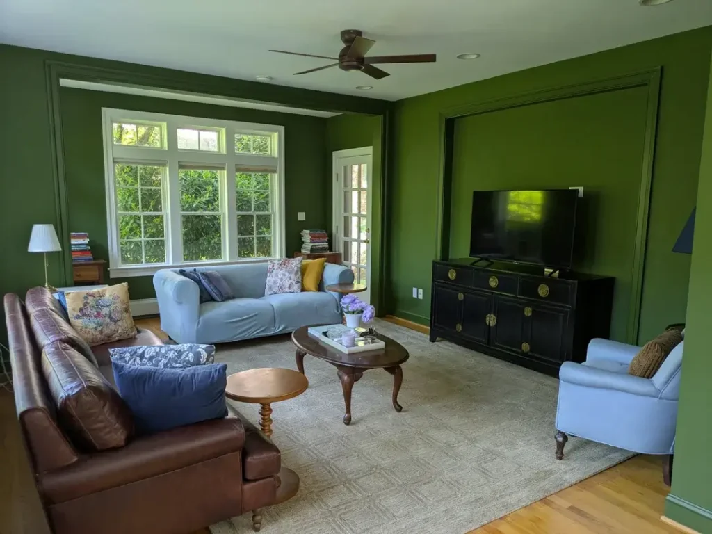
What if the wall decor was literally just the wall?
This traditional style living room demonstrates something that gets underestimated constantly: a deeply saturated wall color, applied confidently, makes additional wall decor nearly unnecessary. The walls are painted in a rich olive green somewhere between forest and moss. Crisp white crown molding and window trim create contrast. The TV is recessed into a framed panel on the right wall, treating the television as an architectural element rather than an afterthought.
A small blue abstract triangle on the far right wall is the only additional wall mounted element visible. And it holds its own against the green through sheer contrast.
The furniture plays off the walls beautifully:
- A powder blue sofa
- A deep cognac leather sofa
- Blue accent chairs
- A black lacquered media cabinet with brass hardware
Here’s my honest take: If your walls feel like they need a lot of decoration, the issue might actually be that your wall color is too neutral to do any work on its own. A white or beige wall creates visual debt. It needs to be paid back with objects. A bold color creates visual credit, and you can spend it more sparingly. This room is living proof.
The Three Panel Landscape Print: Classic, Clean, and Underrated
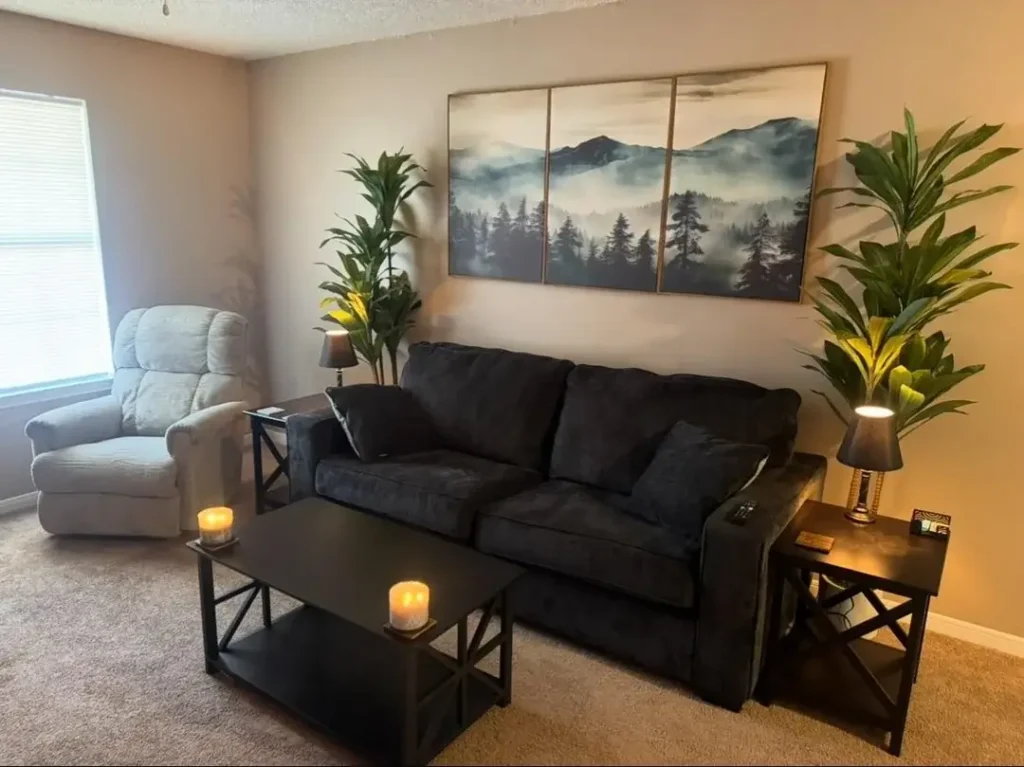
The triptych format has endured for a reason. It works reliably for almost every living room, in almost every style. And yet people keep sleeping on it.
This first apartment style room pairs a dark navy sofa and black X frame side tables with a three panel horizontal artwork depicting misty mountain scenery. Pine trees and peaks in deep blue gray tones with soft cloud gradients between the panels. Flanking the sofa, two tall tropical houseplants add organic vertical height that balances the horizontal stretch of the artwork. Pillar candles on the coffee table and side tables add warmth without cluttering the overall calm.
Why the triptych format actually works:
- It fills a wide horizontal wall span without requiring multiple separate hanging decisions
- The panels create a rhythmic visual break that a single canvas of the same width wouldn’t
- The gaps between panels add a subtle breathing quality. The eye reads it as one image but experiences it as three smaller ones
For this particular style: The dark sofa pairing is well considered. The cool toned mist in the artwork echoes the charcoal and navy of the furniture without matching it exactly. If you’re looking for wall decor living room ideas that are easy to implement and hard to mess up, a landscape triptych above the main sofa is about as reliable as it gets.
Retro Living Room with Arched Mirror and Maximum Personality
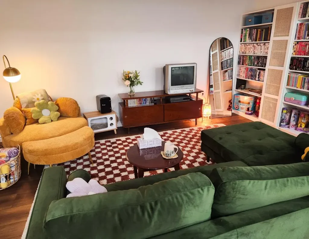
This room might be the most joyful space in this entire collection. And the wall decisions (or rather the non wall decisions) are a huge part of why.
The vibe is unmistakably retro:
- A round armed mustard yellow corduroy sofa chair with a green daisy pillow
- A deep forest green velvet sectional sofa
- A red and white checkerboard rug
- A walnut toned mid century media console
- A retro gray CRT television sitting on top of it (yes, deliberately)
On the right wall, a tall arched floor mirror with a rattan style frame leans against the wall rather than hanging. It creates height and reflection without committing to a permanent installation. A towering white shelving unit filled with paperback books, VHS tapes, and colorful collectibles serves as a full height wall feature on the far right.
The important lesson here: Mirrors and shelving are wall decor, not just functional objects. The arched mirror earns its place as a decorative element because the arch shape itself communicates style. The bookshelf creates a wall of color and texture that requires zero frames or artwork.
If you’re drawn to this kind of lived in, personality first aesthetic, consider what you already own that could do double duty as a wall feature. You might be surprised.
Also Read: Small Living and Dining Room Combo: 10 Real-Life Ideas You Can Actually Steal
Casual Print Cluster Above a Fireplace: The Imperfect Gallery Wall Done Right
Perfection is overrated in living room walls. This example proves it beautifully.
A bright, plant filled living room features a fireplace with a painted salmon pink surround. Above it, five framed prints cluster informally on the white wall. The arrangement includes a vertical nature illustration, two smaller botanical or figurative prints, a colorful event poster or art print, and an abstract illustrated card.
Here’s the key detail: They’re not aligned to a precise grid. The spacing is uneven and the frames are mismatched. None of that is a problem. The result feels like a wall built over time, with genuine affection for each individual piece, rather than a set purchased together for the sake of coordination.
On the right side of the room, a wooden ladder shelf holds books, trailing plants, and small objects. It functions as its own wall element without a single nail hole. The combination of the casual print cluster and the ladder shelf creates two distinct wall moments in the same room without either competing with the other.
The takeaway: Give yourself permission. Wall decor living room ideas that feel most authentic are usually assembled gradually rather than planned all at once. Start with one print you love, add another when something catches your attention, and resist the urge to make it all match. Rooms that look like this take time. And they look better for it.
Boho Accent Wall with Macramé, Typography, and an Evil Eye Mirror
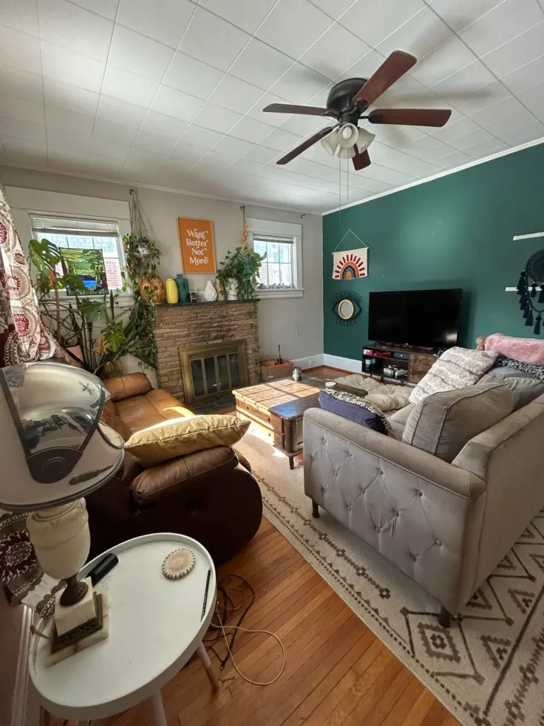
This room splits its personality across two walls. And somehow it works perfectly.
On the left, a natural wall with a brick fireplace is decorated across the mantle with a mix of houseplants including monstera, pothos, and smaller trailing varieties. Plus a bold orange typographic poster reading “Want Better Not More.” On the teal accent wall to the right, a small round evil eye mirror hangs centered above the television. A textile wall hanging with a rainbow arch motif in red, yellow, and blue occupies the upper portion of the wall. On the far edge, a string of beaded or fabric hangings in black adds texture at the corner.
The decision I find most interesting: Rather than painting the entire room (which would have been a heavier commitment), this homeowner painted a single wall in a deep teal. It creates a natural focal zone around the television, and the decor choices on that wall reinforce the boho aesthetic without overwhelming the space.
About that typography art: A well chosen typographic print can carry the values or mood of a household without being preachy. The key is believing in what it says. A phrase you don’t actually care about is wallpaper at best. If you’re going to put words on your wall, make sure they actually mean something to you.
Floating Shelves as a Living Wall: Books and Trailing Plants Together
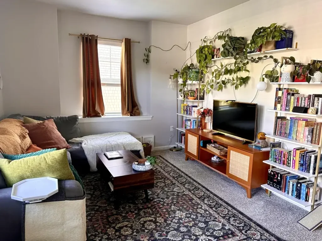
The combination of books and trailing plants on open shelving is having a major moment right now. And this example shows exactly why it earns its popularity.
Two white floating shelves span the upper portion of the right wall, holding a dense collection of colorful paperback and hardcover books alongside trailing pothos and heartleaf philodendron plants. The plants have been allowed (or guided) to grow outward and downward, their vines extending well beyond the shelf edges. Some are reaching toward the floor. Small decorative objects like a ceramic mushroom figure, a blue TARDIS box, and scattered small pots are tucked among the books. Below, a warm toned walnut and cane media unit holds the television.
What makes this arrangement genuinely successful: The balance between controlled and organic. The books create a structured, colorful backdrop. The plants introduce a living element that softens the edges and adds movement. Neither overwhelms the other.
If you’re considering this approach:
- Trailing varieties like golden pothos or philodendron scandens work particularly well because they direct growth naturally without much intervention
- Allow them to grow rather than constantly trimming. The trailing effect is literally the point
- Two tiers at varying heights creates more visual interest than a single wide shelf since the upper tier acts as a canopy for the one below
Also Read: 12 Very Small Living Room Decor Ideas (Real Apartments, Real Results)
Floral Accent Wallpaper Behind the TV: A Single Wall Statement
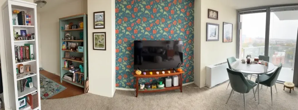
Wallpaper is not a small commitment. But this room makes the case that the right wallpaper on the right single wall is worth every bit of effort it takes.
A teal botanical wallpaper featuring oversized red poppies and green foliage covers the wall directly behind the television unit. Only that wall. The surrounding walls are left in plain off white. The effect is a focal panel that frames the TV without making it feel like just a screen on a wall. Small decorative pumpkins line the top of the media console as a seasonal touch that complements the botanical theme. On either side of the accent wall, framed prints and a bookshelf add to the room’s layered, curated character without competing with the wallpaper’s visual energy.
Practical advantages of this single wall approach:
- Requires far less material and labor than papering an entire room
- Can be removed or replaced without a total room overhaul
- Concentrates visual impact exactly where you want it
For readers interested in trying this: Bold botanical patterns on dark backgrounds (like this teal poppy design) read as sophisticated rather than busy when used on a single wall. The key is leaving the surrounding walls clean and simple so the pattern has room to register properly.
Marble Effect TV Panel with Integrated Shelving and LED Cove Lighting
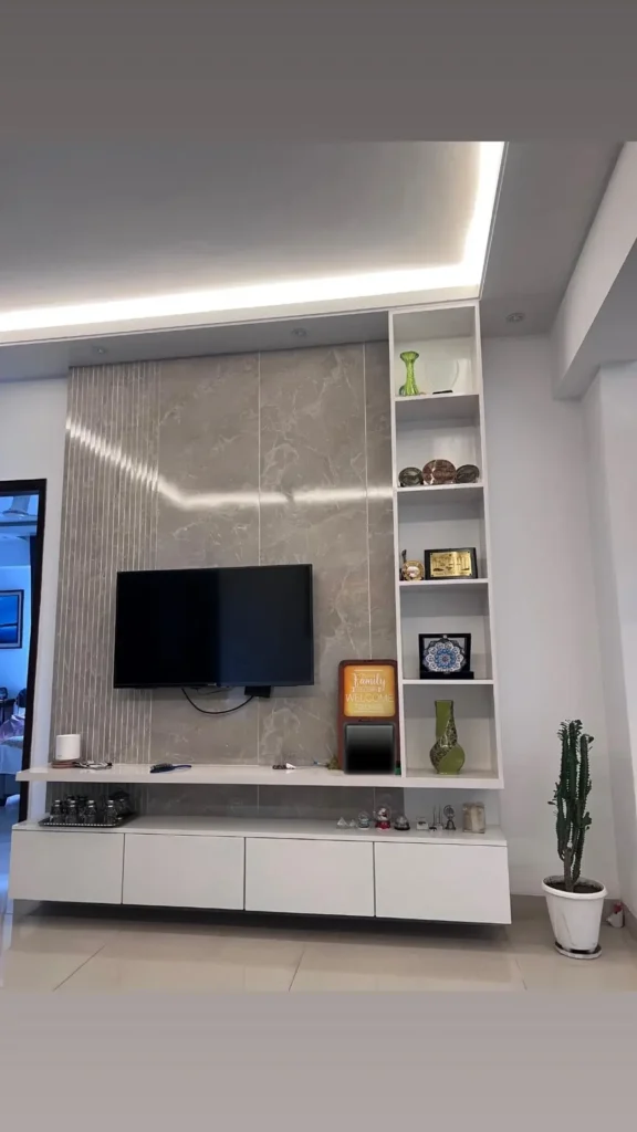
This is the most architecturally ambitious wall treatment in the collection. And it demonstrates what’s possible when wall decor becomes wall construction.
A built in feature wall centers on a large flat screen television mounted against marble effect panels in a warm gray veining pattern. Vertical fluted or ribbed detailing runs through the center panel, adding tactile depth to the stone look surface. To the right, an asymmetric open shelving unit in glossy white integrates directly into the wall, with shelves at varying heights holding green glass vases, decorative plates, a tiled plaque, and a small illuminated “Family” sign. Below the TV, a floating white media unit with push open drawers provides clean storage. Cove lighting runs along the ceiling edge, casting a soft upward wash that defines the entire wall zone as intentional architecture.
The fluted or ribbed detailing is worth noting specifically: It elevates a surface that would otherwise be flat by introducing a directional shadow line that changes with the light. You get visual interest without adding color or clutter.
Real talk: This level of renovation is beyond what most people can undertake casually. But the principles transfer to smaller scales. Even a painted accent wall with a floating shelf and an LED strip light behind it produces a version of this effect.
The formula: A textured or colored backdrop, a floating surface for objects, and integrated lighting that defines the zone.
Terracotta Accent Wall with Minimalist Arc Line Art
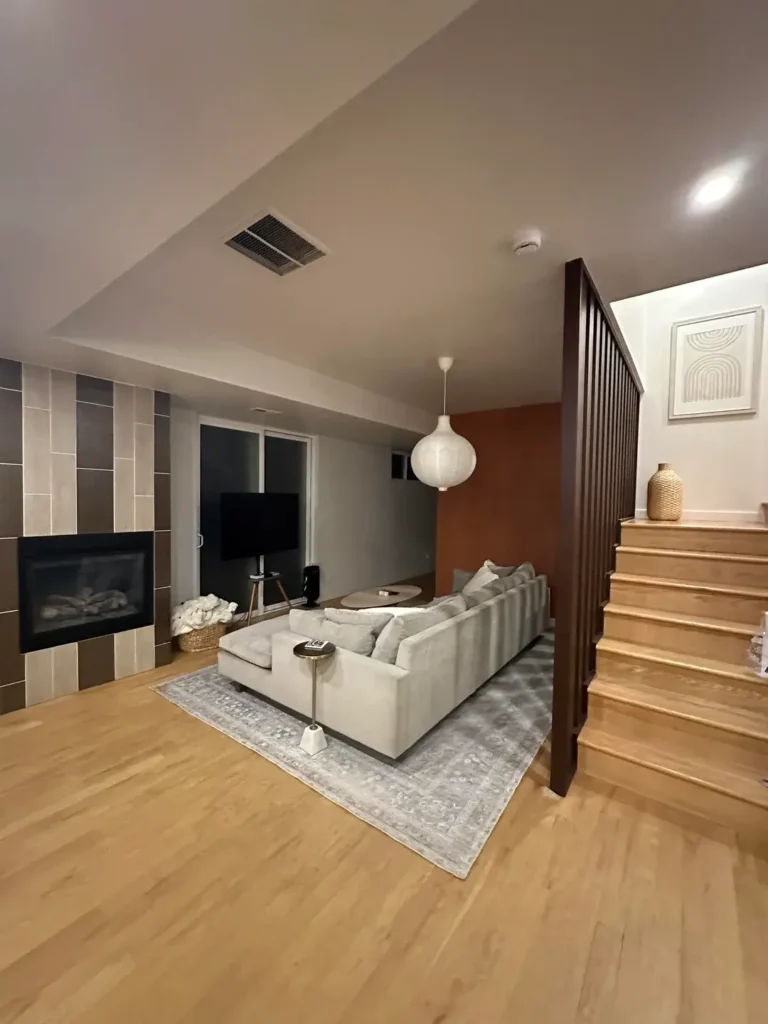
The final example in this collection might be the most restrained. And restraint is its own kind of skill.
A basement level living room features honey toned oak flooring, a large cloud gray sectional sofa, and a fireplace wall clad in vertical striped ceramic tiles in beige and taupe. The most notable wall decision is quieter than anything else in this collection: on the wall adjacent to a staircase, a terracotta accent panel (a warm burnt orange red) provides color behind a staircase railing in dark stained wood. On that terracotta wall, a single framed print of a minimalist arc rainbow line drawing in cream on a neutral background hangs above a small ledge holding a woven basket vase.
The composition here is nearly perfect in its simplicity. The terracotta wall is warm and saturated, but the arc print is cool and linear. The contrast is deliberate. Soft geometry against vivid color, earth tone against the abstract. The single framed print would be unremarkable on a white wall. On that terracotta background, it becomes a considered object.
The closing lesson on wall decor living room ideas: The wall color and the wall decor should be considered as one decision, not two separate ones. The print and the paint were chosen in relation to each other, and the result is a wall that requires nothing else.
How to Choose the Right Wall Decor for Your Living Room
Picking wall decor feels overwhelming because there are literally infinite options. But honestly, the process gets way easier when you break it down into a few key questions.
Start With the Feeling, Not the Object
Before you buy anything, stand in your living room and ask yourself: how do I want this space to feel? Calm and minimal? Cozy and collected? Bold and energetic? Your answer narrows down your options immediately.
For calm and minimal vibes:
- Single statement pieces
- Landscape triptychs
- Simple line art on accent colored walls
For cozy and collected energy:
- Gallery walls built over time
- Floating shelves with books and plants
- Layered textiles and mirrors
For bold and energetic spaces:
- Large scale portrait art
- Maximalist gallery arrangements
- Typography prints with strong messages
Consider Your Wall’s Existing Characteristics
Not all walls are created equal. That awkward narrow space next to your doorway needs different treatment than the massive expanse behind your sofa.
- Wide walls above sofas: Triptychs, horizontal gallery arrangements, or single oversized pieces work best here.
- Narrow vertical spaces: Lean into the shape with tall mirrors, vertical plant arrangements, or stacked small frames.
- Walls with existing features (fireplaces, built ins): Let the architecture guide you. A casual cluster above a fireplace or strategic lighting near built ins often works better than fighting the space.
Match Your Commitment Level to Your Lifestyle
This sounds obvious but people forget it constantly. If you’re renting, don’t fall in love with ideas that require permanent installation. If you hate maintenance, maybe skip the trailing plant shelf situation.
- Low commitment options: Removable hook gallery walls, leaning mirrors, ladder shelves
- Medium commitment options: Accent paint walls, peel and stick wallpaper, floating shelves
- High commitment options: Built in features, permanent wallpaper, architectural panels
Why Your Living Room Walls Still Look Bare (And How to Fix It)
You’ve probably tried decorating your walls before. And somehow they still feel… empty? Here’s what’s actually going wrong.
You’re Playing It Too Safe
The number one reason living room walls look bare is that people buy neutral, inoffensive art that basically disappears into the wall. That beige abstract print from HomeGoods? It’s doing nothing for your space because it was designed to offend no one.
The fix: Buy one piece that genuinely excites you, even if it feels “too bold.” Bold pieces earn their place on walls. Forgettable pieces just take up space without adding anything.
Your Scale Is All Wrong
Small frames on big walls look like postage stamps. It’s awkward and makes the wall feel emptier than if you’d just left it bare.
The fix: Measure your wall before buying anything. For the wall above a sofa, your art or arrangement should cover roughly two thirds of the sofa’s width. For standalone walls, go bigger than you think you need.
You’re Treating Wall Decor as an Afterthought
Most people finish their entire room and then panic about the walls. By that point, your options are limited to whatever happens to match what you already have.
The fix: Consider your walls from the beginning. That statement piece you love? Buy it first and let the room evolve around it. Rooms designed this way always look more cohesive.
You’re Waiting for Perfect
You’ve been “looking for the right thing” for three years. Meanwhile, your walls stay bare because nothing ever feels certain enough.
The fix: Start with one piece. Literally just one thing you like. Live with it for a month. Add something else. The best gallery walls in this collection were built gradually, not purchased as complete sets. Give yourself permission to begin imperfectly.
What Type of Wall Decor Works Best for Small Living Rooms?
Small living rooms need strategic wall decor that makes the space feel bigger, not more cramped. Here’s what actually works.
Mirrors Are Your Best Friend
I know, everyone says this. But it’s true. A large leaning mirror or an arched wall mirror instantly doubles the visual depth of a small room. The retro living room example in this collection proves you don’t even need to hang it. Just lean it against the wall and call it done.
Best mirror styles for small spaces:
- Arched floor mirrors (they add height without dominating)
- Round mirrors above furniture (they soften small rooms)
- Mirrored gallery arrangements (multiple small mirrors create interest without bulk)
Go Vertical, Not Horizontal
Small living rooms often have limited wall width but decent ceiling height. Use that vertical space instead of trying to fill horizontal spans you don’t have.
Vertical wall decor ideas:
- Tall floating shelf arrangements with trailing plants
- Vertical gallery wall arrangements (stacked frames rather than side by side)
- Floor to ceiling leaning art or mirrors
- Hanging textile art or macramé
One Bold Piece Beats Multiple Small Ones
Counterintuitively, one large statement piece makes a small room feel bigger than a bunch of tiny frames scattered around. Multiple small objects create visual clutter that makes spaces feel cramped.
The formula for small rooms: One anchor piece per wall, maximum. Keep surrounding walls simple or bare entirely.
Light Colors and Simple Frames
In small living rooms, heavy dark frames and busy patterns can visually weigh down the space. Opt for lighter frames, simple line art, or nature photography with lots of white or light tones.
Exception to this rule: If you’re going bold with wall color (like the olive green or terracotta examples above), you actually want contrast in your decor. The bold wall does the heavy lifting and simple art reads as intentional rather than wimpy.
Comparing Wall Decor Approaches: A Practical Guide
| Approach | Best For | Commitment Level | Estimated Cost Range |
|---|---|---|---|
| Gallery wall (mixed frames) | Collectors, renters with lots of art | Low (removable hooks) | $50 to $300+ |
| Single statement canvas | Minimalists, first apartments | Low (one hanging) | $80 to $400 |
| Bold paint color | Confident decorators, owned spaces | Medium (full paint job) | $60 to $180 for paint |
| Accent wallpaper (one wall) | Renters and owners alike | Medium (prep required) | $100 to $400 per wall |
| Built in shelving with lighting | Owners with renovation budgets | High (permanent) | $500 to $3,000+ |
| Shelves with plants and books | Plant lovers, casual decorators | Low (no contractor needed) | $50 to $200 |
Final Thoughts
These 12 rooms share almost no stylistic DNA. And honestly, that’s the most valuable thing about looking at them together. A deep green maximalist curiosity wall and a terracotta minimalist arc print exist at completely opposite ends of the decorating spectrum. Yet both succeed for the same underlying reason: someone made a considered choice and followed it through.
The most common mistake in wall decor isn’t choosing the wrong thing. It’s not choosing at all. Defaulting to bare walls because nothing feels certain enough to commit to. Every room in this collection started with a single decision: a paint color, a print, a plant on a shelf. The rest followed from there.
Here’s what I want you to do: Pick one wall in your living room. Decide what you want it to feel like. Not what you want it to look like, but how you want the room to feel when you look at it. Start there. The perfect gallery wall arrangement or statement piece will become obvious once you know the feeling you’re chasing.
What’s the first wall you’re going to tackle?