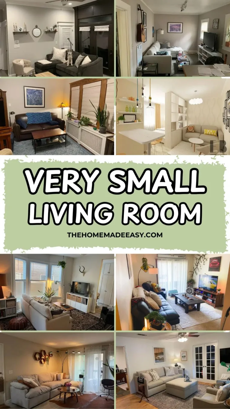
12 Small Space Living Room Ideas I Stole From Real Homes (That Actually Work)
Let me save you some time. Your small living room probably isn’t failing because it’s small. It’s failing because your couch is eating half the room, your layout fights the natural flow of the space, or you’ve been buying “small space” decor that honestly just makes things worse.
I’ve spent way too many hours scrolling through tiny living rooms on the internet, and here’s what I’ve learned. The best small living rooms aren’t designed around limitation. They’re designed around intention. Someone decided what they wanted and committed to it. That’s the whole secret.
The 12 rooms below come from real people living in real apartments and houses with real constraints. No staging. No sponsorships. Just people who figured out how to make their small living rooms feel genuinely good. I pulled apart what works in each one so you can steal the ideas that fit your situation.

1. The Unified Neutral Palette That Makes an Open-Concept Room Actually Flow
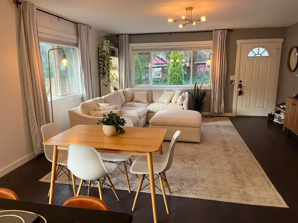
Combining your dining area and living area into one space sounds great until you try it and both zones just awkwardly stare at each other. This room nails it, and the secret is almost embarrassingly simple.
Everything pulls from the same warm, quiet family of tones. Greige walls. Cream linen curtains. Cream sectional sofa. The butcher-block dining table with white molded chairs adds just enough cool contrast to keep things interesting without breaking the harmony.
Here’s what I really love about this space:
- A Sputnik-style brass chandelier hangs over the dining table, giving that zone its own identity
- A matching brass arc floor lamp does the same for the living area
- The shared brass finish ties both zones together without being matchy-matchy
- Plants scattered at different heights add life without stealing floor space
- The sectional faces the windows instead of a wall, which makes the room feel twice its size
The big takeaway? If you share a dining and living space, unify your color story and your lighting hardware. That alone will get you 80% of the way there. Overhead lighting by itself just flattens everything and makes both zones feel like one sad cafeteria.
2. Dark Charcoal Furniture in a Light Room (Yes, It Works)
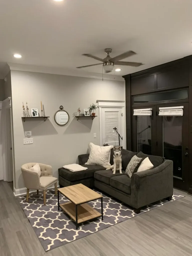
Can we kill the myth that small rooms need light-colored furniture? Because this apartment just buried it.
The charcoal sectional and sofa bring serious visual weight into the room. But the light grey walls and white ceiling keep everything breathable. The contrast actually creates a focal point instead of competing with one. A beige tufted accent chair softens things up, and a small wood-and-black-frame coffee table keeps the center of the room feeling open.
The Wall Decor Strategy Worth Copying
Instead of one big piece of art or a bulky media unit, the owner went with:
- Two simple floating shelves at different heights
- A round porthole-style mirror between them
- Dried botanicals, framed black-and-white photos, a candle, and a small plant on the shelves
Each piece earns its wall space. Nothing feels like filler.
There’s also a bold dark built-in unit on one wall that could easily overwhelm a small room. But because everything else stays lighter and more open-framed, it works. A geometric grey-and-white area rug grounds the seating without closing the space off.
IMO, if you have dark furniture you love or dark architectural features you can’t change, stop fighting them. Build your lighter elements around them strategically. This room proves that approach works beautifully.
3. The Personality-First Living Room That Breaks Every “Rule”
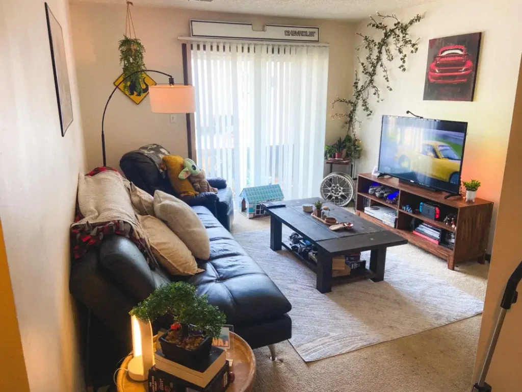
Not every small space living room idea involves white walls and three carefully chosen objects. This apartment belongs to someone, and you feel it immediately.
The setup centers around a deep black leather sectional facing a walnut-tone media console and a large TV. Pretty standard. But then you notice:
- A bonsai tree on a tray table in the foreground
- A trailing vine climbing a wall
- A Chevrolet sign mounted above the window blind
- Car art canvas on the adjacent wall
- A hanging arc lamp over the corner of the sofa
- Plants at every level, from hanging pots near the ceiling to small greens on the console
The warm carpet and a candle lantern add softness that offsets all the leather and dark wood. It sounds like it shouldn’t work, but it absolutely does.
Here’s why: coherent personality creates visual cohesion just as effectively as a curated color palette. Every item in this room belongs to the same person with the same interests. So despite the variety, the room reads as unified. If you feel pulled toward a specific theme, commit to it fully. Half measures in a small space just look cluttered.
4. One Boho Wall Textile That Carries an Entire Starter Apartment
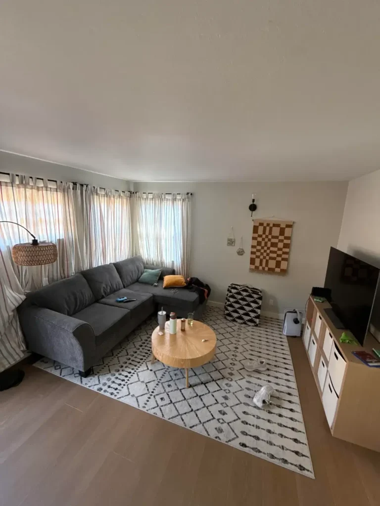
What do you do with blank walls when you’re not ready to invest in a full gallery? This space answers that question for about $40.
The furniture is straightforward. Grey L-shaped sectional. Round light-wood coffee table. Low IKEA-style media unit. Nothing fancy. But then you look at the wall and everything changes.
A large checkered wall hanging in ochre and natural cotton anchors the main wall above the sofa. It hangs from a simple black wall-mounted rod. Beside it, a small woven wall sconce lamp adds another handcrafted touch.
The supporting cast includes:
- Multi-stripe curtains pulling in amber, rust, and neutral tones
- A Moroccan-style black-and-white area rug that defines the seating zone with graphic contrast
- Warm-toned wood laminate floors tying everything together
The overall effect? A room that feels assembled with intention rather than furnished during a panicked weekend IKEA run. For anyone in a transitional living situation, this room proves that one strong wall textile and a well-chosen rug can carry a space that would otherwise feel unfinished. Low budget, high impact.
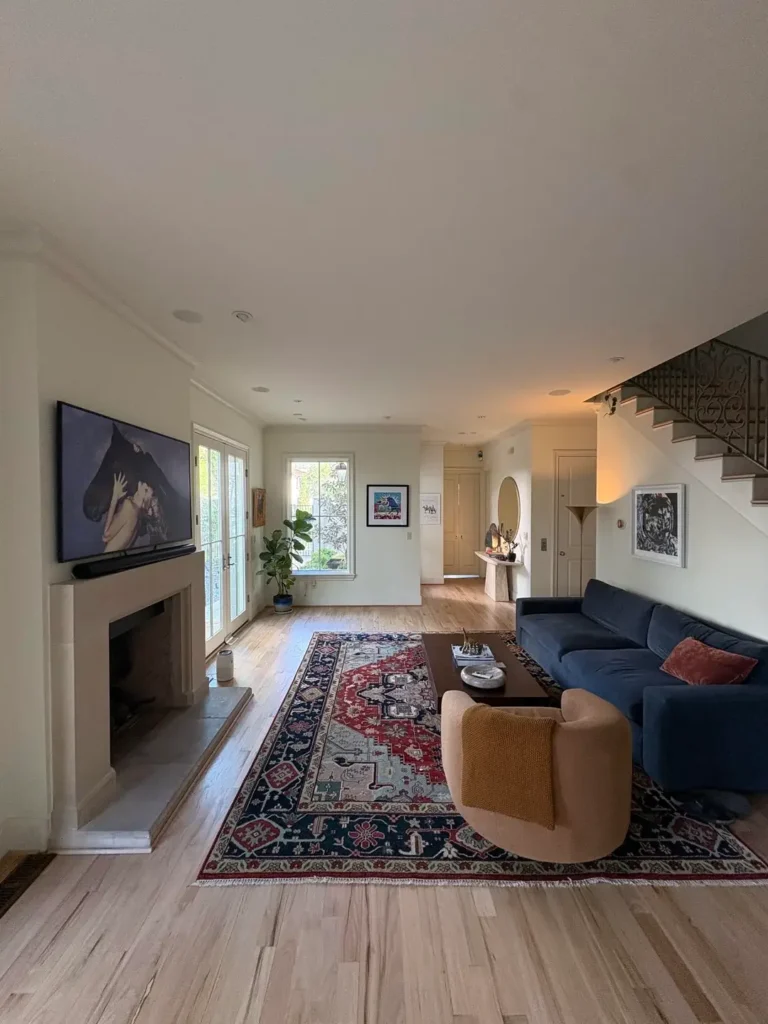
5. A Brooklyn-Style Room Where a Fireplace, Bay Window, and Home Office All Coexist
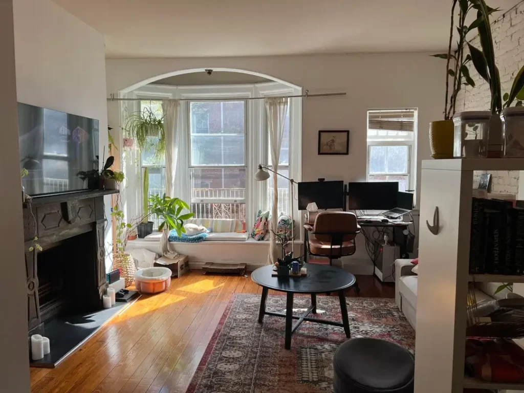
Fitting a living room AND a home office into one compact space without both looking terrible? That’s genuinely hard. This apartment in what looks like an older urban building pulls it off, and the result feels rich instead of cramped.
The arched bay window is the room’s architectural superstar. The owner leaned into it fully with a low daybed in the alcove, layered with pillows and surrounded by trailing spider plants. Original hardwood floors and an exposed brick chimney breast add the kind of character that no amount of money can replicate.
The home office sits against a side wall near a secondary window. Just a simple standing desk with dual monitors. No attempt to hide it or pretend it isn’t there. A worn Persian-style area rug grounds the central seating area where a round black coffee table and a mid-century leather rolling chair anchor things.
The key principle here is huge. If your small room has a fireplace, a bay window, an unusual ceiling height, or exposed masonry, those features do more for your space than anything you could buy. Treat them as assets, not obstacles. Work with them, not around them.
6. A Persian Rug That Runs the Entire Room’s Design
Some rooms work backwards from their statement piece, and this one makes zero apologies about it. The deep red, navy, and cream Persian-style area rug dominates the space, and every other decision responds to it.
Here’s the formula:
- Both sofas stay in warm light grey (no competition with the rug)
- A whitewashed wood coffee table adds contrast at floor level
- A tall arched iron-and-glass display shelf in the corner holds plants, candles, and photos (vertical presence without bulk)
- A mustard gold curtain panel echoes the amber tones in the rug
- Plantation shutters on the main window provide clean architectural lines
- Crown moulding and a ceiling fan with dark blades add period-appropriate detail
If you have a bold rug or plan to invest in one, this is your blueprint. Neutral seating. One or two accent pieces that pick up a color from the rug. Restrained wall decor. Let the rug do the talking and keep everything else relatively quiet. The rug carries the room’s entire personality, and nothing fights it for attention.
7. A Gallery Wall and Fireplace That Turn “Awkward” Into “Character”
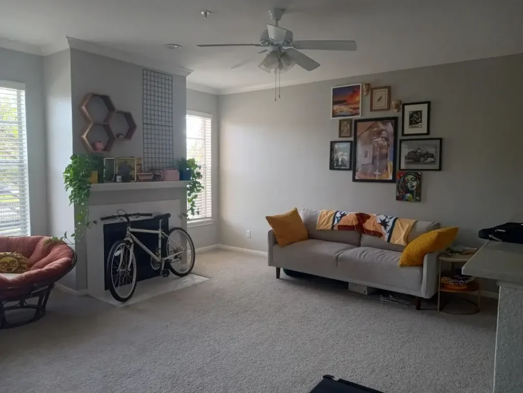
An empty fireplace that doesn’t work anymore and a bunch of blank wall space. Sounds like a decorating problem, right? This room reframes both as opportunities.
The non-functional fireplace now stores a bicycle. Bold? Yes. Practical? Also yes. In a small apartment where a bike would otherwise eat floor space, this is honestly genius. The mantel above holds a trailing plant, framed photos, and small objects, turning dead architecture into a meaningful display shelf.
The wall to the right carries a gallery arrangement of seven or eight framed pieces in different sizes, styles, and orientations. Prints, paintings, photographs. The arrangement clusters toward the corner rather than spreading evenly, which gives it an organic, accumulated feel instead of a rigid, formal one.
The grey sofa with amber and orange throw pillows keeps a clean, mid-century silhouette. A papasan chair in weathered red wicker adds an eclectic note that somehow works perfectly.
Your gallery wall doesn’t need to be perfectly curated or expensively framed. The arrangement and the commitment to filling the wall with things that actually mean something to you is what gives it energy. For small living rooms that lack architectural drama, a well-executed gallery wall is one of the most effective low-cost transformations you can make.
8. Smart Furniture Placement That Makes a Narrow Room Feel Wider
Narrow rooms have a specific problem that wide rooms simply don’t. Everything emphasizes the length and kills the width, making even a decent-sized room feel like a hallway. This townhouse living room addresses that head-on.
The deep navy velvet sofa runs along the longer wall (standard move for a narrow room). But here’s where it gets smart. A curved caramel-tone armchair sits perpendicular to it at a slight angle, breaking the parallel arrangement and creating a more conversational grouping.
A dramatic vintage-style Kazak rug in deep indigo, red, and cream anchors the whole setup. A tall fiddle-leaf fig in a blue ceramic pot stands near the french doors, pulling your eye toward the natural light.
Here’s the counterintuitive move that makes this room work: the owner preserved empty floor space around the furniture grouping instead of pushing everything against the walls. In a narrow room, most people shove furniture to the perimeter to “create space.” This room does the opposite, and it paradoxically feels less tunnel-like because of it.
A round mirror and console table near the staircase bounce light deeper into the space. If your living room feels too narrow, prioritize floor space around your furniture over floor space at the edges. It sounds wrong, but it works.
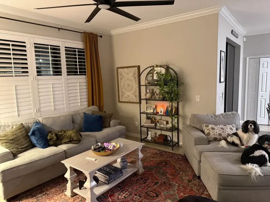
9. A Family Living Room That’s Honest About Being a Family Living Room
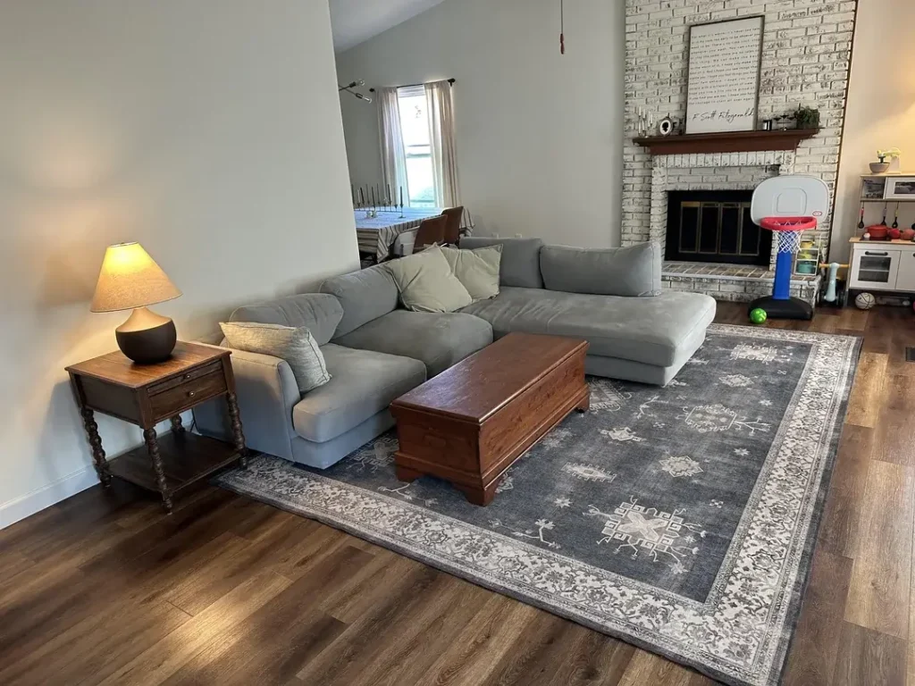
Family living rooms face unique pressure. Adults want something comfortable and considered. Kids need room to exist without every object being precious. This room balances both needs without pretending the kids don’t live there.
The highlights:
- A large grey sectional sized for a family that actually uses it
- A rich walnut-stained vintage trunk as a coffee table (surface + hidden storage, problem solved)
- A carved barley-twist wood side table with a simple linen-shade lamp
- A small toy basketball hoop near the fireplace, unapologetically present
- Whitewashed brick fireplace that preserves texture while keeping things light
- A dark grey medallion-pattern area rug that grounds the sectional and hides minor wear
This room models something important. A family living room can look designed around real life rather than some aspirational fantasy where nobody spills anything or leaves toys in the corner. Choosing durable materials, furniture with hidden storage, and rug patterns that forgive everyday chaos will serve you way better than choosing based on aesthetics alone.
The room looks collected and comfortable. That’s a much more realistic target than “showroom perfect,” and honestly? It looks better for it.
10. Moody Amber Lighting That Transforms a Room After Dark
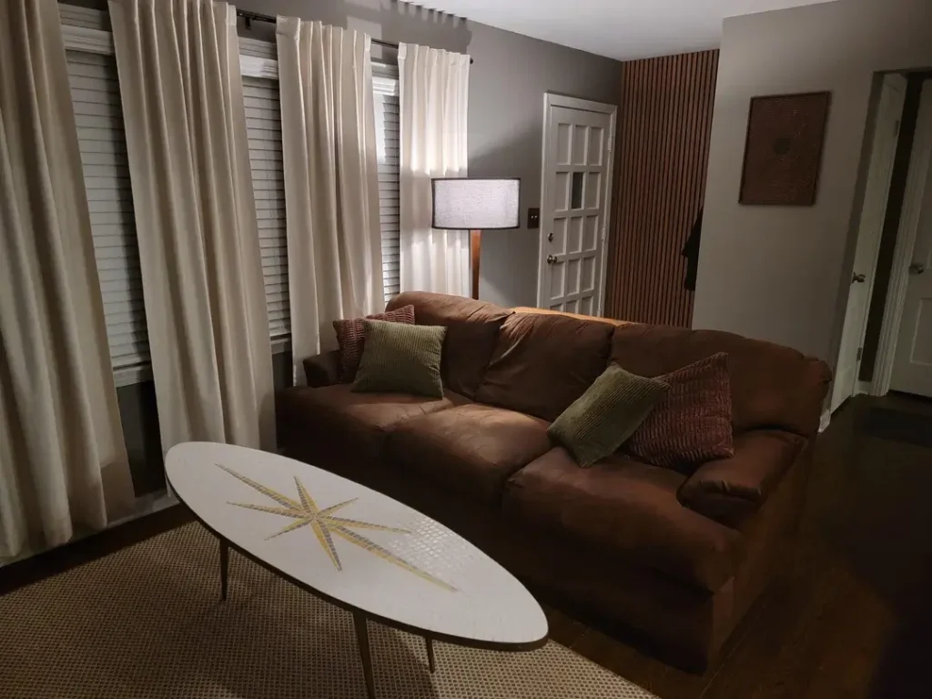
Here’s a reminder that your living room doesn’t need to peak in daylight. This room was clearly designed for evenings, and the warm, amber atmosphere it creates is genuinely inviting.
A large caramel-brown sofa with a beautifully worn, lived-in quality sits at the center. Green velvet and dusty rose cushions add depth without fighting the warm palette. A tall mid-century table lamp with a wide drum shade casts a broad amber pool of light from the corner.
The details that make it work:
- Long cream drapes falling to the floor, softening window frames and blocking cold exterior light
- A vertical wood slat panel on the wall that catches warm lamplight and creates shadow depth
- A woven rattan wall piece adding another natural texture
- An oval coffee table with a starburst mosaic inlay bringing a retro-modernist surprise
The real lesson here is about lighting, not decor. Most small living rooms rely entirely on overhead fixtures, which flattens the space and kills any sense of depth or atmosphere. One well-positioned floor or table lamp at a lower level than your ceiling fixture changes the entire character of a room after dark.
If you want your small living room to feel genuinely cozy in the evenings, buy a great lamp before you buy a new throw pillow or wall art. Higher return on investment, every time.
11. A Dense Gallery Wall That Makes a Rental Feel Like Home
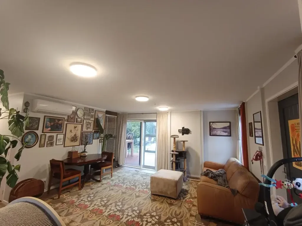
Rental apartments often feel like nobody lives in them, and that’s hard to fix when you can’t paint, knock through walls, or make permanent changes. This room solves it with one powerful move: a densely populated gallery wall that wraps around an entire corner.
The gallery includes:
- Framed photographs
- Decorative plates
- A clock
- Botanical and landscape prints
- Various small objects at different scales and in different frame styles
The arrangement is genuinely eclectic. Not “curated matching frames from a set” eclectic, but “accumulated over years of actually living” eclectic. That’s what gives it authenticity.
The rest of the room mixes periods and functions freely. A dining table with traditional dark-wood chairs. A brown leather recliner. A caramel ottoman. A large floral-pattern area rug. A monstera in the corner. Red curtain panels framing the main window.
A gallery wall that sprawls across an entire corner reads as a deliberate display, not a collection of random stuff. The arrangement is the difference between “gallery wall” and “cluttered wall.” If you’re renting and want your small living room to feel like yours, a committed corner gallery is one of the most effective tools available. Low cost, high personality, zero damage to your security deposit.
12. Hanging Plants, LED Strips, and Full-On Whimsy
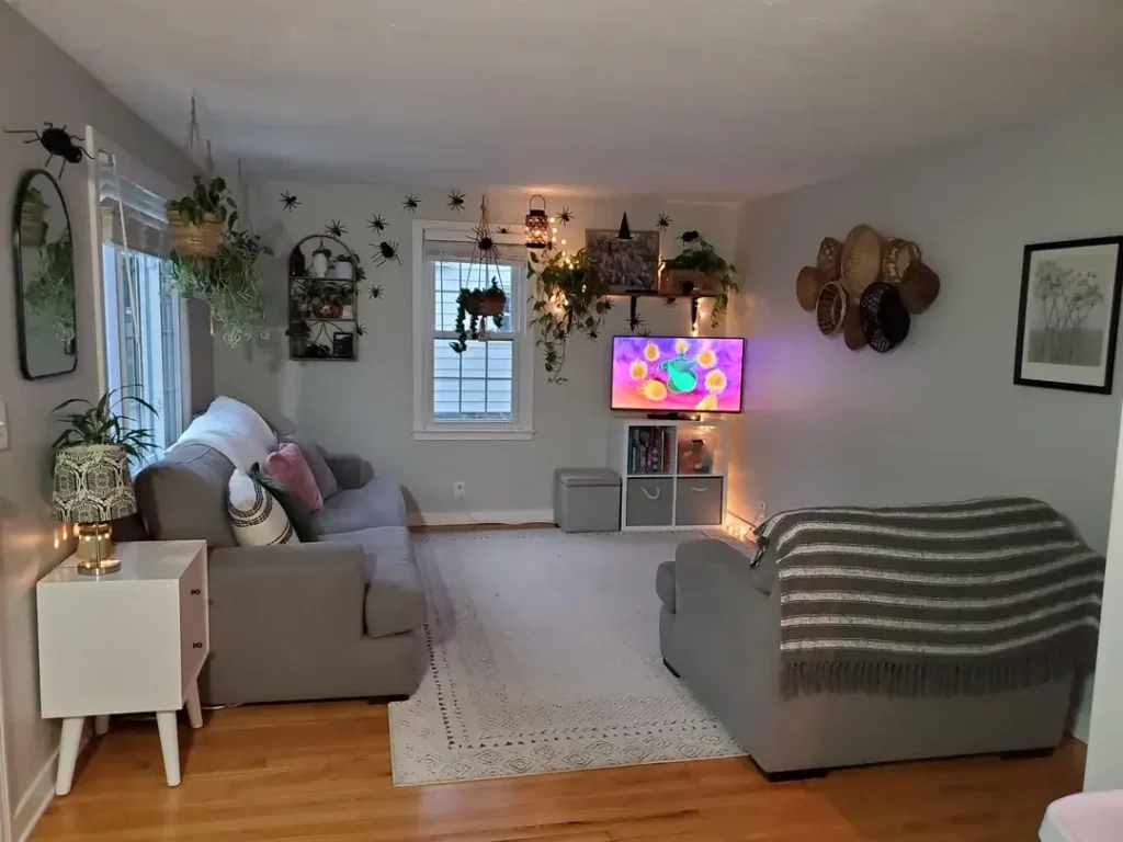
Not every small space living room idea needs restraint. This room commits fully to a maximalist, plant-heavy, personality-driven aesthetic, and the result is genuinely joyful.
Multiple hanging planters descend from the ceiling at different heights, trailing pothos and other long-leafed plants at eye level. Wall-mounted shelves hold more plants alongside small lanterns and decorative objects. A wicker basket gallery clusters on one wall beside a framed botanical print. A round leaning mirror near the window reflects light and opens up the corner.
The seating keeps things simple with two grey sofas facing the TV area, a white and charcoal diamond-pattern rug between them, and a white retro-style side table holding a patterned lamp. LED strip lighting behind the media unit adds a warm glow that creates depth at floor level.
Small decorative spiders on the walls hint at a seasonal Halloween theme, which shows how easily a small room can refresh with low-cost seasonal touches. No furniture rearrangement needed.
The big strategy here? Using vertical space aggressively. The plants, baskets, shelving, and layered lighting all operate at ceiling and upper-wall level. This draws your eye upward and makes the room feel taller than it probably is. In a small living room where floor space is limited, move your decorating instincts upward instead of outward. You have more ceiling and upper-wall space than you’re probably using right now.
Quick Comparison: Which Idea Fits Your Situation?
| Idea | Best For | Budget | Effort |
|---|---|---|---|
| Unified neutral palette | Open-concept rooms | Medium | Low |
| Dark sofa + floating shelves | Renters and first apartments | Low-Medium | Low |
| Personality-themed layering | People with a defined interest | Low | Medium |
| Boho wall textile focal point | Starter apartments | Low | Low |
| Bay window + home office | Multi-use small rooms | Low-Medium | Medium |
| Persian rug as foundation | Traditional or eclectic spaces | Medium-High | Low |
| Gallery wall over fireplace | Rooms lacking architecture | Low | Medium |
| Narrow room furniture tricks | Townhouses and row homes | Medium-High | High |
| Vintage trunk coffee table | Family rooms needing storage | Low-Medium | Low |
| Moody evening lighting | Any small living room | Low-Medium | Low |
| Dense corner gallery wall | Rentals needing personality | Low | Medium |
| Hanging plants + LED accents | Maximalist or boho lovers | Low | Medium |
What All 12 Rooms Have in Common
After looking at all these spaces, a clear pattern shows up. The rooms that feel like successes aren’t the ones with the most money spent or the most matching pieces. They’re the ones where someone made a clear decision about what they wanted and then followed that decision consistently.
Whether that decision involved creating a moody amber retreat, a plant-filled jungle, a family-proof comfort zone, or a multi-use live-work apartment, the commitment to the decision gave each room its coherence. Indecision in a small space shows up as clutter, mismatched scale, or a room that can’t figure out what it wants to be.
The other consistent principle? Vertical space. Plants hung from ceilings. Gallery walls that rise well above eye level. Shelving that runs floor to ceiling. Curtains mounted near the ceiling rather than the window frame. Every single one of these choices adds perceived height and draws your eye upward instead of letting it bump into the limitations of the floor plan.
Make Your Small Living Room Yours
Here’s the honest truth. Your room doesn’t need to look like any of these 12 examples. It needs to look like it belongs to you and works for the way you actually live in it.
Pick the specific techniques that apply to your situation. Ignore the rest. If you’ve got a narrow room, steal the furniture placement trick from room 8. If you’re renting, grab the gallery wall strategy from room 11. If your evenings feel flat, invest in a good lamp before anything else.
The rooms that inspire the most always come from people solving real problems in real homes with real budgets. That’s exactly what these 12 rooms represent. So pick your favorite idea, commit to it, and stop overthinking. Your small living room has way more potential than you’re giving it credit for. Now go make it yours