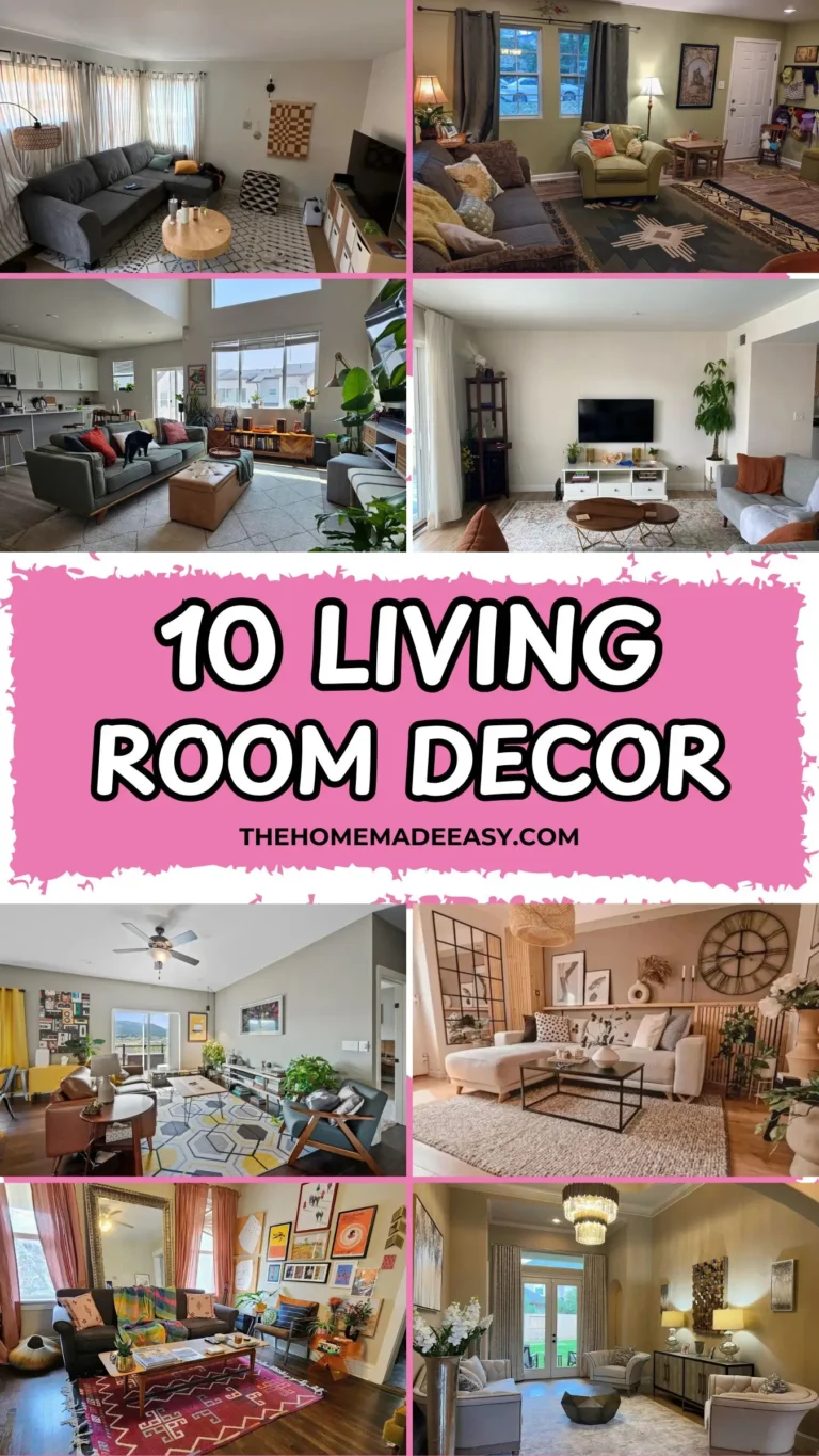
Small Living and Dining Room Combo: 10 Real-Life Ideas You Can Actually Steal
Look, I get it. You’ve got one room that needs to pull double duty as both your living room and your dining room, and you’re staring at it thinking, “How on earth do I make this not look like a mess?” Good news: it’s way more doable than you think. Honestly, a well-planned small living and dining room combo can feel more intentional and put-together than two separate, half-empty rooms ever could.
I went deep into real spaces shared by real people online. Not those impossibly perfect showroom setups where nobody actually lives. These are actual homes with actual furniture decisions, some still very much a work in progress. And the common thread across every space that works? Someone made deliberate choices about zones, scale, and keeping things visually cohesive.
Whether you’re working with a tiny city apartment or a suburban open-plan layout, there’s something here you can straight-up steal for your own space. Let’s get into it.
High Ceilings and Zoned Rugs in a Light-Filled Open Plan
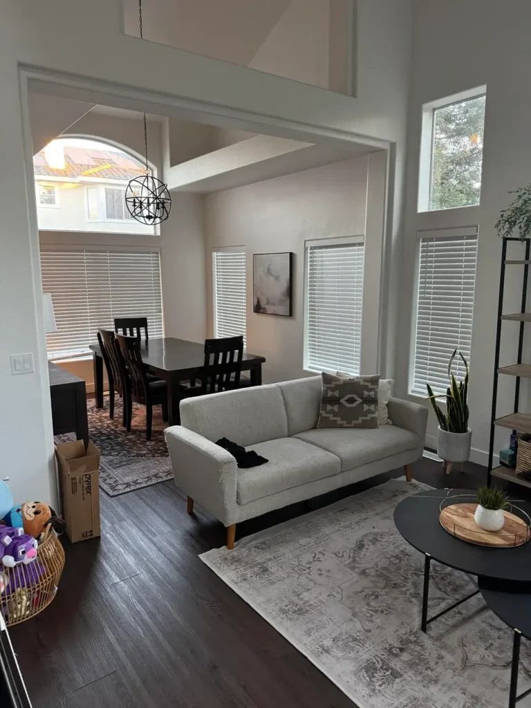
Not every small living and dining room combo has to feel like you’re living in a shoebox. This space proves that ceiling height changes absolutely everything.
We’re talking soaring ceilings with transom windows flooding the upper walls with gorgeous natural light. On the living side, a light grey linen loveseat sits on a muted grey vintage-style area rug, grounded by a round black metal coffee table. A lean black shelving unit holds a snake plant and some small decor without overwhelming anything.
Over on the dining side, a dark espresso wood dining table with matching chairs sits on a completely separate Persian-style rug in deep burgundy and charcoal tones. And that separation? That’s the whole trick.
Why Two Rugs Beat One Every Time
The two distinct rugs do all the heavy lifting here. Instead of one massive rug trying to unify everything, each zone gets its own foundation. You get visual separation between living and dining without needing a single partition, screen, or awkward bookshelf wall.
The contrast between the grey living rug and the patterned dining rug also adds a ton of visual interest. No extra decor required.
What really impresses me is the restraint in furniture scale. That loveseat is deliberately compact, leaving breathing room between the two zones. A full sectional would have absolutely swallowed this room whole. If your ceilings are tall, resist the urge to fill vertical space with tall furniture. Let the ceiling do its thing and keep your pieces low and lean.
Pro tip: Start with two area rugs sized to each zone, not one oversized rug across the whole floor. That gap of bare floor between them? Totally intentional and totally essential.
Rustic Wood Pendant and Round Dining Table in a European Apartment
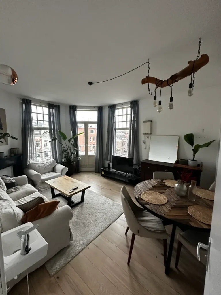
There’s a reason round dining tables keep popping up in small living and dining room combo ideas, and this European apartment shows exactly why.
The star of the show is a handcrafted raw wood branch pendant light hanging over the dining area by black chains. It holds four Edison bulbs at different heights, giving the space warmth without any stuffiness. Below it sits a round parquet-patterned dining table in warm walnut tones, circled by white upholstered dining chairs with tapered mid-century legs. Woven rattan placemats layer in extra texture.
On the living side, a large white slipcovered sofa (giving major IKEA vibes) anchors things down, paired with a chunky wooden coffee table on a pale grey shag rug. Bay windows with sheer grey curtains frame a cityscape view. Pretty dreamy, honestly.
Round Tables Are a Cheat Code for Small Spaces
A round table removes corners, which means people can move around it from any angle. It also creates a softer visual boundary between your living and dining zones. The pendant light acts as a zone marker, drawing the eye down and basically announcing, “Hey, this is where we eat.”
What this space nails is mixing textures without mixing too many colors. Everything lives in a warm neutral palette: white, grey, walnut, rattan. The variety comes from materials, not color. That’s a technique absolutely worth stealing. Pick your palette, then go wild with textures within it.
FYI: If you have bay windows or any kind of architectural feature, position your dining area to take advantage of it. Natural light makes even the tiniest table feel like an event.
Also Read: 12 Small Space Living Room Ideas I Stole From Real Homes (That Actually Work)
Warm Oak Floors and Mixed Seating in a Long Narrow Combo Room
Long and narrow rooms are their own special breed of challenge. This example handles those tricky proportions better than most spaces I’ve seen.
The room runs deep, with rich warm-toned oak hardwood floors carrying through both zones seamlessly. On the living end, a taupe button-tufted sofa sits along the right wall next to a leather cognac accent chair. A round barrel-style chair in light grey fabric sits opposite, creating a conversational grouping around a rectangular light oak coffee table on a pale grey printed area rug.
At the far end, a natural wood dining table pairs with all-black dining chairs under a simple black multi-arm chandelier. Two botanical prints hang symmetrically behind the table. Clean, intentional, and it just works.
Treating the Floor Like a Runway
The key to making a long room work is placing rugs as “stops” along the floor. The grey area rug clearly defines the living zone. Beyond the rug, the dining area floats on bare hardwood. This progression feels natural, not forced. The room has visual rhythm because the two zones are different but coordinated through consistent warm wood tones.
I really appreciate the mixed seating in the living area here. The cognac leather chair adds warmth against the cooler grey sofa, and the barrel chair in the foreground creates depth. Not every seat needs to match. What matters is that each piece is proportionally appropriate to the room and to each other.
Also worth noting: a floating wall shelf near the entry holds books and small objects, adding personality without eating up any floor space. Vertical storage is criminally underused in long narrow rooms. A shelf at shoulder height on a long bare wall changes the entire vibe.
Indoor Plant-Filled Open Plan with a Long Communal Dining Table
Some spaces pick a lane and fully commit. This one decided it belongs to the plants, and honestly, I’m here for it.
The room centers on a long bleached oak dining table on hairpin legs, surrounded by wire mesh chairs and low sheepskin-topped stools. A large dome pendant in off-white hangs above. But what makes this room truly distinctive is the density of tropical houseplants. A monstera deliciosa and several fiddle-leaf fig specimens cluster near the wall between zones, acting as a living, breathing room divider. A mid-century walnut dresser holds several smaller plants along the partition wall.
On the living side, a dark brown leather chesterfield sofa sits low on a natural jute rug next to a wooden coffee table. The whole space feels like a cozy jungle and I mean that in the best way possible.
Plants as Zone Dividers (Done Right This Time)
Using plants as room dividers gets talked about a lot, but rarely does anyone execute it this deliberately. Here, the plants don’t just add life to the room. They actually define the boundary between dining and living without a wall, shelf unit, or any other partition. The effect feels soft and organic, which perfectly suits the earthy aesthetic.
Here’s the thing that makes it work: these are large specimens, not a sad little cluster of succulents on a windowsill. Going big with a few plants creates way more visual impact than scattering twenty tiny ones around. That monstera alone pulls the eye and signals the transition between zones.
The pale dome pendant over the dining table is a smart pick for a room already packed with visual texture. It adds definition without adding noise. If your space already has a lot going on visually, keep your lighting simple. Let the rest of the room be the star.
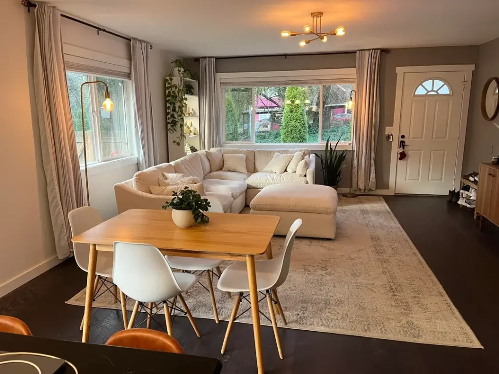
Compact White Bistro Table as a Dining Nook Beside a Fireplace
This is the small living and dining room combo at peak efficiency. And I genuinely mean that as a compliment.
The living area features a soft greige sofa and a coordinating accent chair, both low and streamlined, arranged around a white marble-topped coffee table with a brass-finished base. A sputnik-style black chandelier with exposed Edison bulbs hangs above the seating area, adding energy to the otherwise soft palette. The fireplace with a white painted surround and grey veined marble tile insert anchors the wall with the TV mounted above it.
In the foreground corner, a small round white bistro-style table with two matching white chairs and a gold wire geometric table lamp creates a dining zone that takes up almost zero floor space. Genius level stuff.
The Bistro Table Approach (Seriously Underrated)
A two-person bistro setup takes up roughly the same footprint as a single armchair. Let that sink in. The white finish keeps it visually recessive, so it doesn’t compete with the larger living furniture. The gold lamp on the table adds warmth and signals that this spot is meant to be used and enjoyed, not just tolerated as an afterthought.
What this room absolutely nails is matching the dining solution to the actual lifestyle need. Not everyone needs a six-seat dining table. If you regularly host just one or two people for meals, a bistro table gives you everything you need while freeing up major floor space for the living side.
The sputnik chandelier earns its spot too. It draws the eye up without adding visual bulk at eye level, which matters a lot in a room where the ceiling is basically the only uncrowded surface.
Also Read: 12 Very Small Living Room Decor Ideas (Real Apartments, Real Results)
Double Rug Strategy with Gallery Wall and Warm Wood Dining Table
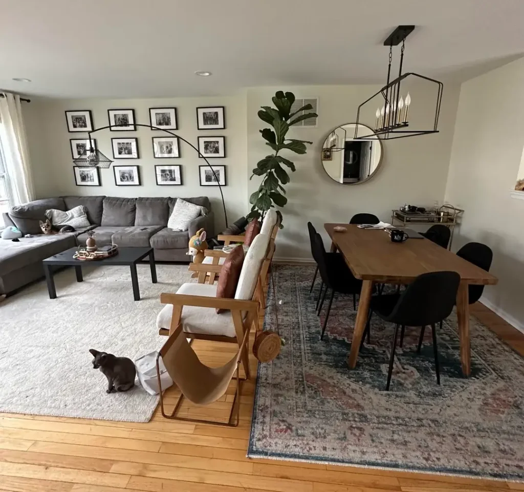
Two cats, a gallery wall, and a dining table that anchors the whole room. This space has personality for days.
The living area centers on a large grey L-shaped sectional sitting on a cream area rug. A low black rectangular coffee table holds books and small objects. Along the back wall, a dense grid gallery wall of black-and-white family photographs in matching black frames creates a striking focal point. No paint, no wallpaper, just photos doing all the talking. An oversized arc floor lamp curves dramatically above the seating area.
Over in the dining zone, a solid warm oak dining table with angled legs sits on a faded boho-style rug in dusty rose, blue, and terracotta tones. Black upholstered dining chairs surround it, with a fiddle-leaf fig tree standing tall beside the table. A geometric brass and black rectangular pendant light hangs low above, and a round mirror sits on the wall behind.
Gallery Walls That Don’t Look Like a Mess
That gallery wall is the most assertive design choice here, and it works because of strict visual discipline. Every frame uses the same black finish, every photograph is black and white, and the grid arrangement stays tight and uniform. This kind of restraint within a bold idea is exactly what separates a gallery wall from a cluttered disaster.
The two-rug approach shows up again here, and it’s worth noting how wildly different the two rugs are. The cream rug in the living zone is plain and quiet. The patterned boho rug in the dining zone is loud and warm. These two rugs create two completely different moods in the same room without any conflict because the furniture between them acts as a natural visual buffer.
That round mirror in the dining area pulls practical weight too. It bounces light and adds depth without adding clutter. IMO, a mirror in a combo room is one of the easiest ways to make both zones feel bigger.
Polka Dot Accent Wall and Compact High-Rise Apartment Dining Setup
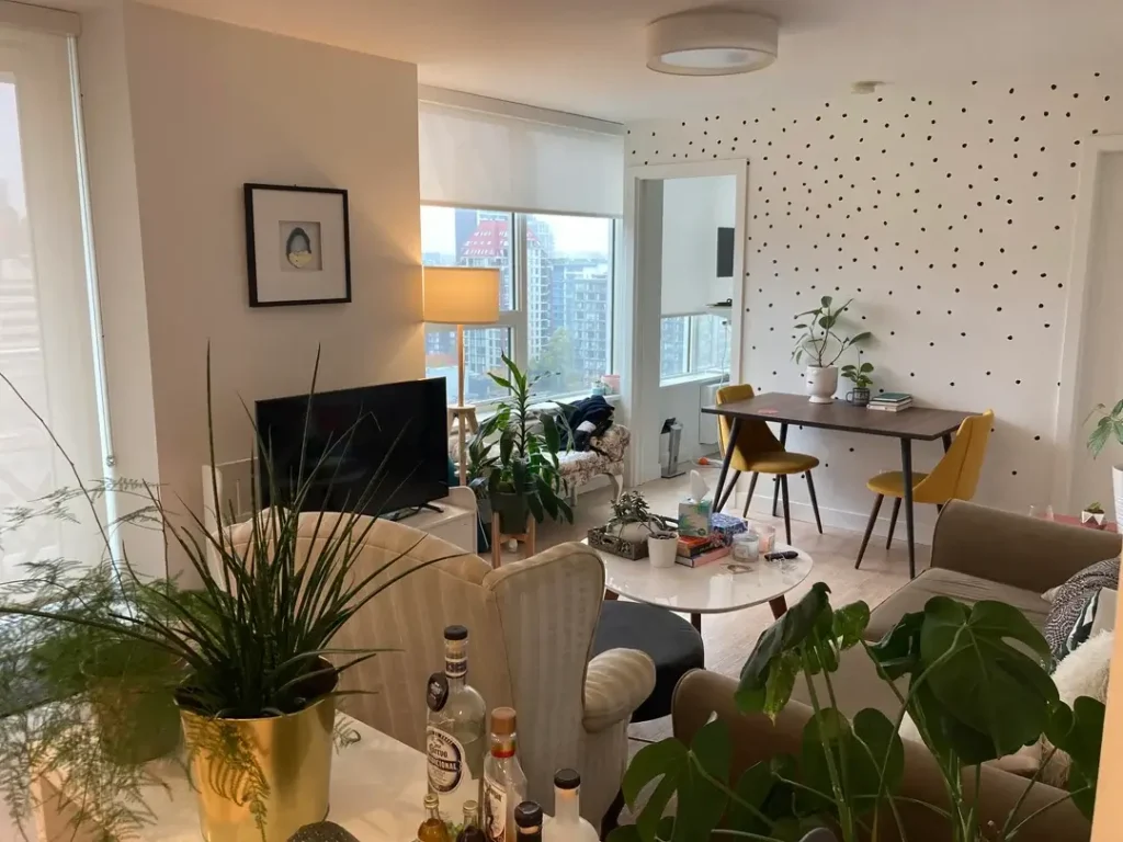
Sometimes the most memorable detail in a small space requires the least effort and the most nerve.
This high-rise apartment features an open-plan living and dining area with floor-to-ceiling windows providing a city view. The living side holds a cream sofa and a taupe armchair surrounding a small white round coffee table. On the dining side, a dark walnut two-person dining table sits with two mustard yellow velvet chairs on tapered wood legs. A practical floor lamp with a cream shade stands nearby.
The wall behind the dining area? Polka dots. Small black dots scattered across white paint, giving the space its entire personality. Plants in gold, ceramic, and terracotta pots fill corners and the coffee table, creating a lush indoor garden effect throughout.
One Bold Color Choice Goes a Long Way
That polka dot accent wall is genuinely clever. It adds visual texture and personality at absolutely zero cost in floor space. And because the dots are small and widely spaced, the effect is playful without overwhelming anything. This is a renter-friendly technique too. Removable dot decals exist, and you can apply and remove them without any damage.
What I notice about this room is how confident the color choices are. The mustard dining chairs are the only strong color in the space, and they earn that spotlight. When you work with a neutral base palette, one well-chosen saturated piece anchors the whole room. Two saturated pieces compete. One creates a focal point.
The city view gets treated as the room’s main artwork. No large canvas or oversized print competes with those windows. If your space has a view, even a modest one, resist filling the wall beside it. Let the outside become part of your interior design.
Mid-Century Dining Table and Bold Navy Accent Wall in a Classic City Apartment
Some rooms carry a mood. This one leans fully into retro confidence and doesn’t apologize for it.
A broad brass sputnik-style chandelier with clear globe bulbs dominates the ceiling of the dining area. Below it, a classic mid-century walnut dining table with softly rounded corners sits surrounded by matching low-slung dining chairs with tapered legs and upholstered seats in faded off-white. Candlesticks on the table add an almost theatrical touch.
The lower half of the walls behind the dining zone gets painted a deep navy blue, creating a strong wainscot-style color block that grounds the whole space. A large areca palm fills the vertical corner naturally. On the living side, a white slipcovered sofa faces a vintage-style glass coffee table with a wicker body.
Color as Architecture (Your Secret Weapon)
The navy two-tone wall treatment creates an immediate sense of enclosure around the dining area without building anything physical. Using color as architecture is one of the most underused tools in small space design. Painting the lower half of one wall a deep color makes the ceiling feel higher and the dining area feel like its own dedicated room within the room.
The built-in shelving unit on the right wall shows how to make storage feel intentional. Every shelf is edited: a few books, a small picture, one decorative object. Nothing is simply stashed or crammed in there.
If your space lacks architectural character, paint is the fastest fix. You don’t need to commit an entire room to navy. A single wall, or even just the lower half of one wall, completely transforms the way a space reads.
Also Read: Stop Wishing for More Square Footage: 15 Small Living Rooms That Prove Bigger Isn’t Better
Jewel-Toned Velvet Sofa and Bold Art in a Maximalist Living Zone
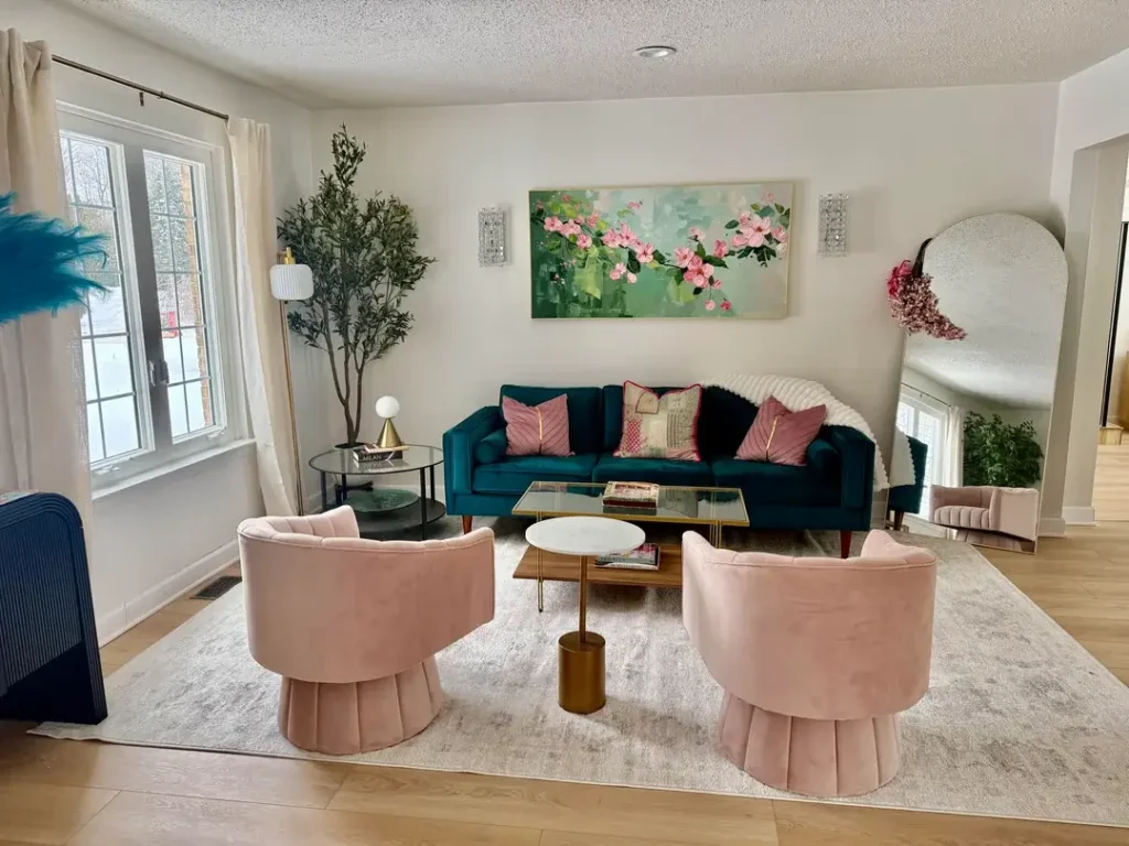
This room is absolutely not for everyone. And that’s precisely what makes it work.
A deep teal velvet sofa with wooden tapered legs anchors the living zone, flanked by two blush pink velvet barrel chairs with pleated bases. Between them, a brass and glass rectangular coffee table holds books, and a round marble side table adds a little accent moment. Above the sofa, a large canvas with a loose botanical painting in green and pink creates a striking focal point. Crystal sconce lights on either side of the canvas add a formal touch.
On the edges of the composition, a tall faux olive tree and a leaning arched floor mirror round things out. A large arched full-length mirror leans against the right wall, reflecting the snowy outdoor view. It’s a lot. But it’s intentionally a lot.
Maximalism in Small Spaces (It’s Not Just Clutter)
The confidence of this space comes from committing fully to a color story. Teal, blush pink, brass, and botanical green form a cohesive palette where every single element earns its place. There’s no safe neutral sofa hedging its bets. The teal IS the statement and everything else supports it.
For the small living and dining room combo context, what works here is that the living zone is so visually complete and self-contained that it doesn’t need to fight for attention with a dining area. A dining space tucked around the corner or at the room’s edge would naturally read as a quiet counterpoint to this lush setup.
Here’s the real difference between maximalism and clutter: every piece in this room is deliberately placed and proportionally sized. Those two barrel chairs, for example, are compact and low. They add visual warmth without eating up the footprint of traditional armchairs. Curation is everything.
Cream Sectional and Warm-Toned Sputnik Light in a Cozy Open-Plan Home
This is the kind of small living and dining room combo that feels immediately livable. Like, you could move in tomorrow and feel at home by evening. That’s the vibe.
A large cream cloud-style sectional with deep cushions and a chaise extension dominates the living side. It sits on a washed grey vintage-style area rug in a faded medallion pattern. A tall snake plant stands in the corner beside the sofa.
On the dining side, a natural maple wood dining table with four white Eames-style shell chairs provides a clean, Scandi-influenced dining setup. A trailing pothos plant spills from a shelf above the dining area. Above the table, a warm brass sputnik chandelier with Edison bulbs casts amber light across the space. Neutral grey walls tie everything together.
When Warmth Makes a Room Feel Bigger
The contrast between the soft cream sectional and the crisp white dining chairs works because the warm maple wood table and brass chandelier tie both zones together. Neither area feels isolated. The shared warm wood tone across the coffee table, dining table, and chair legs creates visual continuity even though the two zones have distinct personalities.
The large sectional is honestly the bravest choice in this room. In a smaller open-plan space, a sectional this size risks overwhelming everything else. It works here because it’s positioned in the back half of the room, leaving the dining area and entry zone completely unobstructed. Placement matters just as much as size. Maybe more.
The overall lesson from this space? Warmth and softness can make a room feel larger, not smaller. The cream, the warm brass, the natural wood tones: none of them compete for attention. They just invite you in.
Quick Decisions That Make or Break a Combo Room
After looking at all ten of these spaces, a few practical principles keep showing up. They’re worth calling out directly because they genuinely work:
- Use two rugs, not one, to define each zone without physical barriers
- Choose a dining table size based on your actual daily use, not your theoretical maximum guest count
- Pendant or chandelier lighting over the dining area acts as a zone anchor even in fully open plans
- Round dining tables consistently win in tight spaces because they remove hard corners
- Mirrors in the dining zone add depth and light with minimal visual weight
- Large plants used intentionally can replace shelving units or room dividers as zone markers
Style Comparison at a Glance
Here’s a quick breakdown of each approach and what it works best for:
| Style Approach | Best Room Shape | Zone Method | Difficulty Level |
|---|---|---|---|
| Dual rug zoning | Square or wide | Two area rugs | Easy |
| Plants as dividers | Open plan, any shape | Large specimen plants | Easy |
| Bistro dining corner | Very small or irregular | Compact table placement | Easy |
| Color block accent wall | Any shape | Paint color contrast | Medium |
| Jewel tone maximalism | Defined living zone | Bold focal furniture | Advanced |
What These Rooms Actually Teach You
The most useful takeaway from all ten of these spaces is honestly pretty simple. The rooms people feel happiest in aren’t the ones that look the most like a design magazine. They’re the ones where someone made a clear decision about what they actually needed and then furnished accordingly.
Whether it’s the polka dot wall that cost almost nothing, the bistro table that perfectly solved a two-person lifestyle, or the teal velvet sofa that flat-out refused to play it safe, every one of these small living and dining room combo ideas succeeded because of intentional choices. The scale was right. The zones were defined. The palette stayed consistent.
The rooms that feel unresolved (and you’ll recognize this feeling in your own space if it applies) are the ones where decisions got deferred. The table bought for a different apartment. The sofa that’s slightly too large but “good enough.” These compromises pile up and create the visual noise that makes a room feel smaller than it actually is.
Start with your zone boundaries. Decide where living ends and dining begins, even if the only marker is a rug edge. Everything else follows from that foundation.
These ten examples prove it works at every scale, in every style, and with every budget. So pick the approach that fits your life, commit to it, and stop second-guessing. Your combo room is going to look great.