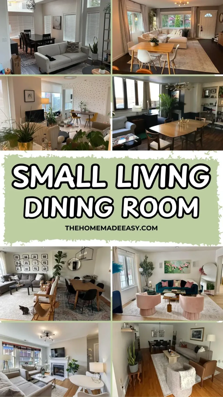
12 Real-Life Living and Dining Room Combo Layouts That Actually Work
You know that sinking feeling when you scroll through Pinterest for an hour, find fifty “perfect” open-plan rooms, then look at your own space and think… what even am I doing? Yeah, same.
Those staged rooms look incredible, but they also look like nobody has ever eaten a taco on that sofa. Not exactly relatable.
So I went hunting on Reddit for living and dining room combo setups from actual humans. No professional photographers. No $50,000 furniture budgets. Just real rooms, real solutions, and real proof that you can make your combo space look intentional without selling a kidney.
Whether your room is narrow, tiny, awkwardly shaped, or just feels like one big “meh,” one of these 12 ideas will hit home.

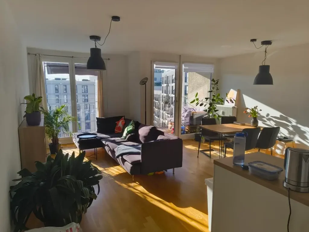
The Plant-Packed Open Plan That Feels Like a Greenhouse (In a Good Way)
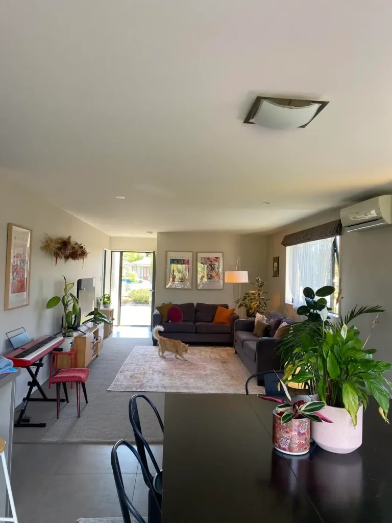
Some people buy one sad succulent and call it decorating. This person went full plant parent, and honestly? It works beautifully.
This long, open-plan living and dining room combo uses greenery as a design strategy, not just decoration. From the dining end, you spot a dark timber table surrounded by bentwood black chairs. The table itself is practically a jungle with peace lilies, pothos, and what looks like a bromeliad in a pink ceramic pot.
The living area flows toward sliding glass doors that flood everything with natural light. There’s a dark charcoal sectional sofa loaded with amber and red cushions, a dusty rose vintage-style rug anchoring the seating zone, and two Matisse-style prints in natural wood frames hanging above.
Oh, and a red keyboard stand with a pink piano stool sits along the left wall. Love that. This is a home where people do things, not just pose for photos.
Why this layout actually works:
- The large, bold plants at the dining end prevent the table from feeling like an afterthought
- The rug in the living zone clearly marks where you sit versus where you eat
- Two anchoring elements create separation without a single wall or partition
Want to steal this look? Pick one anchor for each zone. A rug for the sofa area and a plant grouping or statement centerpiece for the dining table. That’s it. Two affordable moves that instantly make your combo space feel like two intentional rooms instead of one confusing one.
FYI, the piano setup along the wall is genius. They worked a hobby space into their layout without it feeling intrusive because it sticks to one consistent wall and doesn’t interrupt the sightline between zones. Smart.
The Traditional Combo with Window Treatments That Earn Their Keep
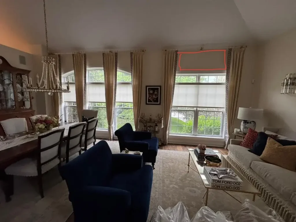
This room has that “I’ve been collecting beautiful things for years” energy, and I am here for it. The ceiling height is generous, and the owners went all in with floor-to-ceiling cream curtains trimmed in a bold black geometric border pattern. That trim detail does SO much heavy lifting. It adds structure and keeps the curtains from looking like plain bedsheets.
The dining area sits on the left with a dark mahogany table, white upholstered chairs, and a glass-fronted china cabinet filled with dishware. Fresh flowers at the center soften the formal setup.
The living area flows to the right with a white fringed sofa, two deep navy velvet armchairs, and a slim brass-and-glass coffee table topped with books and a decorative tray. A blue and white chinoiserie lamp anchors the corner.
One real-world detail worth mentioning: the original poster was asking about a curtain rod bracket that interrupts the curtain’s hang. Happens all the time. Mismatched or visible hardware can undermine even the most gorgeous window treatment, so keep that in mind.
The big takeaway here? Strong window treatments can unify two zones better than almost any other single element. When you run curtains continuously across multiple windows at full wall height, you create a cohesive backdrop that makes both areas feel connected. If your room has multiple windows along one wall, try one long curtain rod across all of them instead of individual rods per window. Game changer.
The Compact Combo That Proves Small Spaces Need One Hero Moment
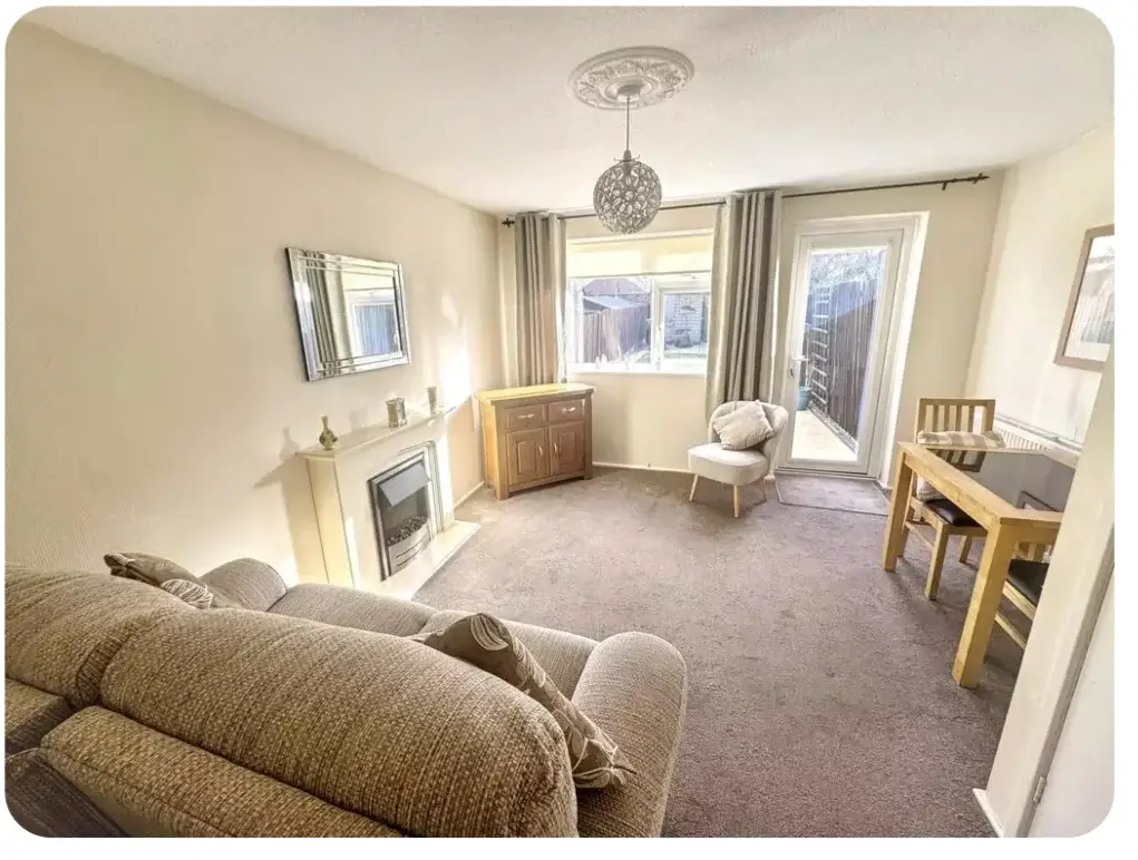
Tiny rooms force you to make decisions, and decisions create character. I genuinely believe small rooms often end up with more personality than big ones because you can’t just throw furniture at the problem.
This compact living and dining room combo revolves around a cream-painted fireplace with a silver electric insert. Everything in the room orbits that fireplace like it has its own gravitational pull.
The palette stays all-neutral: cream walls, greige carpet, warm oak tones in the sideboard and small dining table tucked into the right corner. A faceted mirror in a silver frame hangs above the mantel, bouncing light around and making the space feel bigger than it actually is.
The dining setup? A small oak table with two chairs pressed into a corner near the window. That’s it. And it’s perfect.
If your combo space is on the smaller side, ask yourself this:
- Do you have one strong focal point everything else supports?
- Or are you making five different things compete for attention at once?
In small rooms, restraint wins every time. One hero piece (a fireplace, a statement light, a bold art print) with everything else playing a supporting role creates calm, not chaos.
Also Read: Small Living and Dining Room Combo: 10 Real-Life Ideas You Can Actually Steal
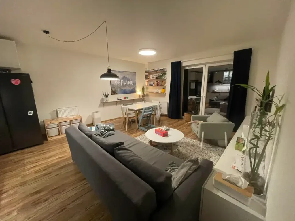
The Scandinavian Apartment Where Pendant Lights Do All the Zoning
Natural light is the MVP of this room, full stop. Floor-to-ceiling windows on two walls pour afternoon sun across honey-toned oak floors, and the whole place glows golden. But here’s what actually makes this living and dining room combo function as two separate zones: the pendant lighting.
Two matte black cone-shaped pendants hang from the ceiling. One sits over the dining area (small round dark wood table, charcoal grey upholstered chairs) and the other hangs toward the living area (low, dark plum sectional facing the windows). Both pendants match in style and scale, which creates visual rhythm and screams “I planned this” instead of “I grabbed whatever was on sale.”
Plants are thoughtfully placed too. A tall areca palm, a rubber plant, and a smaller potted plant add life without cluttering the furniture layout. Accent pillows in orange and green on the sofa warm things up nicely.
Here’s the lighting trick everyone should know: When you hang a pendant or chandelier above your dining table and a separate light source (pendant, floor lamp, arc lamp) anchors your sofa zone, you create two pools of light that signal two separate destinations. You don’t need walls to define a space. You need lighting with intention. IMO, this is the single easiest zoning hack for any open-plan apartment.
The Bohemian Combo with a Rust Sofa That Runs the Show
Some rooms build their entire personality around one brave color choice. This is one of those rooms, and I respect the commitment.
The rust-orange L-shaped sofa is loud, warm, and completely in charge. Everything else quietly supports it. A Persian-style area rug in cream with deep red and navy floral detailing defines the living zone.
The TV console (very IKEA Hemnes vibes) sits topped with a tall areca palm and grey storage boxes. A wooden ladder leans against the far wall doing double duty as storage and decor. Trailing pothos plants cascade from a high shelf. A woven basket holds extra stuff below.
Through the background, you catch the dining area near a bright window: white table, wood-framed chairs, plants along the windowsill. Botanical curtains in warm brown tones tie the whole space together from one end to the other.
The lesson here is simple: A bold sofa color can become your room’s entire design direction. Once you commit to rust, terracotta, or any warm earthy tone, the rest of the palette practically writes itself:
- Warm wood tones
- Cream and off-white accents
- Plants everywhere
- Woven textures and natural materials
If you’ve been staring at beige sofas for months because you’re afraid of going bold, let this room give you the push you need.
The Craftsman-Style Combo Where French Doors Steal the Show
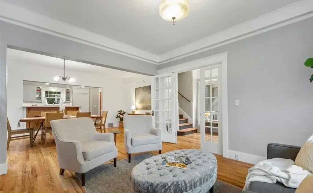
This room nails the “living with architectural character” thing better than most. Crown molding, picture-frame wall trim, and warm oak hardwood floors with an amber finish place it squarely in the craftsman or traditional American home category. And the furnishings respect that heritage without being stuffy about it.
The living area holds a white sofa, two white tufted wingback chairs with dark walnut legs, and a large circular tufted ottoman in dusty silver-grey that doubles as a coffee table. Through a wide doorway, you spot the dining area with a wood table, mixed chairs, and a pendant chandelier.
But the real star? The pair of white-painted French doors on the right wall. They create a transparent partition that preserves openness and light while offering the option of visual or acoustic separation when you need it.
Honestly, French doors (or glass-paned pocket doors) are wildly underused in combo spaces. They let you close things off without permanently chopping up your floor plan.
Pro tip: If your home already has architectural character like trim, molding, or original floors, build your living and dining combo around those features, not against them. That existing character is an asset. Use it.
Also Read: 12 Small Space Living Room Ideas I Stole From Real Homes (That Actually Work)
The Narrow Long Room That Leans Into Its Awkwardness
Long, narrow combo rooms are probably the most common layout headache I see people post about. This room handles it beautifully by doing something smart: instead of fighting the proportions, it leans into them.
Living zone up front. Dining area at the far end. Clean front-to-back flow.
The living area features a mid-century grey tufted sofa with rust and black throw pillows, a brown leather accent chair, and a round swivel chair in soft grey. A light wood coffee table sits on a muted grey rug with a traditional pattern.
A tall snake plant on a walnut side table adds height on the left wall. A floating shelf holds a few books and frames. Simple, curated, not overdone.
The dining end gets a light wood table with six matte black chairs, two framed botanical prints, and a simple black iron chandelier with candle-style bulbs.
The two-rug strategy is everything in narrow rooms. Here’s why:
- A rug under the living area defines that zone
- A second rug under the dining table completes the separation
- Without rugs, long narrow rooms read as glorified hallways
- The consistent flooring running the full length still ties everything together
If you have a long, narrow combo space, rugs are your best friend. Don’t skip them.
The Condo Combo Where Marble Meets Navy
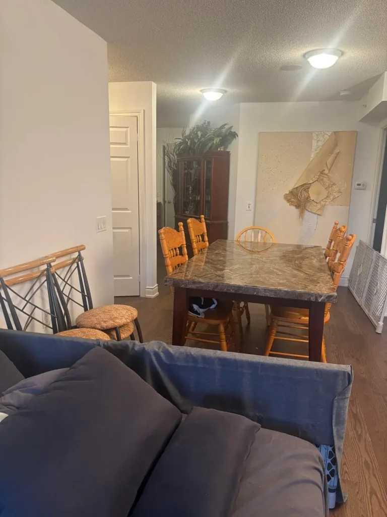
This layout tackles a challenge tons of condo and townhouse owners face: the living and dining areas aren’t truly open plan. They’re separated by a half-wall, staircase banister, or architectural column. Here, a decorative iron-and-wood staircase railing marks the transition between the entry and the main living space.
The dining area dominates the image. A substantial dark marble-top table with granite-like veining sits centrally, surrounded by six honey-oak spindle-back chairs and two stools. The table sits at counter height, which is worth noting because counter-height tables in smaller spaces can feel cramped if the ceiling is low. A dark wood china cabinet with a fern arrangement sits in the corner, and a large abstract canvas in cream and tan tones leans against the wall (the casual lean instead of hanging is such a vibe).
The navy blue sofa peeks in from the foreground. There’s a slight visual tension between the warm oak chairs and the cool dark marble, and honestly, a rug that bridges both tones would pull this together even more.
Here’s the thing nobody tells you about combo spaces: Your dining table and sofa are having a design conversation whether you planned it or not. When those two pieces clash in tone, scale, or era, the room feels like two unrelated spaces shoved together. When they share even one material, color, or stylistic thread, the whole room reads as one coherent home.
The Evening-Lit Combo with a Bookshelf Doing Double Duty
I genuinely love this room. It was photographed at night, which actually reveals the lighting plan in action. And the lighting plan is working.
A matte black industrial pendant hangs low over the dining area. An “OFFLINE” art print on the wall adds casual, self-aware personality. The white dining table holds an assortment of mismatched chairs in grey-blue and natural wood tones, and it works because the table provides a common base for the eclectic seating.
The living zone features a large dark charcoal sectional, a round white coffee table (with a board game on top, love it), a small grey armchair, and a textured natural-toned area rug. Navy curtains frame a door at the far end, adding depth and moodiness.
But the real MVP is the wall-mounted bookshelf system running along the back wall between dining and living areas. It acts as a visual boundary without blocking light or closing anything off.
This is one of the most practical combo zoning tricks out there: An open shelving unit placed perpendicular to a wall, or along the shared edge of two zones, creates the impression of a room within a room. No construction needed. No commitment to a permanent wall. Just shelves.
The overall vibe here screams “we read books, play games, and actually use this space together.” That’s exactly what a living and dining combo should feel like.
Also Read: 12 Very Small Living Room Decor Ideas (Real Apartments, Real Results)
The Dark and Moody Combo That Goes All In
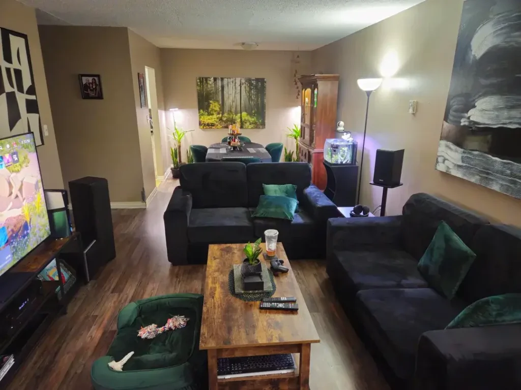
Not every living and dining room combo needs to be light and airy. This one said “nah, we’re going dark” and absolutely committed.
The palette is bold: matte black sectional sofas, deep forest green velvet accent pillows, a matching green pet bed (cute), a distressed walnut coffee table, and dark laminate flooring throughout. The walls hit a warm medium taupe that keeps the room from feeling like a cave despite all the dark furnishings.
Two sofas sit in an L-shape facing a big TV. A small aquarium glows on a shelf next to a dark wood cabinet in the background. Such an unexpectedly lovely detail that adds movement and light to a dark corner.
The dining area features emerald green velvet chairs at a small table flanked by tall indoor plants, with a forest scene canvas print hanging above.
Why this room works so well: Someone made a clear decision about the color story (dark, moody, green-accented) and applied it consistently across both zones.
- Green accent chairs in dining echo the green pillows on the sofas
- Wood tones in the coffee table echo the dining table
- Both zones get significant artwork with matching visual weight
Want to make your combo space feel unified? Pick two to three colors and repeat them in both zones. That’s it. That’s the formula.
The Dining Area That Refuses to Be an Afterthought
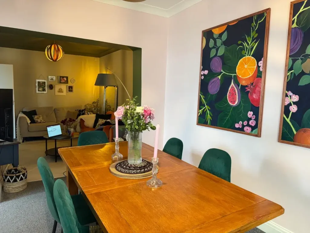
This image focuses on the dining end of a combo space, and it makes a killer argument for treating your dining area as a design destination, not just “the table near the kitchen.”
Two large-scale paintings on dark navy backgrounds with bold botanical illustrations (sliced oranges, figs, pomegranates, lush leaves) hang on the white wall in warm wood frames. They’re striking, confident, and the kind of art that makes you stop mid-conversation.
The dining table is warm honey oak, extended to seat six with forest green velvet chairs. A glass vase of pink flowers and two tall pink taper candles in silver candlesticks make a simple, elegant centerpiece that costs almost nothing to recreate.
Through a wide archway in the background, you catch the living area glowing warm from a curved arc lamp, with a gallery wall of small prints, a beige sofa, and an orange accent chair.
That archway is the architectural hero here. It creates a natural threshold between zones without needing a door. If your home has a similar feature (even just a beam or a slight ceiling height change), lean into it. Don’t minimize it. It gives your combo layout a genuine sense of two distinct rooms.
Quick art tip: two large-scale pieces of similar size but different subjects create more visual energy than one oversized piece. They give the eye two places to land and add rhythm to the wall. If you’ve been debating what art to put above your dining table, consider a diptych or two related pieces instead of a single print.
The Narrow Townhouse Combo with a Gallery Wall Worth Studying
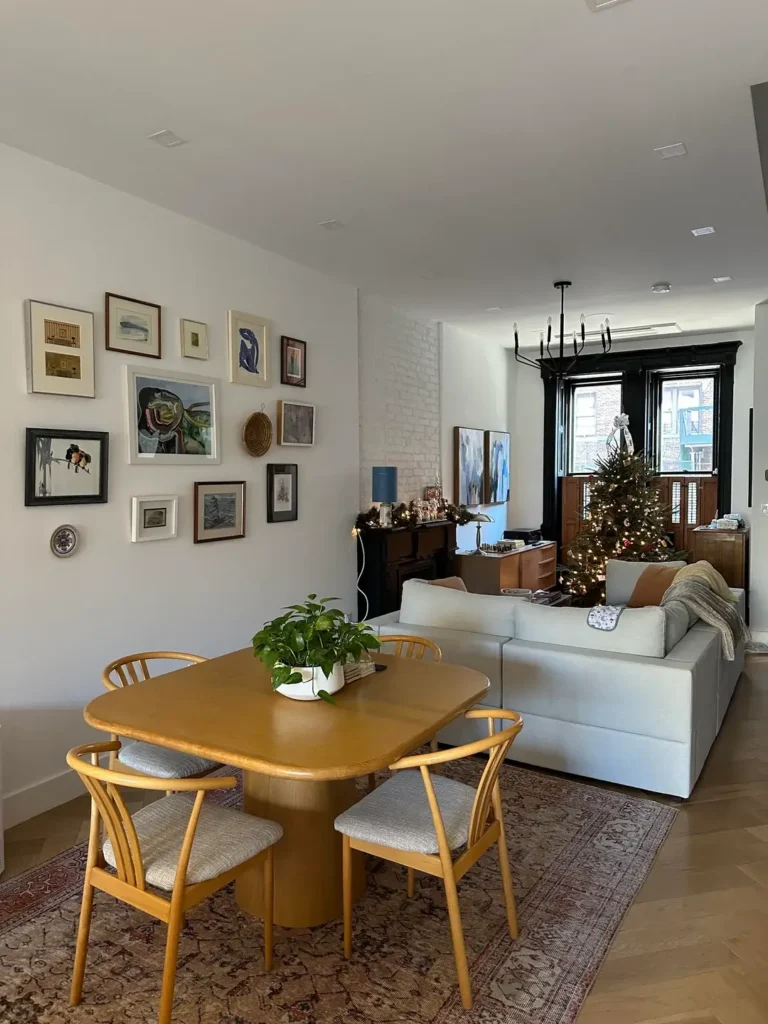
This might be the most carefully curated space in this entire collection, and the gallery wall alone earns that title. A dense, organic arrangement of frames in varying sizes covers the left wall: small watercolors, pen-and-ink sketches, abstract prints, black-and-white photographs, a small ceramic plate, and a woven basket circle.
The frames mix black, white, natural wood, and gilt, unified by consistent white mats and the fact that every piece feels personal and collected over time.
The dining table is a warm amber-toned pedestal table with a softly rounded square shape. That pedestal base is a smart choice for narrow spaces because it takes up way less visual room than four separate legs. Matching amber wishbone-style chairs have light grey upholstered seats that balance the warmth of the wood with a cooler tone.
Beyond the dining area, the living zone holds a large light grey modular sofa, a dark upright piano used as a credenza (!!), a blue accent lamp, and a Christmas tree near black-trimmed windows. A matte black chandelier with candle-style arms hangs above. Herringbone light oak flooring runs the full length.
An exposed white brick column separates the dining zone from the living area, and the owners wisely left it unpainted. It creates a natural visual anchor and transition without fully dividing the space. If you live in a converted loft or older townhouse and have an exposed brick or concrete column, keep it. Celebrate it. Don’t hide it behind drywall.
What All 12 Rooms Have in Common
After studying twelve real living and dining room combos from people who actually live in them, a few patterns keep showing up. These aren’t just style preferences. They’re spatial logic.
Rugs are the single most powerful zoning tool you have. Almost every functional layout here uses a rug to define the sofa zone. In narrower spaces, a second rug under the dining table completes the separation. Without rugs, open plans tend to feel like one big undifferentiated blob.
Lighting creates destination. A pendant over the dining table says “eat here.” A floor lamp by the sofa says “relax here.” Without those light cues, open-plan rooms just feel like one continuous, confusing space. Think about your lighting plan before you pick throw pillows.
Repetition builds unity. The rooms that feel most cohesive repeat colors, materials, or textures across both zones. It doesn’t need to be obvious. A dining chair in the same green as a sofa pillow is enough. That small thread pulled between zones makes the whole layout read as one home.
Here’s a quick cheat sheet based on what I’ve seen:
- Long and narrow room: Use two distinct rugs and a pendant over the dining table
- Square and open room: Let furniture arrangement and a large area rug do the work
- Small and compact room: Pick one focal point and let everything else support it
- Awkward room with columns or beams: Use that architecture as your zoning tool
- Traditional home: Invest in full-length curtains that span the wall
- Modern apartment: Match your pendant lights across zones for instant cohesion
The most important thing these spaces prove? A living and dining room combo doesn’t need to be perfect to feel like home. It needs to feel intentional. It needs to look like someone made actual decisions about color, light, and furniture placement. Every person whose room appeared in this article was asking for advice, which means they were paying attention to their space.
And paying attention? That’s genuinely where every good room starts. So go look at your combo space with fresh eyes, pick one idea from this list, and just start. You’ve got this.