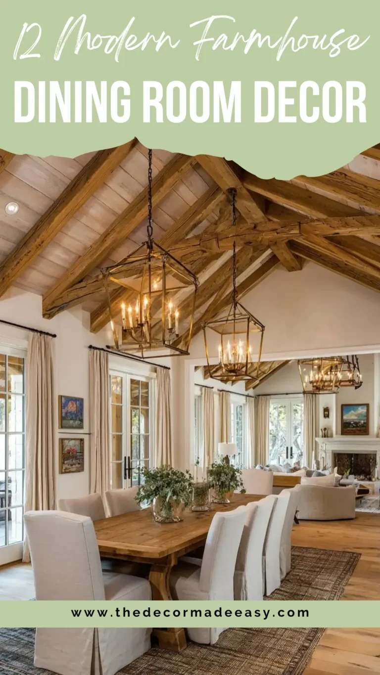
Dining Room Wall Decor – 10 Ideas That’ll Make Your Space Look Seriously Good
Let’s be honest. Your dining room walls are probably just sitting there doing absolutely nothing. And yeah, you notice it every time you walk past. It’s like putting together a gorgeous outfit and then forgetting to wear shoes. The table looks great, but that blank wall behind it? Total letdown.
I’ve rounded up ten actual examples of dining room wall decor that’ll fix this situation. We’re talking everything from big statement mirrors to wild wallpaper choices. Each one tackles the problem differently, and honestly, that’s the whole point. There’s no magic formula here, just ten legit options that actually work.
An Antique Gold Mirror Above the Fireplace Creates Timeless Drama
Okay, so mirrors in dining rooms have been a thing for centuries, and there’s a good reason. They just work.
This space nails it with a deep olive green wall that’s somewhere between forest and sage. Against that rich backdrop sits a massive arched gold-leaf mirror chilling on the fireplace mantel. The ornate gilded frame does all the heavy lifting here. And get this, the mirror isn’t even hung up. It’s just leaning there, which somehow makes the whole thing feel more confident and less stuffy.
Below the mirror, trailing ivy spills down the white marble surround. It’s literally the only natural element in this otherwise super controlled room.
What makes this setup really click is how it mixes old and new. The gold mirror screams traditional antique shop finds, but then you’ve got burnt-orange velvet dining chairs, sputnik-style pendant lights, and herringbone floors pulling everything into modern territory. There’s even a coat-of-arms plaque on the side wall that adds personality. This room looks collected over time, not ordered from a catalog on a Wednesday afternoon.
Here’s the deal if you want to copy this look: invest in a quality mirror. A cheap one with fake gold will look exactly like what it is, a cheap mirror with fake gold. The olive green wall is actually easier to pull off than you’d think. It reads pretty neutral depending on your lighting and pairs beautifully with warm wood tones.
The leaning thing? Do it if your mantel can handle it. That casual vibe is half the appeal.
The bright white fireplace surround creates killer contrast against the dark wall, which basically frames the whole setup without you needing to add more stuff.
A Large-Scale Figurative Painting Flanked by Wall Sconces
Bold art in dining rooms tends to split people right down the middle. This one definitely starts conversations.
The painting here is huge, almost ceiling height. It shows a woman from behind wearing a vivid red dress with her dark hair swept up dramatically. The background is silver-gray and linen-textured, which keeps it from completely taking over the room. The red and dark tones tie into the espresso and ivory palette happening elsewhere.
On each side of the canvas, matching wall sconces with black twisted-metal arms cast warm light upward. This both lights up the painting and creates this theatrical framing effect that looks intentional as heck.
Above the table hangs a substantial silver chandelier with long crystal rods in a drum shape. This room commits to statement lighting, no question. White upholstered dining chairs with curved silhouettes, a dark wood table, and two arrangements of white roses finish the look. This is a confident dining room that chose atmosphere over playing it safe.
What really stands out is how perfectly centered everything is. The painting sits exactly between the two sconces with just enough breathing room from the dark wood sideboard below. The white roses on the sideboard echo the white chairs, creating this visual loop that keeps your eye moving around the room.
Want something similar? Look for figurative artwork with a strong silhouette. The subject here reads clearly even from across the room, which matters when people are sitting and staring at it during dinner. Wall sconces flanking a large canvas are seriously underused. They eliminate those harsh shadows overhead lighting creates while adding layered warmth.
A Triptych of Abstract Horizon Paintings That Feels Almost Like a Window
Three panels. One continuous image. The effect lands somewhere between abstract painting and landscape you can’t quite pin down. That ambiguity gives this wall serious staying power.
The triptych spans nearly the full width of the dining room wall. Each panel shows the same moody composition: deep charcoal gray at the bottom transitioning to luminous burnt amber and gold in the upper half. The shift between them suggests either a horizon, weather rolling in, or just something beautifully painterly.
The black frames are thin and clean, mounted within recessed white wall paneling that creates a crisp architectural border around the artwork.
Everything else in the room backs off to let the art breathe. The walnut dining table and white upholstered chairs are refined but restrained. A gold-framed cylindrical chandelier above adds warmth without competing. The neutral geometric rug grounds things without demanding attention.
This is one of those setups where the scale of the artwork does the actual work. Three medium pieces wouldn’t achieve the same effect. The three panels together read as a single immersive installation that makes the room feel larger and more dramatic than it actually is.
For a similar vibe, the most important choice is the total width of the triptych relative to your wall. These panels span roughly 70 to 80% of the available wall space, which feels intentional and generous rather than wimpy. Abstract landscape art at this scale is pretty easy to find through galleries or online print services, and framing in matching thin black profiles is affordable but looks polished.
Also Read: 15 Dining Room Lessons to Steal (Even If You Don’t Have a Trust Fund)
A Stone-Carved Sculptural Relief Panel as the Centerpiece
Some dining room wall decor comes from totally unexpected directions. This one is less about hanging art and more about treating the wall itself as architecture.
The feature wall here uses warm sandstone-colored tiles. Big horizontal slabs that create a natural, textural backdrop. Set into this wall is a large stone relief panel, hand-carved with a classical Indian motif showing figures surrounded by intricate floral and foliage details.
The carving has serious depth. The figures stand almost three-dimensionally from the surface, and the ambient lighting from ceiling-mounted track lights casts shadows that shift across the relief throughout the day. It’s genuinely cool to watch.
The dining furniture responds appropriately: a white marble table with a polished surface, dark wood chairs with lattice-carved backrests that echo the craftsmanship of the relief, and cream upholstered seat pads. Through the adjacent opening, a slate-gray stacked stone column creates a counterpoint texture. Rougher and more modern against the refined sandstone of the dining wall.
What makes this approach distinctive is that the wall decor carries actual cultural and personal significance. This isn’t just decoration for decoration’s sake. It carries meaning, and you can see how the entire room was designed around it.
Sculptural relief panels work best when the surrounding wall treatment supports them. A carved stone panel on plain painted drywall reads completely differently than the same panel set into a textured stone-clad wall. The latter makes the carving feel embedded and intentional rather than slapped on.
If a stone carving blows your budget, high-quality resin reproductions exist. Wall cladding in stone or large-format tile is becoming more achievable at moderate cost.
One Oversized Figurative Canvas Full of Color and Story
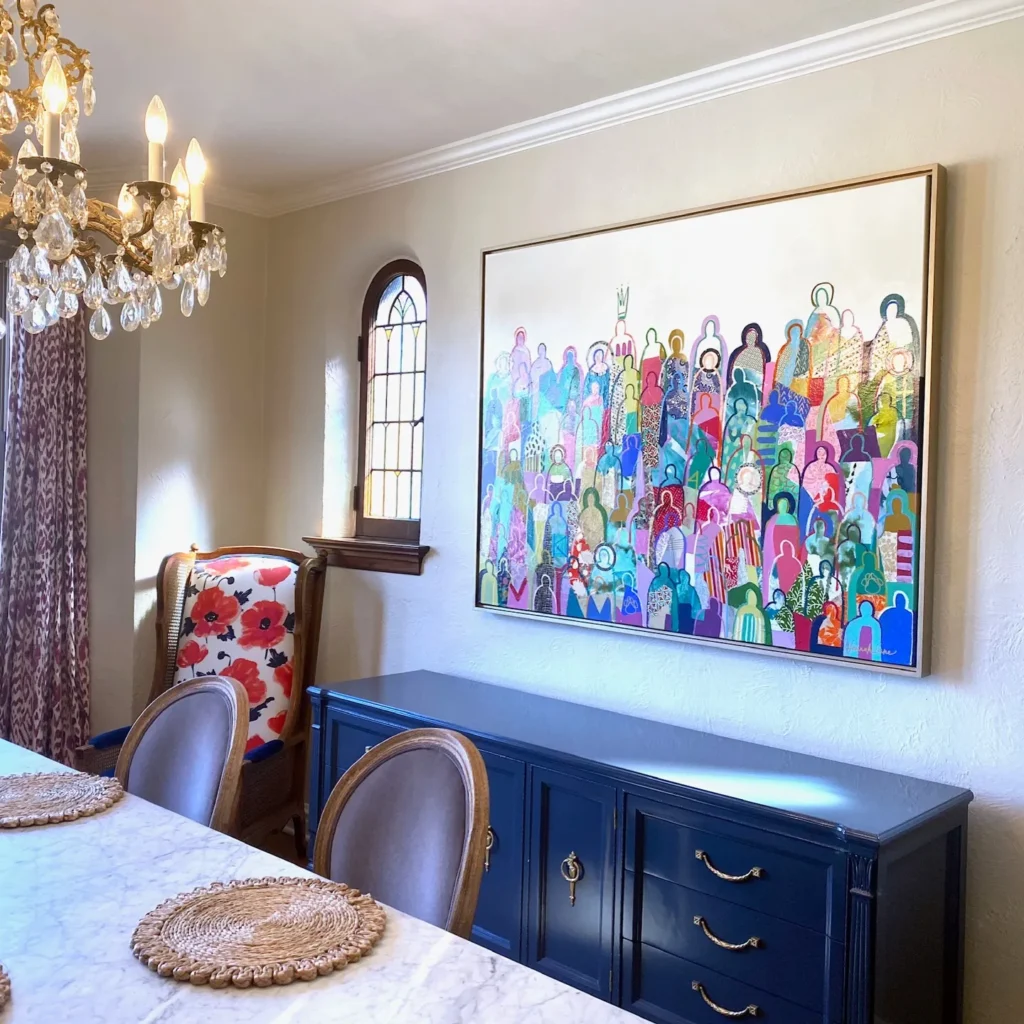
There are rooms where the art is decoration, and then there are rooms where the art IS the conversation. This is definitely the second kind.
The painting here is massive. Roughly 5 feet tall and 6 feet wide. It depicts a crowd of abstracted human figures rendered in an extraordinary range of colors: teal, coral, lavender, saffron, crimson, olive, and every shade in between. The figures are simplified to silhouettes and patterns, packed together like a celebration or gathering. It sits in a thin gold floater frame that gives the canvas just enough separation from the warm cream wall behind it.
The room itself is a joyful contradiction. A navy blue lacquered sideboard with brass hardware sits below the painting. A vintage carved-wood chandelier with candelabra bulbs hangs above the table. Poppy-print fabric chairs sit beside plain linen dining chairs. A marble-top table grounds it all. This room was assembled with confidence and zero apologies.
What I really appreciate here is that the painting’s scale prevents it from getting overwhelmed by everything else happening. A smaller piece would disappear in this context. At this size, it holds its own and gives your eye somewhere to land amid all the eclectic furniture choices.
The gold floater frame is worth noting specifically. It allows the canvas edges to show, which makes the painting feel like an art piece rather than just a picture. For large canvases, floater frames almost always look more considered than standard frames with matting.
When choosing figurative art for a dining room wall, look for pieces where the color palette pulls from at least one element already in the room. Here, the canvas teal doesn’t connect to anything, but the warm coral and navy tie directly to the sideboard and chair fabric. That creates visual harmony even in an eclectic space.
A Single Textured Circular Canvas in Black and Silver
Not every successful dining room wall needs scale or color. Sometimes the right move is one precisely placed piece that earns its space through surface and detail.
This circular canvas hangs on a light dove-gray wall. Its thin black frame gives it clear definition against the neutral backdrop. The artwork itself is an etched or painted circular composition with concentric rings radiating outward from a dark center. It’s rendered in black with silver metallic accents that catch the light differently depending on your viewing angle.
The texture is clearly physical rather than printed. This is a piece that makes you want to walk up and look closer.
The room around it stays deliberately spare. A marble-topped dining table with a dark geometric metal base. Deep slate-gray upholstered chairs with gold-tipped legs. A single white orchid as the table centerpiece. A statement chandelier above combining black metal and amber crystal rods. The palette is gray, black, gold, and white. Consistent throughout and never broken.
What this arrangement proves is that strong art doesn’t need company. There’s no gallery wall here, no vignette, no sideboard styled beneath the canvas. The painting simply hangs, the wall provides clean space around it, and the composition is complete.
For rooms where you want a calm, sophisticated atmosphere rather than an expressive or energetic one, a single piece of textured or mixed-media artwork is often the better choice. Circular canvases break the expected rectangular format and draw attention in a way that a same-size rectangular piece wouldn’t.
Look for work with physical texture. Impasto, metallics, applied materials. Flat prints lose their impact when you walk up to them. Textured pieces gain it.
Also Read: 10 Luxury Living Room Ideas That Actually Work in Real Homes
A Full-Width Black Accent Wall with Layered Molding Detail
This is the dining room wall decor idea for people who don’t want to hang anything at all. And it’s probably the boldest move on this entire list.
The wall here is painted entirely in deep matte black. But the paint alone isn’t the statement. The surface is articulated with layered architectural detail. Rectangular panel moldings in the traditional style sit on either side of the wall, while the center section features vertical fluted battens. Narrow parallel strips running from floor to near-ceiling that create rhythm and shadow.
The combination of classical molding and contemporary fluting in a single jet-black expanse is unexpected in the best way.
The furniture responds to the drama without competing. A dark walnut dining table. Cream boucle upholstered barrel chairs. A single white ceramic vase holding bright magenta cherry blossom branches, the only color in the entire frame. The light wood floor reflects back just enough warmth to prevent the room from feeling heavy.
What makes this wall work is that the detail IS the decoration. There’s no art, no mirror, no shelving. The architectural surface treatment provides all the visual interest the wall needs.
The fluted batten detail in particular does a ton of work. Vertical lines draw your eye upward and make the ceiling feel higher, while the ridges cast soft shadows that change with the time of day.
This approach requires more commitment than hanging a painting, but the result is genuinely bespoke. Standard panel molding is available at any home improvement store, and fluted batten panels have become widely available in MDF form.
Here’s the key: paint everything the same color. Wall, molding, and battens all get the same treatment. Any contrast between the elements would fracture the effect.
A Three-Panel Gold Accent Art Grouping on a Grey Wall
This is one of the more approachable dining room wall decor ideas on this list, and it works because of how clearly it understands its own scale.
Three rectangular canvases hang in a loose cluster on a mid-gray wall, positioned roughly above where a dining table would sit. Each piece is different in pattern but unified by palette: black grounds with gold metallic detailing. One shows an abstract mesh of gold lines, the center piece has a circular swirl in burnished gold and dark brown, and the third displays an intricate vein-like gold pattern on black.
They’re mounted at slightly different heights with intentional spacing, which prevents the grouping from looking like a purchased set even if it is one.
The room around it is equally confident. A white sintered stone table with a gold-edged profile. Sand-colored boucle chairs with gold sunburst frame legs. A gold-toned floor lamp. A classical white sideboard with marble top and gold hardware. The gold thread running through the art grouping ties every element together.
What I find effective here is the conscious use of negative space within the grouping. The three canvases don’t fill the wall. They occupy maybe 40% of it, which means the gray wall itself becomes part of the composition.
Too many groupings cram pieces together, eliminating the breathing room that makes a vignette readable.
For a similar effect, the key is palette consistency across all three pieces. The specific subjects or patterns matter less than the colors. If all three pieces share a dominant hue and a secondary accent, the grouping will read as intentional.
Mixed metallic canvases in black and gold are among the most widely available wall art options and pair naturally with contemporary dining furniture that incorporates brass or gold-tone hardware.
A Mid-Century Dining Room Where the Wall Vignette Tells the Full Story
Some of the most effective dining room wall decor involves treating an entire wall as a composition rather than focusing on a single piece.
The accent wall here is painted deep charcoal black. Against it, the designer has assembled a layered vignette on the left side. A large sunburst mirror in a natural rattan or wood frame overlaps with a tall white lamp that has a broad shade. Behind the lamp sits a small abstract art print in black and white.
The sideboard below has a ribbed navy blue front with a light oak top and brass base rail. A mid-century-inspired piece that could have come straight from a 1965 Danish catalog.
On the opposite side of the wall, a single framed black-and-white abstract print with a brown wood frame is precisely placed at eye level, balancing the more complex vignette on the left.
The curtains add wide geometric shapes in terracotta, cream, and white. They bring pattern without overwhelming. The walnut dining table, gray linen chairs with walnut legs, and a square black pendant lamp in a cage frame complete a room that’s fully committed to mid-century modern principles.
What the layered vignette accomplishes is depth. The overlap of mirror, lamp, and framed art creates a three-dimensional quality that individual pieces mounted separately can’t replicate. The sunburst mirror sits at the center of the composition and the arrangement radiates outward from it, which is why it anchors the whole wall successfully.
To build a similar vignette, start with the largest piece. Likely a mirror or oversized art. Then work outward, adding layers that have different heights, materials, and visual weights. The goal is organized interest rather than curated clutter.
Also Read: Most Shelf Styling Advice is Useless: 10 Real-Life Ideas That Actually Work
Tropical Flamingo Wallpaper with Painted Wainscoting Below
If every other idea on this list has felt too restrained, this one is for you.
The upper half of this dining room wall is covered in lush, dark-ground tropical wallpaper. Flamingos in coral pink amid green palm fronds and hibiscus flowers, all set against a deep charcoal background that makes the colors pop rather than fight.
The lower half is finished in dusty rose painted panel wainscoting with rectangular raised-panel details. The pink here is softer than the flamingo pink above, which is a deliberate tonal relationship that keeps the two halves from clashing.
The furniture commits to the palette. A dark walnut round dining table. A velvet chair in deep blush pink. A linen chair in warm cream. Woven rattan placemats. Brass candlestick holders with cream candles. Dried pampas grass in a clear vase. Two frosted glass pendant lights on brass fittings hang above, casting a warm diffused glow that softens the room at dinner time.
This is a bold dining room wall decor idea, and I was honestly skeptical it would photograph as well as it does. The key is that the wallpaper has a dark ground. If it were white or light, the effect would be chaotic. The dark background makes the pattern feel lush and contained rather than overwhelming.
The way it meets the painted wainscoting at the chair rail creates a clean horizontal break that gives your eye somewhere to rest.
Peel-and-stick wallpaper has made statement murals and patterned papers way more accessible and reversible than they used to be. For a room like this, the critical decision is the height of the wainscoting. A chair rail at roughly 36 inches creates a natural division that protects the lower wall from chair damage while giving the wallpaper room to perform above.
Finding Your Own Direction
Looking at these ten examples together, a few patterns emerge that are worth noting before you pick up a paintbrush or order anything.
Scale matters more than budget. The most impactful dining room wall decor ideas in this list succeed because they’re sized generously relative to the wall. The triptych, the oversized figurative canvas, the carved stone relief all work because they’re big enough. A small piece on a large wall reads as timid regardless of what it costs.
Commitment is its own form of skill. The rooms here that feel most resolved are the ones where someone made a decisive choice and followed through. The all-black molded wall that hangs nothing. The tropical wallpaper that doesn’t apologize for itself. The olive green wall with a single arched gold mirror. Hedging with a few small prints arranged with no clear focal point almost always produces a less satisfying result than one bold decision.
The wall decor and the furniture should be in conversation. Every example here works because the art or treatment responds to something in the room. A color, a material, a style period. If you’re starting from an existing furniture arrangement, let that be your starting point. Pull a color from your chairs or rug and look for art that shares it.
Lighting is the one thing people consistently underestimate. The carved stone relief depends on track lighting for its drama. The figurative painting with the red dress is transformed by its flanking sconces. Before you hang anything, consider whether your current lighting will show it at its best. A modest investment in a picture light or adjustable downlight might do as much for the wall as the decor itself.
Your dining room walls don’t have to just sit there looking awkward anymore. Pick one of these approaches, commit to it, and watch the whole room come together. You’ve got this.